

Most company websites include a blog as a part of their content production strategy, and it’s with good reason. Blogs provide the chance to connect with an audience and give readers a space to find the information they want to learn more about. Just like any part of a web design, there are many different ways to approach a blog design and blog format.
Along with podcasts, social media, email newsletters, and other content, a company blog can be another important part of businesses' overall content strategy.
A company’s blog layout can include many things. It can contain case studies, company news, infographics, behind-the-scenes stories, as well as other relevant content that a potential customer would like to know. Blogging adds authenticity to a businesses' digital marketing and helps forge a more personal connection with their audience.
Great content is just one part of having a small business or corporate blog. Along with well researched and well written posts, a successful blog also needs to have a clear organization. Tagging posts, and otherwise categorizing them can go a long way in making this content accessible.
Blogging also has another valuable benefit, and that's in helping with search engine optimization. When a website’s content is kept new and updated through active blogging, web crawlers scan through it, and recognize that it’s not a forgotten dead end. Blog posts are full of relevant content and keywords that will also help web crawlers in identifying what a website is about. A business blog not only helps out your target customers, but may help in its SEO ranking. And the great thing about Webflow for blogging is that it doesn’t rely on heavy plugins platforms like WordPress use. This ensures your content loads quickly and there is no need to keep up with constant updates.
Beautiful blog examples to inspire you
Let’s take a look at 12 different blog layouts, to see why they’re important, and to provide inspiration when you need to design one on your own.
1. Impira

Businesses generate a wealth of data — some of which they may be completely unaware of. Whether this is unstructured data embedded in PDFs, image metadata, or a part other types of media, Impira’s software taps into this information using AI. They show how their app makes it simple to collect and manage this information, all in a hip and modern looking business website.
Their blog covers a wide range of relevant content. Topics like hyper-automation, machine learning, as well as other data related subjects are all explored. They don’t just rehash content. They serve up in depth articles that are all consistent with their field of expertise.

The top of the blog layout dedicates a full screen to their most recent post. Below this are three more posts, each occupying an evenly spaced column. These entries, along with the primary featured article, effectively puts 4 articles in front of someone in just a short scroll. Heading down further the screen, we get this interactive list of articles.
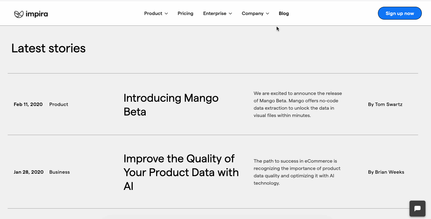
In a lesser web design, this could have been a long, uninspired user experience. Instead, the variety of ways these blogs are displayed keeps the layout from getting too crowded, making each individual post easy to identify.
2. Atelier and Avenue

With a sense of high end sophistication, this design for the agency Atelier and Avenue reflects so well the luxury brands that their agency serves. Scrolling through this website feels like flipping through the pages of a fancy fashion magazine.
They show that even with their blog, that they aren’t ones to fall into conventionality, titling it “Observations.” The top space of the layout dedicates almost the entire screen to the first featured article, with a stacked layout that is consistent with the print-like feel of the rest of the design. Scrolling down brings you through more of their entries, all slightly staggered, further adding to the refined sense of the design.

Though they aren’t that active in keeping this updated, all of the topics fit in so with the values of their agency. One of their own selling points in helping their clients with ecommerce and improving their digital presence is that they stay out of any potential conflicts of interest. The featured blog at the top on “The 4 unacceptable conflicts of Interest of ‘classic’ consultancies & agencies” gets into why this is a problem, and further strengthens the case for using them as an agency.
Atelier and Avenue stay consistent with the look and feel of their agency website, with an elegance that touches every element of their design including their blog. Through this, they show their targeted audience of high end businesses that they’re not your run of the mill digital agency.
3. Lambda School

Not making students pay for their tuition until they snag a job is a business model that quite a few tech related educational institutions have embraced. Lambda Schools stands out as one of the more well known, with coursework to put people on careers paths as web developers or data scientists.
Their blog acts as another channel to help out their students, covering a wide range of school related topics. From student profiles, to announcements about Lambda School, they use their blog to keep their students updated and informed.

They refer to their blog as “The Commons.” This tie in to the commons on a college campus, which functions as a centralized location for student resources, is the perfect title for this section of their website.
The blog page gets its own navigation with nav options like Career Advice, Lambda Community, and In the News giving students direct access to posts related to these areas. Along with a well ordered grid layout of posts, and plenty of white space, a student doesn’t have to spend a lot of time finding the information that they’re after.
4. Lattice
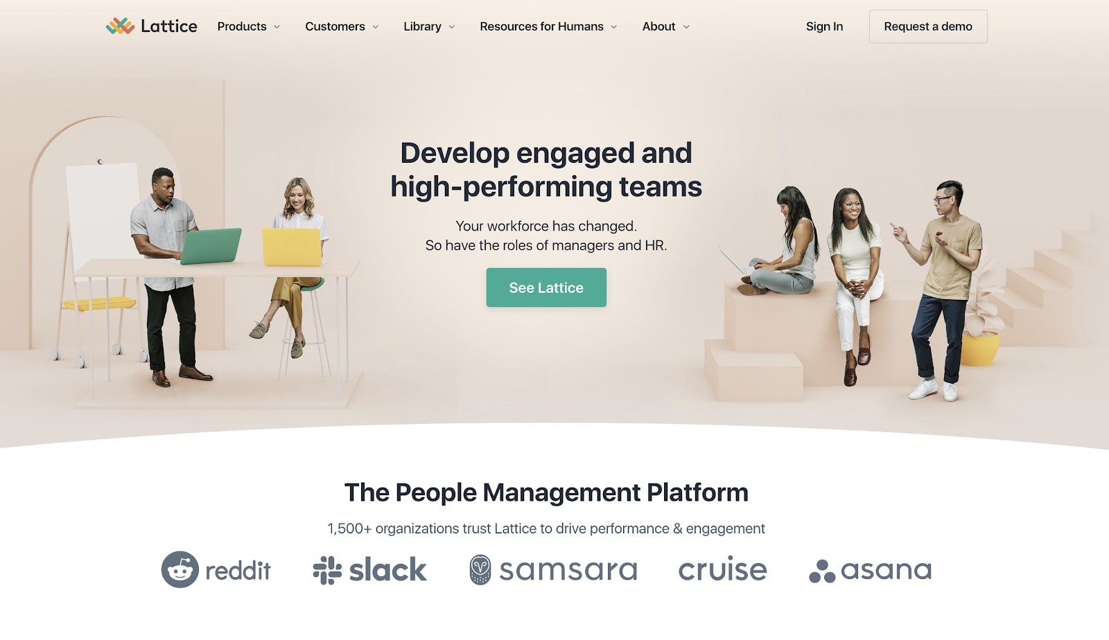
Companies are offering more flexibility when it comes to remote work. With this new way of working, businesses need tools to keep their employees connected, and to make sure that everyone is working towards the same company goals. Lattice offers software that helps companies adapt to this new way of running their businesses.
They title their blog “Resources for Humans Magazine” and offer a great selection of articles with the type of relevant content any HR person, or other management role would want to read about.

This blog is topped by its own navigation, different from the rest of the main website. With Company Culture, Employee Engagement, Employee Feedback, and other related menu options, this presents someone with a direct route in reading about the topics they want to learn more about.
This layout follows the format that many magazine and news related websites follow. With a large featured post occupying the left hand side and a column of articles on the right, it feels familiar and intuitive to navigate.
5. November Five

November Five opens up their business website saying that they, “create digital experiences that drive people and businesses forward.” What follows are a few detailed case studies about how they’ve helped their clients’ in meeting these goals.

They begin their blog with huge typography and a statement summing up that these posts are about both their successes, as well as challenges they’ve had to overcome. They get out right away what someone will be reading about.

Scrolling down, we get to this space, with the left hand occupied by big blog titles, with accompanying images on the right. The text change to red on hover really grabs your attention. There’s also plenty of negative space in this tidy two column layout.
Along with company news and what’s happening behind-the-scenes, they cover such areas as app development, stack technology, and other topics of interest to designers and those into tech. They don’t take too narrow of a scope with their blogging, instead opting for a wide variety of topics to keep things interesting.
6. Retrium

Retrospectives gives team members the chance to measure their success, and to communicate how well a project is going every major step of the way. Retrium streamlines this process and allows data to be integrated into these retrospectives, to further convey how things are going.

The webinars and other relevant content in their blog discuss things like product updates, ways to use data, as well as other tech business related topics. The articles are arranged in a card layout, with a rich golden for the Read more buttons, as well as a handy tag on the top classifying the type of content for individual posts. This is a great example on how through some tasteful applications of color, you can really make calls to action spring from the screen.
7. Luhhu
Zapier offers a powerful platform for automating processes and shuttling data between different apps. It can do so much, but also has a lot of moving parts. Luhuh is here to help businesses better integrate Zapier, and make their automations more efficient.

Their blog further establishes themselves as experts on Zapier, with almost every post touching on same facet of using this software. Not only does this position themselves as authorities about Zapier, but having all of this relevant content also makes for better SEO.

From a design standpoint, they keep things simple with a two column arrangement. They give just enough information to let you know what each post is about — and there’s quite a few posts here. The clean arrangement of articles are well organized and easy to scan through to find something that might be of interest.
8. Dwellito

Prefabricated homes have evolved into a niche form of architecture. Dwellito is a marketplace for modular homes, giving potential customers the information they need to help them find one that will work with their personal tastes and budget.
Their blog content covers the topics prospective buyers would want to learn about, and answer many of the questions they may have. It acts as an integral part of their content marketing, helping turn potential customers into paying customers.

This blog homepage, with its modern typography and sparse layout speaks to the same minimalism that contemporary modular homes follow. Nothing gets lost in unnecessary decorative embellishment. Instead there’s a straightforward linearity that holds everything together.
9. Freshpaint

Freshpaint gives businesses a software tool for automating website analytics, as well as being able to send it off to other apps. It taps into the power of data in furthering marketing efforts all without using code. Whether you’re a project manager or some other member of a marketing department, Freshpaint offers a handy and powerful set of analytics tools.

The blog is a handsome two column arrangement of blocks, with an animated hover effect that lifts each entry from the screen. This gentle effect does so much in bringing someone closer to actually clicking on one of these articles, and gives a bit of dimensionality to the web design. So many blogs suffer from unmoving grids and this subtle interaction brings this page to life.
10. Math3ma

With a PHD in math from CUNY Graduate Center, and currently active as a post-doc at the Google founded X, the Moonshot factory, Tai-Danae Bradley is an accomplished scholar and researcher. Her blog presents what she’s working on as well as other relevant math related content.
Math can be intimidating. But each of these entries lays out enough information to give even a layperson a basic understanding about what each post covers.

Another design choice that helps with comprehension are the inline quotes. Each blog has a key point in grey broken out into the center. What might be a difficult concept is distilled into an easy to comprehend description. This stays true to her whole philosophy about math, which aims to demystify it and make it more accessible.
Though these posts cover some heavy topics, the writing keeps them from falling too far into the pit of academic jargon. There’s a straightforward tone, and matter of fact voice that keeps these from feeling intimidating even for those of us who aren’t math scholars.
11. Hello Sign

We’ve all had to electronically sign documents, and HelloSign exists as another app out there for making this happen.

One would think that with a cut and dry product like HelloSign that having a company blog wouldn’t matter. HelloSign comes through with a whole library of blog posts relevant to those in business. Any successful blog should provide information that people may not be able to find elsewhere, and HelloSign delivers plenty of practical information.
Blog categories include Intelligent Business, Company, and Products. With a robust blog regularly updated with relevant business topics, not only do they give their target audience plenty to read, but as we discussed at the top, this can give a nice SEO boost to the website.
12. Aaron Ward

Aaron Ward offers instruction in helping people put together their own online classes. There’s both a free masterclass as well as paid options.
He teaches people how to earn extra income through teaching what they know. His work is guided by an entrepreneurial spirit in helping others find a way to monetize their smarts.

With a colorful grid of blog posts, there’s plenty of content that compliments the courses that Aaron offers. Each gets a tag at the top, with categories including online marketing, social media, as well as blogs that give more information about the courses. Each blog has a colorful thumbnail, with clean graphics and an easy to read headline.
Bloggers are still important
Though not the most glamorous of content, blogs still provide plenty of value. Where else can people get updates, learn more, and further their knowledge? They’re a centralized space, enriching people’s understanding with relevant content, and allowing them to feel a closer rapport to the business or entity behind it.
Designers shouldn’t feel the need to relegate blogs as a thing of the past. Instead, they should embrace them for their practicality, and potential for SEO magic, and instill them with the type of design work that will make people want to keep reading.
If you’d like, check out our blog templates and begin designing a custom blog of your own!
Experience the unprecedented ease, speed, and power of CSS grid layout in Webflow — with all-new on-canvas controls.
Experience the unprecedented ease, speed, and power of CSS grid layout in Webflow — with all-new on-canvas controls.