
It seems like there’s one basic layout used for 90% of the websites out there. You know the one I’m talking about.
The site begins with a photo filling the entire viewport (bonus points if it’s an overhead shot of a designer’s desk). Floating above the photo on a soft bed of text-shadow: a headline, some teaser copy, and a giant call-to-action button. That’s followed by three text blurbs with Font Awesome icons perched above the copy, mystifying visitors with their enigmatic relationship to the text.
You know the rest of this story.
It’s easy to go with the trends
Maybe it’s the popularity of web design trend posts. Maybe it’s the constraints that come from starting with a template. Maybe it’s designers working under tight deadlines and tiny budgets.
A lot of it has to do with the fact that vertical scrolling is such a common, intuitive behavior that it's the natural default for website navigation. Sites that follow this formula are seemingly easier to sell to clients and users since they’re comfortable and familiar. If it’s popular, it must work, right?
But every now and then — when the right project comes along — we designers should think outside the predefined box and start looking at layout concepts from entirely new angles.
Even if only because it’ll force you to re-evaluate your core ideas about the relationship between your content and the viewport.
If you jump straight to the same old layout formula every time, you could be doing your clients, and yourself, a disservice. As designers continue producing minor variations on the same old themes, there’s a huge opportunity to stand out by simply doing something different.
But how do you create a unique layout that doesn't frustrate and confuse your readers?
To learn how, we're going to examine three sites that gracefully deliver a beautiful, unique layout without frustrating users.
These sites not only deliver something new, but also make their content both accessible and responsive. The creative thinking behind them also brought their designers tons of exposure, demonstrating that novelty can indeed help your design portfolio stand out. So, if you’re looking to start taking on more design clients, you have one more reason to read this article.
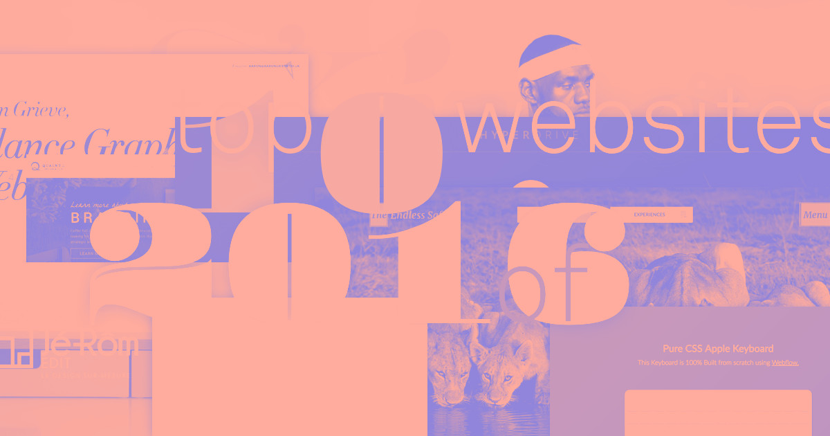
Layout #1: JP Texeira’s image-heavy redesign of IMDB
Before we explore our first layout example, take a look at IMDB’s current site.

IMDB’s current layout follows a pattern that’s very popular among content-heavy, database-driven sites. Stories with a higher importance get bigger thumbnails, larger headlines, and more detailed excerpts. A sidebar houses lower-priority content visitors still need to be immediately accessible.
A big-picture approach to the redesign
Purely on spec, designer JP Teixeira created a stunning redesign of IMDB’s homepage.

Varying box sizes, colors, type treatments, and other cues help organize and prioritize content on the homepage.
With no client to answer to and no constraints to worry about, JP was able to ask, “What if?”, and let his imagination run wild.
Personal projects like this give us designers a truly great way to learn: it’s like a quick return to design school! Some of your work might turn into gorgeous client sites, some might turn into proof-of-concept pieces for future experimentation, and some will definitely wind up in the trash.
But that’s okay—knowing what doesn’t work is just as important as knowing what does. Let’s take a look at JP’s layout, which he built from scratch in Webflow.
Why this IMDB redesign works
JP’s reimagining gives us an excellent example of a designer creating more than just a design — he’s created a design system you can apply to any site featuring continually updated content. That’s the key: this isn’t just novelty in aesthetics, it’s also novelty in accessible content.
By taking a step back and looking at the big picture, Texeira realized that the main challenge facing IMDB is the huge amount of movie news and media that would be updated on a daily basis.
JP uses scale to highlight featured articles with large, visually impactful images. The contrast between these rich images and the ample white space of the Tweet box allow both to equally stand out. These elements don’t blend into one another: each type of content has a unique visual style designed to make it instantly recognizable in the home page’s content stream.
Yes, there’s a lot going on, but the purpose of every element is immediately clear. Asymmetric balance is another effective design technique in use here: If this layout was box after box of equally-sized images, you’d quickly get tired of scrolling through all that sameness trying to find the next bit of visual excitement. By changing the width, scale, and color of each piece of content and displaying it in an asymmetrical, yet still balanced manner, the designer urges the reader to stay visually engaged — something new and exciting might be right around the corner!
What you can learn from this redesign of IMDB
Asymmetry can have engagement value, but it can be confusing. Be sure that it doesn’t jeopardize accessibility.
When many elements are tightly positioned together, use white space to call attention to important tertiary parts of the page.
With more complex layouts, it becomes increasingly important to reduce clutter on the page. You must aggressively reduce confusion and visual noise.
Layout #2: Long-form editorial content in Geospace
More and more sites publish complex, lengthy stories supported by rich photography, thought-provoking pull-quotes, compelling video, and complex data visualizations.
It’s no surprise that even this relatively “new” form of screen-based storytelling has already developed a standard layout formula! Even new ideas can go stale quickly.

A standard “magazine-style” layout used by many long-form storytelling sites.
A novel approach inspired by magazine design
Geospace takes the concept of the “magazine-style layout” to a whole new level.
Both the site’s navigation and its editorial content borrow liberally from techniques used in book and magazine design. By combining Webflow’s interactions (soon to be redesigned with interactions 2.0) and advanced typographic styling, the designer of this layout was able to recreate the look of a tactile, glossy publication while adding engaging interactivity.
Instead of treating the site as a single, vertical page, the designer (again J.P. Texeira!) decided to treat the horizontal viewport as a spread.
Geospace presents an elegant solution not only because it’s uniquely beautiful, but also because it’s intimately familiar. Even though the layout doesn’t work the way the user might instantly and instinctively expect, the site works the way it feels like it should work — the hallmark of any excellent user experience. Because of this, it very quickly becomes fully usable.

By embracing a spread-oriented layout, the navigation takes center stage, featuring compelling photos that draw readers into the story before a single word is read.

Only the selected navigation panel stays in place — the others slide off-screen, revealing the content.

Although it features a unique layout, functionality like scrolling works just the way you’d expect.
You can see more influences from publishing in the complex type system the designer crafted here: Large, heavyweight headlines contrast with the slender serifs in the body copy. There’s a clear visual hierarchy of information. Lead paragraphs are set in a larger type while consistent margins and ample white space allow the eye to “breathe” between elements. The result is a story that’s not just readable — it’s a pleasure to read. It’s whitespace done right.
What you can learn from this editorial-style layout
If you break with tradition in one aspect of the experience, stick to tradition in another. Not everything should be completely unique. Users need cues as to how to painlessly use your interface, and traditional approaches provide those cues, lessening the cognitive load.
Motion design can help provide affordance—subtle indications of intended behavior—to reaffirm UI behavior.
No matter how creative you get, remember that content is king. The primary purpose of the site remains the publication of easily digestible editorial content. Don't let the design reduce legibility.
Layout #3: Navigation as art in personal site Species in Pieces
Our final layout, Species in Pieces, offers a rich experience packed with CSS animations and unusual UI patterns — and raises awareness for endangered species.
As a personal project, the designer had the freedom to build an immersive, emotional experience not drive by the need for conversion. It’s a rare luxury, and one that designer/developer Bryan James took full advantage of.
However, going down this exploratory path can mean putting users at risk of getting frustrated and lost. It’s a creative decision you cannot make lightly.

Focus on the “one thing” with every page
The site’s layout stands apart via its calming simplicity. All content is contained in a static, horizontal viewport.
The hypnotic, motion-reinforced transition from one species to the next becomes the whole focus of every screen interaction. Secondary information is therefore hidden behind navigation options. This allows the illustrations to truly shine, consuming all of your attention.
The total experience draws a user in with simplicity then encourages them to explore further levels of complexity.
Why this navigational pattern works
This site’s innovative navigation works because it honors the fact that people instinctively scroll to navigate a web page: When a user scrolls up, the previous transitional animation fires. When they scroll down, the ensuing animation is triggered.
In other words, the site adheres to basic website navigation expectations rather than subverting them. Yes, this design is unique, but that doesn't mean it's going to complain when you try to interact with it in ways you're already used to. In short, common behavioral patterns are rewarded with a unique result.
What you can learn from this experimental website
The less you’re beholden to selling a product or service, the more experimental you can be. Consider creating a concept or art site to push boundaries and gain notoriety.
Breadcrumbs gain power when a navigation system doesn’t follow tradition. So, make it obvious where the user is at all times so that they don’t get lost.
No matter how experimental you are, you have to keep traditional patterns in mind — you’re creating a website, not a game or an app. By altering expected behavior in a predictable way, the experiment becomes even more successful.
Bonus layout: the golden spiral as grid—and interaction model
Another piece of navigational art that emerged mid-2017 is a Nick Jones' portfolio site. Like Species in Pieces, Nick’s design makes brilliant use of experimental CSS animations and unusual UI patterns.
Jones describes his inspiration for this site as “what [Karl] Gerstner’d do if he had CSS” and I personally think he nailed it. You can see his graphic and typography design work also has a Gerstner-esque style.
While experimental designs are amazing for sustaining personal creativity, they’re generally best employed in non-commercial applications. That said, it’s incredibly important as a designer to always be experimenting in areas where you may not feel comfortable – helps keep a creative perspective when building more “functional” sites for products and services.

The artistic approach to layout
The debate over the relationship between art and design seems never-ending — and I’ll let you all continue it in the comments — but I definitely consider this a work of art.
As this site a portfolio, Jones could have reach his goals in many other, more expected ways — but he built something that many people have never seen before and that seems to be a true expression of himself. And I believe when you create something to express yourself without sacrificing anything for objectives (or clients), it’s art.
Why this portfolio design works
While Nick has created a true piece of digital art, it won’t speak toevery potential client. That said, it’s a stellar example of a designer showing future clients and/or employers the type of work he wants to be doing. Which if you haven’t learned already, can be one of the most important things your portfolio can do. The kinds of clients who will be turned off by this site probably aren’t the folks he’d enjoy working with anyway.
What you can learn from this experimental portfolio
Though experimental designs might not be the right choice for clients/employers, it’s important to do experimental designs in your spare time to keep creativity fresh.
Use your public portfolio and designs to show potential clients what types of work you want to be doing.
Always have fun when designing. We’re still in the pioneer-age of making art for a new, digital world. Explore and enjoy!
Let’s recap: Five tips for creating your own unique layout
Include navigational cues
If you’re going to experiment with a unique website layout, your user interface needs to make it clear how to interact with it. These little “Hey, is this what you’re looking for?” animations provide visual cues that guide users through unfamiliar experiences. With a simple rotate or fade animation, you can increase user confidence by adding clarity.

Transformicons uses simple animations to show the state of a menu icon.
Never jeopardize responsiveness
A unique design means little unless you can experience it everywhere. As more users view websites from their mobile devices first, consider how a unique website layout will look on everything from a wide-screen desktop to an iPhone. (You also don’t want to be penalized for creating something cool that isn’t responsive.)
Unique layouts start with unique inspiration
We all get design inspiration from the web. It’s where we live for 8 hours or more every day. The Webflow Showcase and Awwwards are my personal favorites. But if you want to be truly unique, you have to also seek inspiration far and wide.
Get inspired by the roller derby, vintage seed packets, or the art of Barbara Kruger. Seriously. Nobody else has the same influences and experiences as you, so draw on them.
Fail often. Fail fast. Fail better.
When you look at a great designer’s portfolio, it’s easy to get discouraged. After all, all you see is the final, elegant UI animation.
You don’t see the “To File” folder on their desktop filled with unused inspiration, amazing ideas killed by the client, and the dozens of half-completed experiments. That’s why we call it a design process.
Personally, my first idea is rarely my best one. Sometimes my fifth one isn’t either. However, each idea takes me one step closer to a novel solution. And I can tell you this with all sincerity: Some of the ideas I’ve stumbled across in my journeys down seemingly dead-end roads have, in hindsight, helped define my career.
Don’t confuse people
Uniqueness is key when making a design that truly impresses, but remember that – for the most part – you aren’t creating a piece of contemporary art. You’re creating a website. The goal is not to confuse or challenge users, but to provide them content in an interesting way.
What’s the craziest site you’ve ever seen?
We’d love to see your favorite layouts. Tell us why you love them, and show off your own layouts in the comments below.
Master the fundamental concepts of web design, including typography, color theory, visual design, and so much more.
Master the fundamental concepts of web design, including typography, color theory, visual design, and so much more.