Your blog can be an incredibly important part of your site, driving traffic, converting leads, and giving you a voice in the industry. But if you’re doing any of the following with your blog’s design, you could be shooting yourself in the foot.
For the majority of blogs, dwell times — the average time visitors spend on a site — are abysmally low, averaging a mere 59 seconds. Given that the average dwell time for a top 10 Google result is around three minutes, the average blog won’t be ranking, and thus driving traffic, anytime soon.
Why are dwell times so low?
Most blogs — especially media publications — leave you feeling overwhelmed, confused, annoyed, or all of the above. All in less than 59 seconds!
Be honest: How much time can you spend on Forbes before having an anxiety attack?
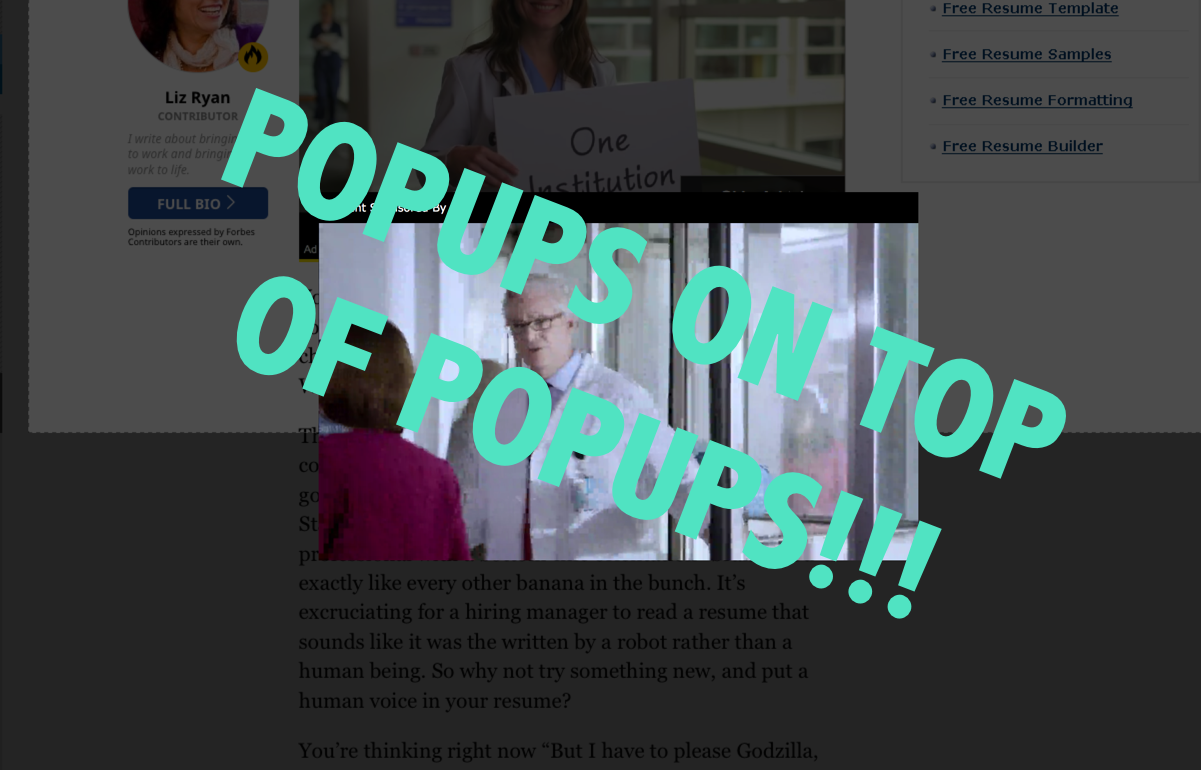
For me, it’s well under 59 seconds — I don’t usually get past the quote of the day, if I click through at all. While your blog may not be as bad as Forbes’, you may be scaring off visitors before they get a chance to fall in love with your content.
Let’s take a look at the common worst practices of blog design — what not to do — with real-world examples.
Shall we?
Force me to click, click, click to get where I want
One of my biggest pet peeves with the Forbes site is that it makes you click through to the next page to keep reading content you’re in a groove with. What’s the benefit for readers here?
It’s inefficient.
Forbes steals my time by making me wait for the next page to load — which takes a while because of all the ads.

It’s annoying when a blog post is broken into multiple pages — clicking the tiny numbered links sours the experience.


Again, these examples are inefficient, when I could be humming along, if it were infinite scroll.
Infinite scroll with a “load more” button is a good option. Something similar to what RateGravity is doing.

Make me squint to read your content
I’ve had 20-20 vision my entire life — I should not need to click zoom 84 times because your font is smaller than 12 px.

If I’m straining to read, I’ll skim and bounce. If I’m really interested in an article, I might make the effort to zoom 84 times, but then I’m dealing with resized elements covering the text.

Blogs should take inspiration from Quartz at Work. The site features clean, big, bold fonts with ample spacing.

Disincentivize sharing your content
I share more blog posts from Medium than any other blog. Probably because they make it so damn easy!

The overwhelming majority of blogs make sharing hard. They place share buttons at the top and/or bottom of a post.

Why would someone want to share your post before even reading it? Sure it happens — but how often? And share buttons at the bottom — well past the end of the article — isn’t optimal for the reader. Some of us don’t even make it that far.
First Round Review’s share buttons work well because:
- They follow me down the page
- They feature share buttons based on the networks I use
- They show the number of shares, making me believe it’s a great article before I even start reading
- They’re noninvasive

AddThis allows you to automagically customize the best share buttons for each visitor.
Let your text stretch as wide as the screen

Long lines of text are difficult to read. Lines that are too short break a reader’s rhythm. Somewhere between 50 and 75 characters per line (including spaces) is the optimal width for tracking.

Build complex interactions and animations without even looking at code.
Build complex interactions and animations without even looking at code.
Bring on the wall o’ text!
Visitors rarely read word-by-word on the web. Instead, they scan the page, picking out individual words and sentences.
In fact, 79% of test users always scanned new pages and only 16% read word-by-word. Because the overwhelming majority of internet browsers scan, blog posts must be formatted with this in mind. Help readers quickly find what they’re looking for.
Content that’s easy to scan features:
- Highlighted keywords (i.e., hypertext links, typeface variations, and color changes)
- Meaningful headings (not clever ones)
- Bulleted lists
- Short, conversational sentences and paragraphs

On the Conversion XL site we see:
- Highlighted keywords with red hyperlinks
- Short paragraphs that are easily scannable
- Descriptive headings that summarize the gist of each section

The Slate article is right — I didn’t finish reading. I can’t easily scan to understand what it’s about. All I see is an overwhelming block of text.
WIRED also formats posts poorly. Even if I do find the headline intriguing, I rarely read on.

When headings don’t tell me what the section will be about, I often give up on the post altogether.
If you want to take formatting up a notch for your longer posts, consider including a clickable table of contents at the beginning of your posts. Let visitors skip to the sections that interest them most.

Another way I’ve seen blogs display a table of contents is in a sticky menu that stays or appears when users scroll.

Only link to your own content
A surefire way to kill your credibility with me is to never link to trustworthy third-party sources.
Credibility is important for web users, since it’s often unclear who is behind information on the web and whether a page can be trusted. Credibility can be increased by adding high-quality graphics and featuring outbound links. Links to other sites show authors have done their homework and aren’t afraid to let readers visit other sites.
SEO consultants may say it’s bad to link to (too many) external sources, and remove links from your content. Early in a blog post you want to keep your links to a minimum — don’t shoo people away as they’re walking in the door. But unless you want to kill your credibility, keep sharing those trustworthy and relevant external sources. Especially if you’re making factual claims.
Distract me with your sidebar

The sidebar on this page from Vandelay Design is too busy. And the lack of white space distracts me from reading the content — the reason I came to this page in the first place. Plus, Vandelay’s sidebar isn’t exactly relevant to the content on this page. In fact, the sidebar stays the same regardless of the category.
Sidebars are exactly that, supplementary content. They should not be a repository for content you can’t find another place for.
I vote for no sidebars! Blogs that don’t have a sidebar are more enjoyable and relaxing to read. They make me want to learn more — but only if the content is good.
If you’re set on a sidebar, keep it minimal, like Copyblogger does. While there’s still a sidebar, it’s not busy and the color contrast in the design helps readers focus on the body content.

Definitely hide the author’s identity
The trend of fake news and “thought leaders” dressing up as experts makes it vital for blogs to provide more information about authors.

All an author gets on the Sumo blog is a small picture and an unclickable name. And when I search the name, I don’t necessarily find anything relevant. The lack of bio and other links makes it pretty hard to learn more about authors.
This makes content instantly untrustworthy if you ask me.

At the very top of a Tuts+ blog post, there’s a clickable author name that takes you to a short bio with more information.

At the end of a Tuts+ article, there’s an author bio and social links.
Keep me guessing how long a post is
Blogs that feature a lot of in-depth content should let readers know an approximate reading time and/or track the reader’s progress.
First Round Review gets it half-right. They do have a progress bar that scrolls across the top as you read. But it’s so subtle I could miss it if I’m not paying attention.


Mark Manson’s blog offers another good example. The hero image has “time to read” front and center on the image.

And when you start scrolling, a minimal sticky menu with a blue progress bar pops up.

Make it super-hard to subscribe
If I can’t easily find your subscribe box, you won’t get my email.

Here are a few of my favorite examples of email sign-ups.
The first is from the Webflow blog.

Webflow’s minimal subscribe form stays in the top right-hand corner (like on this very page!) as you scroll through an article.
That’s perfect for someone who is falling in love with your post as they read and thinks, “MUST SUBSCRIBE. SO AWESOME.”
Another great example is from the Intercom blog.

And again, First Round Review does a great job with its subscribe form at the top.

Do (I repeat: do) optimize your blog design if you’re doing any of the above
I’m a big believer in “nonchalant marketing,” meaning you don’t have to have a sidebar with 900 calls-to-action (CTAs) to get people to purchase from you.
I’m also a huge advocate for the user — if your design facilitates users having an amazing experience on your blog, they will return. It’s also likely they’ll go out of their way to subscribe and purchase.
Just make sure you give before you take.
Give your audience the stellar, industry-related information they’re looking for. You’ll be surprised when they start doing all the things you’d been hoping for!
TLDR: Stop designing your blog for you and start designing it for your readers.