


Behind every powerful, consistently expressed brand, there is a document: a style guide. And while most of them live in the form of hard-to-find and even-harder-to-update PDF formats, the best of the best live on the web, in the form of living style guides.
In this post, we’ll show you how to build one, and perhaps even more importantly, why.
Why build a living style guide?
Because (most) style guides suck
Instead of giving you a step-by-step description of the average experience of working with a style guide, here’s a quick story that sums it up:
Before Webflow, I was at an advertising agency. We worked with a client that always had about 10 style guide PDFs, with various levels of correctness, floating around. We — the design team, but really, everyone involved — never knew for sure which style guides to follow because they were constantly being updated. By a separate agency. Mind you, our client was a giant company, where adhering to a style guide becomes even more critical, yet increasingly harder to manage. Let alone keep up with.
I was constantly asking which button blue was correct that day, versus the day before, versus the icon blue. And then having to deal with client feedback regarding these types of discrepancies. Too often, client feedback regarding style was actually wrong, because even they didn't always have the current style guide.
On top of all that, there’s the issue of actually finding the files for the most current, style-guide-approved logo/icon/font because the style guide was just a static PDF.
And this was an everyday problem: never an ultimate source of truth, but instead, a constant guessing game.
The best-case scenario for style guides (before Webflow)
A handful of companies have built great style guides as websites. MailChimp, Intuit, IBM, and Salesforce have all taken giant steps closer to what a style guide can be. But that giant step comes at a cost: either in terms of engineering resources to code the site, or the price of using a third-party service that hinders creative freedom.
Despite that, the return is invaluable. Because they’re online, you no longer need to worry about having the latest version. The other key benefits of these “best-case-scenario style guides” is the ability to download assets, and other sorts of interactivity.
But even these best-case scenarios could still be so much better:
I built our style guide in Webflow, and it makes everyone's lives better
When you build a style guide with Webflow, it can literally just live as a page on your website. It’s dead simple. And because your style guide now lives within your website, it’s inherently up to date, always live and accessible (or password protected), and it’s visual (as a style guide should be).

Master the fundamental concepts of web design, including typography, color theory, visual design, and so much more.
Master the fundamental concepts of web design, including typography, color theory, visual design, and so much more.
And it’s easy to do. Here’s how to build a style guide in Webflow
Whether you're starting from a blank slate or building a guide for an existing site, the steps are largely the same. In this example, we’ll start from scratch. And if you want to skip all this, I made a template you can start from instead. But it can’t hurt to learn it, right?

1. Create a new blank project, then create a page called “Style Guide”

As noted above, you can also create a style guide for an existing project to bring a little more consistency to your build. But ideally, your style guide is the starting point for all projects, so consistency is built in from day 1.
Ideally, your style guide should include content guidelines as well, but we’ll focus on the most important design elements here.
2. Structure your layout

Ultimately, the layout is up to you, and can be as polished or as rough as you need. The template I created for you uses a two-column layout nested inside a container, inside a section. Don’t overthink the layout here: the simpler and easier to navigate the better.
3. Build out your style guide’s sections

Make a section for each element you want your style guide to cover. I’d recommend having at least:
- Typography
H1–H6, paragraphs, blockquotes, text links, etc. - Colors
Brand colors, text colors, and neutrals. - Logos
Black, white, and (if needed) color versions. - Components
Forms, cards, etc. Anything that consists of multiple basic elements combined to form a more complex module.
With those sections in place, start throwing a bunch of elements onto the canvas, in their appropriate sections.
4. Style each element’s base state
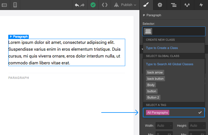
Leaving your color pallette aside for a moment, start styling your element’s base states, without creating a unique class name. So for an H1 heading, you’d select the element on your canvas, click into the Selector box, then select “All H1 Headings” at the bottom of the dropdown.
When you reach your button, you will need to create a class, and use that class for every button on your site. “Button” is a solid name for this class.
5. Add your colors

Make a box (or whatever brand-appropriate shape you want) of solid color for each brand color, text color, and neutral tone you’ll use on the site. Make a global swatch for every color you need, but keep the non-global black and white. Give your brand colors memorable names, and use that name as the label on the canvas.
6. Add logos, components, etc.

In the example provided, you’ll see logos and components, which is what I’m collectively calling more complex elements, like forms, tabs, and cards. It’s helpful to add any other elements that’ll show up multiple times on your site, too.
And that’s about it! This is really up to you, your workflow, and the site you're building, plus what your client might find useful. Enjoy!