You know you have something special when people are asking for merchandise featuring your brand.
For years, we were asked by people how they could rep gear featuring Webflow. We’re not the first brand to be in this position. Slack started the modern trend with their iconic socks, Fast has used their store to get people to try out their one-click checkout button to buy fresh hoodies, and Square took things further with their own fashion line with Cash by Cash App.
We recently launched our Merch Store and it helped raise thousands of dollars for charity in the first week alone. While we shared a bit about why we started the store, we wanted to talk more about our approach in an effort to help guide other brands that might find themselves in this position in the future.
Before you get started, here are key questions to consider:
- Are customers asking for merch? If there isn’t any interest, people won’t purchase the merch, plain and simple. See if you can find requests on social media or anecdotally before embarking on this venture. The last thing you want is to spend a lot of energy producing a store that gets minimal interest.
- How can you make fulfillment simple? Carrying inventory and fulfilling orders yourself requires time, space, and resources. Try to figure out if this is something you can take on yourselves or work with a partner to take care of all the printing and shipping, like we did with Printful. Printful’s ability to handle the inventory, printing, and shipping made it easy for us and gave us confidence to manage the Merch Store.
After you’ve answered these questions, you then have to figure out the right way to authentically represent your brand.
How we approached the Webflow Merch Store
The idea of building a Webflow merch store has been talked about for so long. Once we launched the integration with Printful, we thought this would be a great opportunity to provide swag for our community and build a great ecommerce store at the same time.
The products
We picked the products based on popular requests from our community, the design of the products, and their quality. There were also some constraints we had to look out for such as printing quality on the materials.
Sourcing
One of our goals is to have as many eco-friendly products as possible. And fortunately there were some products that we were able to find eco-friendly versions of via Printful.

Designing the products
Once we had the final list of products we went into building mood boards. We came up with a few directions ranging from more illustrative to a more minimal approach. After some research and brainstorming, we concluded that most people tend to wear things that are more minimal. There was also the fact that with Printful, we couldn’t completely control the production of these products and the printing quality. Plus, our Webflow brand is evolving and we figured it would be better to stay on the simple side, so we decided to lean towards simple typography and color blocking with a dash of personality.

After narrowing in on the style, we worked with the content team on the possible copy that would go on the products. Once we were in this exploration stage, our focus shifted to try and find the balance of what felt like Webflow but also had some fun. We brought in some brand elements such as our typography, some existing graphics, and our brand colors — but we also introduced some new styles, treatments, and elements to the whole collection.

We then narrowed these down to a few sets. From here we mixed and matched to form our first collection of products. The decisions at this stage were based on constraint in printing areas and consistency within the collection.

Collaborations
We also partnered with designers within our no code community (ThreeSixtyEight, Finsweet, and Mackenzie Child) to design some special versions of products. We set guidelines for them to make sure they understood how we represent our brand and the designs within our merch store to reduce the back and forth edits. Our goal was for the collaborations to be original, creative and reflective of the style of our partners, so our guidelines were more around our audience, DEI and accessibility, and constraint in colors and printing.
The site build
We wanted to create a very minimal site that let the products take center stage, while the UI and interactions are intentionally simple and monotone. A couple of websites that we looked to when building the layout were Everpress and Actual Source.
Bringing the Merch Store to life required use of Webflow’s ecosystem including: our Printful integration, Monto, and NoCodelytics. This is just a small sampling of some great products that build on top of Webflow's platform and can be helpful when making your own merch store.
Our hope is also to have a simple foundation that we can iterate upon. In the future, we hope to offer more functionality and playfulness in the design as our amount of products and collaborations grow.

Once we had a direction for the site, it was time to get into the details. We iterated upon a consistent nomenclature of the products that was both descriptive of what they were and concise. IE: “I make websites tee” instead of “Typographic tee.”
We also had to organize options like product variants, by either color and/or design, while also deciding on the amount of variants to offer. Among our questions: Should each product offer a full crayon box worth of colors, or do we keep it simple with mostly neutrals?
We wanted to ensure some kind of buying cycle within the store to encourage users to grab products while they were available and to communicate to any prospective customers that all profits were being donated to a charitable organization. One way we did this was to implement abandoned cart recovery emails using Monto.
Two weeks before publicly launching, we did an internal soft launch with employees and this was critical in refining the UX and ironing out any bugs before it launched to our community.
Making it accessible
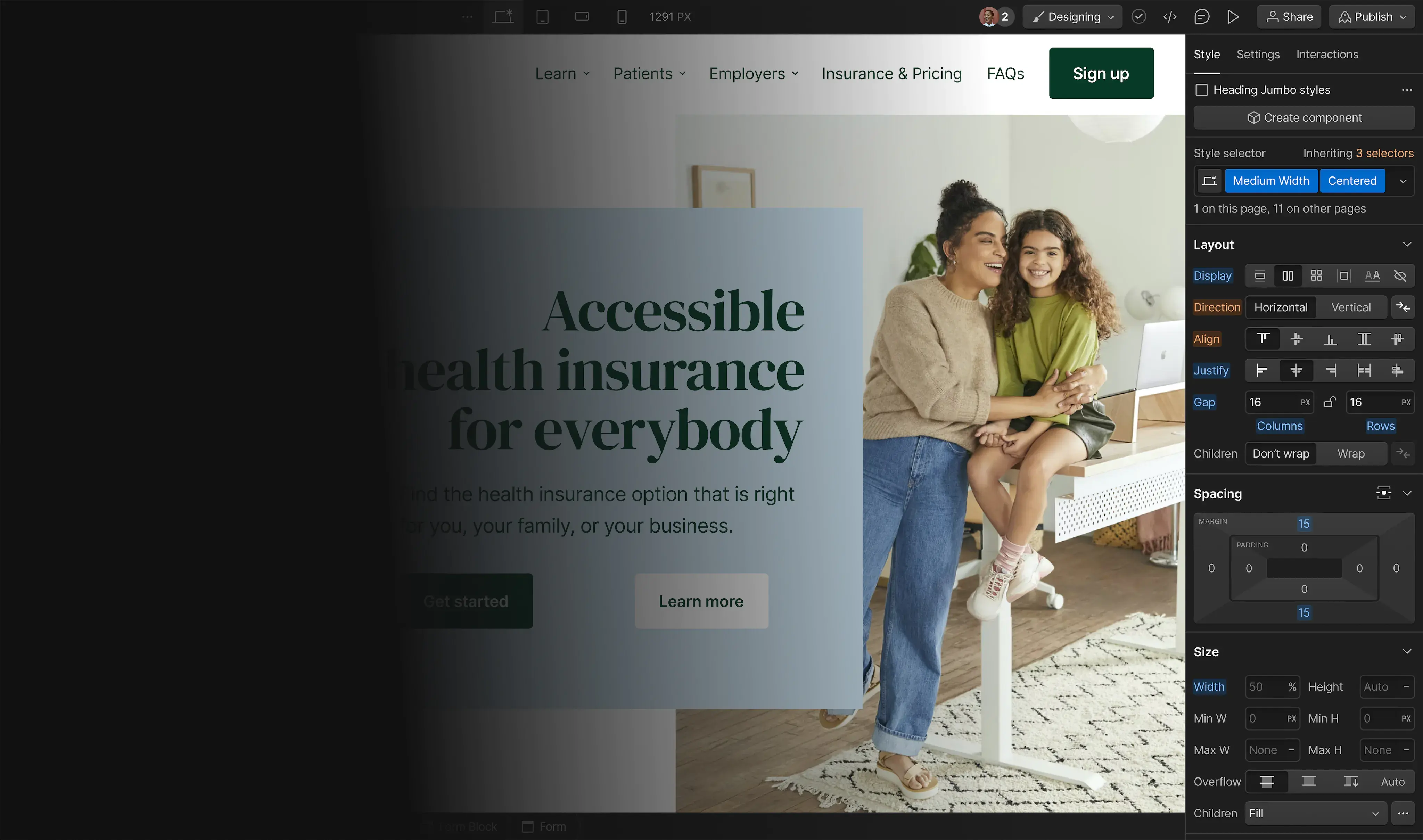
We designed the Merch Store with a semantic page structure and order of elements in mind. For example, what looks like a simple UI for each product card, is actually a strategic hierarchy of elements, conditional visibility, and flexbox to ensure each is read in an ideal order for screen readers, while being consistent with the visual layout.
Ensuring a consistent experience for both mouse and keyboard only users was also important to us. We achieved this by adding a sprinkle of custom CSS and JS here and there for things like focus state visual indicators and animations on the product cards.
All elements are using their proper HTML property where possible, and when not we utilize ARIA roles and labels to identify them as such. For example, while we aren’t able to create traditional HTML <table> elements within the Webflow Designer, we did use CSS Grid to create the product size tables below along with ARIA roles to label the headers, rows, and columns for the benefit of various assistive technologies.

Donating the funds
Before we even set up our Stripe account to collect funds, we asked ourselves what we would do with the money generated from sales. A merch store is fun, but not core to our business. We’re not selling shirts at the back of a concert (ugh, remember concerts?) to finance the tour. We planned to donate our profits to a good cause and given the global nature of our community, we wanted this to be a charity that supports a worldwide issue. Picking 350.org felt like a natural fit, given their important work fighting climate change. We plan to donate the funds on a quarterly basis.
We hope this post has been helpful in guiding you through how we built our Webflow Merch Store. Be sure to browse our products, buy a few, and share photos of your swag.
Shape your customer's experience every step of the way, and build a modern ecommerce website — all without writing a single line of code.


