


When it comes to shopping online, we place a ton of value on the design and “feel” of the websites we visit — both consciously and unconsciously. This article dives deep into the concept of persuasive design, explaining the role your ecommerce website’s appearance plays in your potential customers’ willingness to make a purchase.
Quick question:
If Amazon.com still looked like this ...

... do you think it would draw anywhere close to the over-300 million customers it does today?
Heck no!
Even if everything else Amazon offers — the wide selection of products, the fast and cheap delivery, the top-notch customer service, etc. — was still in place, there’s no way the company would be as successful if its website still looked like that.
The design of an ecommerce website plays a major role in the consumer’s decision to purchase — as well as your ability to keep consumers coming back for more.
Whether you’re just starting an ecommerce store or already have an established business in place, you’ll learn several design elements you can use to engage visitors and spur them to action.
First, let’s talk a bit about the role emotions play in influencing a modern consumer’s purchasing decision.
The purchasing decision: a mix of logic and emotions
Think about the last five or so things you purchased.
Maybe you got gas. Or maybe you bought a sandwich for lunch today. Perhaps you had yesterday off and treated yourself to some retail therapy at Target.
The first two examples show an individual making a purchase based on logic: Their car was out of gas, so they filled it up. They were hungry, so they bought a sandwich.
The retail therapy example, on the other hand, shows an individual making purchases based on emotions: they simply felt like shopping and bought a few items they felt like buying.
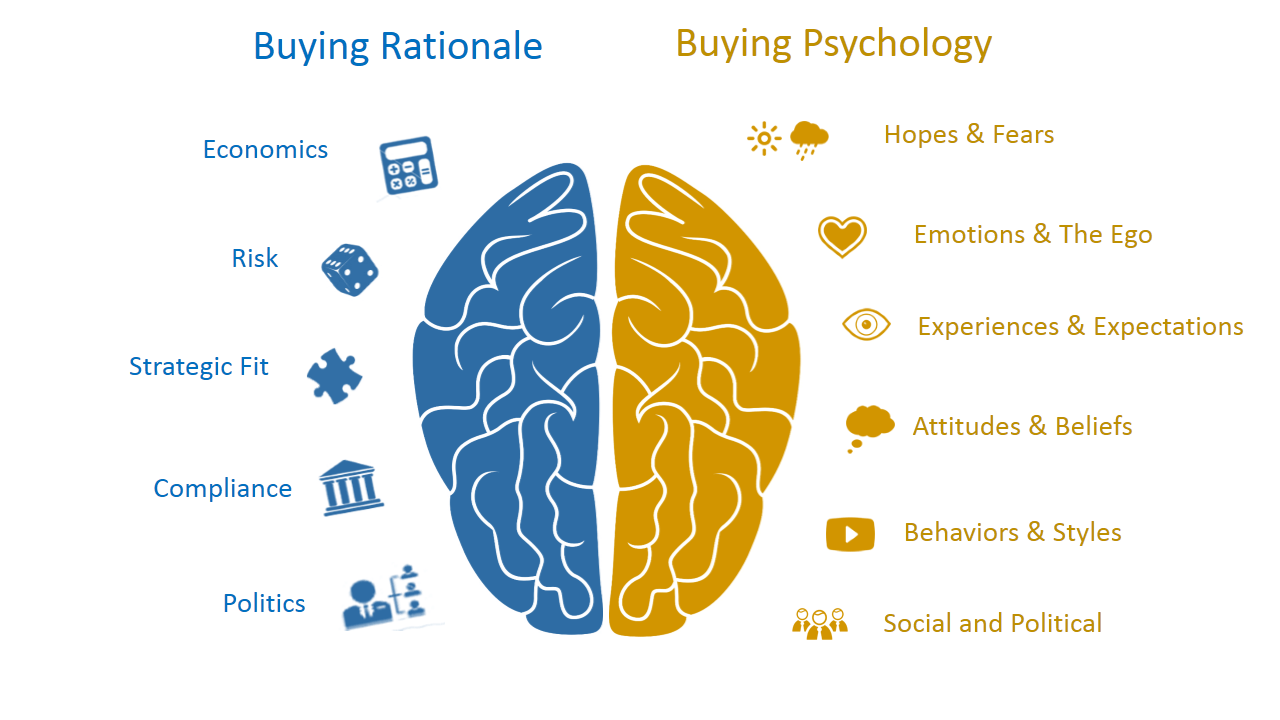
The two sides of the buying decision
The diagram below shows the two hemispheres of our brain to illustrate that rationale (left) and psychology (right) both influence our decision to buy.
Buying rationale can involve:
- Economics
- Risk
- Strategic fit
- Compliance
- Politics
Buying psychology can involve:
- Hopes and fears
- Emotions and the ego
- Experiences and expectations
- Attitudes and beliefs
- Behaviours and styles
- Social and political
But, regardless of whether an individual purchases something out of necessity or desire, their emotions will always play a role in their purchasing decision in one way or another.
For example, the person who needed gas decided to drive across town to the more well-kept gas station. The hungry person went to their favorite local deli and bought their “usual” hoagie. And the retail shopper specifically went to Target rather than another department store because Target always has better deals and a wider selection of products to choose from.
While the above examples are pretty overt in their emotional reasoning, sometimes cognitive biases also come into play. For example, the person who indulged in some retail therapy might favor Target over a competing department store simply because Target is their “happy place.”
Logic often takes a backseat to emotions when it comes to purchasing. So it’s essential to design an ecommerce website that makes customers feel good.
Which is where persuasive design comes in.
A quick sidebar: This is not to say that you want to use persuasive design to “trick” your visitors into doing something they don’t want to do. Rather, use it to make them comfortable and confident in their decisions.
“The key emotion that matters is trust, once trust and credibility have been established you can use imagery or copy to trigger user behavior. Without first establishing trust any attempt to tap into user emotions will be viewed as manipulative. Which is not what persuasive design should be about.
Persuasive design is about the intent of the designer, (and as mentioned that intent should be to establish trust as well as credibility) and then to support users throughout the designed experience resulting in the desired behaviors.
And to establish that trust you have to know who your target audience is and then focus on the first impression, or what Robert Cialdini calls the "Pre-Suasion", that process of ensuring your recipients are receptive to your message before they receive it.”
–Dr. Page Chen, President & Chief Innovation Officer, Remote-Learner
Increase engagement and conversions with persuasive design
Persuasive design is the process of designing products or marketing materials (in our case, your ecommerce website) in a way that positively influences your visitors and persuades them to take a specific action.
How you implement persuasive design depends heavily on what you’re offering. In the case of ecommerce websites (and websites in general), there are five core principles to persuasive design.
1. Clear information
Overwhelmingly, the modern consumer simply wants to know what your website is all about more than anything else.
Take a look at this example from Uber:

If you’ve ever used Uber, you know that using the service really is that simple. That said, there’s really no reason for the company to waste a new user’s time pontificating or getting too fancy with their landing page copy.
“As visitors are on your site, the site itself is actually having a conversation with them as they move through their journey. As a designer, embed yourself into that conversation and figure out what you would tell visitors to do next if you were sitting next to them.
This makes the process of creating copy easy to write.
In much the same way what would you tell them not to select? If there is anything - you may want to consider removing it from the page.”
–Dr. Page Chen, President & Chief Innovation Officer, Remote Learner
Within seconds of landing on your site, your visitor should understand:
- Who you are
- What value you provide
- Why they should care
Anything more, and you risk losing them from the get-go.
“There are several persuasive patterns that can be used in a website’s copy to present information clearly to a user: chunking, sequencing, curiosity, reduction, conceptual metaphor, recognition over recall, serial positioning effect, framing, value attribution, and priming effect to name a few from the Persuasive Patterns card deck.”
–Anders Toxboe, Founder, UI-Patterns.com
2. Visual appeal
Visual appeal is secondary to clarity of copy simply because providing clear information is necessary to keep visitors engaged and moving forward in their purchasing decision.
That said, visual appeal is, without a doubt, what hooks them in the first place
Remember Amazon’s original homepage from the beginning of this article? While it might have been the seed to something great, it definitely pales in comparison to present-day Amazon:

There’s really no debate as to which version is more visually appealing, is there?
Now, when we say “appeal,” we’re not just talking about aesthetics — although that’s certainly part of the equation.
Like your site’s copy, its visual appeal revolves around clarity. In other words, your site needs a layout that makes visitors’ pathways crystal clear.

True to the overall theme of the brand, Apple’s website is incredibly simple — and also rather sleek. Now, don’t mistake “simple” for “empty.” Going back to Amazon’s current homepage, there’s certainly a lot going on. However, it’s still easy to navigate and understand visually.
Also worth noting is the idea that your site’s visual design should fit into what’s “typical” of sites in your industry. For example, take a look at eBay’s homepage:

While it doesn’t look exactly like Amazon, you could probably tell that the screenshot above is from some kind of ecommerce marketplace, even if the eBay logo wasn’t visible.
So from a visual standpoint, your ecommerce site should:
- Be simple and free of clutter
- Match your visitors’ expectations (especially those surrounding your industry)
3. Strong visual hierarchy
Take a look at the following screenshot from MVMT Watches:

If you’re visiting this site for the first time, where are you clicking first?
You’ll likely choose either of the two images (or perhaps the “Shop Now” buttons within said images). These features are clearly the most prominent on the page — both in size and visual aesthetics.
Visual hierarchy is the practice of making the element you want visitors to engage with most stand out above everything else. There are a few ways you can use visual hierarchy to persuade your visitors to take a specific action.
As in the example above, you can make certain elements of your site larger and more detailed.
You also might use color the way Dr. Dental has:

Or, you could simply use whitespace to make your target element “pop,” as Best Buy does here:

“When employing visual hierarchy, the trick is to make your focus element stand out while simultaneously making it fit with the rest of your site. In other words, make it stand out — but don’t be blatant about it.”
–Alon Popilskis, Digital Marketing Consultant, Smart SEO Designs
4. Attention-grabbing and keeping
If we were to nail this point down to a single word, it would likely be “immersion.”
You want visitors to become so engaged with your site that, for the duration of their stay, they completely forget everything else around them.

Take a look at how Jorden Roper from Creative Revolt catches — and keeps — our attention using a combination of eye-catching imagery and badass copy:

Sometimes, keeping your visitors’ attention means presenting the unexpected — the way Jorden does with her brash copy. Other times, it simply means telling visitors exactly what they should expect the way GiftRocket does:

The main thing to keep in mind is that your site is giving visitors an experience — make it memorable.
5. Singular focus
“If your website doesn't match customers’ search intent, it's the equivalent of performing surgery with the lights off. This is why it’s important that each of your pages position themselves in a way that solves a user’s query — otherwise they're just going to leave and look for a solution elsewhere.”
–Dan Young, Director, LoudDigital
Every single page on your website should exist for one reason.
Your pages should not pull visitors in more than one direction. Whatever you want your visitors to do on a certain page — that’s what you should focus their attention on. This doesn’t mean everything else on the page is unimportant. Far from it, in fact.
On the contrary, everything else on the page should serve to direct a visitor to take the specific action you want them to take.

In the example above, the offer is promoted front and center — but the call to action (CTA), the Buy button, is also crystal clear.
Sometimes, you might want to include a secondary CTA to engage visitors who are reluctant to take the main course of action:

Still, the main CTA (“See Plans”) is obvious, making it easy to convert those ready to do so.
Your goal should be to use the entirety of each page on your site to prepare visitors to engage with the element you intended. Whether that’s signing up for your mailing list, purchasing your product, or contacting your company for more information — everything else on that specific page should get visitors ready to take action.
“Choice is a powerful persuasive tool, but you want to be sure to provide choices that move visitors in the desired path, but don't trap them in a tunnel. It's a balancing act.”
–Dr. Page Chen, President & Chief Innovation Officer, Remote Learner.
Build complex interactions and animations without even looking at code.
Build complex interactions and animations without even looking at code.
Design your ecommerce site with your audience in mind
So now that we’ve gone over the principles of website design, it’s important to see things through the eyes of the people that really matter:
Your customers.
Understand your target audience’s behaviors and expectations
In order to design your website in a way that caters to your audience — and spurs them to action — you need to know how they act, and what they expect, when browsing your site.
In terms of behavior, there are a few things to take note of:
First, you want to know how and why your visitors ended up on your website in the first place. This preliminary information can provide you with valuable insight into the mindset of your visitors when they arrive.
Google Analytics can help with this:

Note the top three referring pages, here. Those that visit this site (whatever it may be) from StumbleUpon are likely “just browsing,” and have likely … well … stumbled upon the site by chance.
But those who came from Facebook and Google are more likely to have clicked on the page for a specific reason. That said, it would benefit the owner of this site to figure out what that reason is, so they can be sure to provide value related to this reason throughout their site.
(Keep this in mind, as we’ll revisit it when talking about visitors’ expectations in a moment.)
You also want to take note of what your visitors do on your website:
- Which pages do they visit and in what order?
- How do they engage with each page?
- How much time do they spend on each page?
- Which pages tend to cause them to navigate away from your site altogether?
The answers to these questions — and more — can provide valuable insight about not just how your visitors engage with your site, but also if the design of your site pushes them towards the actions you hope they’ll take.
In addition to all of this rather speculative information, you also want to gain more concrete info about visitors’ expectations. For this, head straight to the source: your visitors!
Survey or interview current customers to determine:
- Why they checked out your site in the first place
- How they rate their on-site experience (in terms of aesthetics and functionality)
- Whether they have any suggestions for improvement moving forward
You obviously can’t please everyone. And some suggestions might not be as valid as others — or might actually do more harm than good. So consider the message or meaning behind customer comments to determine what improvements to make to your site’s overall design.
In other words, don’t blindly follow customer suggestions. Instead, use them to gain an understanding of what they need and want — trust your expertise to make changes as you see fit.
Use the BJ Fogg framework
Ready for some math?

Just kidding … kind of.
We don’t need to deal with the numbers — and we’re not even sure how you’d multiply motivation by ability by prompt — but it’s beneficial to see how an individual’s motivation and ability influence their behavior when prompted by external stimuli.
Let’s break this down a bit further.
Motivation
Within Fogg’s framework, motivation refers to an individual’s motivation to take the action you intend for them to take.
According to Cialdini’s Principles of Persuasion, there are 6 main ways in which motivation can be fostered:
1. Reciprocity: People are more likely to engage and take action if they’re given something upfront. In the ecommerce world, this translates to providing incentives like exclusive offers, personalized content, or a small freebie for checking out your site in the first place.

2. Commitment and Consistency: This principle states that consumers tend to stick to a decision once they’ve committed to it — and deepen their commitment to their decision moving forward. Ecommerce companies can play off of this propensity to commit by getting visitors to take “baby steps” toward a larger commitment. Like you might ask new visitors to sign up for your mailing list on their first visit, then send further marketing material via email down the road.
3. Scarcity: We all want things that are hard to come by (the diamond industry is built entirely on this notion — even though such “scarcity” has been completely man-made). At any rate, you can capitalize on consumers’ propensity to take immediate action in order to avoid missing out with limited-time offers, sales, and putting a cap on your valuable offerings.

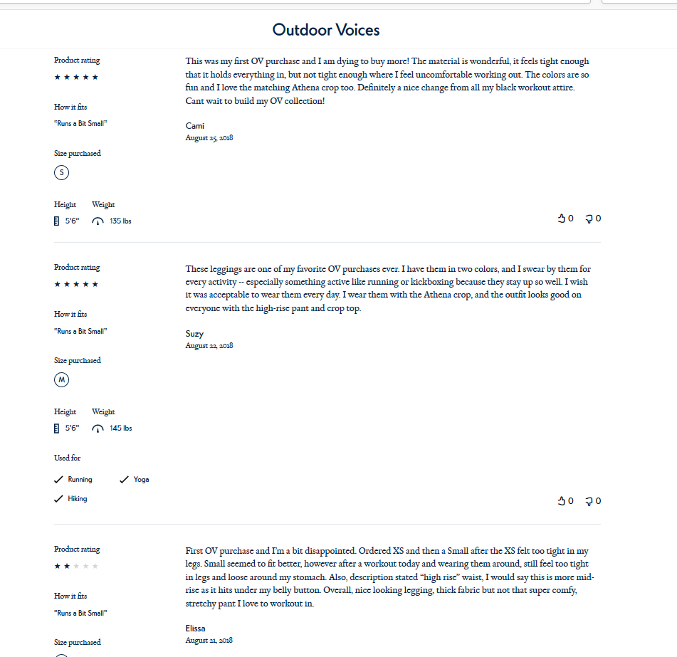
4. Social Proof: People trust other people, so include customer reviews, testimonials, and other words of praise throughout your website (where appropriate, of course).
Note: Don’t worry if your products have some negative reviews. As long as they’re authentic, they can actually help with overall conversions.
“When displaying reviews on your product pages, don't be afraid to include bad reviews as they might actually help increase your conversion rate. One study found that the presence of bad reviews improved conversions by 67%. Just make sure your bad reviews don't outweigh the good reviews."
– Michael Folling, Founder, Limitless Designs
5. Liking: Along with people’s tendency to be influenced by recommendations, consumers are also more likely to listen to people they like (or people who are like them). This is why it’s essential for ecommerce companies to showcase the human side of their organization as much as possible.

6. Authority: While consumers appreciate recommendations from their peers, they also tend to listen to the voice of authority. In terms of website design, you can convey a sense of authority by ensuring your site adheres to the principles we spoke about earlier (e.g., simple, clear, functional, etc.). Additionally, when including social proof, such as testimonials, you’ll want to include commentary from well-known individuals within your industry, as these comments will mean much more to your customers than the words of random strangers.
“Establishing your ecommerce website as an authority makes it more likely that your customers will be persuaded by your marketing efforts.
Right now, sit down, take a look at your ecommerce website, and honestly ask yourself if it conveys the message that you’re an authority source. If not, it’s time to start building it up.
Steps you can consider include highlighting that your ecommerce site is secure and can be trusted, making use of credible images (such as customers using your product or actual product images) as opposed to stock photographs, incorporating video reviews from micro-influencers on product pages, etc.”
–Alon Popilskis, Digital Marketing Consultant, Smart SEO Designs
Ability
Ability refers to the consumer’s ability to make the purchase and the ways your website facilitates that purchase.
“A great example of ability and simplicity is Amazon's 1-Click. They make it simple for repeat visitors to make a purchase by saving all transaction data from previous purchases. Visitors trust Amazon so they are okay with them having that information in exchange for making the buying process easier.
The goal of in ecommerce isn't merely the first transaction, it's to create repeat shoppers.”
–Dr. Page Chen, President & Chief Innovation Officer, Remote Learner

Amazon’s 1-Click makes it simple for consumers to make a purchase, leading people to buy more.
It’s also worth reiterating that the more functional your site, and the clearer the pathway to conversion is, the easier it will be for visitors to take action when landing on your page. So make your CTA buttons the focal point of each of your web pages and make sure your site functions properly.
To complement all of this, consider adding a progress bar to your site so your customers know how many steps are required to complete a purchase.

Prompts
Let’s go back to the graph from the beginning of this section for a moment:
Notice that “prompts” only work after an individual’s motivation or ability (or both) to take action is high enough.
To be clear: timing is everything. Finding that opportune moment to persuade users — known as kairos — requires placing triggers in the paths of motivated users.
“It’s all about the providing the right message to the right users at the right time to persuade them to take the right action.”
–Dr. Page Chen, President & Chief Innovation Officer, Remote Learner
Present your trigger before visitors are ready to take the next step, and you’ll come off as pushy. Present it after a wall of text that takes 10 minutes to read, and visitors likely won’t reach it in the first place.
This goes back to the principles of using a visual hierarchy and providing a singular focus on each page. Although visitors are free to engage with your site however they see fit, your goal is to design it so they can’t help but engage with elements in the order you intended. In doing so, you’ll increase the chances of them hitting your “prompt point” at the exact moment they’re ready to take further action.
Simply put: your design matters
If the design of your ecommerce website is an afterthought, you’re almost certainly missing out on a ton of business.
Approached strategically, and with your target audience in mind, your design can spur your company to massive levels of engagement and conversions.


