MyOps: From MVP to Market-Ready - SaaS Product Redesign

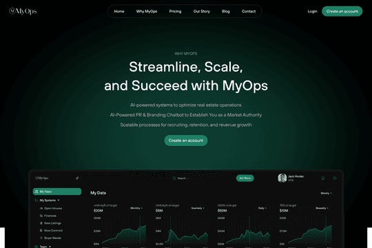
The redesign started with a single constraint: every workflow an agent completes in the field had to be achievable in one or two interactions. No more. The reference points were deliberate - Robinhood's dashboard clarity, Apple's discipline around subtraction. In a tool used under operational pressure, complexity isn't neutral. It's friction, and friction is churn.
Mobile-first for agents. Streamlined desktop for admins. Not two versions of the same interface but two architecturally distinct responses to two completely different operational contexts, held together by a single visual system that makes them feel like the same product.
MyOps now looks like the company it already is. The gap between product quality and product presentation is closed.