Overcoming Pixel-Based Breakpoints in Webflow

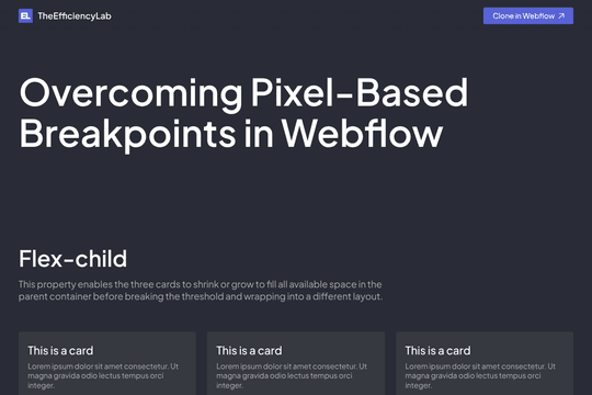
Explore adaptive card layouts using Flex-child, Container-type: inline-size, and Grid-template-columns, all without relying on traditional breakpoints.
How to Use:
1️⃣ Open the Cloneable in Webflow
2️⃣ Explore the settings and layouts to better understand how it works
3️⃣ Save it as a handy reference for your future projects
Feel free to use this component in any personal or client project you like!
.png)
