
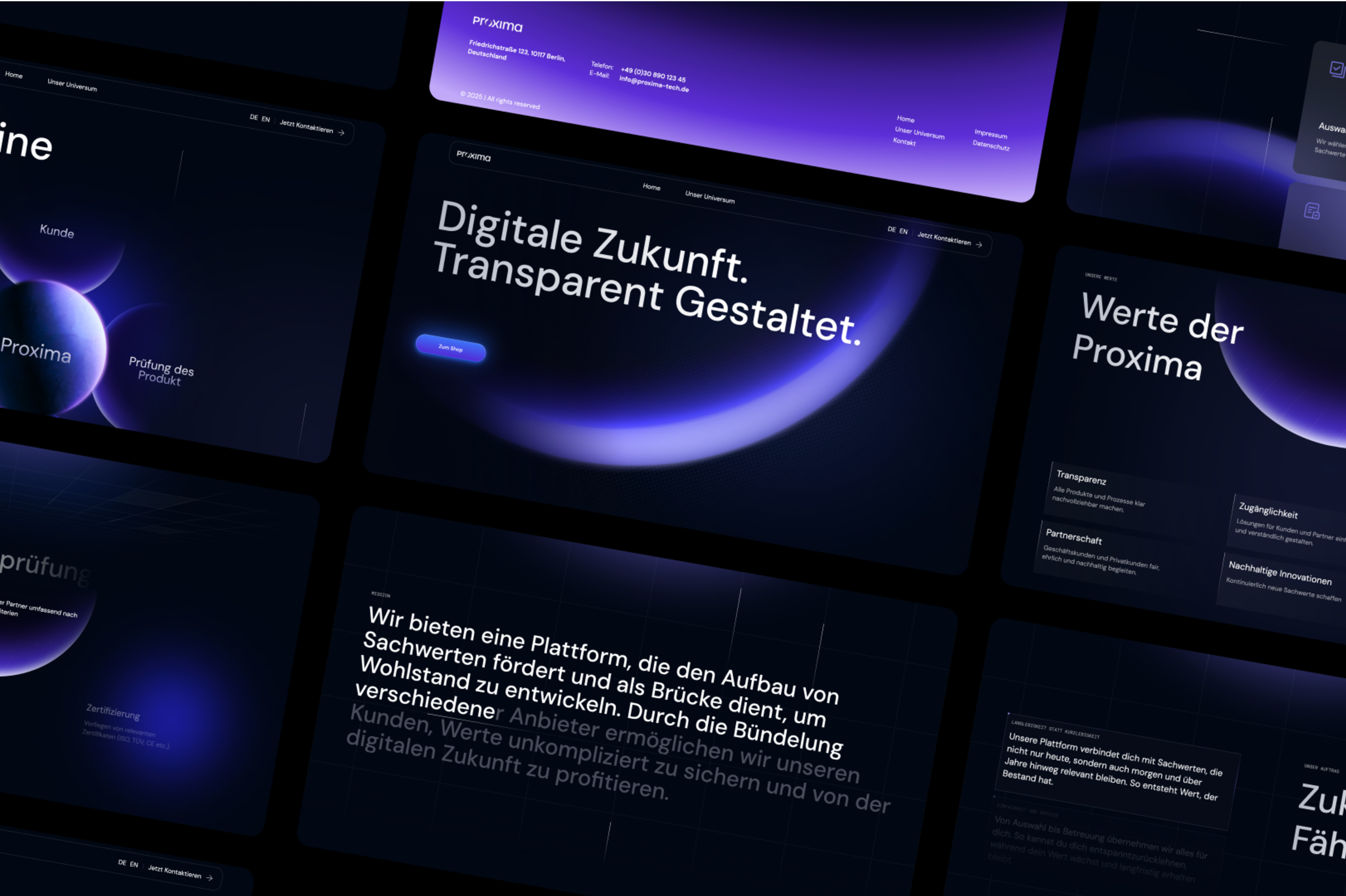
A rebranding was developed for Proxima that combines digital innovation with human closeness. The visual language is calm, structured, and intentionally unhurried, creating trust in complex topics. Colors, typography, and animations work seamlessly together to form a consistent brand experience.
Proxima’s corporate identity provides clarity, orientation, and trust. Combined with the comprehensive web design and Webflow implementation, it results in a holistic brand presence that works long term and strengthens Proxima’s positioning as a modern investment brand.