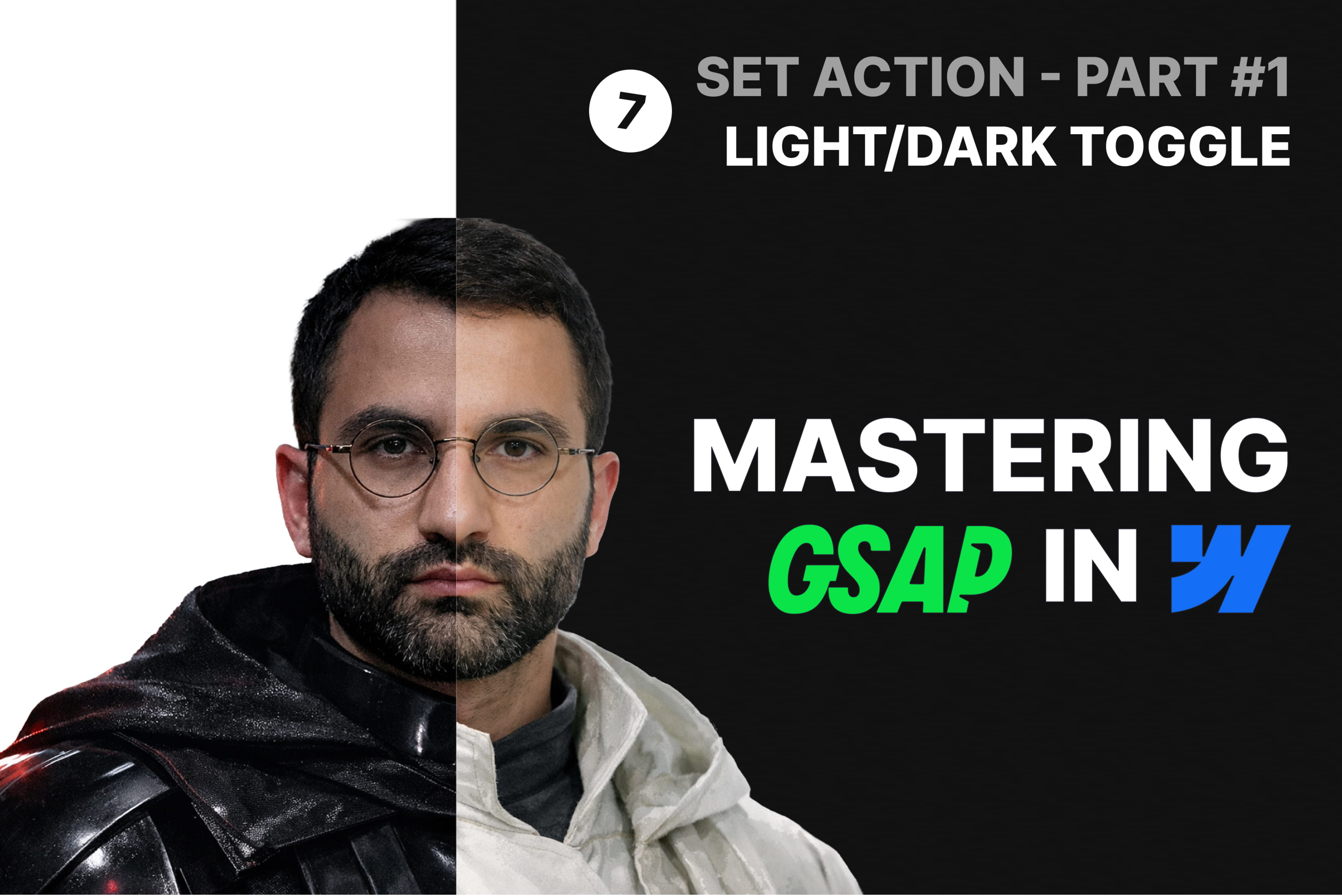
Mastering GSAP Interactions in Webflow: Persistent Light/Dark Mode Toggle

In this lesson, we build a complete and persistent light/dark mode switch from scratch.
But this isn’t just about toggling colors.
We start by structuring a proper Variable-based color system, defining a dedicated Dark Mode as a manual Variable Mode, and connecting every relevant color property across the project to that system.
Then we build the toggle itself using Webflow’s new GSAP-powered interaction system, leveraging the Set action to manage theme state through classes instead of directly animating properties.
To improve the visual experience, we introduce a controlled transition system that ensures smooth color shifts without interfering with hover, scroll, or other animations.
Finally, we add a small layer of JavaScript to:
✅ Persist the user’s theme preference using localStorage
✅ Respect the user’s system color preference (prefers-color-scheme)
✅ Prevent flickering by applying the correct theme before the page renders
👉 Watch on YouTube: https://youtu.be/WI--cOr72u0

