Testing Landscape Viewports (Without Leaving the Designer)

Testing layouts against landscape viewports in Webflow can be surprisingly inconvenient.
The usual workflow involves publishing the project, opening Chrome DevTools, enabling responsive mode, and manually resizing the viewport to simulate different aspect ratios.
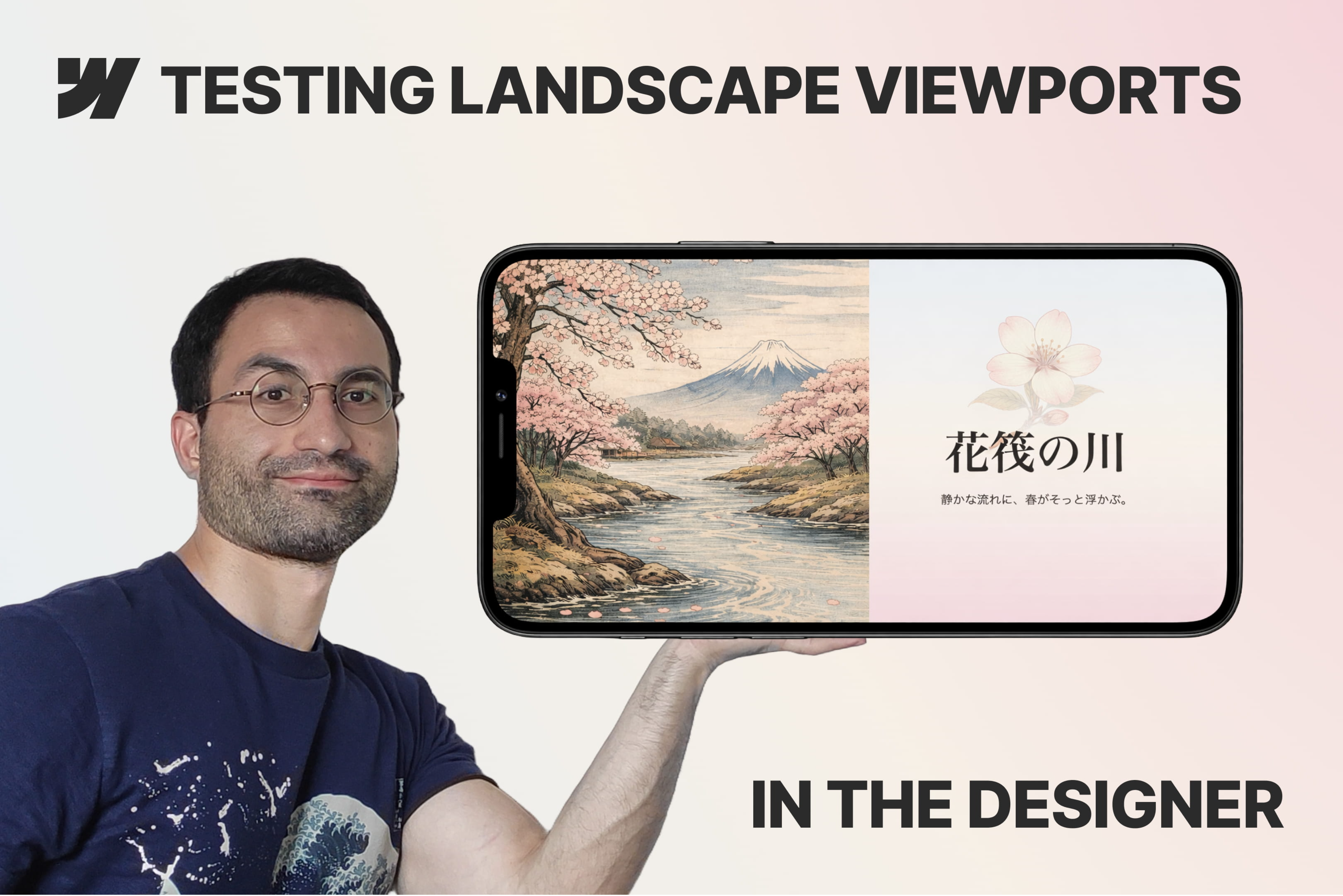
This cloneable shows a simple system that allows you to simulate a custom viewport directly inside the Webflow Designer.
By combining a wrapper element with a Webflow variable that scales all properties defined using vh units, it becomes possible to quickly preview how a layout behaves at different viewport heights — including common landscape scenarios like 16:9.
The setup is lightweight, easy to adjust, and just as easy to remove once responsive testing is complete.
A small but practical technique that can make debugging responsive layouts inside Webflow much faster.
👉 Watch on YouTube: https://youtu.be/4hHJPUMvUDA
