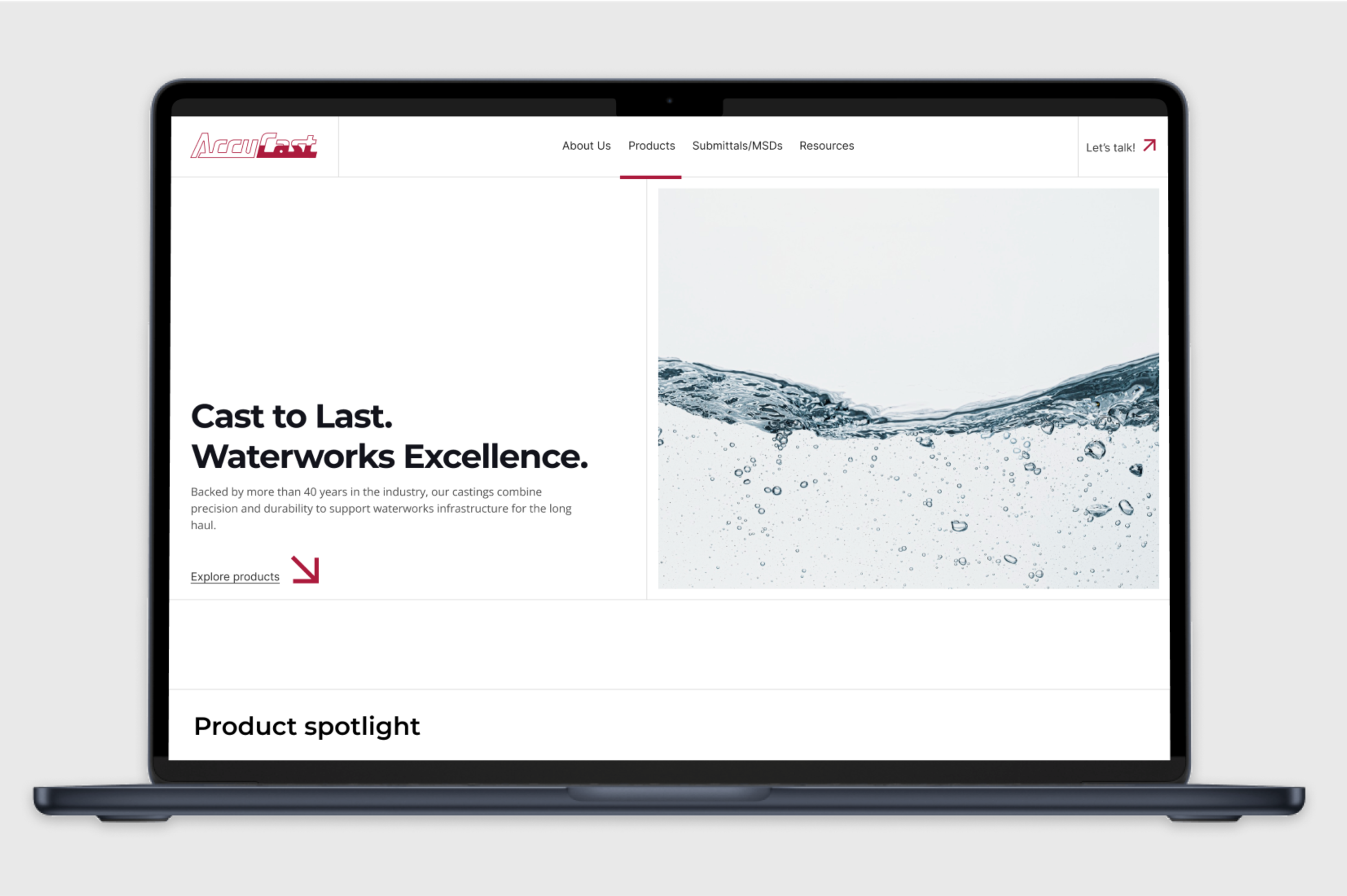
AccuCast makes the iron that keeps cities flowing—valves, elbows, the heavy stuff nobody notices until it fails. The old site felt municipal-yellow-pages: a dated mark, iron-grey everywhere, and specs that took work to decipher.
We started with a brand refresh: tightened logo, sturdier type, and an industrial palette that feels engineered, not ornamental. The website got a heavy redesign—product families organised by real-world use, spec-first templates, fast access to downloads, and a CMS that mirrors how distributors and engineers actually search and compare.
On the content side, we kept it practical: targeted landing pages for key lines and sectors, a blog for updates and how-tos, and a plain-language glossary to demystify terms.
Result: A brand with some steel in its voice, less catalog slog and a Webflow build that’s easier to manage.