Hover UI Duo — Directional Cards + Mega-Menu
What it is
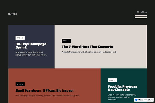
Two clean hover patterns in one clonable: fast, readable, and easy to brand.
Inside
Directional Hover Cards: the highlight tile slides in from the side you enter and auto-contrasts with each card’s background (text color flips for perfect readability).
Mega-Menu Hover: links reveal with a tidy top-down hover state that feels layered “from behind,” fully keyboard-friendly.
Setup (30 sec)
Paste the small script in Page Settings → Before </body> on each page.
Use the provided structure/classes ([data-directional-hover], [data-directional-hover-item], [data-directional-hover-tile], .mega, .mega__toggle, .mega__panel, .mega__item).
Publish.
Customize
Timing: [data-enter-speed], [data-leave-speed], [data-enter-ease], [data-leave-ease]
Direction (cards): [data-type="x" | "y" | "all"]
Notes
Accessible by default (focus mirrors hover). Overlay ignores pointer events, so links stay clickable.