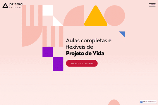
The Prisma website was designed to be simple, easy to navigate, almost didactic. Those features suit an educational project that merges all the requirements of the Brazilian school curriculum with learning techniques straight out of the Silicon Valley, Harvard, Stanford and the Institute for The Future.
This unique fusion of educational elements aims to prepare students for the real, competitive reality of the labor market. Furthermore, it enables those who attend Prisma to design their own personal projects for the pursuit of happiness in their lives. It empowers them to reach for their goals and aspirations with the tools they acquire.
That's what Via had in mind when creating the Design, Front-end, UX and UI of this website as a simple way to convey complex ideas.
