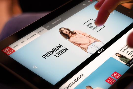
UNIQLO Responsive Experiment

A personal project (in no way affiliate with Uniqlo). Whilst shopping at Uniqlo I realised they had quite a unique and complex navigational system. I wanted to recreate this but in a more tablet and mobile friendly way. In doing so i was able to push some of the boundaries in Webflow, in terms of layout and interactions. Hope this work inspires someone.


