


What are phone website templates?
Phone website templates are pre-designed layouts that are specifically designed for mobile devices. They are designed to work best with touch-based interfaces and smaller screens. With the help of these templates, you may create mobile-friendly websites or mobile adaptations of your current website, improving accessibility and usability for users who access the site through tablets or smartphones. They frequently have attributes like quick loading times, simple navigation, and responsive design.

Ignite your app startup's success with Phone X, a premium Dark Mode App Webflow template from Brix Templates. With 28 unique pages, it's designed to make your app stand out in the competitive market. Plus, you get the Figma file with your purchase for easy customization. Benefit from three headers, footers, and notification bars, along with social media cover designs. Enjoy seamless responsiveness and lightning-fast loading speeds on all devices. Customize effortlessly with global symbols, colors, and fonts. Stay ahead of the curve with regular updates. Get Phone X and launch your app website with style!

Introducing Adevo, a meticulously crafted Webflow template by Mg, embodying minimalist design and adherence to web standards. It offers an easy-to-modify platform that serves as a blank canvas for creative expression while maintaining elegance. Adevo ensures seamless responsiveness across all devices, from phones to unconventional platforms like fridges, enhancing user experience. It features an adaptable style guide for effortless brand customization, allowing precise adjustments to align with unique aesthetics and branding. This template combines minimalist design with cutting-edge responsiveness, ensuring every interaction is not just seamless but also enjoyable, reflecting innovative thinking in every detail.

Computer Repair 128, crafted by 128 Digital, is a top-tier Webflow template tailored for electronics and computer repair businesses. With three dynamic homepage layouts and over 26 inner pages, it caters to diverse business needs. User-friendliness is paramount in its design, coupled with full responsiveness and retina-ready visuals. Customization is a breeze with Webflow's intuitive platform, requiring no coding knowledge. SEO optimization ensures swift loading times, crucial for online success. Enjoy seamless animations and dedicated support, making website creation effortless and enjoyable. With Computer Repair 128, establish your online presence seamlessly in the electronics and computer repair industry.
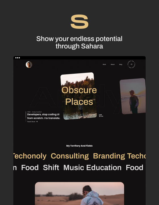
Sahara, designed by Azwedo, is a creative Webflow template perfect for showcasing your personality, work, and projects with elegance. It’s user-friendly and fully responsive, ensuring your portfolio looks great on any device. Sahara includes sections for your work, about page, blog, bio, contact info, case studies, and social links. Azwedo offers continuous support, making Sahara not just a template, but a tool for expressing your uniqueness and professionalism.

Introducing Aerials, a Webflow template meticulously crafted by Over Sight. This fully responsive and SEO-optimized design ensures your website looks stunning on any device. Leveraging fluid grid technology and flexible images, Aerials guarantees every photograph is displayed in its utmost glory. Inspired by fine art, it features clean lines and a minimalist layout to highlight your photos. The chic use of white space and sophisticated typography creates a gallery-like ambiance, making each image stand out. Perfect for photographers, Aerials blends functionality and aesthetics, presenting your work as art and commanding attention in a saturated visual landscape.

Apps, crafted by Brix Templates, is the ultimate iOS and Android mobile app Webflow template. Seamlessly transform visitors into active users with its stunning design and latest trends. Upon purchase, gain access to the Figma file for easy customization, ensuring your site meets specific needs. Packed with premium features like carefully crafted design, speed optimization, and perfect responsiveness, Apps guarantee an exceptional user experience. Its seamless animations and 100% customizability make updating colors and fonts a breeze. With a comprehensive CMS structure, manage content effortlessly. From homepage to contact page, Apps offers a complete solution for building professional website.

The Happy template is a sleek, modern solution for showcasing your app with a standout marketing site. Its responsive design ensures an impressive display across all devices, while features like responsive navigation, symbols, and interactions facilitate easy customization and a dynamic user experience. It also includes a custom 404 page, 3D transforms, CSS grid capabilities, and retina-ready web fonts to keep content crisp and engaging.
Apps Ecommerce, a premium Webflow template by Brix Templates, targets iOS and Android mobile apps, aiming to convert visitors into active users. Its cutting-edge design ensures impeccable appearance, with notable features including a Figma file upon purchase, speed optimization, and perfect responsiveness across all screen types. Seamless animations enhance visual appeal, while its 100% Customizable nature allows for easy updates. With numerous pre-designed page templates and customer support available, customization is easier than ever. Don't wait, choose Apps Ecommerce for your mobile app website needs.

Unleash your creativity with Toronto, a Webflow template by Azwedo designed to showcase your skills, thought processes, and passion. Fully responsive, Toronto ensures flawless presentation on any screen size, from desktops to mobile devices. Its minimalistic, timeless design features elegant interactions customizable to reflect your personality. The template includes everything needed for a compelling online presence: a stylish portfolio, 'About' section, blog posts, CV feature, contact options, and case studies. Toronto integrates social links seamlessly and offers comprehensive support, making it ideal for creating a unique, professional online identity.

Cyankent, designed by Flowyak, is a cutting-edge, fully responsive HTML website template ideal for showcasing projects and attracting clients. It features a modern design with optimized layouts, colors, and fonts for flawless display on any device. Powered by Webflow Editor, it allows direct content editing without complex backend CMS navigation. Cyankent offers fast global customization through global swatches, enabling quick color theme changes. With 1k+ integrations, including Facebook Lead Ads and Slack, it enhances functionality and integrates seamlessly. The template also includes enterprise-grade security against spam and hackers.
Who should use phone website template?
Phone website templates should be used by individuals, businesses, or organizations looking to create a mobile-friendly website. This includes business owners who are starting a new venture and need an affordable solution to establish a credible web presence. Using phone website templates allows small to medium-sized enterprises to concentrate on their main business operations while saving time and money on online development. These templates can help nonprofit organisations expand their audience and make a bigger impact. In a similar vein, content producers and bloggers can guarantee that their material is easily accessed on mobile devices by utilising phone website themes.
How do you choose the best phone website template?
The best phone website templates are defined by several crucial components.
Above all, they should be responsive, which means they should change their size on the fly to fit the screen of the device being used. This guarantees that the website works and looks excellent across a range of gadgets, including desktop computers, tablets, and smartphones.
Second, the templates ought to have an easy-to-use interface with clear, uncluttered design and navigation. It should not be necessary for users to search through numerous pages or menus in order to locate what they're looking for. For larger sites, a search function might also be helpful.
In addition, the templates must to have a polished, contemporary look that complements the brand's aesthetic. This includes the use of high-quality images and graphics, as well as a consistent color scheme and typography.
Additionally, the best templates are SEO-friendly, meaning they're designed in a way that makes it easier for search engines to crawl and index the site. This could increase the website's exposure in search engine results and increase website traffic.
Lastly, the templates ought to be easily adjustable so that the owner of the website may change the layout and content to suit their own requirements. This could entail altering the typography or colour palette, adding or eliminating sections, or shifting the layout.


