


When you look back on the past year, what stands out?
Most likely, you remember the experiences you had, not just the objects or things that you saw. That’s how humans work: we’re wired for stories and interactive journeys that engage all of our senses.
This same principle applies to web design. To be memorable, your marketing site needs to be more just a static page — it needs to come to life and offer an experience. Fortunately, in 2024, it’s easier than ever to differentiate your website and connect with your users through experiential design.
What is an experiential marketing site?
In short, a site that’s experiential offers more than just a transaction or a form. Through rich graphics and various design elements, an experiential site plays with ideas like depth, movement, and texture, while it engages your emotions or sense of humor with smart copy.
An experiential site can be all-encompassing, but it doesn’t have to be. Smaller tweaks like microinteractions and parallax scrolling can make a page come to life, too. To get started, here’s some of our favorite examples of experiential marketing sites.
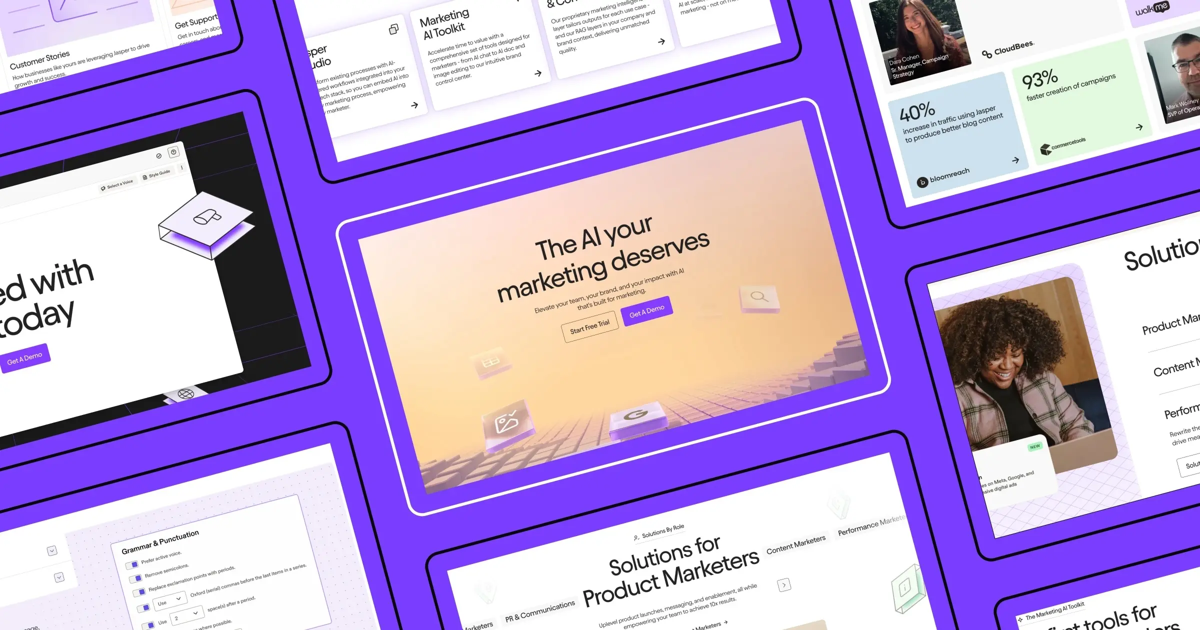
Jasper
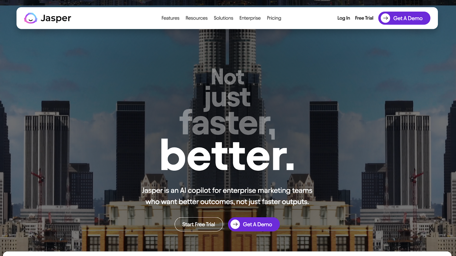
With a video that mixes funhouse mirrors and urban drone footage, Jasper’s site instantly captivates the eye. As you scroll below the fold you see a realistic preview of Jasper’s product where letters are typed on the screen — giving users the illusion that they've tested the product themselves.
DIKO
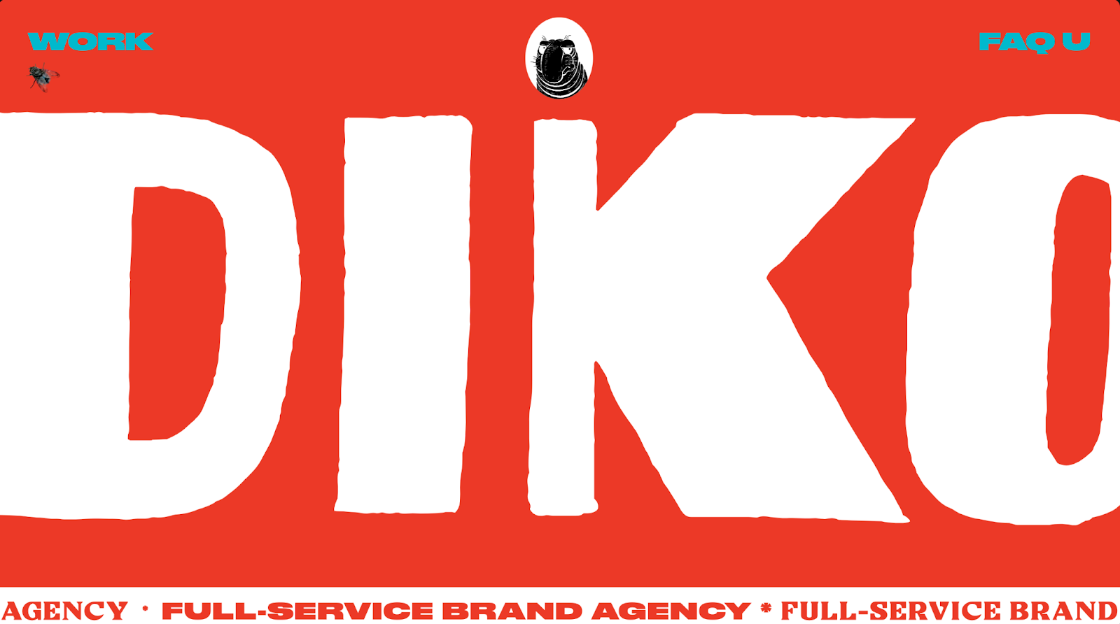
If you’re dreaming big in 2024, consider brand agency websites for inspiration. They tend to take more creative risks than the average business, and DIKO is a perfect example. Their site almost looks like a modern art exhibit, with the Warholian colors and self-aware “this is a paid advertisement” sticker that unfolds on the page. Truly, it’s a site that’s best experienced for yourself.
Ramp
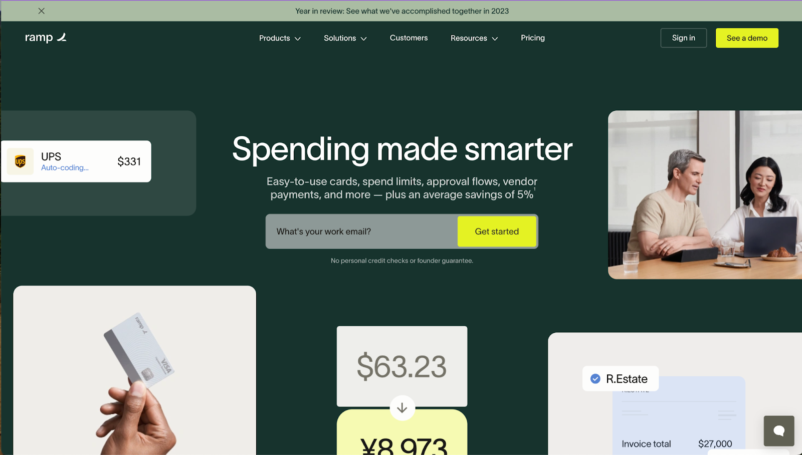
Ramp’s site is a great example of how carefully-selected design elements are able to engage the user, without distracting from the message. As you scroll below the fold, the visual blocks in the banner shrink away into the center of the page. It’s a small touch, but something that’s hard not to play with again and again.
Mural
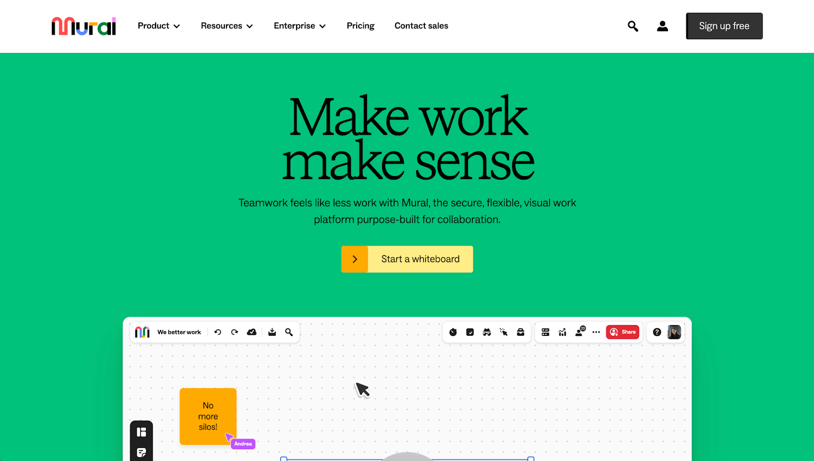
With smart, snappy headline copy and bright colors, Mural’s website lets its brand’s personality shine through. A product preview starts off with text and post-it note elements that fly onto the screen, inviting the user to play the full video. Further down, clickable elements and a bold graphic style encourage the user to linger on the page, since it almost feels like interacting with a product.


Build a better site experience
In our ebook, learn how to approach your next website redesign — from collaboration and trust-building to finding the right tools.
Design elements for experiential sites
As we saw in the examples above, experiential sites employ a variety of design elements to achieve their intended effect in large and small ways. Some designers will lean towards bold, immersive elements such as striking visuals and multi-sensory features that capture user attention as soon as they land on the page. Other designers favor subtlety and integrate considered touches that enrich the user experience without dominating it.
The decision to go bold, stay subtle, or find a harmonious balance between the two largely depends on the brand's personality and the story it wants to tell. Regardless of the approach, we expect designers to gravitate towards these design elements when crafting these online experiences:
- Rich graphics: Textured and layered graphics that add depth and visual complexity to sites. As we noted in our 2024 trends post, we expect sites to move away from the clean and minimalist design aesthetic to sites full of color, texture, and richness.
- Micro-interactions: Small animations and visual cues that thoughtfully enhance a user's experience on a website. This can be something as small as the way a button behaves on hover. A good example of this being how Mural’s buttons “fill in” with an animation.
- Parallax scrolling: A visual technique where the foreground and background content move at different speeds, adding a layered, three dimensional feel to the experience.
- Kinetic typography: A design style that uses moving text to set a tone, capture attention, and entertain users. We saw an example on Jasper’s site, where text is animated on the product preview.
Crafting an experiential site has never been simpler
Static transactional websites were once the norm, but those days are past. With GPUs and processors that can load intricate animations quickly, and modern browsers that can run heavy workloads — not to mention the ability to use generative AI to jumpstart your designs — 2024 is shaping up to be a year where if you can dream it, you can do it.

.jpeg)