


There are so many websites out there that look like duplicates, stamped from the same digital template. But there are also loads of designers taking chances on designs that stand out from bland conformity. Check out these ten websites taking a different approach to navigation.
1. WhaleSynth

What did we do before WhaleSynth? For those who wanted to sing the songs of these oceanic mammals, your only choice was to get into a swimming pool and hum. Which is a weird and difficult thing to explain to friends and loved ones when you climb out of the deep end.
WhaleSynth puts the sounds of whales at your fingertips. You can change the species of whale with the click of a button, add other whales to join in, and adjust the bloops and clicks with the sonar control. Each tone is triggered by clicking one of the undulating bands of water which moves the frequency up or down, depending on the depth.
There are instructions, but it's easy enough to navigate by messing around with the controls. Also great — there’s no piano keyboard or anything typical of most music/sound generating programs. The controls of WhaleSynth are as unique and cool as the concept.
WhaleSynth may seem like pointless fun, but it's actually a form of digital marketing. I know, cynics of the internet, I can feel your disapproving glares — stay with me. WhaleSynth exists because of MailChimp and their lighthearted branding.
And there’s a marketing message, but it's subtle. It never gets in the way of making whale sounds. And let’s all be thankful they went with WhaleSynth, instead of ChimpSynth, which would have been a more screechy, less-pleasant experience.

2. E162

E162 is an online gallery for students of the DSAA Typographic Design program. I know some of you are freaking out over the clash of colors, but sometimes a little bit of disorder is a good thing. There's no mistaking that this page reflects a more experimental aesthetic. It teeters on brutalism without falling into the chasm of unusability.
This page could have been one long scroll featuring students’ work. Instead, your navigate by flipping a cube with a cursor or by clicking one of the numbers at the bottom which spins it to a specific page. Is it practical? Not really. Is it easy to use? That’s debatable. But is it artistic? Yes! And it’s what makes this design stand out. How many websites can you name that use this same style of navigation?

3. Faces of Power
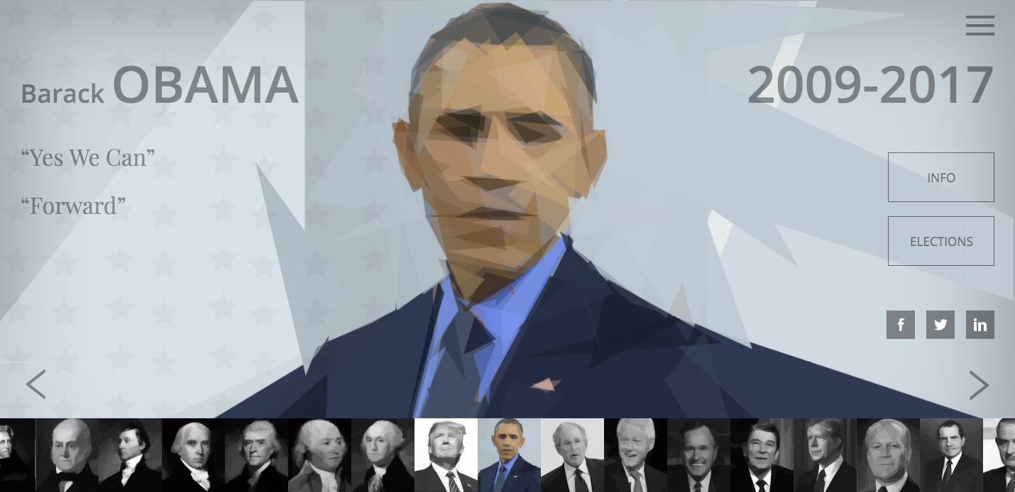
Depending on where you stand politically, you may not see all the presidents of the United States as being the faces of power. Okay, I know what you're thinking. As a blog writer I need to keep my politics out of this. But we can agree — we all know the worst president.
And that man was Martin Van Buren. Amirite?
All joking aside, Faces of Power makes presidential history interesting for those of us, like me, who snoozed through history class.
These presidents could have been arranged in a grid layout. It would have been easy — and boring. Instead, we navigate with on a film-like strip at the bottom, each frame containing a president.
Making a selection transforms one president to the next into a stylized geometric portrait. You can learn more about each one in the navigation on the right. You’re never clobbered with content, but instead invited to learn more. Though this is an uncommon navigational approach for such a large amount of content, it’s never a tiresome experience — it’s intuitive and simple.
4. YS portfolio

Yen Song is a graphic designer specializing in interactivity and movement. This portfolio integrates these two skills into an original way of navigating through the featured projects.
It's a layout of overlapping circles, each containing projects related to a specific area of expertise. As you scroll, an arrow anchored to the cursor points in whatever direction you're going. When you do make a selection, the arrow launches that project, opening a new page with details.
It's fun and feels like a video game. Though the rest of the portfolio follows a solid, yet standard layout, it’s this interface that stands out from so many other portfolios. There could have been easier navigation patterns integrated into this design, but this extra effort and ingenuity makes one wonder what other unique ideas Yen Song is capable of.

5. Curry Explorer

There’s so much curry in the world — Curry Explorer is here to show us the clear distinction between curries so you can find the right fit for you. Do you like your curry on the dry side? Maybe you’re looking for one that has a bit of sweetness? Anyone like to take a walk on the spicier side of life? It’s easy to scroll through different dishes based on curry traits.
Great web design is about finding new ways of presenting information. Curry Explorer serves up a variety of curries for you with a very appetizing navigation style.
Now who's up for some Saag Aloo?


Discover the processes and tools behind high-performing websites in this free ebook.
Discover the processes and tools behind high-performing websites in this free ebook.
6. Apollo 17

It’s hard to believe that Apollo 17, the last manned mission to the moon, was over 40 years ago. Apollo 17 lets you experience this event through actual historical audio, video, and photos. It’s wrapped in a modern design, making you forget the mission was decades ago.
The liftoff page has a timeline at the top where you can choose a moment in the mission. There’s video on the left that syncs with a transcription of NASA’s commentary as the mission unfolds. Mission status windows pop up with all the pertinent info about the mission in given points in time.
Apollo 17 is a multimedia experience capturing the scientific wonder and human achievement that was our journey to the moon. It’s a piece of work that shows how static information, typically found on the pages of a textbook, can come to life on the web. Apollo 17 drops you in the middle of the excitement of this lunar mission.
And what’s especially cool is the timeline at the top of the page — you can scroll through the hours and minutes and click on those moments in the mission. Major milestones — like “Descent” and “Returning to Earth” — are noted on the timeline.
It’s like going forward and backward in a video file. It’s a smart navigational choice that promotes curiosity and exploration.

I dare you not to get excited with each second of the countdown from the 10 second mark to liftoff.

7. Who Cares Agency Website

Landing on this page for the Who Cares Agency is like taking the controls of an alien spacecraft. There's a dull ambient rumble that echoes of travelling through the galaxy. Text flickers like the coordinates to a far off planet with bloops and bleeps chirping like alien circuitry.
There’s no room for laziness in pulling off a sci-fi-inspired design like this. There are so many well-crafted details, like an interface for selecting projects. It’s fresh, fun, and engaging.
What really sets this site apart is the navigation on the Resultados page. It’s what I imagine a portfolio would look like for the Predator from the 1987 Schwarzenegger film if the alien decided to give up all that interstellar trophy hunting and took up web design. Check it out below.

8. Radiooooo.com

For those not music obsessed, it's difficult to understand people — like me — who are. And I get it. Why does anyone need an IKEA bookshelf full of records? Why do I need to know the producer of every album? And why do I have opinions about songs based solely on the sound of the snare drum (don't get me started on Springsteen's "Born in the USA")?
But how do we music fanatics find new artists? There are plenty of streaming audio services with algorithms to help us discover new music, but the number of duds can be a bummer.
Radiooooo.com offers an interface that lets you find music you’ve never heard in a fun, inventive way. It prompts you to make your own discoveries as you scroll through its global map and timeline of eras. There’s plenty of vinyl crackle as you explore this world of rhythms and sound.
You can customize your searches through the Taxi interface and toggle between slow, fast, or weird — for some of us, these are the only three genres that matter. It’s a refreshing break from those tired buttons that haven’t changed much from the days of Musicmatch and RealPlayer. Am I dating myself with that reference?
So if you’ve never heard Brazilian music from the 30s, Algerian music of the 60s, or American music from the 20s — it’s all there, ready to fill your ears with unfamiliar frequencies.
Now please excuse me while I organize my record collection by genre, release date, and alphabetically to the second letter.

9. Torque Editions

Some of the best web designs approximate a real world experience. Torque Editions is a publisher and in the background are different printed works they've released. Navigating through the books magnifies the cover, giving us a closer look — like when a cover grabs your attention at the bookstore.
Clicking a book brings up more detail in an introductory block of content that hits all the important specifics. Yes, there’s scroll jacking, but the ease of browsing titles makes it worth it. It’s an example of unique navigation that adds to the user’s experience, bringing us closer to the content instead of repelling us with a convoluted, tedious experience.

10. Badass Films

Badass Films is video production company with a content-heavy website. This does slow things down a bit, but the quality content is worth the wait. And yes, they commit the sin of scroll jacking, but this is also easily forgiven.
There are plenty of high-profile clients, like McDonald's and Jim Beam — with a spot featuring William Dafoe! Badass Films are indeed badass with an impressive list of clients and creative, well-executed productions.
You can scroll through their roster of directors by clicking their names to bring up a sidebar with clips from their projects. It’s a simple way to navigate their enormous list of video projects. It’s a creative solution, adding a bit of complexity to the navigation, in the pursuit of making the video content accessible. And taking this risk pays off in the ease of use.
It’s also interesting to see commercials meant for different demographics. Did you know in France there’s a lumberjack-themed burger called the McTimber? There’s also a commercial with a man and woman making out that I hope no one in the office saw on my laptop.
You’ve been warned.

It’s easy to get stuck in the same patterns of design
Sometimes there just isn’t time or a client who's willing to try something more creative. But if you do have the opportunity — get brave and try something new. To grow as a designer, you must be willing to stretch your imagination and go beyond the norm.
Challenge yourself to create designs free from those habits you lean on. Take your standard practices of navigation and do something different. You may end up with something that surprises and delights you.
We’d love to hear about what you’re working on in the comments.


