


Brutalist websites make things weird, but in a good way.
They offer unorthodox user experiences and defy design conventions. Brutalist websites draw us in with their strangeness.
Let’s take a look at where brutalism comes from and how it’s used in web design, then explore some brutalist websites so you can see how it’s done.
Where brutalism began

Brutalism’s architectural roots sprouted in post-war Europe, most notably in the UK. It resulted in stark, monolith-like buildings without ornamentation. Straight lines and recurrent patterns brought a necessary sense of order to a world still shaking off the mayhem of World War II.
It’s easy to misinterpret the “brutal” in brutalism, but this term derives from the French “béton brut,” which translates to “raw concrete.” People wanted to get back to normal as quickly as possible, which led to the exposed building materials that are characteristic of brutalist architecture. Schools, government buildings, apartments, and other important structures were built in the brutalist style because time and efficiency were the priority during this period of post-war recovery. It was a new era where ornamental architecture didn’t make sense. The practicality of brutalism allowed cities to quickly rise from the rubble and move forward.
Brutalism in web design
Where brutalist architecture occupies a more narrow spectrum, brutalist web design is a bit more varied. But like its architectural counterpart, brutalist web design pushes against the grain of tradition and convention.
Brutalist web design sometimes embraces a similar sense of minimalism seen in architecture. Repetitive patterns, monochromatic color schemes, and unpretentious typography echo the restraint seen in post-war reconstruction.
Brutalism in web design does diverge in the extremes it can go to. In its spirit of nonconformity, things can get visually loud. Where traditional web design is polite, brutalism can be brash and sometimes obnoxious — which is often the whole point.
The key features of brutalist web design
Brutalist web design delights in pushing against the status quo. It’s similar to the first wave of punk rock that rebelled against the watered-down 1970s music popular at the time. It unleashes a cacophony of visuals and text. Where traditional web design is more Tom Jones, brutalism is more Johnny Rotten.
Brutalism may be about breaking the rules, but there are some common elements we can observe across the many brutalist web designs out there.
Lack of organization
Brutalism can be a nightmare for those who value structure. There is often very little hierarchy. This can be confusing, but this absence of organization makes us focus on deciphering what’s before our eyes.
Symmetry and asymmetry
There may be grids hiding beneath a layout, but visuals and text may stray radically from these anchors. Broken layouts mix order with disorder.
Crowded layouts
Traditional web design uses negative space and deliberate placement for every element. Brutalist websites are often overflowing with visuals and text pushing up against each other.
Clashing colors
Brutalism is all about opposites. Colors are smashed together without regard for complementary hues. Brutalist websites pulse with contrasting colors, making them stand out from the tame color palettes that we’re used to.
Strange or absent navigation
Navigation may be purposefully obtuse with no obvious or familiar elements. Brutalism takes joy in obscuring elements and making things difficult.
Eclectic typography
Brutalism hits extremes on either end of the spectrum of typography. Toward the more minimalist, there may be only one typeface in a single size with consistent spacing for all of the text. Monospaced typefaces are common in brutalist websites.
Typography can also be the exact opposite, bringing together multiple typefaces in various sizes and styles.
One page layouts
Ignoring the formality of multiple pages each with a dedicated purpose, brutalism lets loose with long scrolls of content all contained in a single space.
Minimal CSS
CSS offers precise control over how a web design appears. Brutalist web designs often keep CSS to a bare minimum and have a stripped-down appearance. This lack of styling gives brutalist websites a sense of being straight to the point, free from the distractions of decorative embellishments.


Free ebook: Web design 101
Master the fundamental concepts of web design, including typography, color theory, visual design, and so much more.
Brutalism offers a wide range of creative possibilities
Brutalist websites can take many different forms — from basic and unadorned, to the more ostentatious. Let's take a look at a variety of website examples that fall within the spectrum of brutalism.
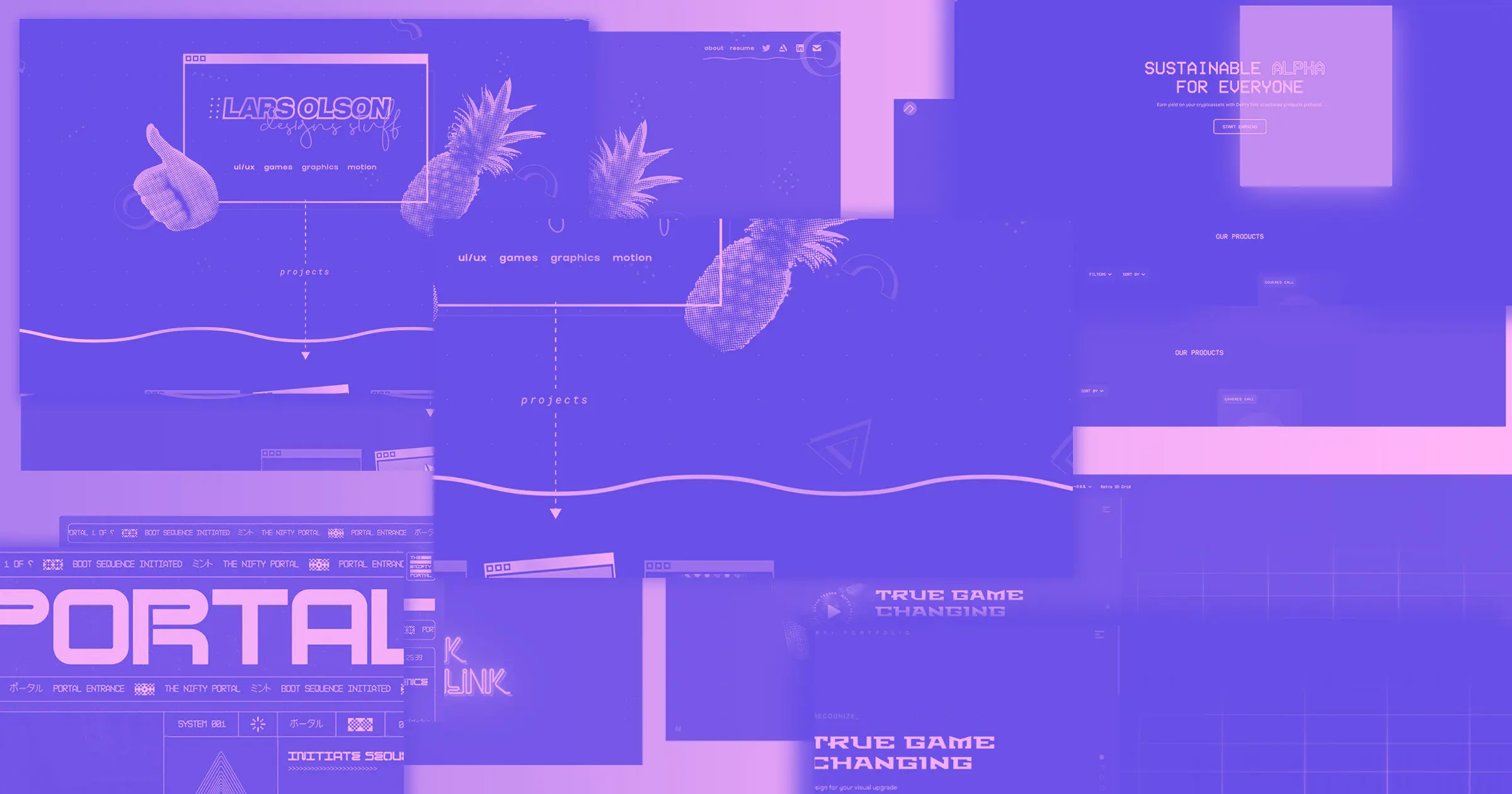
Ashley Cook Design Portfolio
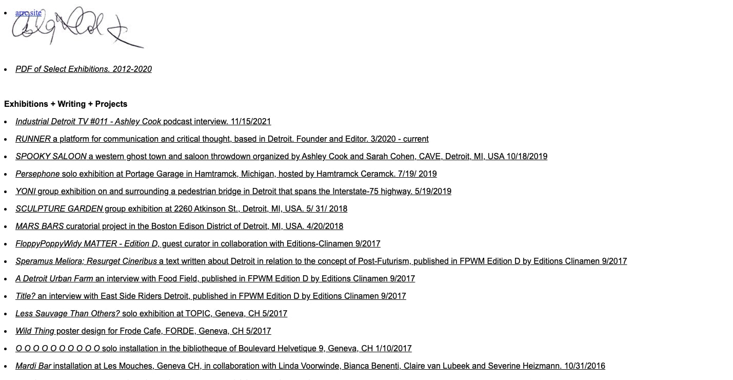
Ashley Cook’s portfolio contains text with very little CSS styling. We see one long scroll of homogenous writing, with very little visual hierarchy.
Without visual distractions, her work is the only focus. It’s reminiscent of the sparse text next to a work of art hanging in a museum. Ashley’s portfolio is a resource list, not a flashy presentation.
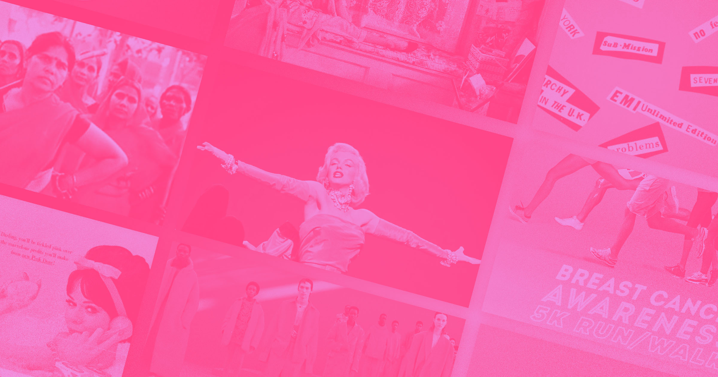
Budapest Park
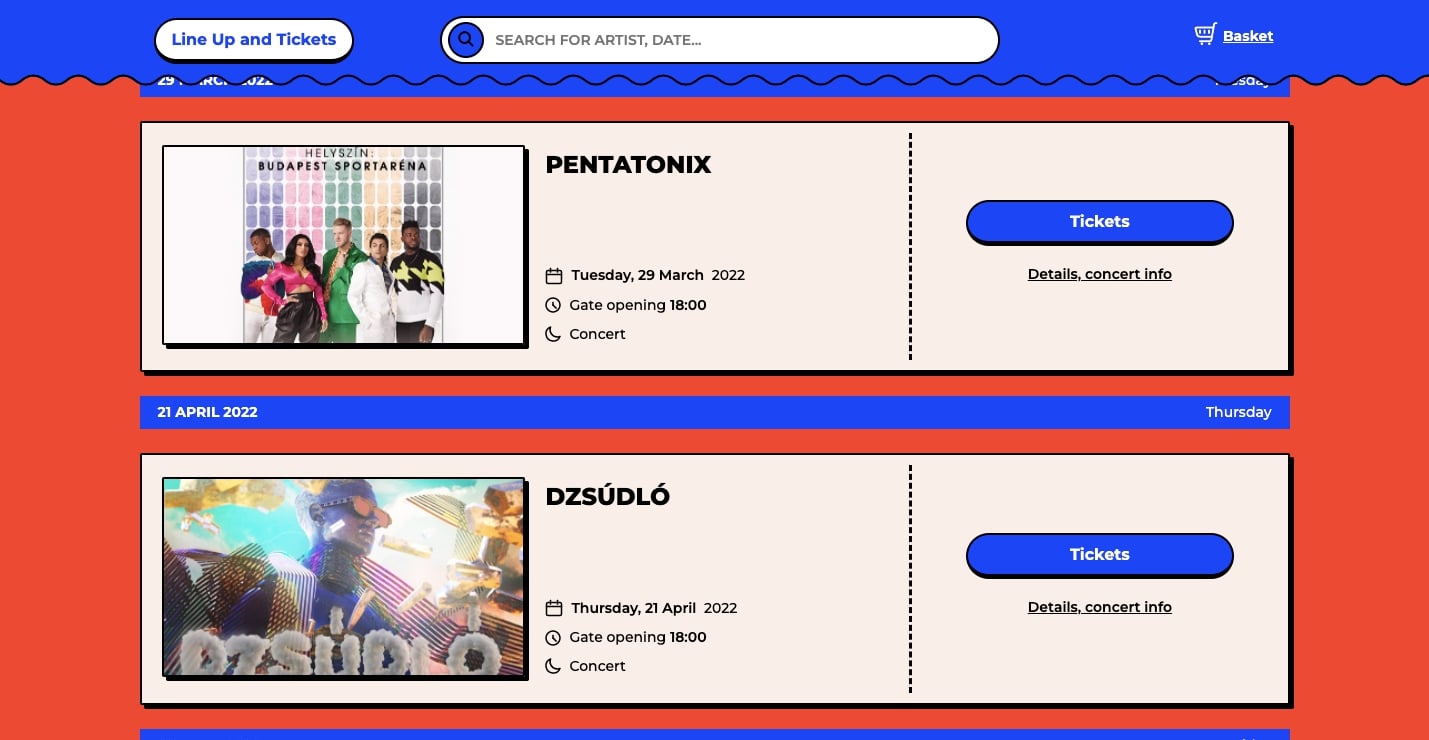
What first catches one’s attention on Budapest Park is the clash of colors. Most designs don’t mix blue, red, and pink, but brutalism is all about jarring juxtapositions.
Along with a clashing color scheme, there’s very little negative space. Wavy lines, squares, elliptical buttons, and photographs make this a busy design. And yet somehow, this style makes us want to scroll further.
Though the clash of colors and abundance of visuals is at the brink of being too much, there’s still a sense of cohesion. It’s easy to see what concerts are coming up at this venue.
Brutalism is purposely weird — its strangeness is what keeps people engaged. Budapest Park succeeds with an unorthodox brutalist design that still effectively communicates information.
New Topographics
With a stripped-down look free from pretension, New Topographics communicates the purpose of the online photography museum. Dark gray and black, sparse white text, and lines forming linear connections between the different elements make this design feel closer to brutalist architecture.
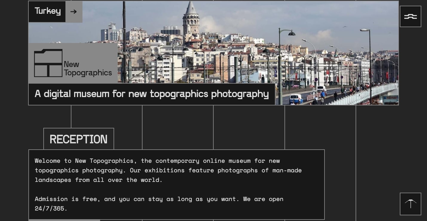
The design serves as a neutral backdrop, never getting in the way of the text or content about topographic photography.
Trivi
While the majority of Trivi’s website delivers a more traditional user experience, the hiring page is crammed with blinking visuals, pixelated text, and other random elements all competing for our attention.
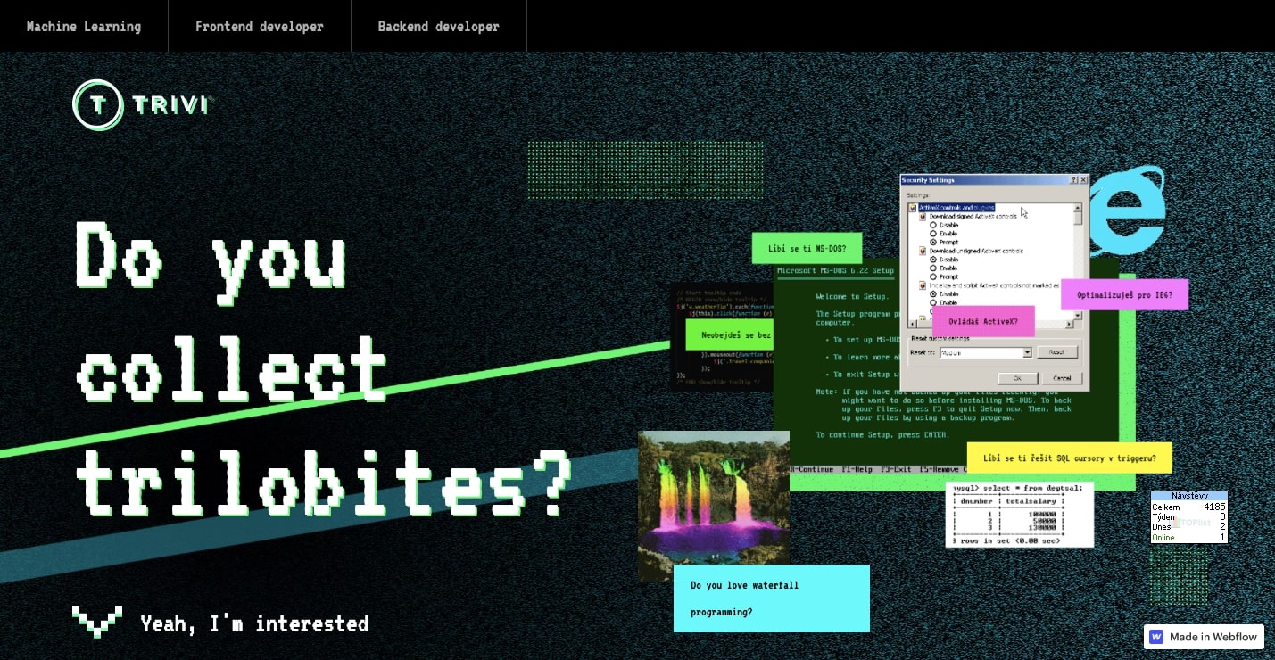
If the rest of the web design were this frenetic it would be overwhelming. This is just enough brutalist absurdity to capture our attention and make us want to learn more.
Sergei Kalymykov
Brutalism provides the perfect sense of experimentalism for telling the story of the Russian avant-garde artist Sergei Kalmykiov.
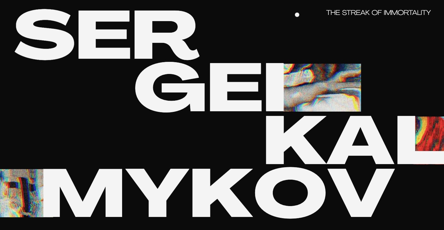
With a black background and all of the text in the sans serif Angrandir, there’s a sense of stillness. This provides a strong sense of contrast to the visuals, which are feathered with a buzz of television-like static and ghostly colors.
Brutalism tends to push a design to the brink of usability. Here, there is just the right sense of abstraction, giving it a surreal atmosphere. The design, built with Webflow, compliments the art of Sergei Kalmykiov.
Make Noise
Modular synthesis is a fairly esoteric branch of electronic music where artists sculpt and generate sound through specialized modules whose functionality depends on how they’re connected. Make Noise makes modular synth modules, and their product “Maths” is popular among many patch cable enthusiasts.
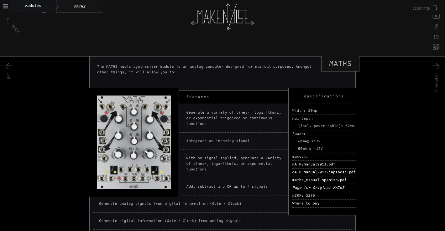
Modular synthesizers are far from being dubbed traditional musical instruments, which is why brutalism is the perfect look for this web design. There’s a minimalist color scheme of black with white text. Outside of Make Noise’s logo, we find just a single monospace typeface, Lucida Console. The layout has both symmetry and asymmetry for a slightly off-kilter feel.
Brutalism, just like modular synthesis, explores new artistic possibilities, and Make Noise uses this aesthetic as the perfect showcase for their electronic instruments.
ThreeSixtyEight
ThreeSixtyEight takes what we expect about navigating a website and turns things around — forcing us to scroll up rather than down. Starting at the bottom of the page, we’re taken through the agency’s work from 2010 through present day. This unorthodox navigation is a perfect example of brutalism in action.
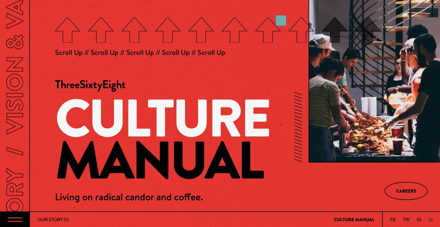
ThreeSixtyEight also embraces brutalism’s love of esoteric layouts. Their About page is a dizzying expanse of floating visuals that’s controlled by the cursor — another great touch of unconventionality.
The design is full of bold colors and visuals that do not adhere to the restrictions of grids. This website shows that they can push the boundaries of design while still crafting a stellar user experience.
Typical Organization
Much like brutalist architecture that doesn’t hide raw materials, Typical Organization exposes its columns with gray lines as if they are weight-bearing elements for the text that runs over them.
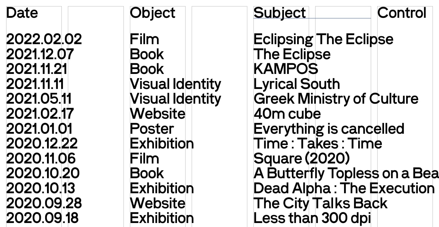
A list of text is one of the most basic ways to display content. Here, all of the featured works are laid out vertically, with little variation in the text. Outside of the columns, all of this text appears the same. This is textbook brutalism.
The navigation experience also gets a touch of experimentation. The text “Control” in the upper right-hand side doesn’t provide much indication of what it does until you engage with it, serving as a cryptic signifier. Once clicked, the color scheme inverts, and a list of categories appears, allowing you to navigate to different sections. Brutalism can be mysterious, and we love this unique navigational element.
Brutalist websites challenge what we know about web design
Most websites put us on autopilot with their familiar layouts and ordinary navigation. We’re able to get to the content we’re after without putting much thought into it. Brutalism smashes our expectations of how a website should look and function. Instead of a user experience that barely registers, we’re drawn into a digital space that demands our attention.
Looking for inspiration for your next design project? Whether you’re looking to do something brutalist or another design style, Made in Webflow is a valuable resource to see what people have been creating with Webflow. We hope to see your work there someday, too!