

Whitespace is a part of almost everything we experience, and it plays a crucial role in how we perceive art, design, and communication.
A well-placed pause in a speech gives the listener a beat to fully grasp the previous point that’s been made. Whitespace can enhance or change the elements it touches or follows, and even tell a story all on its own.
But in order to make full use of whitespace in web design, we must first understand its many forms and functions. Let’s dive in.
What is whitespace?
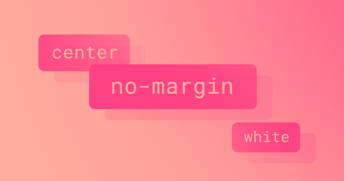
Whitespace, sometimes called “negative space,” is space that is left intentionally empty. For web designers, whitespace may be the margin or padding between elements on a page. For photographers, negative space is made up of pixels surrounding the subjects in an image. But while whitespace is empty space, it is not devoid of meaning and significance.
Negative space creates breathing room around important elements, drawing attention to and enhancing the items it encompasses. Just think of the significance a pause can have in a conversation. A hesitation before answering the question, “do you like it?” could betray that even an emphatic “yes” is a lie. Negative space can change the tone and tempo of musical compositions, impact the aesthetics and convenience of interior design, and much more.
Examples of whitespace
Whitespace, or negative space, can be found almost anywhere. It can be the deep, velvety backdrop contrasting stars across an evening sky. It can be the tumultuous expanse of indigo surrounding a seafaring vessel, or a blank page in a passport beckoning you to plan your next adventure.
Known as “ma” (間) in Japanese, negative space is an important element of a bonsai tree, where the space between branches, leaves, and the soil impact a tree’s design as much as the curvature of its trunk and lushness of its foliage.

Whitespace has played a pivotal role in printing because the margins surrounding text and the spaces between letters, words, paragraphs, images, and lines directly affect the readability and flow of books, magazines, or other print media. The evolution of whitespace in printed materials has even affected the way in which we read. As tightly packed ancient manuscripts gave way to printed materials with more breathing room, the need for reading out loud dissipated as well.
Today, magazines, books, and online publications heavily leverage whitespace to make text more skimmable. Architects leverage space when creating open floor plans, and Minimalist interior designs often feature an abundance of empty space.
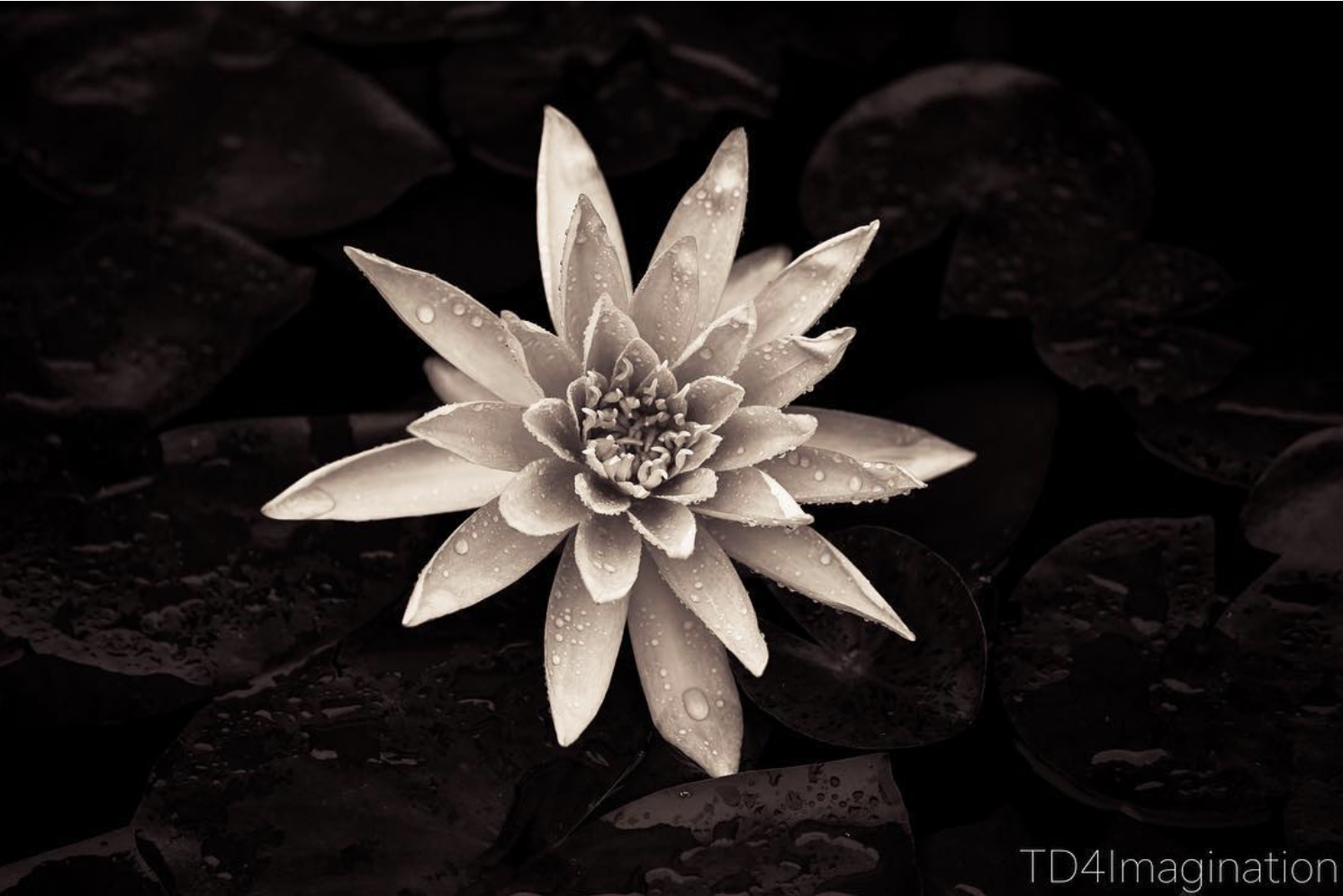
But just because it’s called “whitespace” doesn’t mean it actually needs to be white. Visual whitespace can be any color, even black, as seen in the image below. The “whitespace” in this photograph is the dark, textured space surrounding the subject — the white flower.
Whitespace can also be something we hear (or don’t hear). More commonly called “negative space” in the world of music, silence can be just as impactful as a catchy chorus or powerful crescendo. Perhaps the most extreme example of this is John Cage's 4'33", which consists of four minutes and thirty-three seconds of silence.
But we can see more moderate pauses in many genres of music. “Roxanne” by The Police has a number of pauses that help build tension. Britney Spears’ pop hit “Stronger” features a hard stop right after the lyrics, “hush, just stop,” which reinforces the lyrics themselves. And Handel’s “Hallelujah Chorus” from the “Messiah” features a dramatic halt toward the end of the piece just before the final “hallelujah”.
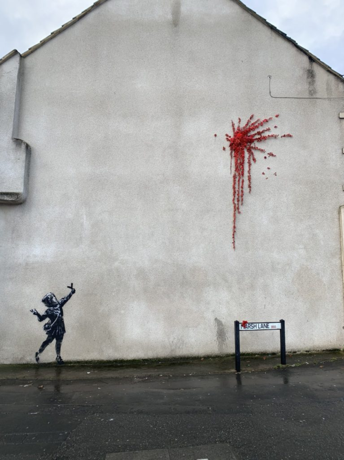
Masters of their craft like Martin Scorsese, Virginia Woolf, and Banksy all harness the power of whitespace with deft precision in their works. Whitespace is all around us creating balance and enhancing the elements it surrounds.
The importance of whitespace in web design
Whitespace is an integral part of web and UX design. It can also help make a logo stand out, enhance brand design, and improve online shopping experiences.
Without proper whitespace, web pages can feel cluttered, deliver a poor user experience, and send your bounce rate skyrocketing. Research has shown that whitespace surrounding text directly impacts your audience’s reading speed, comprehension, and overall experience. And relatively small variations in the amount of whitespace on a page (differences of just 10%) can elicit significantly different responses from viewers.
5 ways to use whitespace in design
There’s no one perfect formula for whitespace in website design or one magic percentage that each design should adhere to. Some studies suggest that less than 50% of a page should consist of whitespace, so as not to negatively impact usability. Others suggest that it’s better to have more than 50% of a page filled with whitespace.
Another study found that whitespace preferences vary based on things like age and education level. So, if you want to know exactly how much whitespace is ideal for a website, I highly recommend some A/B testing. Try out a couple different options and see which one yields a better response from your unique audience.
That being said, here are several ways you can leverage whitespace to enhance website designs.
1. Increase click-through-rate (CTR)
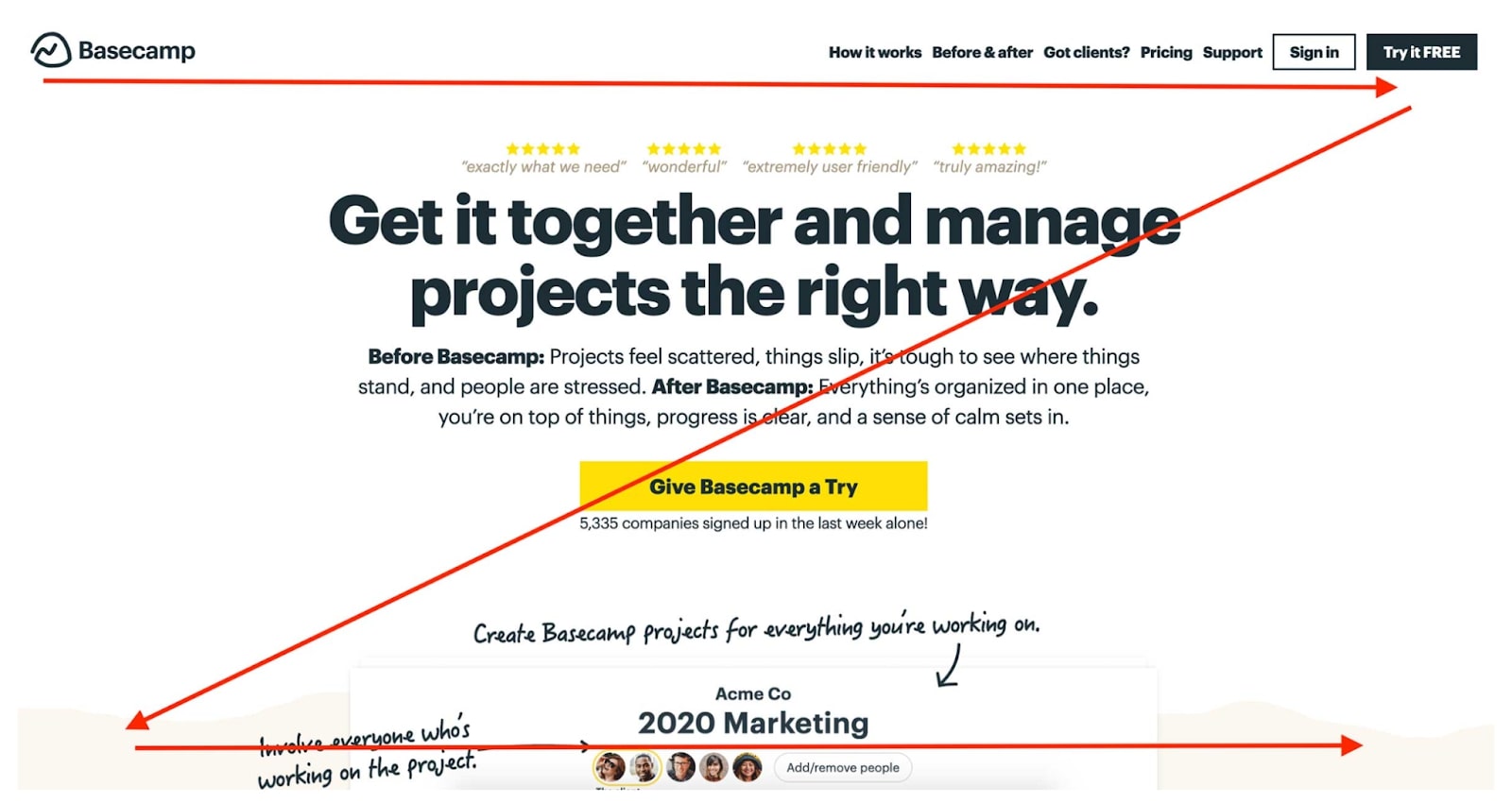
Want to increase your CTR? Take a look at the whitespace surrounding your call-to-action (CTA) button. Does it feel cluttered? Could it use more breathing room? One startup was able to increase lead generation by an astounding 232% in part by incorporating more whitespace when redesigning their CTA masthead.
Whitespace can help visitors focus on the parts of your website you most want them to interact with — like your free trial or CTA button.
2. Improve readability
Several factors influence the legibility of a web page including font, font size, color contrast between text and the background, and whitespace. One study found that increasing margins around text slowed reading speed but improved comprehension. The same study also suggests that providing ample breathing room within paragraphs (between individual letters, words, and lines) can elicit more favorable responses from readers.
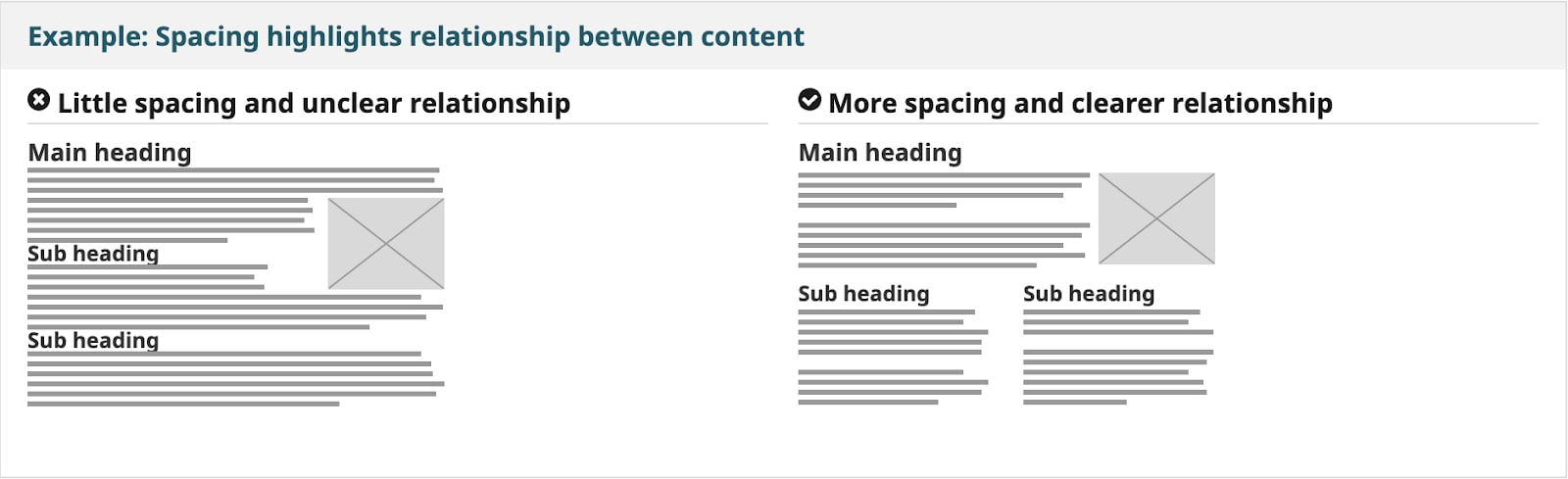
3. Optimize visual hierarchy
Good web page design uses visual hierarchy to make it easy for visitors to scan pages. Designers can utilize whitespace to encourage Z-shaped scanning and make it easier for visitors to digest information on a page.
4. Create a sense of elegance
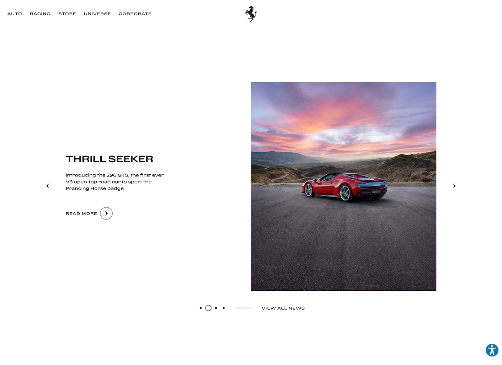
Iconic fashion designer Coco Chanel once said, "Simplicity is the keynote of all true elegance." So, it makes sense that simple web designs with lots of white space create a feeling of sophistication. Designers of luxury products from clothing to cars have been leveraging whitespace for decades and today we can see ample whitespace in high-end websites for brands including Chanel and Ferrari.
5. Build credibility
Research conducted by the Stanford Persuasive Technology Lab uncovered ten ways web designers can boost a website’s credibility with visitors. These included building a professional-looking website and making your site easy to use. As we discussed, whitespace can help convey a sense of luxury or elegance, thereby increasing the perceived professionalism of your site. And whitespace is great for creating an easily scannable, user-friendly design.
6. Ensure accessibility and inclusivity
The World Wide Web Consortium (W3C) specifically recommends using whitespace to declutter web designs, group content and related items, and make pages more scannable.
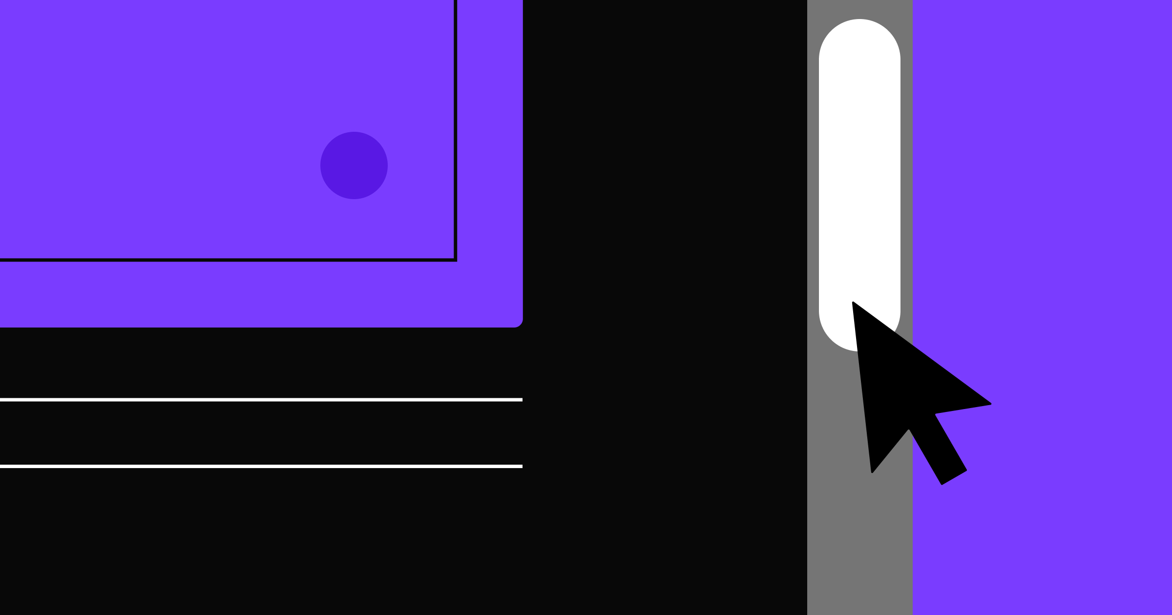
Be sure to choose a color for your “whitespace” that provides ample contrast for text. You can see if your color ratios for text meet Web Content Accessibility Guidelines in the Webflow Designer by opening the color picker under “Typography” in your Style panel.
Finding inspiring ways to use whitespace in design
Looking for a little inspiration for your next web or graphic design? Check out the Webflow Blog for collections of innovative web designs. And be sure to connect with other designs in the Webflow Showcase.


Get our 100 video course on web design — for free
From the fundamentals to advanced topics — learn how to build sites in Webflow and become the designer you always wanted to be.