


Webflow resources
Designing for accessibility is quite a broad topic. Training your team to build with accessibility takes time and a thoughtful approach rooted in first principles.
That said, there’s no time like the present to get started. If you’re new to web accessibility, we recommend starting with a couple Webflow resources:
- Accessibility at Webflow offers a few different resources to get you started.
- The Webflow accessibility checklist includes digestible guidance derived from WCAG. You can learn more with our “Accessibility on the web” course.
- The Audit panel helps flag common accessibility issues on your website.
Testing websites for accessibility
The best way to test your sites for accessibility is with a hands-on approach. To ensure the most inclusive practices, test each time you launch an update to your site. Major updates, such as a redesign, a new site section, or a large content update should be thorough. If you’re launching a more minor change—such as a new blog post or adjusting a small piece of content—a spot check is often appropriate.
There are various levels of accessibility testing:
Activities
- Using the Webflow resources provided in this article to check your site’s design and build
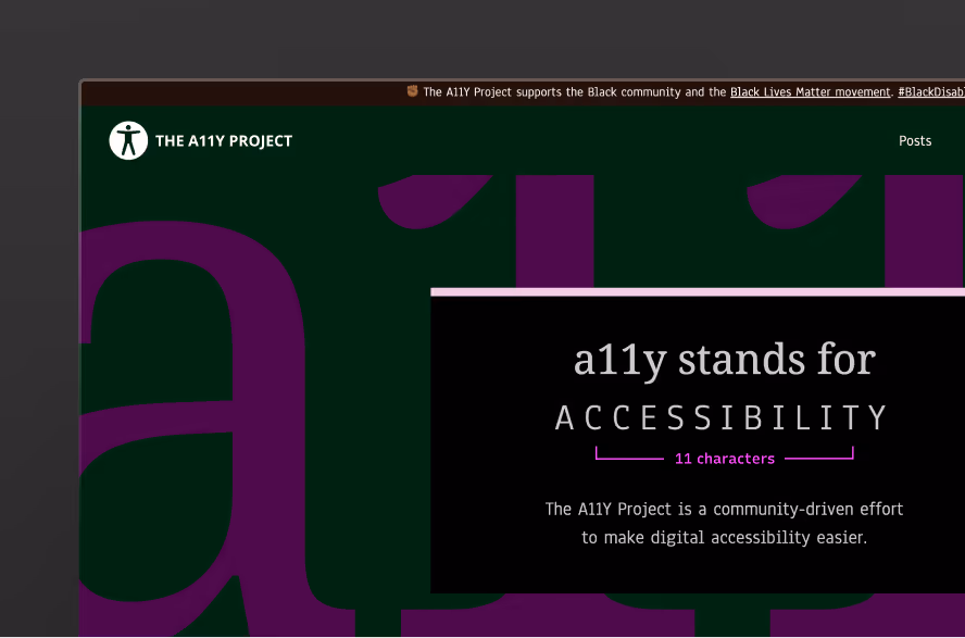
- Using additional tools to manually test, such as the Accessibility Insights browser extension for quick evaluations. The A11y Project lists many additional resources to peruse. “A11y” is a numeronym short for “accessibility”.
Test with assistive technologies, which many (but not all) disabled people use to browse the web. These can include:
- Screen readers such as NVDA, JAWS, Narrator, VoiceOver, and Talkback. Ideally you should test multiple different desktop platforms and mobile platforms, with various combinations of screen readers and browsers.
- Voice input tools, such as Dragon or Microsoft Voice Access
- Browser zoom and font size controls
- Operating system accessibility settings, such as font sizing, Contrast Themes, or transparency preferences
- Screen magnifiers, which can be used with or without screen readers
- Keyboard-only navigation
Assistiv Labs and other emulation platforms can help you access more browser + assistive tech combinations. For more ideas, The A11y Project lists many resources for testing with assistive technologies.
Note: it is expected that different assistive tools will not all work the same way. Sometimes this is a bug, but often it’s a diversity of choice on the market. Make sure you read the documentation for a particular tool before testing, so that you understand how it works. For example, some developers early in their accessibility journey believe that they need to make all elements on a page focusable with the tab key; this is not the case, as screen readers (for example) provide methods to reach non-interactive elements.
Testing your designs with disabled users is considered the gold standard. Fable and similar platforms can make it easier to connect to folks who can help you test!
Writing content
As you write content for your website, there are several best practices to keep in mind to ensure that it’s accessible for your audiences.
Keep content clear and concise
When writing content for your audiences, use simple language and formatting as appropriate for the context. Not only is this a best practice for accessibility, clear and concise writing promotes site discoverability (SEO) and site experiences optimized for your users.
- Use plain language. Avoid technical jargon or complex vocabulary when simpler alternatives exist.
- Be direct. Use active voice and short sentences.
- Chunk content. Break long paragraphs into smaller chunks. Use bullet points or numbered lists to improve readability.
- Avoid redundancy. Eliminate filler words and repetition that don’t add meaning.
- Front-load important information. Start with the most important idea in a sentence or paragraph to help users scan effectively.
- Define acronyms. When using acronyms, make sure that you expand the acronym for the first use.
- Provide clear instructions. If there are actions that require user inputs, ensure that instructions, guidance, and error messages are clear and descriptive
Page titles
Provide informative, unique page titles:
- Be specific and descriptive. Clearly summarize the purpose of the page.
- Keep it concise. Aim to keep titles under 60 characters.
- Make each title unique. Differentiate each page by its content and function. Avoid duplicating titles across your site.
- Include branding when appropriate. Consider adding your product or company name at the end of the title.

Put the unique and most relevant information first.
Page headings
Use headings to convey meaning and structure:
- Use headings to structure content. Apply headings to break content into meaningful sections (e.g., Overview, Benefits, How to Use).
- Follow a logical order. Use a hierarchical structure: <h1> for the main title, <h2> for major sections, and so on. Don’t skip heading levels.
- Avoid using headings for styling only. Don’t apply heading tags just to change text appearance — use proper semantic tags for actual section titles.
- Be descriptive. Write headings that clearly convey what the section is about. “How to Add Custom Code in Webflow” is better than “Tips.”
Limit one <h1> per page. Reserve the <h1> for the page’s primary topic or title. Webflow automatically assigns this in most templates.
Add alt text to images
Alternative (“alt”) text is a textual description of an image embedded in a page.
- Descriptive vs. decorative. Alt text should not be used for purely decorative images that do not add informational value to the content.
- Be descriptive and concise. Clearly describe the content and function of the image in a concise manner. Keep alt text descriptions to a maximum of 125 characters or less. If an image shows a picture of the Webflow CMS opened to a Collection settings, provide alt text like “Webflow dashboard with CMS collection settings” instead of “screenshot of Webflow”
- Avoid redundancy. You don’t need to include phrases like “image of” or Picture of” as screen readers already announce the presence of an image.
- Contextualize the image. Ensure the alt text is relevant to the context of the content. Describe what is important about the image in relation to the surrounding text.
- Use for functional images. For images that are functional, (e.g. buttons or links), describe the function rather than the appearance so that users, particularly those with screen readers, understand the purpose of the image and how to interact with it. For example, for a search button, use “Search button” rather than “Magnifying Glass”
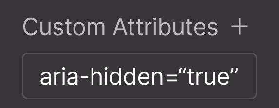
For images that don't add any informational value, it’s best to mark them as decorative so that screen readers will skip them.
Add link text
Accessible link text helps users understand where a link will take them or what action it will perform. Vague or repetitive links confuse users, especially those navigating with screen readers.
- Be descriptive. Clearly state what the link leads to or does.
- Avoid generic phrases. Skip vague text like “learn more,” “read more,” or “see details” unless it’s paired with clear context.
- Keep it concise. Aim for brevity while maintaining clarity. Avoid long, paragraph-length links.
- Ensure links make sense out of context. Screen readers often pull out lists of links. Make sure each one is understandable on its own.
- Don’t duplicate link text. If two links go to different places, don’t use the same text for both.
Use buttons for actions. If the link triggers an action (like submitting a form), use an HTML <button> element for clarity and consistency. You can find examples of these in the “Forms” section of the Add panel in Webflow. The “Button” element in the “Basic” section of the Add panel is a link stylized to look like a button, and should not be used for this purpose.
Structuring content
As you test against WCAG criteria for structure, we recommend paying especially close attention when 1) extending HTML-native semantics with ARIA and 2) ensuring proper keyboard accessibility.
Adding ARIA attributes
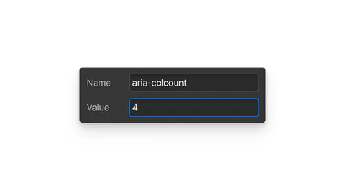
ARIA (Accessible Rich Internet Applications) is a set of attributes that define ways to make web content and web applications more accessible. These attributes can be added to HTML elements to provide additional information about how elements behave and how they should be presented to users by assistive technologies such as screen readers. In Webflow, you can add ARIA attributes through custom attributes in the Element settings panel.
Examples of ARIA usage include:
role="button" can be added to a div or span to ensure it is recognized as a button by assistive technologies. However, a <button> element is better, because the web platform handles common interactions for you (such as SPACEBAR input).
aria-checked="true" indicates that an interactive element is checked.
aria-label="Close" provides an accessible name for a button that might only be represented by an icon.
Best practices for using ARIA include:
Always prefer native HTML elements and attributes for accessibility before resorting to ARIA, as native solutions are typically more widely and thoroughly supported.
Adding unnecessary ARIA attributes can create confusing site visitor experiences. Use ARIA only when needed.
Ensure ARIA states and properties are dynamically updated to reflect the current state of the UI.
Regularly test your site with various assistive technologies to ensure that ARIA attributes are correctly implemented and provide the intended enhancements.
Tip: the first rule of ARIA is “no ARIA is better than bad ARIA”. Lean on HTML as much as you can, adding ARIA only when absolutely necessary to ensure that your site content is perceivable, operable, understandable, and robust (POUR principles).
Keyboard navigation
Keyboard accessibility is vital for web accessibility, particularly for users who rely on the keyboard as their primary means of navigation. It's essential to ensure that all interactive elements on your website can be accessed and used with a keyboard alone. This means that everything a user can click on should also be navigable via the keyboard:
- Arrow keys should be used to scroll and navigate
- The Tab key moves forward through interactive elements, and Shift+Tab goes backward
- The Enter or Space keys should select items, emulating the action of clicking with a mouse
As you navigate, an outline, or the focused state, should clearly indicate which element is currently selected. While tools like Webflow’s Keyboard Focused state allow you to customize this focused state, it is crucial not to remove it, as it helps users understand where the focus is.
Ensure that all interactive elements such as links, buttons, and forms are accessible via tab navigation. If an element is not focusable, users may be unable to access it, creating significant accessibility barriers. Conversely, make sure that non-interactive elements are not focusable to prevent confusion. Additionally, verify that elements are navigated in the correct order when tabbing through, following the hierarchy of HTML elements.
It is also important to avoid keyboard traps, where an element, such as an overlay, prevents users from using the keyboard to exit, such as by not allowing them to close a popup with the ESC key.
Including a "skip to main" link at the top of the page, which is hidden until focused, can also enhance keyboard navigation. This link allows users to bypass header content, such as navigation menus, and jump directly to the main content of the page. These considerations are just starting points; the best approach is to navigate your website using only the keyboard to identify and address any accessibility issues.
Styling content
For accessible styles, a few Webflow resources can help get you started:
Color contrast
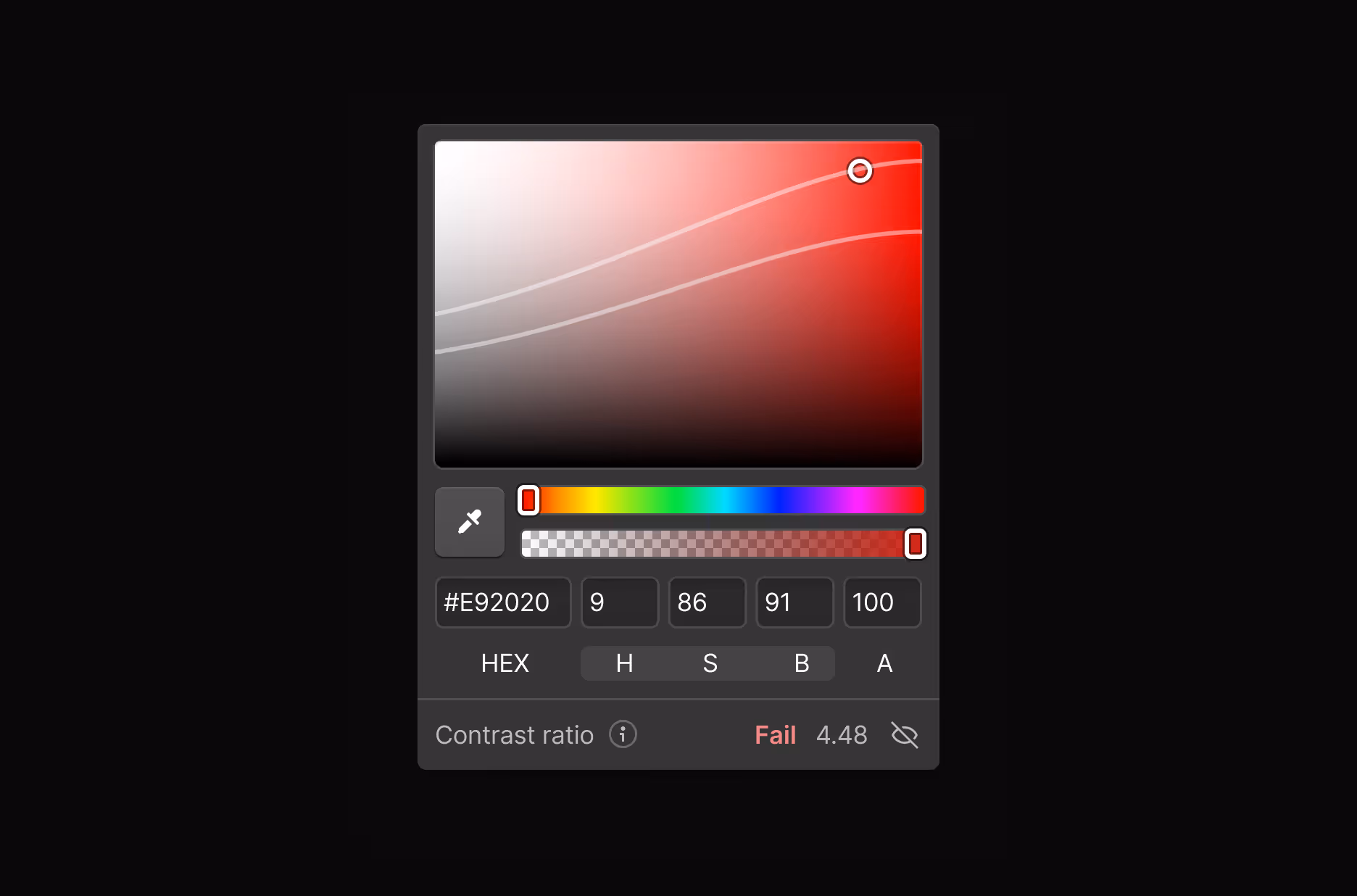
The Color contrast checker displays the contrast ratio for text elements along with the corresponding Web Content Accessibility Guidelines (WCAG) level rating. With the checker, you can view different contrast ranges: AAA enhanced (indicating the most contrast and legibility), AA minimum, and Fails. The rating is based on the background color, text color, font size, and font weight. Note that the checker does not analyze text elements over images, so this will require manual auditing.
Vision preview
The Vision preview tool simulates how your site appears to visitors with various visual impairments, including different types of color blindness, blurred vision, and text scaling.
Keyboard focused state
Your visitors may use their keyboard instead of a mouse to navigate your site. When they tab into an interactive element from their keyboard, it focuses on the element but doesn’t activate it (e.g. selecting but not clicking through on button). In Webflow, you can style the Focused state or Focused (keyboard) state to make interactive elements more visible to users relying on keyboard navigation. Setting an outline on interactive elements can help visitors identify the currently-focused element, without these styles affecting the layout of this or neighboring elements.
Check out “Testing websites for accessibility” for additional tips on testing your styles.
Animating content
Animation should enhance—not exclude. For motion-sensitive site visitors, animation can cause dizziness, nausea, or disorientation. Other visitors might find that motion distracts them from their task.
Here are a few tips to start from when designing inclusive animations:
Revisit intentional animation design
Return to first principles and consider whether motion is the best tool to support your goals for a particular site experience. Choosing not to move forward with an animation—due to it being possibly excessive or distracting—could be helpful to all users.
Follow WCAG criteria for motion, including at a minimum:
Recommended reading
To learn more about web accessibility best practices, check out the following timeless resources:
For a real-world example, check out how 8020 helped Brink build an AA-rated accessible site in Webflow.
Next up: CMS Collections and CMS items
Webflow’s CMS Collections enable you to scalably manage structured content such as blogs, team directories, and much more.
More ways to level up
 Webflow University
Explore courses and pathways to grow your skills or prepare for a Webflow-verified certification.
Go to University Help Center
Find solutions to your Webflow questions and get help from our expert customer support team.
Go to docs Community
Connect with other designers and developers to share tips, ask questions, and show off your work.
Go to Community