


When to use a Library
For in-house teams and agencies working in client workspaces, a Library should be used when multiple sites share the same brand and design patterns. Libraries are also a great fit for multi-brand organizations, where multiple “child” brands share the same overall look and feel, but may have child-brand-specific color palettes, typography, or sizing.
Agencies and site builders could even use a Library to more quickly scaffold client and customer sites.
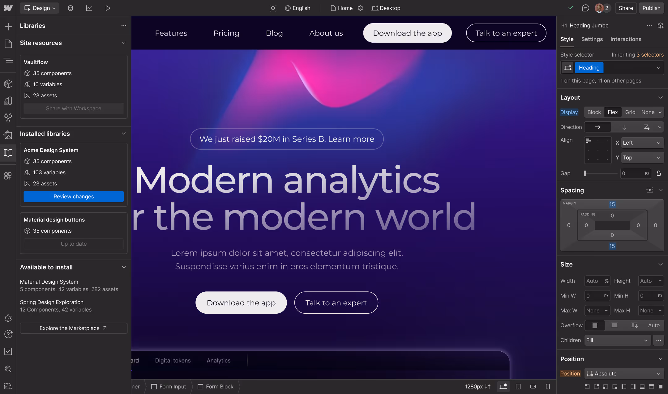
The Libraries panel shows the components, variables, and assets being shared from the Acme Design System.
How to name a Library
You can share a Library from any site, but we generally recommend creating a separate site for your design system. That way, when you have edits to your design system, you control when those changes are ready to share.
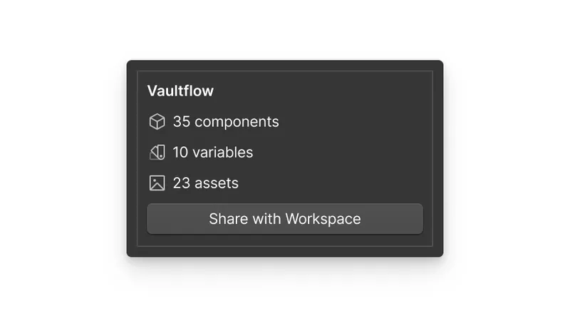
To name a Library, start with the name of the organization and append it with “Design System” or “Library”. For example, a corporate events company called Gruppo could name their Library “Gruppo Design System” or “Gruppo Library”.
If your brand has more than one design system, you could append a modifier to the organization name. For example, “Gruppo Product Design System” and “Gruppo Marketing Design System”.

The fewer design systems a single organization needs to maintain, the more consistent your customer experiences will be.
What to include in a Library

Your Library on Webflow should include:
- Variables as atomic design tokens. Organize your variables into collections and groups. For multi-brand Libraries, use variable modes to adjust brand-specific theme values.
- Components as the structural building blocks for your sites.
- Assets for images, documents, and animation files that are shared across your brand.
When to include resources in a Library vs a site
The key pieces of your design system should be defined as globally as is practical and appropriate. If some aspect of a brand is shared across more than one site, this definition belongs in a Shared Library.
If some part of a design will only be repeated across one site, that should be defined in the variables, components, or assets for that site.
Using a Library to scaffold client or customer sites
For agencies that keep multiple clients in one workspace, you may also use a Library to scaffold new client projects and brands. Site builders that generate many customer sites in a particular vertical—such as independent online shops, restaurants, or law firms—could also leverage shared libraries this way.
Suppose you create similar color or type ramps in variables for each new site; or every site you build needs components for a header, footer, sections, buttons, cards, and so on. You can:
- Create a Library e.g. “Agency Name Starter Kit” and define these commonly-used variables and components once.
- Install the Library on each new client site that would benefit from this starter kit.
- Uninstall the Library from the site, which converts the shared resources into site variables, components, and assets.
- Update these configurations with any brand-specific aesthetics or structural elements.
Documenting your design system with a style guide
Once you’ve built your design system as a shared Library on Webflow, documenting it is crucial for educating and enabling your team to adopt it. A well-documented design system ensures that everyone understands how to use and implement the system consistently. It serves as a living guide that can evolve with your brand and helps maintain uniformity across various touchpoints of the user experience.
We recommend embedding this documentation directly in the Library source site on Webflow. This ensures that the system is easily accessible and visually consistent with your actual components. To do this, create a page on the Shared Library site for each of the topics listed in “What to include in documentation”. The documentation pages won’t be shared to sites where you’ve installed the design system, but:
- Designers and developers can open the shared Library in Webflow to consult the documentation, and/or
- You can publish the Shared Library as a site, for anyone to consult—whether they have Webflow access or not! You can make your design system public, publish it on an internal-only domain, or password protect it.


Add a layer of protection to your shared library with a password.
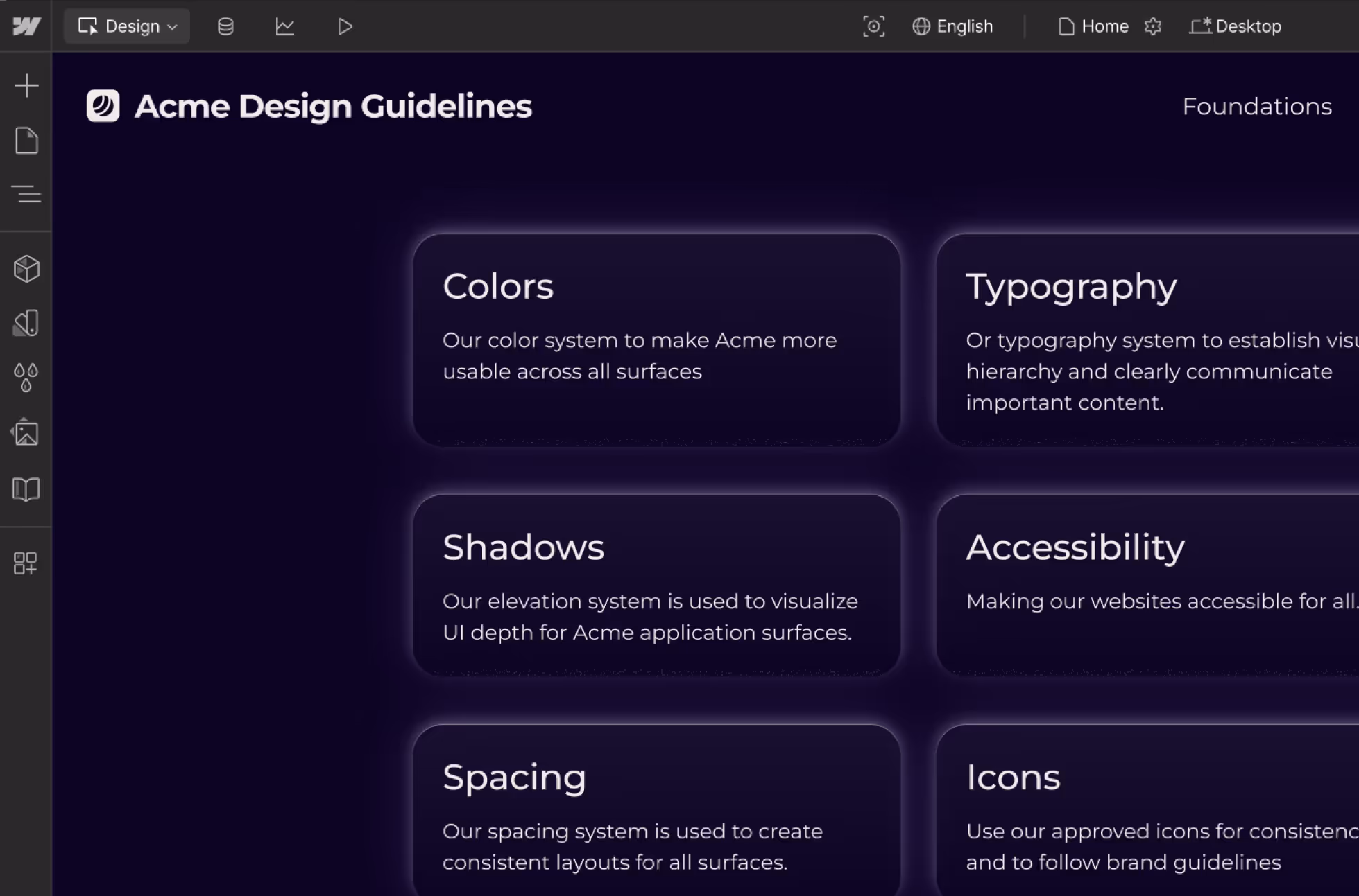
What to include in documentation
Remember, design details listed here should use variables, components, and assets wherever possible.
The purpose, goals, and problems that your design system aims to solve should be clearly articulated. Additionally, the scope of the design system, including components, color schemes, typography, etc., should be defined.
This section documents visual identity rules including logos, color palette, typography, and iconography. It also outlines the brand’s voice and tone for written content to maintain consistency in communications.
Document all primitive colors, and explain the usage rules for different colors within the system. Describe semantic colors used for specific purposes like error, warning, success, and information.
Provide a detailed type scale, including font families, weights, sizes, and line heights, and explain where each typographic style should be applied within the project. Document additional text styles such as links, buttons, or specific caption styles.
Define a consistent spacing system using margins, padding, and layout grids, and provide examples of these spacings in action. Outline key layout principles, such as alignment, consistency, and responsiveness guidelines.
Describe the style and usage of icons within the system, including a Library of commonly used icons. Provide guidelines for the types of images appropriate for use in the project, including style, tone, and treatment.
Document how your design system addresses accessibility, including color contrast ratios, keyboard navigation, HTML elements and attributes, and any ARIA attributes. Offer best practices for maintaining accessibility throughout the design and development process.
Create a change log to keep a record of updates and changes to the design system, including new components, deprecated elements, and modifications to existing components. Establish a method for gathering and integrating feedback into the design system documentation.
Library classes are namespaced to prevent collision with your site styles. Selectors in custom CSS will need to be namespaced manually. We recommend using custom properties in the Style panel, rather than custom code.
Using Libraries with custom code
Library classes are namespaced to prevent collision with your site styles. Selectors in custom CSS will need to be namespaced manually. We recommend using custom properties in the Style panel, rather than custom code.
Next up: Designing for accessibility
Not only is web accessibility the most inclusive way to build for real customers, it’s also crucial in ensuring your brand has the broadest possible reach.

More ways to level up
- Webflow University
Explore courses and pathways to grow your skills or prepare for a Webflow-verified certification.
Go to University - Help Center
Find solutions to your Webflow questions and get help from our expert customer support team.
Go to docs  Community
Connect with other designers and developers to share tips, ask questions, and show off your work.
Go to Community