


When to use a variable
Use variables anywhere that you repeat a style value across a site or brand. These repeated values are key to ensuring consistency across a single site or across all of your organization’s sites.
Maximize the impact of variables by defining their purpose and configuring them globally as frequently as possible. Remember: you can set variables on a single site or as part of a Shared Library. For example, a brand color palette should be defined in a Shared Library instead of re-defined on each site where that brand is used.
Similarly, agencies that use a Shared Library to scaffold themes for their clients should include variables in this starter kit.


When not to (re)use a variable
Don’t create variables for style values which are truly special, one-off cases
If this changes in the future, you can always create a new variable from the value from the Style panel.
Don’t over-use a semantic variable across distinctly different design use cases
Suppose the value 3rem is repeated multiple times on your site: as a margin value, as a padding value, and as a font size value. In this case the best approach would be to:
- Create one primitive variable for the raw value.
- Create two separate semantic variables: one for spacing (margin and/or padding) and one for font sizing. Each of these can reference the primitive variable.
Using this approach, if you ever need to refactor font sizes, you can do so without unintentionally changing spacing.
Key use cases
Effective design systems define variables for the use cases below.

Primitives & semantics
Design systems include two types of variables:
Primitives
Primitives are raw values that form your brand’s aesthetics. Each primitive variable is named to describe the visual appearance of the value, rather than how it should be used. These variables do not have any meaning or context attached to them. Rather, they are low-level style values meant to be referenced by semantic variables.

Semantics
Semantics are variables that have a specific purpose and context. Each semantic variable is named to describe how it should be used, like “Primary Text” or “Card Border”, rather than the visual appearance of their values. These variables can use a raw value, but when multiple semantic variables have the same value, they should reference a shared primitive variable.
Modifying values with modes

When to use a variable mode
- Specific breakpoint values
- Light or dark color schemes
- Different site, page, or section themes unique to your brand and sub-brands
- Experimentation with different design treatments as part of a Webflow Optimize variation. Note: you’ll need to create your new variable modes before setting up a variation.
You may also pair variable modes with custom code to automatically support:
- Site visitor preferences for light, dark, or device color schemes
- Contrast, motion, or transparency preferences
- Device orientation and other characteristics
You can manually apply variable modes to any selector in the Style panel, or apply them automatically for specific breakpoints.
When not to use a variable mode
If you have a design token that never needs to change its value based on the context it’s in, don’t create a mode for that. A good test is: do you need to return to a selector or element and sometimes relink one of its style properties to a different value? That’s a good use case for a mode value.
If you need element or component-specific values, this is a better use case for variable groups, rather than modes.
Naming variables

Naming principles
Variable names follow these conventions as a best practice:
Do not mix casings, word separators, or internal naming structures. Pick a strategy and stick with it.
Variable names should be economical: any applied variables will contribute to the size of your site’s rendered CSS. However, don’t sacrifice clarity of purpose for brevity — this will help prevent team members from creating multiple variables that serve the same or similar purpose, which could be worse for site performance and design system maintainability.
Anyone who contributes to your sites or design systems should be able to understand what a variable does and how it should be used, just by looking at the name.
Embrace language that your team members and clients understand. Use your design system to reinforce this shared language consistently.
You don’t need to add the word “color” to each name, for example. All variables have type indicators, and you could use the group name (e.g. “palette”) to indicate purpose as well. These are strong enough context clues.
We recommend that variable names use title casing with words separated by a space. This ensures that variable names are human-readable, empowering everyone on your cross-functional team to contribute.
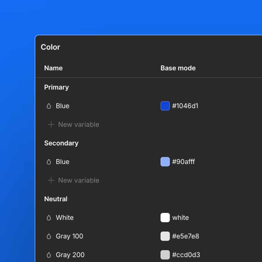
Color primitives
Human name
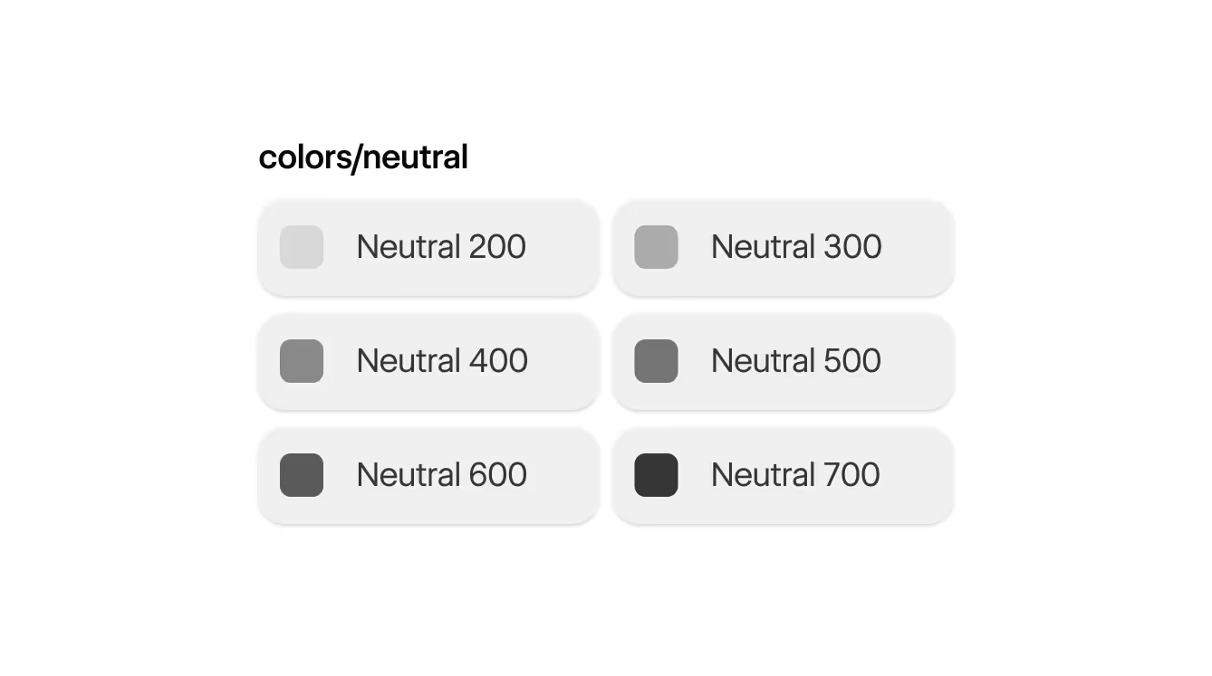
Use a color word that any team member could recognize. Gray, Blue, Turquoise, Neutral, Primary, and Secondary.
100 - 900
Unless this is a one-off color (e.g. White), use a 100-based number from 100 to 900 to indicate roughly where the color falls on the value scale. 100 is the lightest value, 900 is the darkest.
- This approach enables you to expand the color ramp later. Keywords like “light” and “lighter” prevent you from inserting a new value in between these shades.
- It also enables you to omit the colors your brand doesn’t currently need. For example, perhaps you only need Blue 400 and Blue 600 today. You may add darker or lighter shades later.
- These numbers are generally unscientific, though you may roughly align the color’s ordinal indicator to its luminosity in
hslnotation.
Size primitives
There are two most-common practices for naming size primitives: number-based steps, and t-shirt-based sizes. Whether you choose to adopt one of these common practices or another naming schema, the most important tenet is consistency.
Use the group name, such as Size/ or Spacing/, to indicate the purpose of the sizing ramp (e.g. spacing, type sizes, line heights). Use 1-based numbers to create a clear scale from smallest to largest value. You may also choose to use 100-based numbers if you’d like to match nomenclature for your color primitives.
The values of these variables should follow your visual language’s needs. In the absence of clear brand requirements, you could choose to scale each step by roughly the same multiplier, e.g. ×1.25 or ×1.5. Smaller multipliers between steps give you more flexibility but less control over consistent use; larger steps can encourage more intentional and consistent design choices but with less flexibility.

.25rem
.5rem
1rem
2rem
4rem
9rem
For a simpler sizing system: use the group name, such as Size/ or Spacing/, to indicate the purpose of the sizing ramp (e.g. spacing, type sizes, line heights). Use human-readable size abbreviations from smallest to largest to indicate relative size:
.25rem
.5rem
1rem
2rem
4rem
9rem
The guidance here differs from color ramp best practices. Sizing—particularly spacing and type size ramps—are more vulnerable to drift, clutter, and lack of rigor in enforcing a small set of consistent values. Define your size ramps carefully and commit to them.
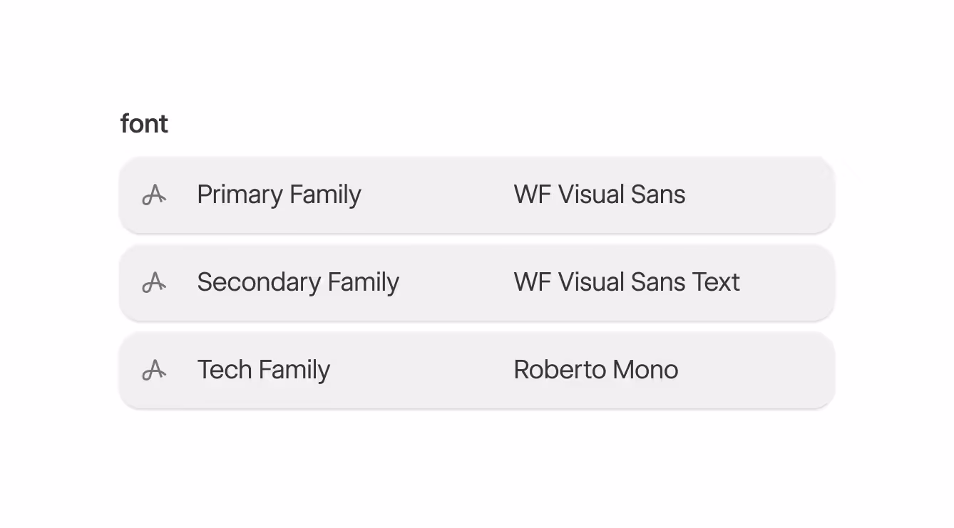
Font family primitives
Use a keyword describing the font-family’s frequency of use or role within your brand.

Inter
Poppins
Roboto Mono

Gruppo can change the typography across their entire site by updating the “Primary Font” field in the variables panel.
How to name semantics
- Element
If you need to reference a nested element, such as a button within a card, start from the parent or containing element, ending with the child, such as: Card Button - Element variant identifiers if relevant
If this is a primary button: Card Button Primary - Property
For example a background color: Card Button Primary BG - Modifiers if relevant
Like the element state: Card Button Primary BG Hover
Organizing variables
Webflow enables you to organize variables into collections and groups.
- Use collections for the foundations of a design system.
- Rename the default collection to its purpose. Consider storing primitive variables here and naming the collection “Primitives”.
- Organize variables within a collection using groups. Variables should be grouped by “like” purpose:
- Primitives: type, spacing, or color ramps (if not already placing primitives in the default collection)
- Semantics: design-context-specific uses for variables
- Order variables within primitive groups from least to greatest values: smallest to largest size, lightest to darkest color
- Define auto variable modes in order of breakpoint: base mode followed by tablet, mobile landscape, and mobile portrait
- Define manual variable modes by specificity of use or frequency of use in your brand. For example: default (equivalent to light scheme), dark scheme, high contrast light, high contrast dark.
Recommended organizational structure
We recommend the following collections (shown in the Variables panel sidebar), and the following structure and ordering for groups, modes, and variables within an individual collection:
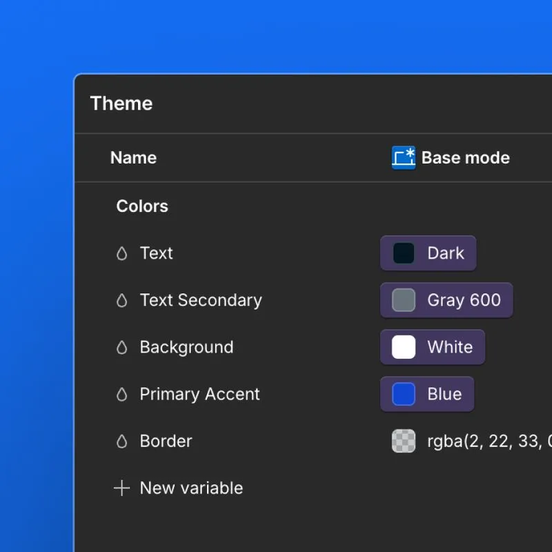
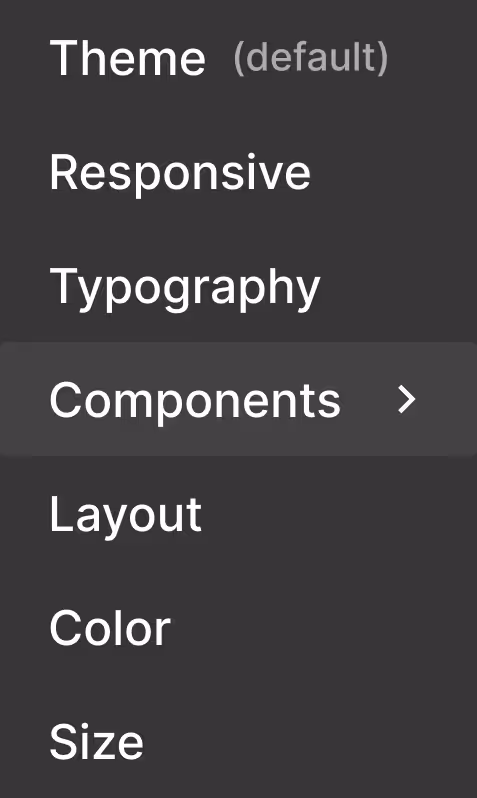
- Theme - Use for color theming like light mode, dark mode, and other accent color modes.
- Responsive - Add any variables here that need to be updated at various breakpoints, like font size or container width.
- Typography - Using variables for all type settings creates a single source of truth for both semantic styles (<h1>) and class-based styles (.h1).
- Layout - Use this collection for common spacing styles.
- Color - We recommend adding your primary brand styles only and not necessarily every color ramp, unless you use tints regularly.

The Gruppo site uses 6 collections to organize the site's variables.
- You can consider adding collections for specific site areas or pages, if these require significantly different variables than the rest of the site.
- The “Components” collection should be organized into groups separating the different components, such as “Card” or “Logo Grid”.
Using variables in custom code
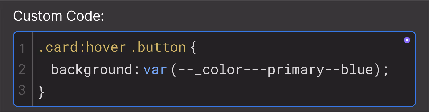
When working with custom code, Webflow variables are available as CSS custom properties — often called “CSS variables” — allowing you to easily extend beyond native styling.
The Variables panel in Webflow enables you to “copy CSS” for a variable. This can then be used in code blocks for custom CSS, SVG strokes and fills, and other styling needs specific to your brand and sites. This is a scalable approach to custom code as your CSS will pick up any value changes made to your variables.
Notes on variable naming in CSS:
- The variable name is converted to a lowercase-dash-separated string.
- The name is prefixed with the group, collection, and Library name, if applicable.
- If the variable name, group, or collection changes, you will need to update any references in custom code.
Next up: Styles
Webflow handles many CSS considerations for you, so often the most important consideration for styling is how you’ll apply and organize your style sets via selectors.
More ways to level up
 Webflow University
Explore courses and pathways to grow your skills or prepare for a Webflow-verified certification.
Go to University Help Center
Find solutions to your Webflow questions and get help from our expert customer support team.
Go to docs Community
Connect with other designers and developers to share tips, ask questions, and show off your work.
Go to Community