


Managing and applying styles
There are currently three available types of selectors in Webflow to which you can add styles, each of them serving a specific purpose:

Component style variants
Variants allow you to define multiple style options for a single component — like a Button with solid and outline styles, or a Card with horizontal and vertical layouts. Each variant can override styles on tag, class, and state selectors.
Set baseline site-wide styles with HTML tags
As you begin to set up a site, embrace the cascade. You’ll get pretty far in your design by setting tag styles. This enables you to style large batches of elements at once, while defining styles that need to be inherited by children elements. These default styles can then be overridden with classes as you continue to design your site.
Apply basic styles to the following HTML tags in this order:
- Body
- Headings (H1–H6)
- Paragraph
- Inline text styles (strong/bold and em/italic)
- Links (all types of links)
- Lists and list items
- Labels
- Images, figures, and figcaptions
- Block quotes
- Code blocks and Pre (the parent of code blocks)
Webflow also enables you to style element tags that appear within a rich text element with a class — without impacting other elements with the same tag. This enables you to visually treat an element (such as headings) differently based on whether they appear in rich text or elsewhere in page layouts.


Learn how to style elements within RTEs with their HTML tag.
Extend styles with classes
Currently, most of the styles you apply to your elements in Webflow will be controlled by classes, which behave similarly to CSS classes. Webflow enables you to set two kinds of classes to your elements:
- A base class
- (Optional) A stacked series of combo classes, which extend the base class
Use this type to...
Recommended for
Create a reusable set of styles used by a subset of elements, sometimes across element types.
- Sections
- Containers
- Buttons
- Form fields
- Navigation elements
- The root element of a component
Create a “utility class” — a class that serves a specific, single-purpose function.
Utility classes typically apply one or a small set of styles to an element. They are intended to be reused and can be stacked with other utility classes.
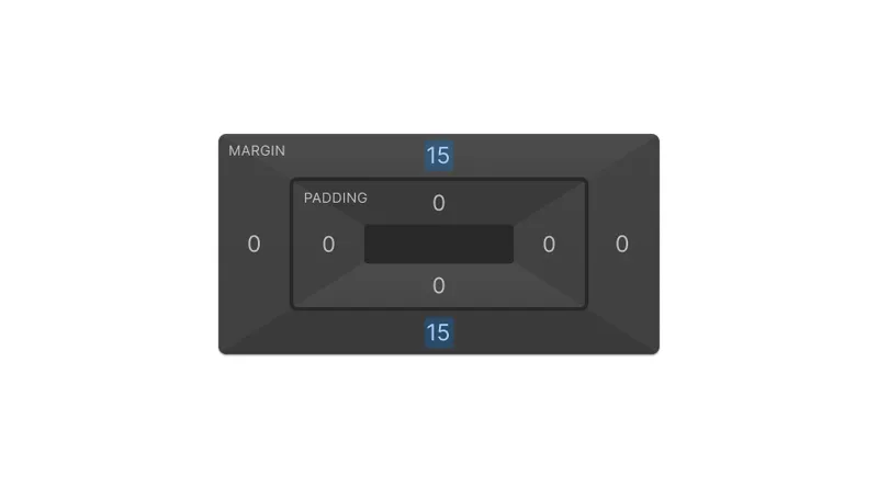
- Spacing (margins and padding)
- Layout sizes and grids
- Text alignment
- Text sizes
- Font weight
- Color (text color and background color)
- Display
- Position
Create style variations of a specific base class.
Variations on the base class’s core styles, such as:
- Section variations
- Button variations
Tip: to reduce the number of classes to track, create a component instead and leverage component style variants.
Stacking combo classes
Utility classes can be stacked to achieve a combination of styles. You cannot reorder stacked classes on an element: class stacks create a compound selector in your published site’s CSS. Our recommendations:
Stacking limits
Use a maximum of 3–4 stacked classes. If you need further customization, create a new base class.
Utilities
Create a utility class in isolation as a base class, rather than within a combo class stack. This ensures that the utility class is available to be stacked with any other classes — not just in that particular stack.
For example, if you want a horizontal list rendered in all caps, add one list element and then create a class for the horizontal treatment. Add another element to create the all-caps class. You can then delete these elements and apply the classes to your original list element.
Thoughtful use of utility classes
In place of utilities, you could consider the following:
- Use a component style variant on one or more components, instead of a utility class. This is a great option when the utility is specific to one or a limited number of components; you could even create a grid layout utility component!
- Use a variable mode, instead of a utility class. This is a great option when you need to swap out style values (such as colors or sizes), instead of applying different sets of properties.
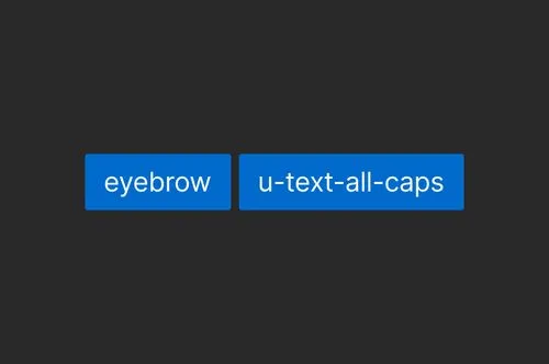
Examine if the style(s) need to be added to multiple different tags or base classes based on an element's context. For example, if an “all caps” typographic treatment is used in many different contexts throughout your design, that’s a good fit for a utility class. If it’s only used for “eyebrows” and H6s, use a base class and an HTML tag selector instead, respectively.
Clean up your classes
Regularly delete unused classes from your site to reduce the weight of your site’s code, and improve your site’s performance. Be mindful not to clean up classes that are only referenced in custom code or custom class attributes; the Style Selectors panel is only aware of how classes are used when visually building.
Fully remove classes when they aren’t connected to any element.
Manage element state treatments
Add visual treatments for interactive elements’ various states. State selectors can and should be combined with tag and class selectors. For example:
- Accessible, interactive elements need to consider hover, pressed, and focused state styles. Account for these states when styling links and buttons, for example.
- Elsewhere in your design, you might add a class to style a specific type or placement of link, such as “Call to Action Link”. This class will also need to be paired with hover, pressed, and focused state styles.
How to name classes

Naming principles
Class names follow these conventions as a best practice:
Do not mix casings, word separators, or internal naming structures. Commit to prefixes you’ll use for each class type. Overall, pick a strategy and stick with it.
Class names should be economical, as they’ll contribute to the size of your site’s rendered CSS. However, don’t sacrifice clarity of purpose for brevity — this will help prevent team members from creating multiple classes that serve the same or similar purpose, which could be worse for site performance and design system maintainability.
Embrace language that your team members and clients understand. Use your design system to reinforce this shared language consistently.
Use prefixes so that your team members can tell at a glance what the purpose of the class is, and what uses of that class are appropriate (e.g. “u-” for utility, “cc-” or “is-” for combo).
Class names should use lowercased-dash-separated words, which enables you to more naturally prefix class names for their various purposes.
Naming each class type
Class frameworks may use different syntaxes or prefixes, as long as they adhere to the aforementioned principles. The following are our recommendations:
Purpose
Name
Example
Adds a baseline, shared set of styles that are common across multiple element types
Prefixes for base classes are optional
Add style variations to your base class
An is- or has- prefix followed by a human readable version of the variation
Also referred to as a “Utility class” or “Combo class”
Adds a style or small set of styles for a singular, yet composable purpose
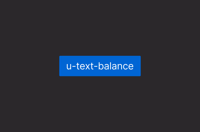
Use a u- or g- prefix, followed by a human readable version of the class’s purpose.
Component-specific base styles
Match the class name to the component’s name. For child elements, start with the root component name first. You may consider using a _ instead of - to separate levels of structural hierarchy, such as component-name_child-name. Whichever punctuation you choose, use it consistently.
You may consider also add a prefix, such as cc- or c-.
Responsive design considerations
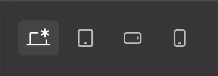
In Webflow, “desktop” is the default breakpoint where you’ll begin crafting your designs. If you’re unfamiliar with using breakpoints to customize designs based on viewport width, learn more about breakpoints in our Help Center.
A couple of key tools can help make responsive design easier to accomplish, allowing you to make fewer manual tweaks between breakpoints.
Variable modes
Variables modes help you update variable values on the fly, without having to relink them to styles:
- Create a base set of variables for type sizing, margins, padding, dimensions, etc.
- Create automatic modes that swap out your variable values automatically based on your chosen breakpoint (such as “tablet” or “mobile portrait”).
That’s it! Learn more about responsiveness with variable modes
Flexible CSS units and functions
In addition to Webflow’s variable modes, some CSS units and functions are more flexible than others and help you create more fluidly responsive designs. We recommend trying the following units and functions, all of which can be reused within Webflow variables:
Purpose
Create fluid typography and spacing systems, without using breakpoints.
A unit of measure relative to the root html element’s font size. rem is great to use when you want spacing to be consistent across different elements. For example, H2s, H3s, and paragraph tags all have different font sizes, but should have the same top margin.
(vh / vw)
*vh and *vw units allow you to size elements based on the viewport height and width. svh and svw refer to the “small” viewport size and can help you navigate mobile browser quirks. If you want to support older browser versions, you can use vh and vw instead.
The px unit should be used more sparingly, i.e., only when you don’t want some visual treatment to scale with the rest of the surrounding context. For example, a decorative visual treatment, like a border, that you’d like to always have the same visual “weight”.
What to test
As you craft new experiences — or update existing pages — be sure to check your site in each available breakpoint to ensure your design is still looking good.

Check to ensure:
- Layouts make the best use of the available breakpoint width from its max to min.
- No text overflows improperly outside parent elements, even with text zoom.
- Default font sizes are appropriate to the available space: not too large on small breakpoints, and vice versa.
- Shadows, gradients, and effects appear well-considered
Make changes in the Style panel to adjust your designs to a given breakpoint. Do lean on variable automatic modes for easier, more responsive designs: you can automatically set a different variable value for each breakpoint, instead of having to make many adjustments on classes and tags throughout your designs.
Accessibility and performance
Accessibility considerations
Designing for accessibility ensures as many people as possible can use your site without barriers or roadblocks. Not only is web accessibility the most inclusive way to build for real customers, it’s also crucial in ensuring your brand has the broadest possible reach.
Accessibility must be considered throughout your site’s structure, semantics, content, style, and animations. Learn more about designing for accessibility
Performance considerations
- Remember that web performance is highly contextual. What works best for one site and its goals might not be the optimal approach for another site.
- Enable per-page CSS, re-publish your site, and determine whether the change positively impacts performance metrics you care most about.
- Avoid creating redundant classes that effectively share the same styles.
- Audit your use of classes and styles often.
- Challenge yourself to achieve your designs with the leanest number of classes and style changes possible. Often, setting or resetting the same property multiple times on an element is an indication that your styling could be more efficient.
- Consider not just page load time, but also visitors’ perception of performance and how styles render on the fly.
Review the article for more tips, particularly on expensive animations.
Using styles in custom code
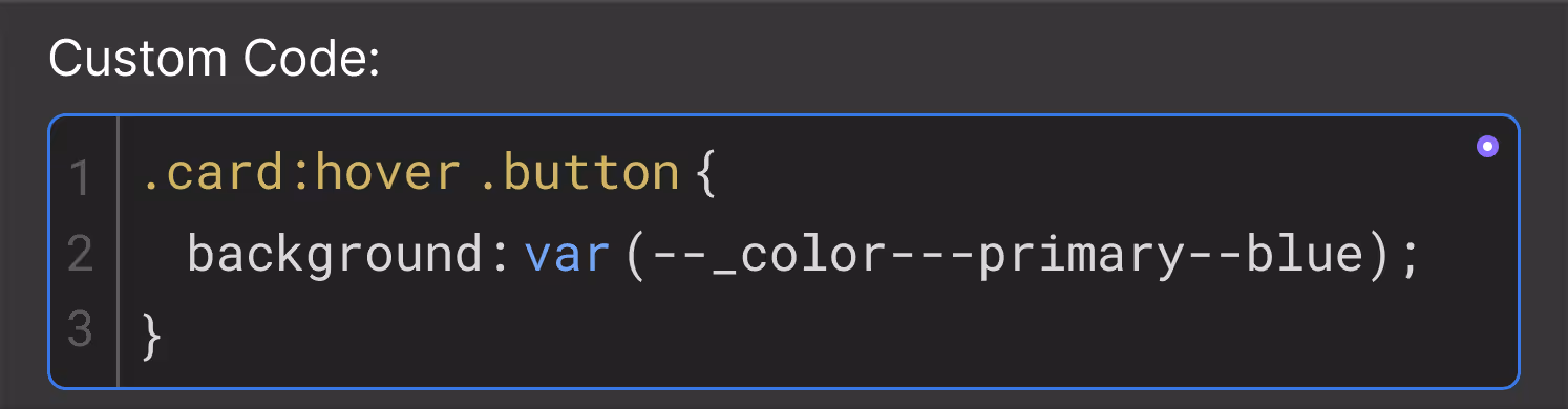
Teams using paid Site plans can also write their own CSS in custom code blocks, which — unlike page- and site-level code — will render inside Webflow’s canvas as you work. You should do this only if you need a selector or media query that is not yet supported natively in Webflow, or a CSS property that doesn’t have broad browser support.
Whenever possible, use the Style panel, which includes a wide range of style properties with purpose-built controls. These styles are checked by our syntax validator, ensuring your team doesn’t ship any broken (meaning unapplied) styles. For CSS properties or values without bespoke Style panel controls, use the Custom Properties section of the Style panel — rather than custom code.
Anyone who contributes to the site’s design in Webflow but doesn’t write code may be confused when they can’t control or edit styles defined in custom code. They may try to work around it and end up breaking your published site’s styles.
Learn how to add styles for CSS properties without native Style panel controls.
Next up: Interactions
Interactions are the final, dynamic layer that brings your brand to life! Motion and other interactivity responds to the site visitor and eases them through the experience.

More ways to level up
- Webflow University
Explore courses and pathways to grow your skills or prepare for a Webflow-verified certification.
Go to University - Help Center
Find solutions to your Webflow questions and get help from our expert customer support team.
Go to docs  Community
Connect with other designers and developers to share tips, ask questions, and show off your work.
Go to Community