


Translation and beyond
Design evolves in complexity as you move from translation to transcreation:
Translation
Your design stays largely the same — content is swapped for another language, and minor spacing or text sizing tweaks may be needed. Components and layouts are reused, and visual identity is preserved globally.
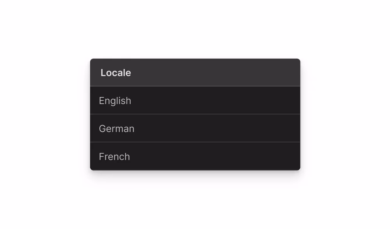
Localization
Visual elements are adapted to fit regional norms and technical needs — including right-to-left (RTL) layout support, culturally appropriate images, or localized font choices. Styles may be overridden per locale using localized styles and style variables.
Transcreation
Design becomes a vehicle for cultural resonance. Layouts may change structure, color palettes may shift to evoke emotion, and entire sections of content may be reimagined. You might use conditional visibility, or market-specific style variants and variables to deliver fully distinct experiences, all while staying aligned to your global brand.
Translation
Localization
Transcreation
Reuse the primary design system. Add fallback fonts and adjust spacing as needed.
Adjust font size, spacing, or line-height for script readability. Use locale-specific font stacks or type tokens.
Redesign typography system for tone and emotion. Use different fonts or hierarchy to support market-specific storytelling.
Keep structure identical. Use flexible containers to handle text expansion.
Adjust for RTL languages and locale-specific spacing. Use logical CSS properties like margin-inline.
Reorder, hide, or replace sections for cultural storytelling. Use conditional visibility to manage layout differences.
Use the global color palette without changes.
Shift accent colors for cultural or seasonal significance. Ensure accessibility compliance remains intact.
Redesign palette to align with local emotion, symbolism, or brand tone. Implement via locale-specific variable collections.
Use the same imagery and media as the primary locale. Localize alt text where needed.
Swap out images and icons for cultural fit. Override assets in the Designer per locale.
Create distinct visuals per market to support different emotional or narrative goals. Use conditional visibility where layout shifts are needed.
Reuse global components. Translate content using Component Main overrides.
Localize internal content using props. Apply style variants to adjust layout or visuals by locale.
Build distinct component variants. Use conditional visibility and props to support unique experiences for each market.
Localize styles
Per-locale styles
One of the most powerful features of Webflow Localization is the ability to customize styles on a per-locale basis. By default, all styles, including classes, typography, colors, and layout, are inherited from your primary locale. However, when a design needs to shift visually for a specific language or region, you can override those styles directly in the locale.
This enables teams to scale global design systems while remaining flexible enough to handle language-specific readability, script-based layout changes, and cultural visual preferences.
Here's how it works. When you're in a secondary locale view, you can select any element and change its font size, spacing, alignment, color, etc.
These style overrides apply only to that locale and are scoped automatically using :lang() selectors under the hood. For example: .centered-heading:lang(fr-ca) {font-size: 2rem;} This ensures clean style isolation and makes it easy to manage design adjustments without duplicating components or layouts.
Best practices for managing localized styles
Use your existing classes
Apply locale-specific overrides to existing classes. This keeps your CSS clean and scalable across locales.
Create locale-specific variable collections
If a locale uses different fonts, color palettes, or spacing systems, define a new variable collection with a name for that locale. This allows you to maintain a centralized system while supporting localized flexibility.
Avoid unnecessary overrides
Don’t override styles unless they’re truly needed. Overriding too many classes without clear documentation can make future changes harder to track and maintain.
Localize typography

Typography plays a critical role in global design, affecting readability, usability, and even brand perception. As your site expands into new languages, your typographic system must adapt to support a wide range of scripts and cultural conventions.
Many Western-oriented fonts only support the Latin alphabet. To prevent missing characters ("tofu" boxes like ☐☐), use multilingual fonts that include support for the scripts your locales require, such as:
- Google Noto: Designed for universal script support.
System fallback fonts like Arial, Helvetica, or Roboto, depending on target region.
If one font doesn't support all your languages:
- Upload any additional font files to Webflow.
- Switch to the relevant locale view.
- Override the typography styles at the class level to assign fallback fonts.
This ensures graceful handling for scripts like Arabic, Chinese, Japanese, or Devanagari, especially when used in rich text components, navigation items, or buttons.
Different writing systems come with different visual behaviors:
- Arabic doesn’t use uppercase and often avoids italics.
- Japanese and Chinese characters are visually denser and may require more breathing room.
- Thai script stacks vertically, making line-height and padding more critical.
Avoid imposing Latin-centric styles (like letter spacing or small caps) on scripts that don't use them.
Scripts with complex or intricate characters, such as Chinese, Tamil, or Bengali, often benefit from:
- Larger base font sizes
- Increased line-height
- More generous spacing between blocks

Use localized variable collections to assign typography tokens (e.g., font-base, line-height-body) that are optimized per locale.
Layout: RTL support and flexible content length
When designing for a global audience, layout must be responsive not only to screen size but also to language direction and text length. A design that works well in English might break when translated into Arabic, German, or Japanese unless it's built with flexibility in mind.
For languages like Arabic, Hebrew, or Persian, the reading order flows from right to left. Webflow automatically applies dir="rtl" to the <html> element for locales that require it.
To ensure layouts adapt smoothly:
- Use custom properties like
margin-inline-startinstead of margin-left - Replace
padding-rightwithpadding-inline-end - Use
text-align: startinstead ofleftfor text alignment
These properties allow the layout to adapt based on the text direction of the active locale without needing duplicate styles.
Translated content often varies in length. German phrases are typically longer than English, while Chinese can be much shorter.
To ensure your layout holds up:
- Avoid fixed widths or heights on elements that contain text
- Use flexible layout methods like Flexbox or Grid
- Let buttons, menu items, and cards grow or shrink with content
- Allow text to wrap where appropriate instead of truncating
Use auto width and min/max constraints to create layout boundaries without hard stops that break when content grows.
Localize color
Color is a powerful design tool, but its interpretation varies significantly across cultures. The same palette may feel vibrant and celebratory in one market and inappropriate or confusing in another. As you adapt your site for different regions, it's important to consider both cultural symbolism and universal accessibility standards.
Research color symbolism by locale
Colors carry different emotional and symbolic meanings depending on the audience. For example:
- Red may signal danger in North America but prosperity and celebration in parts of Asia
- White can symbolize purity in Western cultures, but mourning in others
- Green may imply freshness in some regions but carry religious connotations elsewhere
Before finalizing a palette for a localized site or campaign, understand what your core brand and accent colors communicate in context.
Maintain contrast and accessibility
Even when adapting your palette for cultural or seasonal reasons, your design must remain legible and inclusive.
Check every localized color combination against WCAG 2.1 guidelines:
- Maintain sufficient contrast ratios for text and backgrounds (AA for body text, AAA for smaller text or tighter contexts)
- Add text outlines or shadows when using bright-on-bright palettes (such as red-on-gold or white-on-yellow)\
Use color variables and locale-based variable collections to apply regional palettes consistently without modifying every instance manually.
Localize assets

Visual content carries powerful cultural and emotional weight. Webflow allows you to localize images and media on a per-locale basis, helping you tailor your site to different markets while maintaining a strong visual identity.
By default, secondary locales use the same assets as the primary locale. However, you can override any asset with a locale-specific version when regional relevance, language, or symbolism requires a change.
Use culturally appropriate imagery and symbols
Images, icons, and illustrations must resonate with your audience’s cultural context. Avoid visuals that may be confusing, inappropriate, or misaligned with local norms. Instead, include assets that reinforce cultural familiarity — such as local landmarks, regional events, or holiday-specific themes.
Adapt iconography and content-driven visuals
Localization is not just about avoiding mistakes. It’s also about creating visual resonance. For example:
- Replace product images that include region-specific packaging or when the original text is irrelevant to the locale.
- Update social proof sections with photos of people who reflect the target audience
Avoid embedding text in images
Text inside images cannot be translated automatically. If you use images with text (like banners or infographics), you’ll need to recreate them for each locale. Instead, use Webflow’s text elements and dynamic content to keep copy editable and translatable.
Technical implementation in Webflow
Localized image overrides
In any secondary locale, you can override the default image, videos or PDFs by selecting the element and uploading a new asset or overriding an asset on a CMS item. This lets you localize:
- Background images
- Product shots
- Product Specs
If you do nothing, the asset from the primary locale will be used as a fallback.
Alt text localization
Accessible and SEO-friendly alt text can also be localized in two ways:
- Global override (via the Assets panel): Set a single alt text for all uses of an image in a locale. Best for shared icons or product images.
- Instance-level override: Customize alt text for a specific use of an image. Best for decorative images or varied contextual meanings.
Always update alt text alongside your localized image, especially if the content or messaging of the image has changed.
Asset organization strategies
- Use folders in the Webflow Asset panel to group assets by locale (e.g., /EN/, /FR/, /JA/)
- Adopt a naming convention for clarity (e.g., banner_es.jpg, icon_fr-ca.svg)
- Keep visual dimensions and aspect ratios consistent across locales to prevent layout shifts
When an asset is overridden in a secondary locale, it is no longer linked to the primary version. If the primary asset changes (such as a new logo), you will need to manually update each localized version.
Localize components

Two localization methods
Components are a powerful part of Webflow’s design system, they let you create reusable, modular content that stays consistent across your site. With Localization, you can adapt these components for each locale without rebuilding or duplicating them.
By default, a component’s content and styling are shared across all locales. But when you need to adjust a component for a specific language or region, Webflow gives you two ways to localize it.
Use component props and style variants
This approach gives you fine-grained control over specific parts of a component without affecting the global structure.
Use when:
- You want to change text, icons, images, or internal layout per instance.
- You want to modify the visual styling of a component (e.g., spacing, alignment, typography) for a certain market.
- Your component needs to look or sound different in different regions while preserving structure.
How it works:
- Create props (like title, description, image) from the primary locale that are inherited by the component in the secondary locale.
- Apply style variants to adjust visual appearance by locale (e.g., compact button spacing in Japanese).
Localize the component main
This approach lets you override the component’s base content and settings per locale. All instances of that component will reflect those changes for that locale only.
Use when:
- You’re translating a shared piece of content (e.g., a global banner or CTA).
- The component structure and logic stay the same across locales.
- You want simple translation, not deep adaptation.
How it works:
- Switch to the target locale in Webflow.
- Select the component and override the main content once.
- The changes apply across all instances in that locale.
Best practices for localizing components
Use case
Recommended method
Translating consistent content
Localize component main
Adjusting per-locale messaging, icons, or layout
Use props and style variants
Supporting transcreated versions with different visual emphasis
Use conditional visibility
Collaborating across teams
Use Build mode with comments to align on copy and layout per market
Next up: Localizing text and SEO
Text is the foundation of how your website communicates with users, whether it’s a headline, a signup prompt, a product description, or a blog post. As you expand into new markets, how you adapt your text matters just as much as what you say.
More ways to level up
 Webflow University
Explore courses and pathways to grow your skills or prepare for a Webflow-verified certification.
Go to University Help Center
Find solutions to your Webflow questions and get help from our expert customer support team.
Go to docs Community
Connect with other designers and developers to share tips, ask questions, and show off your work.
Go to Community