


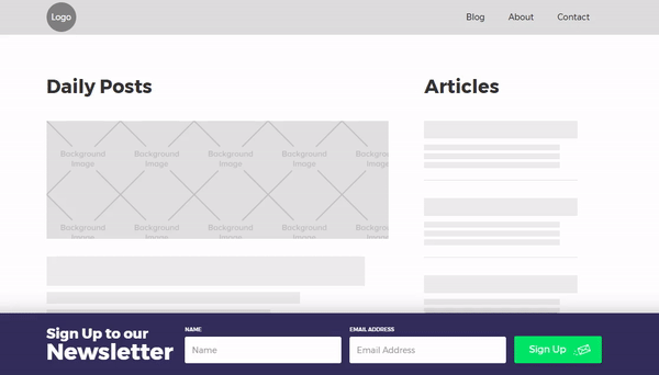
Sure, popups increase conversion rates, but they’re also annoying. Especially those persistent ones that don’t get the message the first time you close them. A good UX compromise for the popup is the on-scroll signup form. It still attracts your attention, but doesn’t block you from reading or enjoying your existence.
Here's what we're going to make together.
Note: for this tutorial, we’ve assumed that you’ve set a default font on the body.
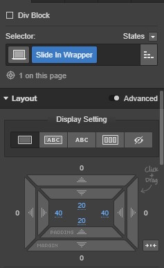
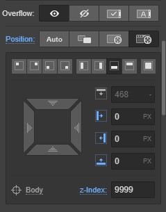
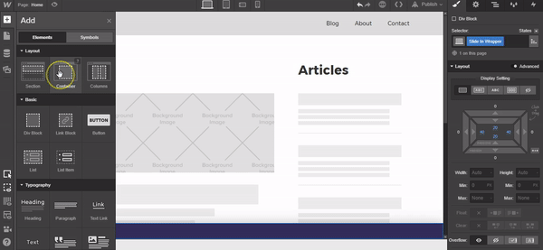
Step 1: Add a div and style
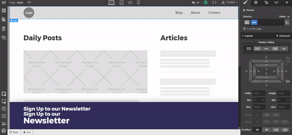
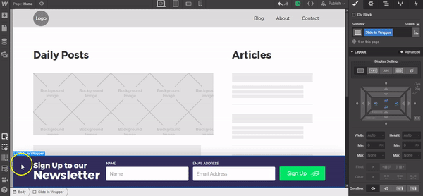
Add a div to the canvas, give it a class of “Slide In Wrapper” and add these settings:
- Padding all sides: 20px
- Position: Fixed, Bottom
- Z-index: 9999
- Text color: #ffffff
- Background color: #332e5a
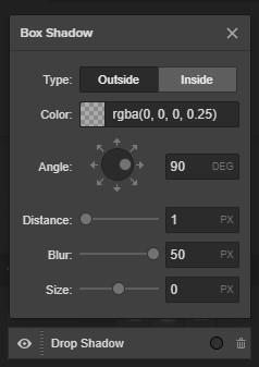
Box shadow settings:
- Color: rgba(0, 0, 0, 0.25)
- Angle: 90°
- Distance: 1px
- Blur: 50px
- Size: 0px
Step 2: Adding content to the slide in wrapper
Add a container to the slide in wrapper, give a class of “Flex Row” and set the display to flex, horizontal, justify:center, and align:center.
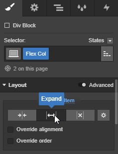
Add two divs to the Flex Row container, name them both “Flex Col” and set them to Expand.
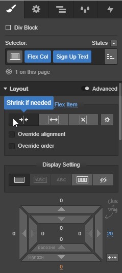
Before adding the content to the Flex Col divs, on the left hand Flex Col add another class called “Sign Up Text” and set Flex Item to Shrink if Needed and add margin to the right of 20px.
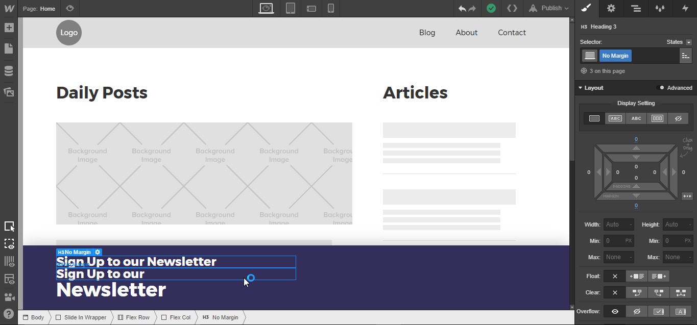
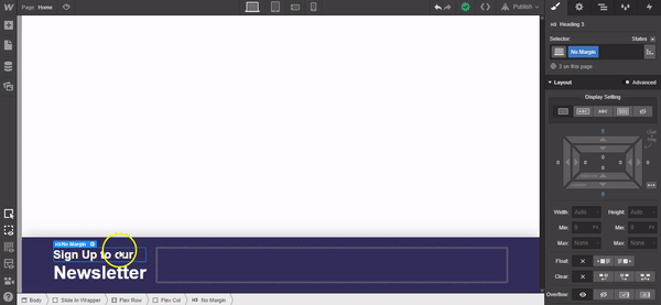
Now add two H3 Headlines and one H1 headline. Give them a class of “No Margin” and remove the default margin from the top and bottom. I’ve added two H3 headlines because one of these will display on the Desktop breakpoint, while the second will show up on all mobile devices.
Change the text as follows:
- First H3 to “Sign Up to our Newsletter”
- Second H3 to “Sign Up to our”
- H1 to “Newsletter”
PRO TIP: Create a class called “No Margin” and set the top and bottom margin to 0px. This gives you a reusable class you can add to any text element to clear out the default margins and preserve your carefully crafted type settings.

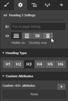
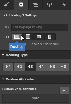
Highlight the first H3, open the Settings panel, and set it to visible on: Tablet & Phone only. Highlight the second, set it to visible on: Desktop only.
Highlight the H1 headline and set this to Visible on: Desktop Only
Go to the Tablet view in the designer and set the Flex Row as Vertical, with Align:Stretch selected. Scroll down and set the text alignment to Center. This will also cascade down to the mobile phone views.
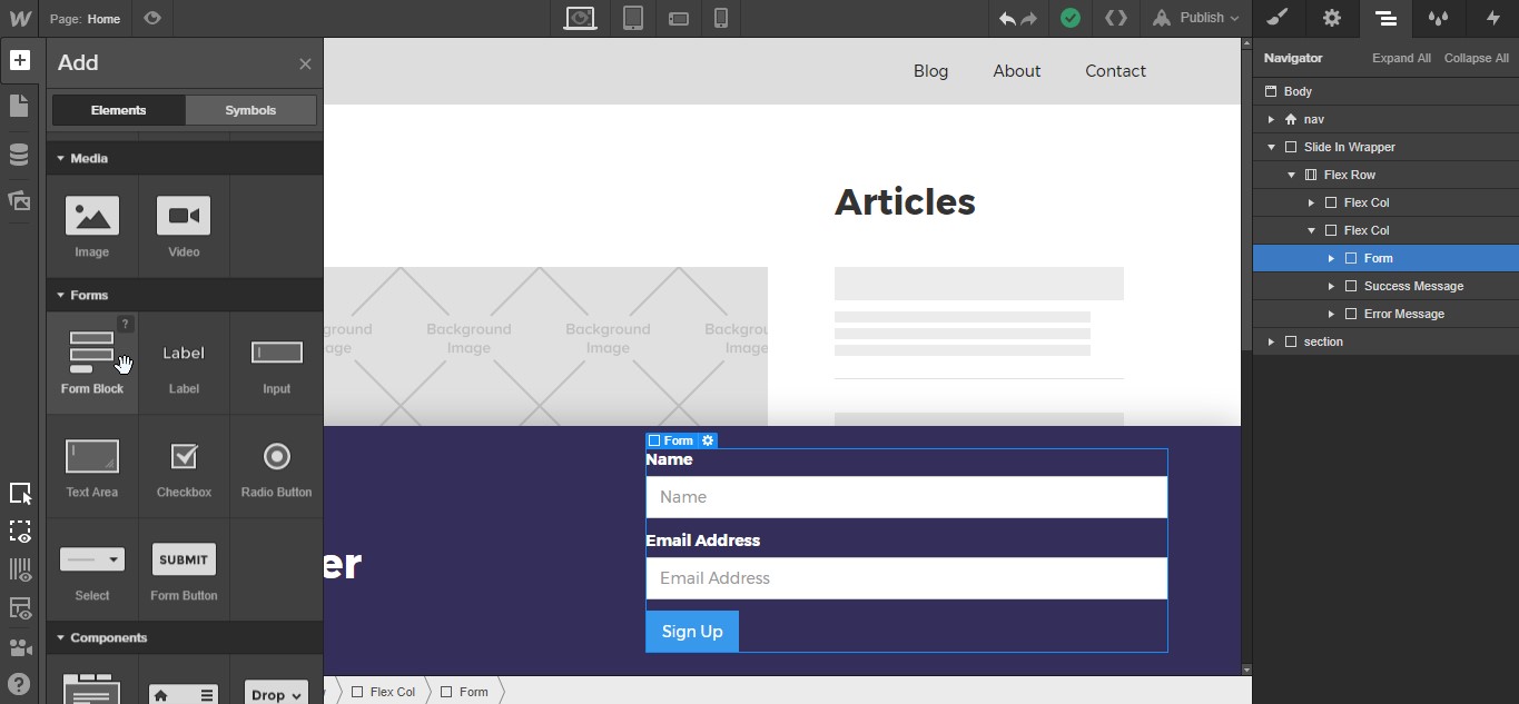
In the second Flex Col add a Form Block.
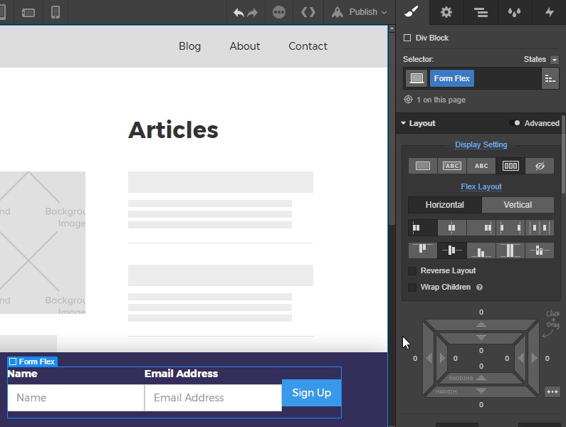
Add a div block to the form block and name it “Form Flex” and use these settings:
- Display: Flex, Horizontal
- Justify:Start
- Align:Center

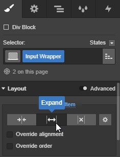
Add a further two divs to the Form Flex div. Call them both “Input Wrapper” and set them to expand.
In each input wrapper div, place one Label and one Input Field.
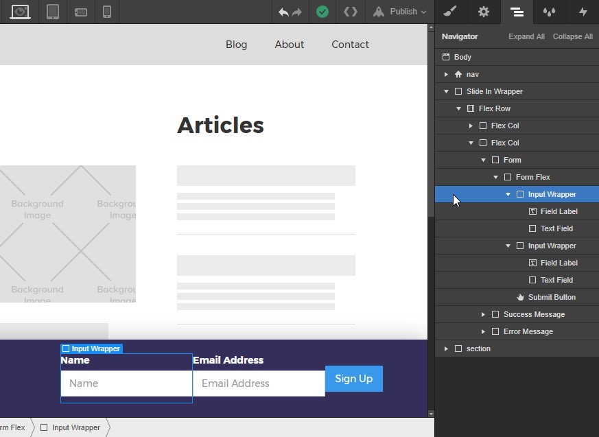
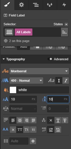
Let’s style the form elements. First select the All Labels default class.
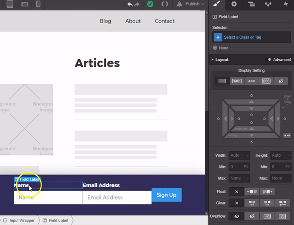
And apply these settings to the labels:
- Weight: Normal
- Size: 10px
- Line Height: 10px
- Text Transform: All Caps
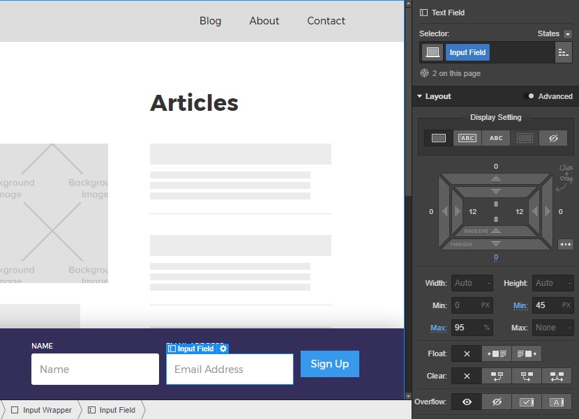
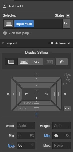
Next, give a class of “Input Field” to both form inputs.
Apply these styles:
- Bottom Margin: 0px
- Min Height: 45px
- Max Width: 95%
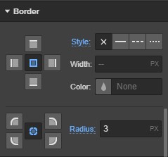
- Border Radius: 3px (remove the default border settings)


Design interactions and animations without code
Build complex interactions and animations without even looking at code.
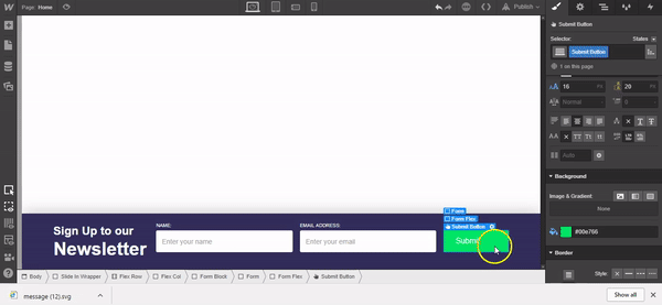
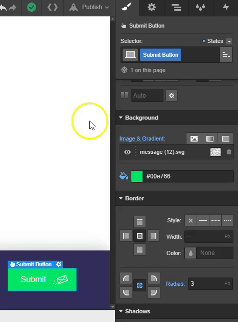
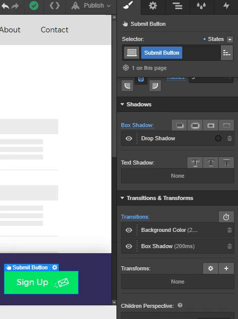
Now we’ll move and style the submit button, place the submit button at the end of Form Flex div, and give it a class of “Submit Button.” Add these settings:

- Flex Item: Shrink if Needed
- Override Alignment: Align Self End
- Top and Bottom Padding: 13px
- Left Padding: 25px
- Right Padding: 60px
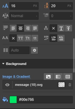
- Font Size: 16px
- Background Color: #00e766

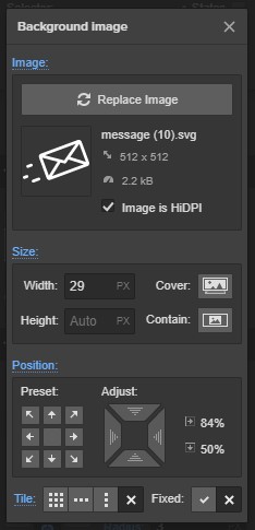
For the mail icon, I used this one from Flaticon. Once you’ve added the icon to the assets panel, add it as a Background Image to the button and use these settings for the placement of the background image/icon:
- Width: 29px
- Position: 84%
- Tile: None
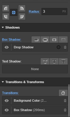
- Border Radius: 3px
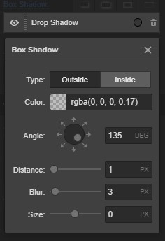
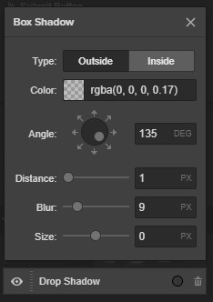
Drop Shadow Settings:
- Color: rgba(0, 0, 0, 0.17)
- Leave all the other settings as default.
Scroll down to the Transitions & Transforms section in the styles panel, click on the timer icon in the top right, and choose Background Color from the dropdown menu, followed by another transition of “Box Shadow.” Leave both styles in their default state.
Next let’s adjust the hover state of the submit button. Click on the states dropdown menu on the top right of the styles panel and select hover.
Then change the background color to #00ca59 and adjust the drop shadow blur setting to 9px.
We’re done here! Time to add the Interactions.
Step 3: Add interactions
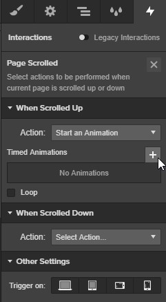
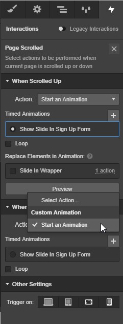
Select the Slide In Wrapper and open the Interactions Panel. Select the plus icon on the section for On Current Page. From the dropdown menu select the interaction for Page Scrolled.
Click on the dropdown menu in the section for When Scrolled Up and select Start an Animation.
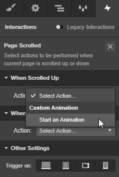
From here, select the plus in the top right of the When Scrolled Up section.
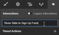
Name this interaction “Show Slide In Sign Up Form.”
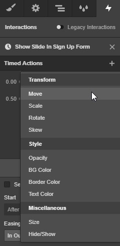
Click on the plus icon next to the Timed Actions text. Select the option Move from the dropdown menu.
Set the Easing to “In Out Quart” and leave the default duration of 0.5s. In the Move section at the bottom, set the Y position to 0%.
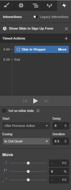
We’re done with this interaction. Close this level by pressing the X in the top right of the panel.
Go back to the Page Scrolled interaction, scroll to the section When Scrolled Down and add a new interaction by selecting Start an Animation from the dropdown menu.
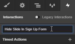
Click the plus in the top right of this section. Name this interaction “Hide Slide In Sign Up Form.”
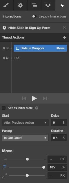
Add an interaction of Move from the dropdown menu by pressing the plus icon next to the text Timed Actions.
Set the Easing to “In Out Quart” with a Duration of “0.4s” and add a Y position of “105%.”
Nice work! Now test it out!