

Famous logos are like timestamps for the history and evolution of design — making them one of the best sources to better understand elements of design and design trends.
Just by looking into previous logos from famous brands, we can see how developments in technology as well as the era’s zeitgeist and design trends influenced the overall logo design.
This lets us understand why certain companies and brands have had to undergo redesigns — as companies often seek to align with the present day’s social climate or simply evolve with the times, culturally and aesthetically.
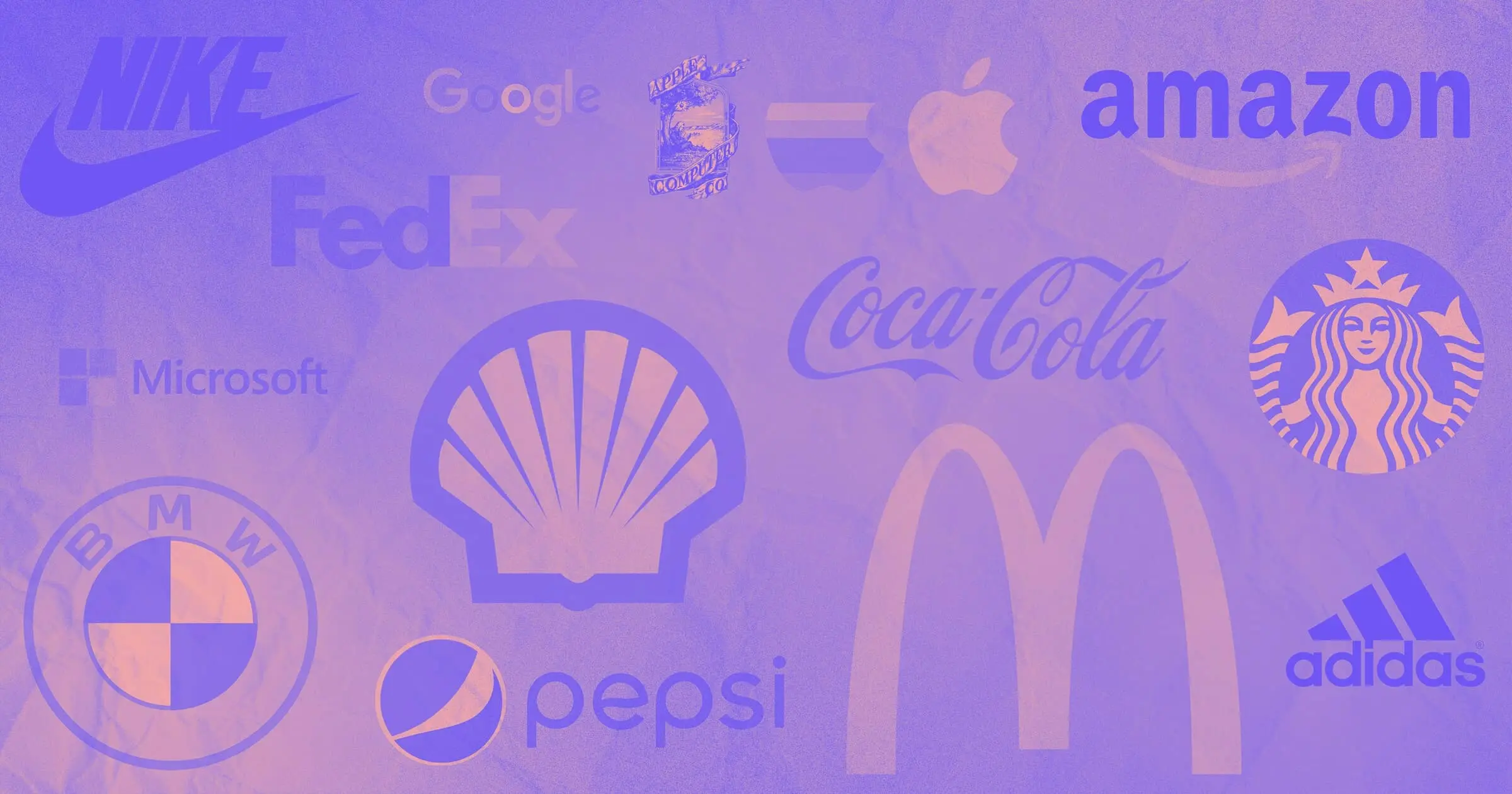
Let's see what we can learn from these 13 famous logos.
1. McDonald's

With a logo as notorious as McDonald's, it’s hard to imagine a time before the yellow ‘M.’ However, they didn't come up with those iconic golden arches overnight. That’s what makes McDonald's logo evolution all the more interesting.
The year is 1960. McDonald's was looking to cement its identity — and they landed on the golden arches.
The 1960 design closely resembles their restaurants — golden arches mimicking the actual arches of the buildings with the cross through the arches representing the rooftop.
It wasn't until 1968 when they dropped the cross and added the name through the arches to create not only a cleaner design but also establish a clear brand identity. The 1975 logo design gave us the McDonald’s look we’re familiar with today.
2. Amazon

Like McDonald's, Amazon also has quite the logo design evolution story.
Initially, Amazon lacked a cohesive design and overall brand identity. But considering they were the one of the first ecommerce platforms — that lack of identity isn’t surprising.
Clearly the early 1988 logo with a large ‘O’ didn’t last long — in the same year Amazon switched to a lowercase type font wordmark with whitespace and an orange underline. And finally in 2000, the orange underline transformed into a smiling arrow connecting the A and Z, symbolizing the wide variety of items available on Amazon, covering you “from A to Z.”
3. Coca-Cola

Coca-Cola leans into nostalgia by using a throwback to a previous design for their current logo. While many brands are embracing throwback logo designs now, Coca-Cola has kept their logo fairly consistent since reverting back to the 1941 design style in 2004.
While there was nothing particularly wrong with the 1987-2003 logo, it’s still a product of its time. With the bolder type font and straightened glyphs, the 1987-2003 design embodies the flirty, bold yet simplistic design tropes of 1980s American advertising with its bright cherry red wordmark.
Yet, as the millennium came upon us, fashion, design, and culture trends evolved. By 2003 the logo was no longer revered as fresh and bold — it appeared clunky and dated. Coca-Cola needed a new logo.
This is a fascinating peek into a designer's process. Perhaps their team made several iterations before they realized that they’d already perfected the design back in 1941.
The Coca-Cola logo is one of the best logo wordmarks because the company Coca-Cola itself is aware of its cultural significance. An elegant and vintage design is fitting for their timeless brand.
4. BMW
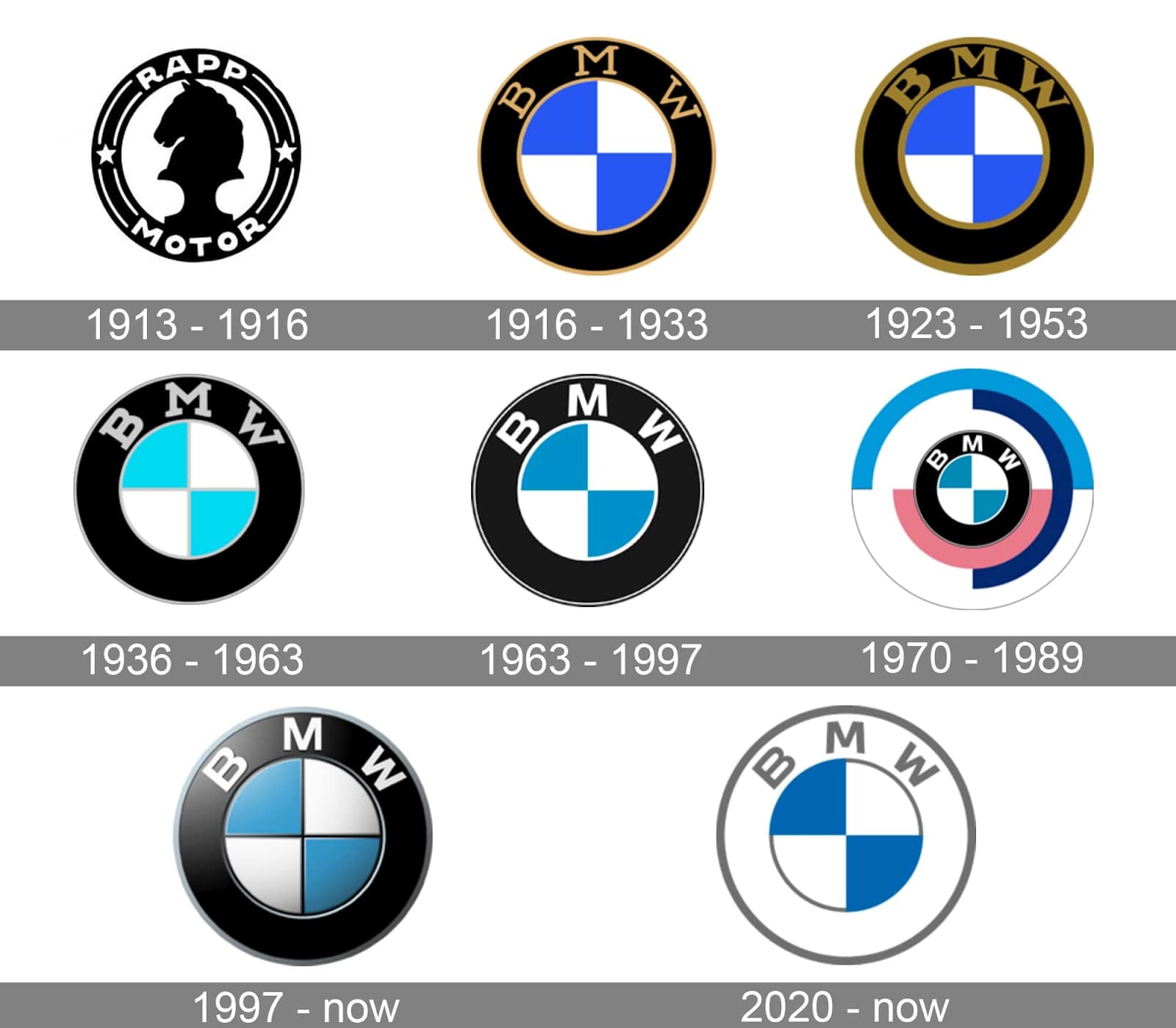
Let's venture outside of the United States and check out BMW's logo monogram design. Like Coca-Cola and McDonald's, BMW's first designs date back to the early 1900s.
At first glance, BMW seemingly hasn't done much to change its logo design. But if we look closely, we can see their team gradually lighten the design — trading dark golds for gray and white, creating visual balance in the process.
From the 1997 design up until 2019, BMW kept the same logo, similar to the 1963-1997 design but with an added 3D element. Yet as the company entered into the next era, so did their design. In 2020, BMW traded in dark black for a bright and luminous white, and eliminated the 3D.
5. FedEx

The FedEx logo is a textbook example of using negative space to create an optical illusion with a hidden message, symbol, or silhouette.
If you look closely, FedEx’s current logo has a cleverly placed arrow between the “E” and the “x” that suggests getting from point A to point B as well as FedEx’s ambition for speed and precision.

FedEx’s logos from 1973-1994 were clunky and dated, with darker hues that made the logos feel muddied and dull. And while in their 1991-1994 design we can see them begin to play with design elements and principles — this design was still transitional.
FedEx was purchased in 1991 and the company hadn't yet solidified its brand identity, let alone the company logo. Their brand logo was still rough, but it introduced their new name and moved closer to the present day logo — which is where graphic designer Lindon Leader comes into play.
Lindon brought his love of minimalist designs and whitespace to the famous logo we see today. Lindon wanted to create a logo that could better communicate what FedEx does.
And what does FedEx do? It moves things. Lindon worked his magic, using negative space to create an artfully placed arrow — and an iconic new logo was born.
6. Nike

If you're a graphic designer or graphic design student, you might be familiar with the name Carolyn Davidson, if not the name, then perhaps her story and association with the Nike logo.
Carolyn was barely at the start of her career when she met Nike’s co-founder Phil Knight entirely by chance. Carolyn was hanging out with some friends talking about how she needed extra money and Phil offered her a $2/hour design gig. A few sketches later and the iconic swoosh was born.
Interestingly enough, Phil did not initially like the swoosh logo. Luckily, the swoosh won out — solidifying the Nike logo as a widely recognizable and famous logo around the world.


Get started for free
Create custom, scalable websites — without writing code. Start building in Webflow.
7. Shell

Shell's logo design evolution is interesting due to its various design iterations.
The visual of Shell’s logo design from 1904 to the present day serves as the ideal example for design evolution. Each rendition of the logo design modernizes due to the technological advancements of the respective era.
This is particularly evident in their 1948 redesign. With advances in print and advertising, Shell introduced color and chose a yellow and red color scheme. This warm, yet energetic color combination encapsulates the sociological and cultural transition into 1950s postwar America. The war was over and American society looked forward to the coming decade. Advertising agencies aimed to sell the idea of the future of America by depicting the colorful, warm new American suburbia.
Today, the warm hues of red and yellow remain, but the logo has since dropped the word “Shell” and now uses a bold, thick outline.
8. Apple

Graphic designer Rob Janoff took Steve Jobs' original logo design and reimagined it to be the quintessential Apple logo design we've all come to know over the past 40 plus years.
While the idea behind the original concept is understandable, it was too complex to be an effective logo.
Rob took Steve's artsy concept and re-envisioned it as the beautiful, minimal, and bold Apple logo we all know today. Finishing off the Apple logo with the rainbow color scheme (up until 1998), Rob created the foundation for one of the most famous logos in existence.
Although Apple’s logo is simple, it’s also known for its incorporation of a deeper meaning. The bite represents knowledge, much like Adam and Eve's biting of the forbidden fruit in The Garden of Eden. This implies that by using Apple products we too are discovering and understanding things that would otherwise be unseen.
9. Microsoft Word
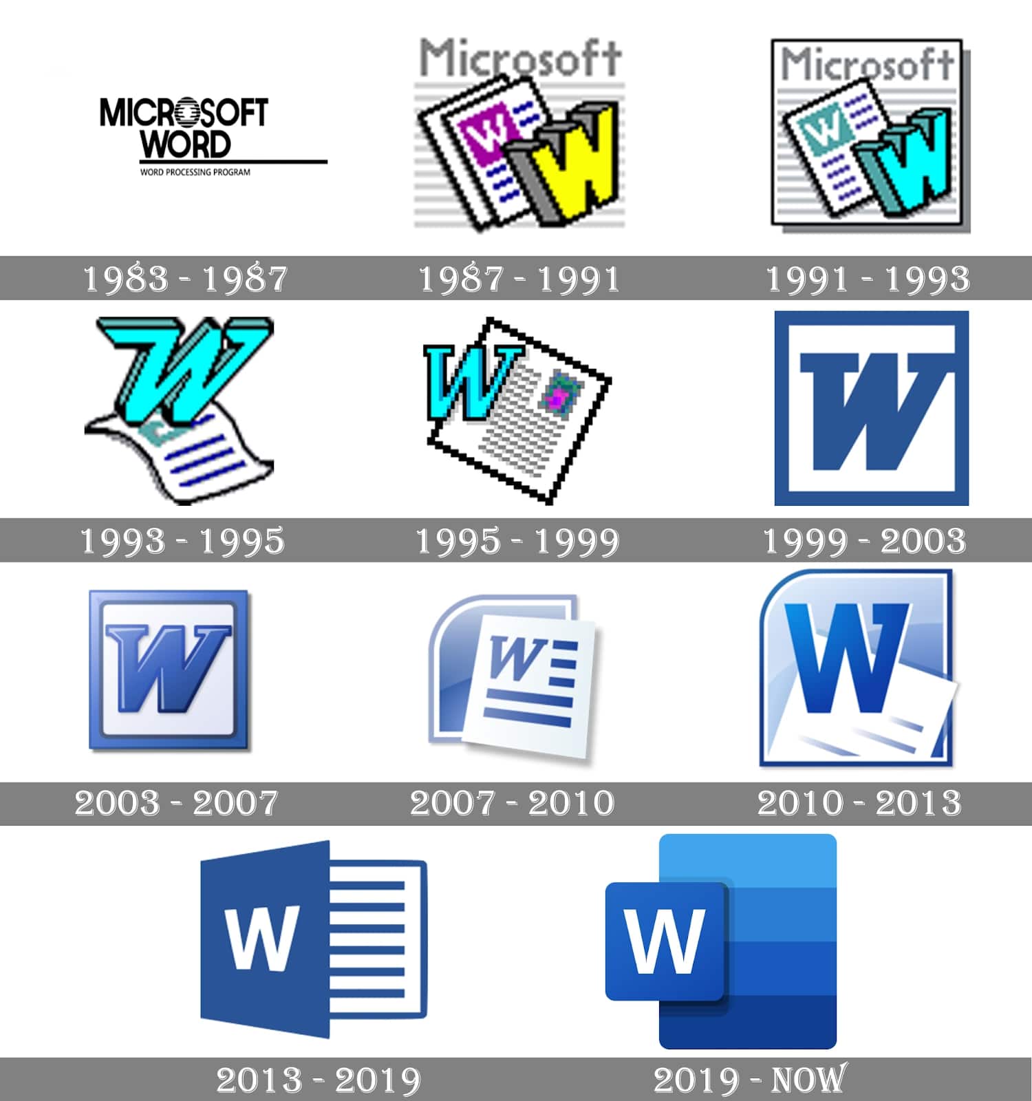
Microsoft Word's logo evolution is something many of us are familiar with. Think back to your childhood and you’ll certainly remember at least one rendition of the Microsoft word monogram logo.
If you grew up with one of those old massive desktops with dial-up and your parents never cared to purchase the latest software release, you're probably familiar with the 1995-1999, 1999-2003, or 2003-2007 logo designs.
Each of these is a testament to the advancements in digital technologies and arrival into the age of the internet and, well, good taste. Looking at the logo variations, we see that each iteration was likely influenced by the particular time's design trends.
The stark difference between the 2013-2019 design and the current logo is particularly fascinating. The earlier logo is muted and harsher, while the newer logo demonstrates the shift to soft and ‘gummy’ 3D design trends we often see in today’s illustrations and icons. The present design is soft and fluid, using color to evoke both movement and unity as well as an emphasis on the W through layout spacing.
10. Starbucks
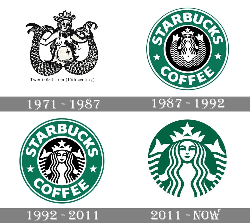
While it may seem like the famous green and white siren Starbucks logo has been around forever, they didn't start with this design. Originally, Starbucks was a local Seattle-based coffee shop, so a traditional, monochrome design suited the current time, audience, and brand identity. And while the 1971-1987 design is different, it’s clear that Starbucks still had a ways to go to get to the current, world-famous logo.
In 1987, we see the first inklings of the logo we know today. This is when we see the first redesign of the siren, wordmark of the brand, and incorporation of the green and white color scheme. In the 1992- 2011 design, we get a another small shift in design — moving to a close-up of the siren and a change in typeface.
This leads us to the present-day logo design. In 2011, Starbucks opted to drop its wordmark and modify its black monochrome siren to take on a green and white color scheme. By removing these heavy black details, Starbucks brought new life into its logo.
The change in composition and coloring make the logo feel bright, elegant, and lively. Starbucks’ new logo is fresh and holds up beautifully to today’s design standards.
11. Adidas
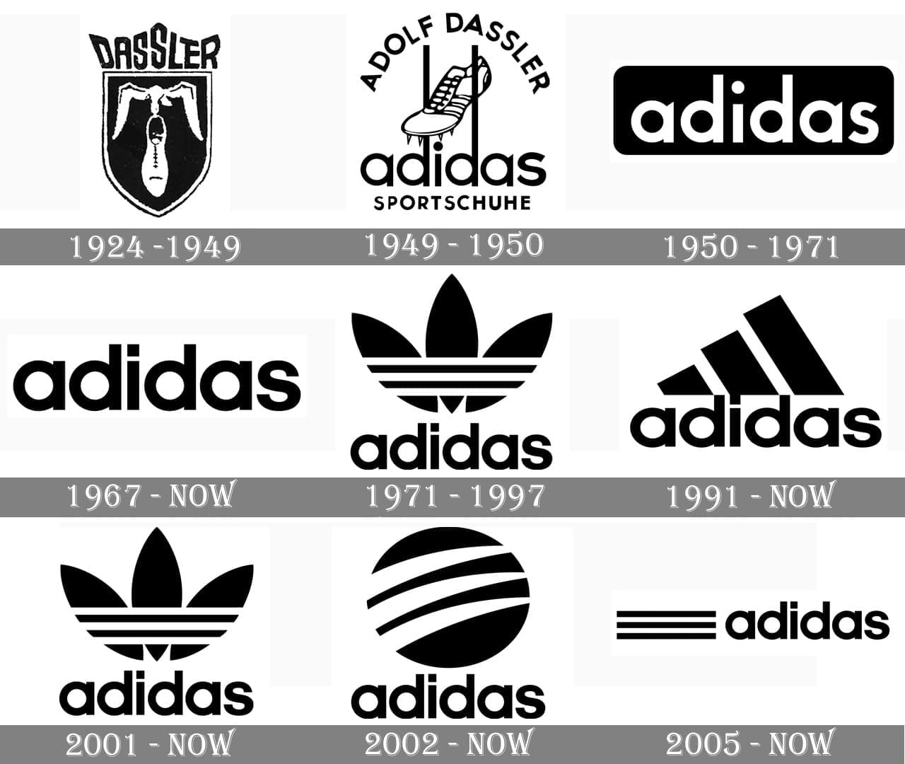
Adidas is a wordmark logo that leans into simplicity. While the 1924-1949 logos included drawings of shoes and other elements — by 1950 Adidas landed on a monochrome wordmark design.
In 1967, Adidas made their first major iteration by inverting the color scheme so that the wordmark itself was black — surrounded by whitespace. This made the logo feel more mature than the prior version and conveyed the confidence and certainty of a brand ready to expand its position in the global marketplace. This was the dawn of Adidas's official brand logo.
By 2005, Adidas added 4 logo designs to their branding, their striped trefoil, Adidas mountain, round emblem, and Adidas wordmark. Each of these designs takes variations in its color scheme depending on the company's current social media and marketing campaigns.
12. Pepsi
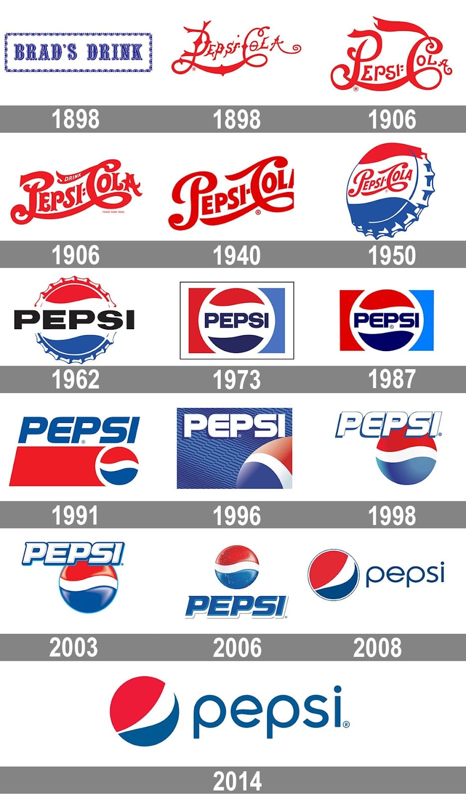
Each Pepsi logo design beautifully captures the spirit and trends of its time. The 1950s logo design is reminiscent of Elvis Presley’s rock and roll, swing skirts, and the dawn of American suburbia. The 1970s — on the other hand — embodies a modernization with a redesign of the bottle cap emblem and the inclusion of a more muted color scheme.
Pepsi’s logo went through several revamps throughout the 90s and early 2000s. In the end, the company decided to change their iconic emblem, inverting the circle so that the wave would resemble a smile.
This minimalist design aligns with today’s progressive and youthful design trends with the lowercase sans serif typography and curvy play on the 'e.’
13. Google
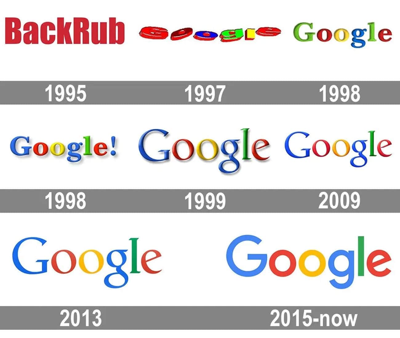
Google’s logo has gone through quite the beautification process. And while it hasn't deviated much in terms of color and placements, its previous iterations are internet time capsules.
It wasn’t until 1998 when we were introduced to the first official, now-classic Google logo — the colorful wordmark with white space. However, only a year would pass before the next redesign.
In 1999, designer Ruth Kendra stepped in to show the world Google’s full potential. She gave the wordmark a slight overcast, elongated the typeface, and dropped the exclamation point. This 1999 design would remain in place for about 10 years, eventually dropping the overcast to better align with the evolving design trends.
The 2015 sans serif iteration aimed to cement Google’s brand identity as friendly, approachable, and simplistic. This design also makes it easier for their team of designers to manipulate and play with the Google logo for their online marketing campaigns, including themed Google Doodles.
The many lessons to be learned in a logo's design evolution
Evolutions in logo design and design as a whole are a testament to changes in society, technology, and coming generations. Each of these factors influences our popular culture, and thus our tastes and perceptions. As a result, new design trends are created and the overall standards in design yet again evolve.
That said, there are many more lessons to be learned from exploring a logo's design evolution so continue your journey by checking out the past logos of your favorite brands.