


Web designers have come up with some pretty clever tricks to give their work a sense of physicality.
Glassmorphism is one such technique. When you combine a blur effect with transparency, pixels take on the slightly opaque quality of frosted glass — adding a touch of texture and dimensionality to the design.
While glassmorphism itself isn’t new, the term has only been in the parlance of web designers for a short amount of time — with Michal Malewicz coming up with the term in just 2020.
The evolution of glassmorphism
We can trace today’s glassmorphism back to skeuomorphism’s primitive attempts at realism. In the 1990s and the early 2000s, computers were getting better graphic capabilities and data rates were speeding up. These advancements enabled designers to create websites that leaned heavier on visuals — making skeuomorphism possible.
Rather than coming up with novel UI elements, designers set their sights on replicating what people were familiar with in the real world. With Skeuomorphism — designers aimed to translate how we interact with the physical world into a digital experience. Extravagant gradients, heavy drop shadows, and excessive reflections dominated websites. Textures meant to look like plastic, metal, and even wood grain were liberally seen across designs.
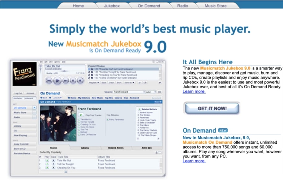
Musicmatch’s UI from 2004 is a great example of skeuomorphism — from the controls of the music player to the file-folder like tabs and overly chiseled buttons.
Glassmorphism employs a lighter touch than the densely packed pixels and hard edges of skeuomorphism. It captures the look of glass — but isn’t skeuomorphism in the traditional sense. It isn’t meant to trick anyone into thinking they are looking at glass. Rather, it invokes the feeling of it.
A great example of glassmorphism can be found in Apple products. When iOS7 released in 2013, iPhones featured translucent gray backgrounds adding a light haze to the icons beneath them. Apple gave another boost to this design style in 2020 with the MacOS Big Sur update, which featured glassy menu drop-downs and translucent sidebars.
But glassmorphism isn’t exclusive to Apple products — Microsoft Windows Acrylic Design system and Windows Vista both use glassmorphism in layering windows over each other and establiishing hierarchy.
Glassmorphism UI remains popular. Buttons, navigational options, sliders, and other UI elements stand out when their crisp lines are laid on top of a glassy blur. Instead of fighting for attention on the same dimensional plane, glassmorphism gives a tiny visual boost — making the elements more obvious to anyone scrolling through.
How to create the glassmorphism effect
Glassmorphism adds a veiled layer of transparency. Designers create it through a mix of layering, opacity, and blur value. Drop shadows and borders are sometimes added to further sharpen the sense of dimensionality.
Soft focus glassmorphism
Mirela’s Prifti’s typography-effect project is an example of a soft focus glassmorphic effect. The background image is blurred beneath a blanket of gray, which gives the overlaid text a sense of definition.
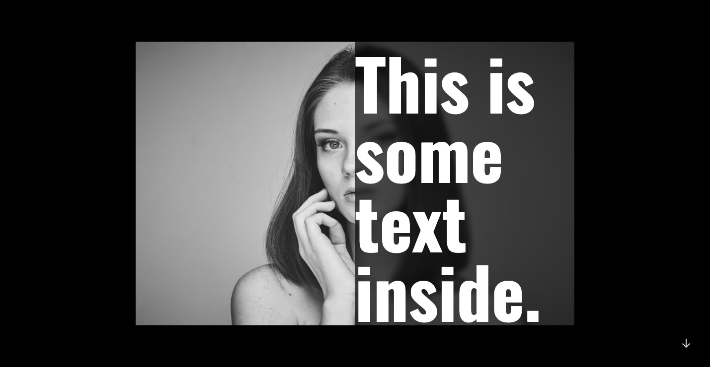
Blur is one of the key aspects of glassmorphism and also one of the trickiest to get just right. The goal is to make the background image appear as if the viewer is looking through an out-of-focus lens, but not so much that it gets lost in a haze of pixels. However, too light of a blur on the top layer allows the background details to bleed through and clash with what’s in front.
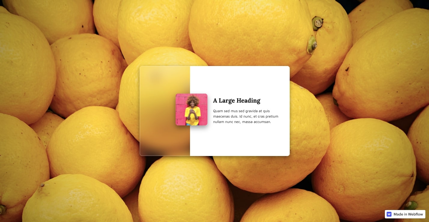
The bottom layer may be a shape with a solid fill or an image without any transparency. The top layer gets a low opacity, allowing what’s behind it to shine through. This stack of contrasting layers anchors one element to the screen while still making the second layer look like it’s floating on top.
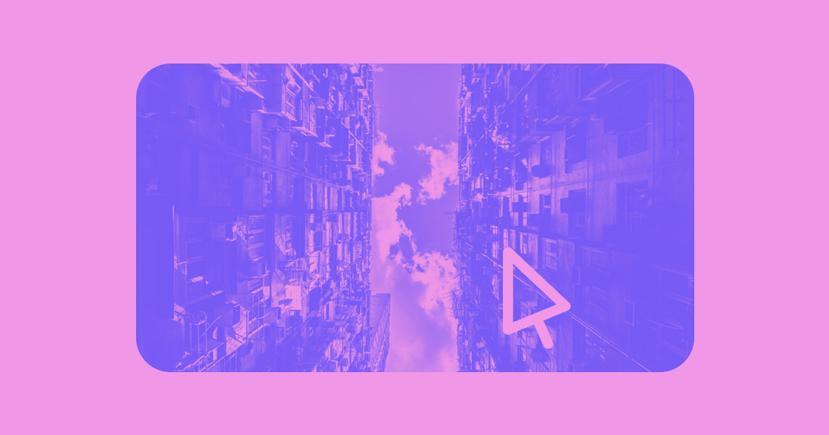
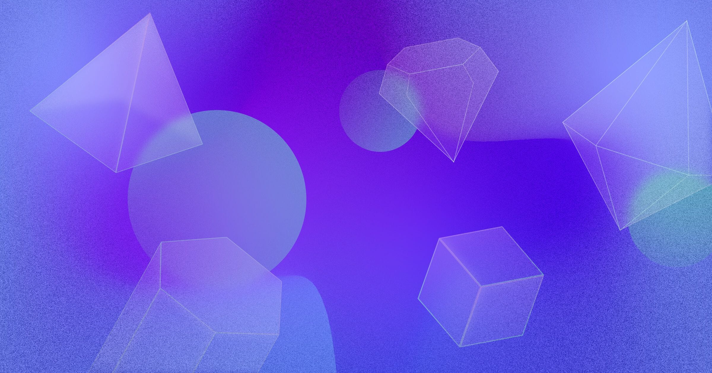
Glassmorphism to create imagery
With a quirky assortment of shapes, this image from designer Dmytro Serebrennikov shows the artistic possibilities of stacking different shapes together.
.jpeg)
For glassmorphism to have the biggest impact, there needs to be something visually engaging behind it. This could be a geometric shape, gradient, or even a photograph. Since what’s in the background is going to be distorted through a glassy blur, bright colors and dramatic shapes work best.
Thin borders and subtle shadows
Designer Artem Abramov uses thin white lines and border-radius to create rounded rectangles that define the top layer of the design.
Because glassmorphism relies on a blur effect, putting a border around the glassmorphic element helps provide definition. In the image above, the borders not only separate the information, they also mimic the shape of a phone screen.
Ideally, borders are lightweight so they don’t distract from the design. Including a hint of a shadow can also add to the sense of dimensionality. Use a delicate touch. Understatement is key.


Get started for free
Create custom, scalable websites — without writing code. Start building in Webflow.
Examples of Glassmorphism
Now that we’ve covered how to pull it off, let’s see some of the ways designers are using it.
Frosted glass
This frosted glass cloneable template embodies all we love about this effect. The hero section offers a cloudy portal to the background, with an image laid on top of it. In addition, a micro-interaction shifts this rectangle on the z-axis, further adding to its sense of dimensionality.
Glassmorphism tutorial
T.Ricks delivers a solid example of glassmorphism in action while teaching you how to use it in your Webflow projects.
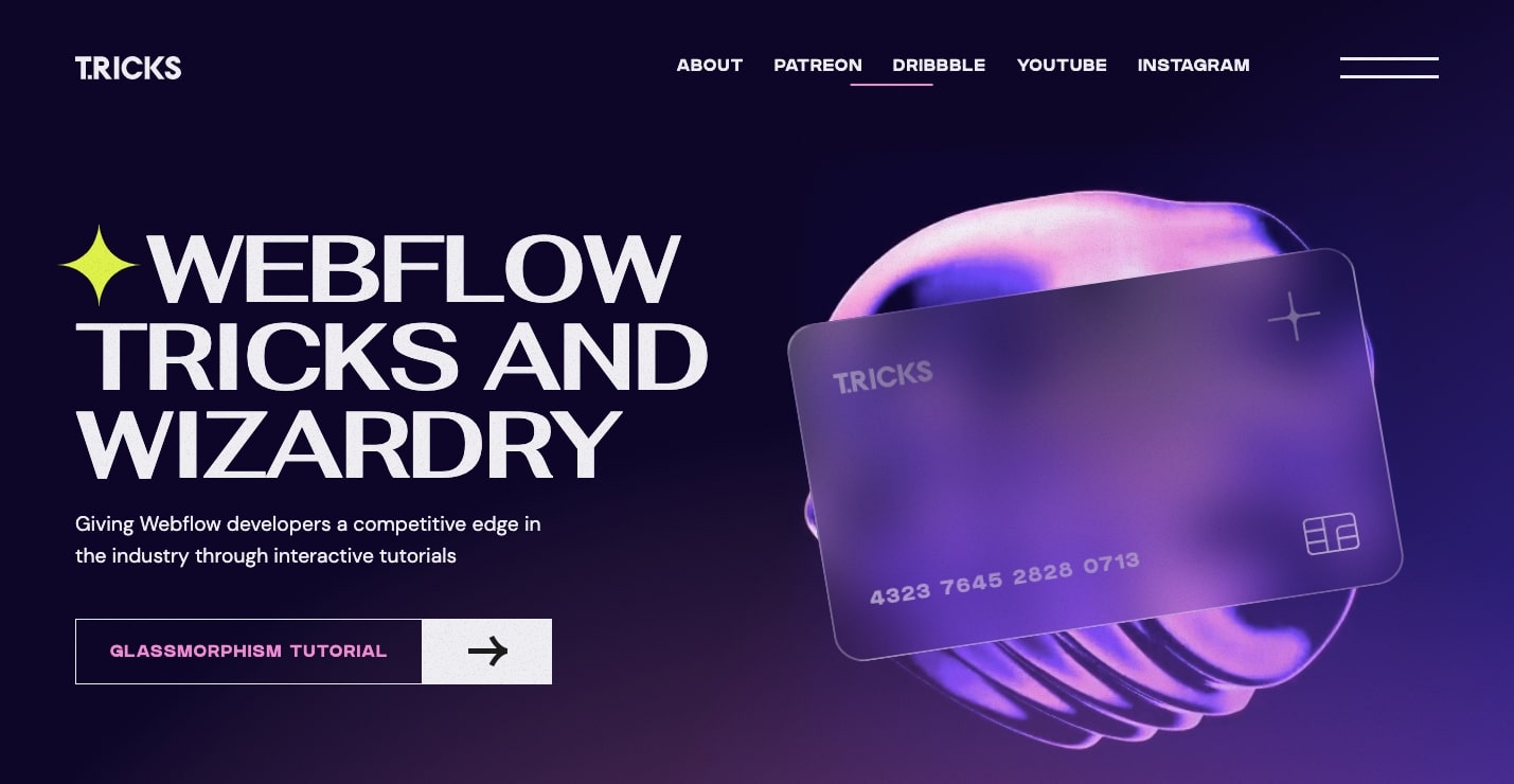
This lesson walks you through how to create this stunning glassmorphic effect featuring a translucent credit card hovering over an amorphous, liquid sphere. When applied to an element like a card, glassmorphism lays down a translucent veneer. Placing something like a button, image, or text on top of it gives it the illusion of being closer to the viewer. It’s an effective way to establish visual hierarchy and to grab someone’s attention.
Conquer the jungle
Travel agency Conquer the Jungle uses glassmorphism to draw your eyes to their three main tours.
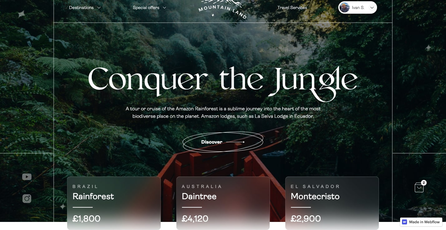
In a standard card layout, the tour blocks would be on the same level as everything else, which would make it easy for them to get lost in the busy tropical background. The layered, frosted glass effect makes the boxes pop off the page and draws your eyes straight to the tour packages.
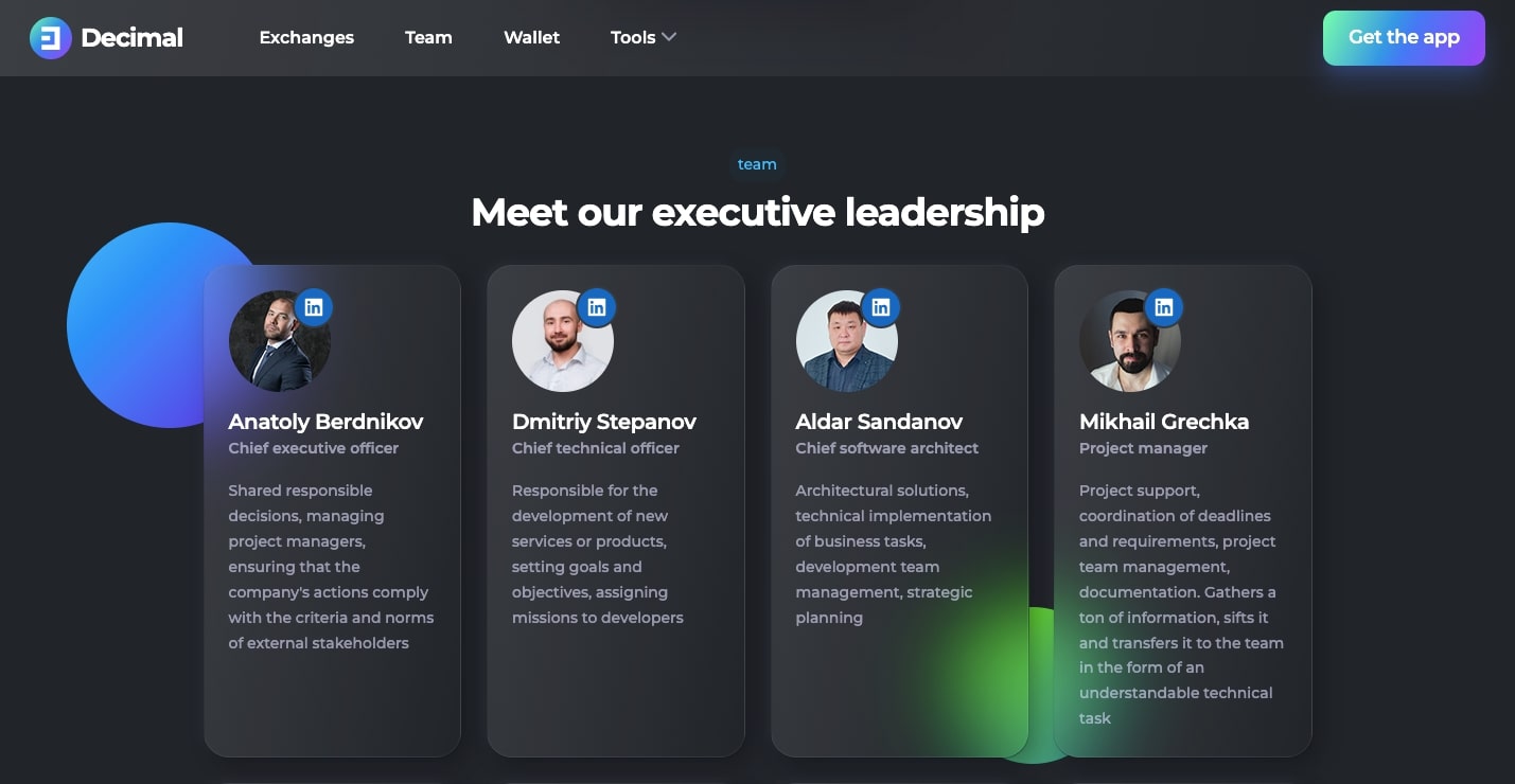
Decimal Chain
Team pages are often just a grid of professional-looking faces. There’s nothing wrong with going with this traditional approach, but a dash of glassmorphism can make the layout more visually engaging. Decimal Chain shows off their team members in these slightly blurred cards.
The colored background circles are refracted through each card, creating ambiance and mimicking frosted glass. By gently lifting each content block off of the screen, the glassmorphic effect grabs your attention.
Give your next design a touch of glassmorphism
As much as we love minimal and flat designs, it’s nice to see designers using depth and space. Glassmorphism lets you mold screen space into something that has dimensionality. All it takes is stacking a few layers, adding in some blur, and then fine-tuning the values until you end up with something you like.
Feel free to post your own glassmorphic explorations in Made in Webflow, we’d love to see what you’re working on!
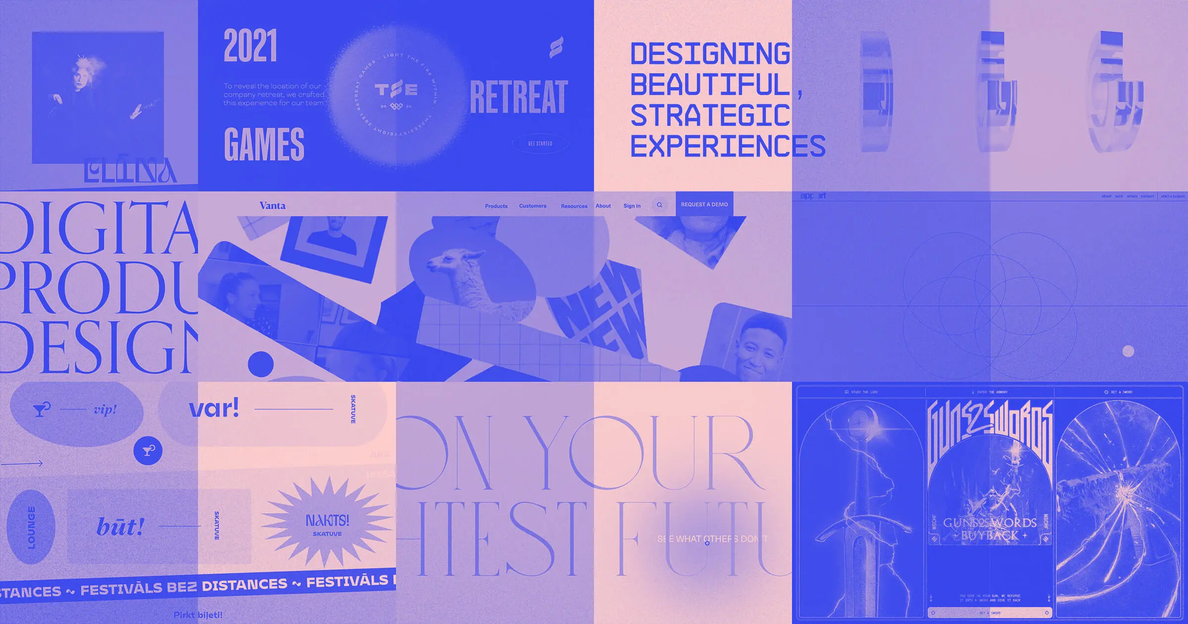
Discover inspiring design work from the Webflow community
Made in Webflow is the place to browse, clone, and customize the latest websites built by the Webflow community.