

Optimize your images to enhance your web design.
Images play a critical role in a visitor’s experience with your site — they can enhance a site’s user experience by showcasing your product or services and reinforce your branding. But if images are slow to load on a website, visitors might get frustrated with the slow load time and bounce before they even engage with your site.
That’s why fast load times are essential for a responsive, seamless user experience (UX). They’re also a key indicator that search engines use to rank results. But adding too many unoptimized images to your site can slow down the UX considerably.
You can strike the perfect balance between visual appeal and performance by optimizing images. To optimize images for the web, you’ll need to compress and resize them to reduce file sizes and improve load times. Let’s explore how to do that, as well as some handy image optimization tools.
What is the process of optimizing images for the web?
Here are five website optimization techniques to ensure pages load fast and users have an efficient site experience.
1. Choose the right file format
You should use three primary image file types on your site: SVG, WebP, or AVIF. These formats offer transparent backgrounds, allowing you to overlay them seamlessly.
Here’s how to use them:
- SVG is for icons, text, and logos that must appear crisp and colorful on any screen size. Their file size is tiny, so they won’t add much to your load times.
- WebP and AVIF are for responsive, full-color photos like slideshows and carousels. They’re much smaller than PNGs and JPEGs, making them an excellent replacement for large photos that would otherwise slow load times.
2. Compress file sizes
Compression involves removing redundant information to reduce image sizes. Converting JPEG and PNG files to WebP and AVIF is one form of compression. But you can reduce file sizes even further with tools like TinyPNG and Optimole. The plugin ShortPixel can even do it from within your browser window.
Whenever you compress images, pay close attention to the type of compression:
- Lossy compression, like JPEG, significantly reduces the pixel count to create a much smaller file size but results in blurry images.
- Lossless compression, such as PNG, removes repetitive data without degrading image quality. This process retains all the original information from the file — it just makes it more efficient.
If you need to compress many image assets at once, Webflow offers a conversion tool that turns images in your web designs into WebP and AVIF formats. Both formats support lossy or lossless compression.
3. Optimize file dimensions
Most devices feature high-resolution screens with excellent pixel density. These screens often double the pixel count to make images sharper.
To ensure your visuals remain crisp, resize images to double the dimensions of their display container. For example, a 300 x 300 frame (or display area) should contain a 600 x 600 image. This practice ensures pictures appear sharp on high-resolution screens while maintaining responsiveness and fast loading times.
However, this strategy also increases the file size, negatively impacting your load time. To mitigate this impact, use a content delivery network (CDN) to store your files on servers spread around the world. When users navigate to your site, the CDN server closest to them serves the image to ensure it loads quickly. Some specialized CDN services, like Optimole and ShortPixel, compress and resize your images automatically.
4. Lazy load your images
It’s best practice to use eager loading for images near the top of your page and lazy loading for images that users must scroll to see. This typically results in better page load speeds.
With lazy loading, browsers don’t load images until they come into view on the page. This strategy ensures the page loads faster because it has fewer components to load up front.
However, some images should load as soon as the page opens to improve performance scores, which is where eager loading comes into play. This approach tells browsers to load images immediately. This has the added benefit of improving performance scores, like contentful paint.
To mark an image for lazy loading, add the loading="lazy" attribute to its <img> element. For example:
<img loading="lazy" src="example.com/sample.jpg" alt "..."/>
In Webflow, you can change the way each image loads in the image settings. Images that appear near the top — considered critical assets — can be set to “Load: Eager” so they load as soon as readers open the page.
5. Add alt text
Alt text provides screen readers with text to describe images to visually impaired users. Without it, these website visitors will have a poor UX. Additionally, if an image doesn’t load properly, users still get a description of the visuals.
When writing alt text, use simple language to describe the most important parts of the picture. Explain the image’s main features and list any essential text. With this information, all website visitors can access and understand your content.
Another great reason to include alt text is that search engines prefer it. When users have a great experience, it reflects well on the platform. So, web crawlers scan your page to check for specific search engine optimization (SEO) image optimizations that indicate an excellent UX, and alt text is one indicator they check for. If you use alt text and other accessibility optimizations consistently, search engines will prefer your content over sites that don’t.


Ultimate web design
From 101 to advanced, learn how to build sites in Webflow with over 100 lessons — including the basics of HTML and CSS.
Which image optimization tools are worth trying?
Optimization tools simplify the process by compressing and resizing images automatically. The following three tools offer robust, reliable features that adjust file size, format, and delivery.
1. Optimole
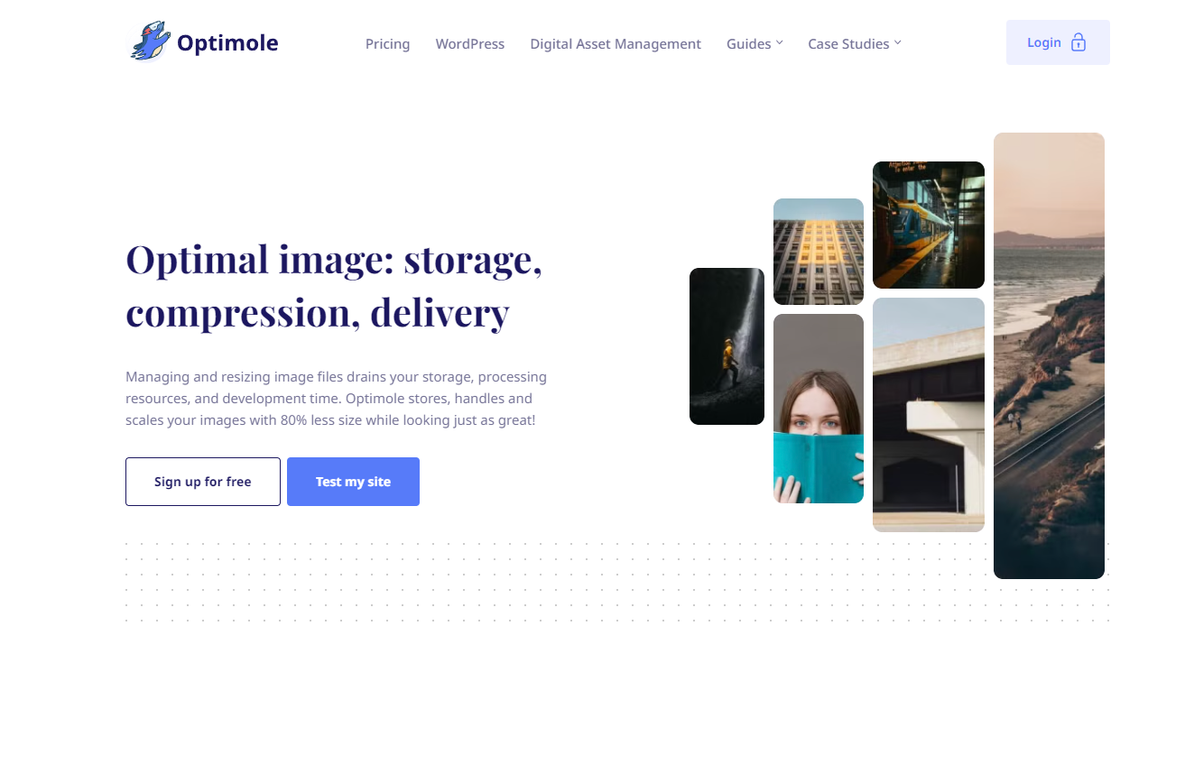
Optimole is an all-in-one tool that’s entirely cloud driven, so it doesn’t slow down your system or server. It’s an excellent option for sites that use many images, like ecommerce listings and digital galleries.
This set-it-and-forget-it tool has several automatic processes that significantly improve load times with minimal maintenance. Optimole compresses files in bulk and marks images for lazy loading on its own. Plus, the platform offers scalable plans depending on your business needs.
2. TinyPNG

TinyPNG by Tinify specializes in lossy compression without visible quality reduction. Their intelligent algorithm uses lossy compression processes but has better color matching and pattern recognition. The end result is a compressed image that looks lossless. Contrary to the name, this platform compresses more than just PNG files — it can also handle JPG, GIF, and WebP.
You can use Tinify’s basic tool for free on their website, but you’ll need to sign up for a subscription to increase your maximum file size. Whether you subscribe or not, you can use their API to shrink images.
3. ShortPixel

ShortPixel is available as a standalone web service, an Android app, and an add-on to Google Drive or Zapier. Perhaps their best feature is the Website Optimizer, which provides a web interface for their API. After you request an API key, you can use the interface to select folders you want optimized. As you add new files to those folders, ShortPixel detects and optimizes them automatically. You can even watch their progress in real time.
Create an optimized website with Webflow
Optimizing your images reduces load times and improves SEO. But most importantly, it makes your site’s UX more seamless and customer-centric.Consider using a powerful web design platform like Webflow to give your website visitors the best experience. Webflow’s responsive images and quality templates accommodate even the most ambitious web designs.
Check out Webflow for your next web design project.
Get started for free
Create custom, scalable websites — without writing code. Start building in Webflow.