Update
Website management
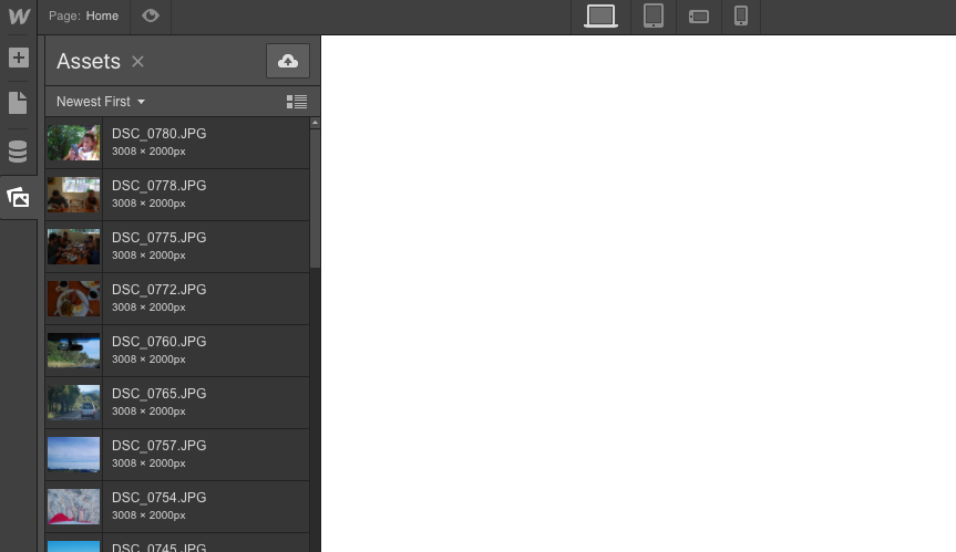
We moved the asset manager
We’ve moved the asset manager to the left sidebar, so now all the elements you add to your site live on the same side of the Designer.

In anticipation of some of the bigger features coming to Webflow in 2017, we’ve moved the asset manager to the left side of the Designer to free up space and conform to some of our existing UI patterns (much like the Symbols move in January).

Why move it?
We have a ton of great features coming in 2017 and we need to shuffle some panels around in the Designer to accommodate them. Moving Symbols and assets to the left panel is an early step toward getting these new features in place.
In addition to freeing up some room in the right sidebar, placing symbols and assets in the left sidebar makes more organizational sense. It’s always felt a little strange that some things are added from the left sidebar, while other things are added from the right. With this update, all of our additive actions will be in one place:
- Add Element
- Add Symbol
- Add Page
- Add assets
Although it might take a little getting used to, the left panel will feel like the most natural place for your assets. We think you'll be excited about the interactive features we're working on for the right panel.
Related updates
Get started for free
Try Webflow for as long as you like with our free Starter plan. Purchase a paid Site plan to publish, host, and unlock additional features.
Try Webflow for as long as you like with our free Starter plan. Purchase a paid Site plan to publish, host, and unlock additional features.


.png)
.jpg)
.jpg)


