


A user’s first impression of your website can make or break their decision to explore your site further.
In a fast-paced digital landscape where users don’t have the time or patience to navigate confusing interfaces, seamless and intuitive web experiences are paramount. User experience (UX) design emphasizes simplicity and efficiency in web design, making it critical in meeting user expectations and paving the way for successful online interactions.
What is the role of UX in web design?
User experience describes a user’s interaction with a product, such as a website or app. Through careful research, iterative prototyping, and continuous user testing, the UX design process ensures users have a satisfying experience by centering their needs, goals, and behaviors.
When it comes to design, UX encompasses every aspect of the user’s experience — including the layout, navigation, visual design, and interactive elements. It focuses on creating visually appealing webpages that are also easy to use to help visitors accomplish their tasks.
7 examples of great UX inspiration
What makes a great website UX? These examples provide website design ideas for great user experiences.
1. Phyll
Designed by the digital agency Manufactur, the website for vegan smoothie producer Phyll immediately greets viewers with vibrant colors, concise copy, and a distinct call-to-action (CTA) button. The bright visuals capture attention and evoke a sense of vitality, freshness, and openness that aligns with the brand’s values.

The messaging succinctly communicates the benefits of Phyll’s plant-based smoothies, promoting the company’s value proposition of helping users get their daily intake of fruits and vegetables. At the same time, the CTA button encourages viewers to explore the product line further, creating a harmonious experience that embraces Phyll’s “It’s time to veg out” slogan while delivering compelling information and content.

Another highlight is the site’s streamlined navigation. Scrolling over the shop on the top left opens a straightforward, easy-to-digest menu. By presenting limited options and clear categorization, Phyll avoids overloading visitors with information, which can result in them bouncing from the site.
2. BrüMate
From the creative minds of Yeti Island Studio, the site for insulated drinkware company BrüMate displays a visually appealing and functionally intuitive website experience. The homepage’s clean and modern black-and-white color scheme exudes sophistication and style while highlighting the vibrant designs of their mugs and coolers. The top navigation menu prominently displays high-level product categories, ensuring site visitors immediately grasp the full range of available products.

When users click on the “Shop now” CTA underneath the image carousel, they seamlessly navigate to a product listing page. BrüMate impresses — without overwhelming — users with a well-organized grid layout that presents their products in an easily digestible format. Options to filter products according to type, color, size, and price add to the smooth experience. The ability to add items to the cart without navigating away from the page further adds to the efficiency and convenience of this UX design.

3. Vergo Bank
A beautifully designed website isn’t just aesthetically pleasing — it’s also a joy for users to interact with and navigate through. The creator of Vergo Bank’s homepage, Joseph Berry, accomplishes this by employing parallax scrolling, a technique in which background images move at different speeds than foreground elements as visitors scroll down to create an illusion of depth and dynamism. The website unfolds like a captivating story, providing a logical flow of information and immersing visitors in an interactive learning experience about the app.

The layout and parallax scrolling not only narrate Vergo Bank’s brand story but also showcase the app’s interface and features. This visual exploration provides a clear understanding of the app and its functions, helping users visualize how easily they can use and navigate it. It also showcases the app’s potential benefits and key features, illustrating how Vergo Bank can cater to users’ financial needs.

The color scheme also draws attention to the strategically placed CTA buttons. The scrolling journey visibly positions these buttons throughout the experience to keep them visible, accessible, and top of mind, allowing audiences to take action at any point. The vibrant orange hues of the CTAs contrast nicely along the backdrop to create visual interest and guide the user experience.
Build completely custom, production-ready websites — or ultra-high-fidelity prototypes — without writing a line of code. Only with Webflow.
Build completely custom, production-ready websites — or ultra-high-fidelity prototypes — without writing a line of code. Only with Webflow.
4. Duncan Dental
Web designer Andrew Nalder demonstrates a keen understanding of Duncan Dental’s audience and their unique needs with this UX design. Concise copy works well for sites that don’t want to overload visitors with information, but the medical industry needs to provide accurate, comprehensive information to patients.
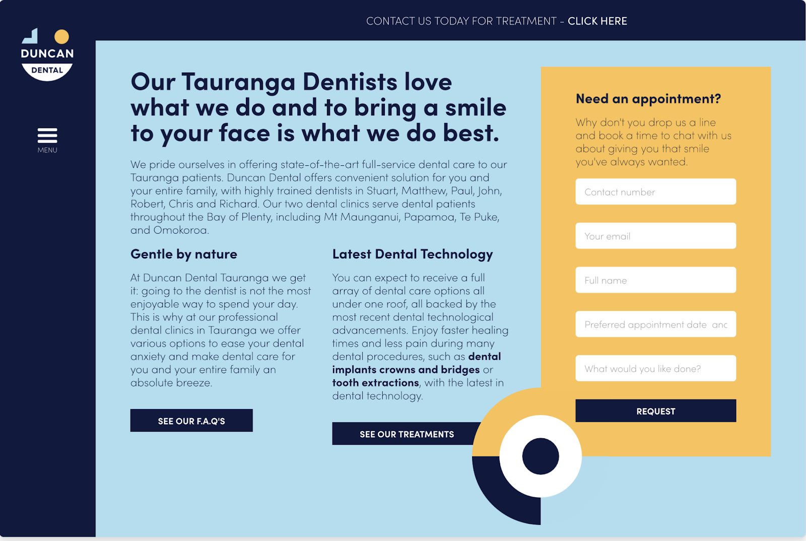
By featuring boldly colorblocked elements, like links to an FAQ page, Duncan Dental ensures patients can access relevant information quickly and readily. An additional link to their treatment page further enhances the user experience, presenting detailed insight into the services they render.
An inquiry form with a bright, contrasting yellow background on the blue homepage draws attention and calls visitors to act. The same form is accessible through a fixed banner at the top of the website, ensuring easy access regardless of where users are on the site.
5. Cinch PR
The website for San Francisco-based strategic communications agency Cinch PR blends aesthetics with user-centric information delivery.
Visual appeal matters in the agency industry. That’s why Paper Tiger, the design studio behind Cinch PR’s site, prioritizes greeting visitors with a captivating experience as soon as they land on the site.
Cinch PR’s landing page features large, high-resolution images of the agency’s past projects in the travel and hospitality, food and beverage, and lifestyle spaces — like two hands toasting glasses, colorful stacked boxes of cocoa truffle bars, and a cozy vacation home in the mountains. This immediate visual introduction to their work does more than just highlight their capabilities — it blends visual appeal with valuable information, embodying Cinch PR’s user-centric approach to communication.

The portfolio section uses interactive effects to pull users further into the site. When users hover over a project image, it undergoes a dynamic transformation — a dusky rose filter covers the image as its edges soften into an arched frame, and an animated soft-blue “view” button appears to invite deeper exploration. This subtle interactivity encourages further interaction, guiding users deeper into Cinch PR’s collection of past work.
6. Heco
The website for Chicago-based website development firm Heco, designed by JT Helms, presents a compelling, single-page site. The site’s parallax scrolling takes users on a journey by gradually revealing content and Heco’s brand story as they travel down the page. The understated navigation favors content, leveraging white space to focus on the page’s minimal web copy and design elements.
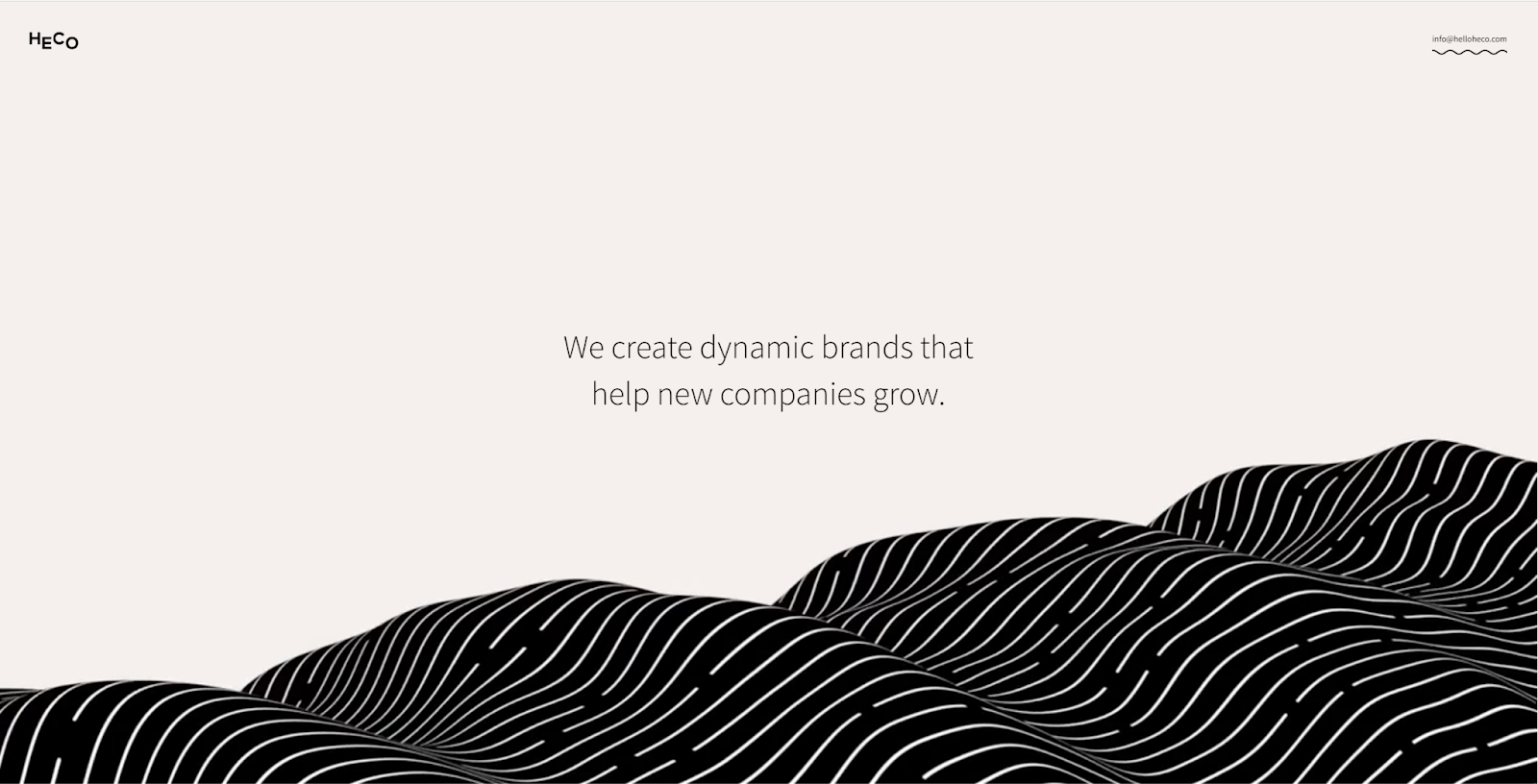
The initial beige-and-black color scheme dynamically transitions as users scroll, delineating different site sections. Upon reaching the portfolio page, bursts of color emphasize each project, inviting exploration. Heco skillfully uses color to segment and harmonize their brand narrative and diverse portfolio, offering an engaging, comprehensive snapshot of the agency’s work. This design shows site visitors all Heco has to offer in one concise but visually intriguing single-page layout.

7. Hacien Tequila
Alcohol vendors face a unique UX challenge: verifying the visitor’s age while maintaining a smooth UX. The agency behind Hacien Tequila, Phunk Creative, tackles this obstacle with a quick screener question, ensuring compliance with age restrictions without excessively inconveniencing customers. The inclusion of a “remember me” option enables returning visitors to access the site effortlessly.

After confirming their age, visitors are greeted by a sleek, modern landing page showcasing Hacien Tequila’s products with high-resolution photos. Scrolling presents visitors with detailed information about the company’s various tequilas and suggested serving styles, the brand’s history, and the specific type of agave it uses.

In the site’s ecommerce section, a single-page layout clearly features the brand’s tequila varieties with visually striking images, while comprehensive product information helps customers make informed purchasing decisions.
By blending elegant design, informative content, and intuitive navigation, Hacien Tequila delivers a premium brand experience while ensuring a user-first journey.
Moving forward with UX inspiration
There are numerous pathways to delivering an exceptional UX, and it’s important to note that webpages serving different purposes, audiences, and industries require specific considerations. Incorporating UX design principles into websites plays a pivotal role in presenting a tailored approach to the user journey, helping to engage and satisfy visitors fully.
Exceptional UX goes beyond aesthetics and usability — it’s about creating a holistic experience that speaks to your brand, resonates with your audience, and leaves a lasting impact.
As you move forward with your website, consider these UX design tips. Your users (and wallet) will thank you for creating an intuitive webpage.