User experience is the crux of product design, whether the product is a website, mobile app, or something else. While it should be obvious that UX is essential to product design, some UX designers still have a lot of misconceptions about it.
But the fact is that if your UX design clicks with your target audience, your product prospers and grows. If not, better luck next time.
5 tips for effective UX design
This guide covers the fundamentals of getting the UX design process right on a conceptual level. These tips will help you figure out how to become a better UX designer.
1. Don’t reinvent the wheel
UX design is all about engagement. As such, engagement is one of the most important elements in app development. But UX designers often fall victim to a mentality of reinventing the wheel, or trying to fix what isn’t broken.
There’s a reason most websites and mobile apps are structured the way they are — it works. Why? Because users are used to it. That’s the psychology of perpetuated habit. Users don’t always like change. They’re used to the conventional mode of presentation and don’t like adapting to something different all that much.

Usually, this desire to reinvent the wheel manifests itself in needlessly unorthodox layouts, odd color schemes, off-putting fonts in the wrong places, and confusing navigation patterns.
The intention is to differentiate one product from the rest. However, this approach hurts engagement and, instead of differentiating, scares off those you wanted to attract and engage.
That’s why it’s better to use tried and tested layouts throughout a product with minor tweaks to fit your particular goals (like call-to-action spots or “you might also be interested in” teasers).
This approach instantly makes users familiar with your platform and lets them use it without getting annoyed by unfamiliar layouts.
For example, there’s no reason to relocate a navigation bar from the top of the page to the bottom or change how users proceed in a mobile application. Sticking to tried and tested patterns saves your energy for those instances where design innovation really matters, such as landing pages and onboarding sequences.
2. Keep it simple and practice responsive design
The other major problem that often happens in the UX design process is when things are too complicated for their own good. The familiar patterns are there (unlike when designers try to reinvent the wheel), but these patterns are just too much, and because of that, the design doesn’t work.
“Too much” is an instant user experience turn-off.
When the user gets to a page that is literally jam-packed with elements and distracting typography, the end result is the user bouncing off elsewhere, which is the opposite of what you want.
Because of that, it’s better to keep things user-friendly. Your goal is to keep the user's focus on getting what they need on your website. Don’t distract them from their goal, and you’ll achieve yours.
Here's what it looks like when a UX designer keeps design simple in practical terms:
- Each page has a single definitive purpose. For example, the checkout page contains only what is required for the checkout process. The contact page contains just contact details and/or a form — not tips on personal-grooming habits.
- The purpose of every page and each component on it is instantly understandable by the user, without explanation. For example, the user interface has navigational elements on the page that are visually distinct (more on that later).
- Any additional but inessential information goes to the bottom of the page. For example, the additional blogroll at the bottom of the post with “you might also like” content.
3. Understand your target audience’s needs and demands
Understanding your target audience’s needs and demands might seem like an obvious UX design tip, but hear me out. Just like anywhere else, UX designers can’t figure out the right UX design scheme without understanding the needs and demands of the target audience.
Why is this a problem? Because of the false assumption that if you are operating in the market segment, you understand what the audience wants and needs without studying it. While some of your intuition might hit the mark, much of it will not.
Get this vital user experience information right during the design process with these two steps:
- Gather feedback from your users via surveys
- Observe how users use your product or similar products, either in person or remotely
Here are the kind of questions this information may answer for you:
- Who are your users, demographically speaking? (For example: men, women, tech-savvy people, tech novices, young adults, etc.)
- What are your users’ needs? How you can provide a solution for their needs?
- How does the correlation between their needs and your value proposition manifest in the interface design?
The answers to these questions form a foundation for a valid UX design concept.
4. Make different elements visually distinct
A visually distinct page layout is one of the most important goals for UX designers. It is a way of maintaining a fluid user journey and engaging user experience.
Long story short: It is always a good thing when you don’t need to think about how to find or do something and can instead simply … do it.
Here are several tips to make it all click that may come in handy during the design process:
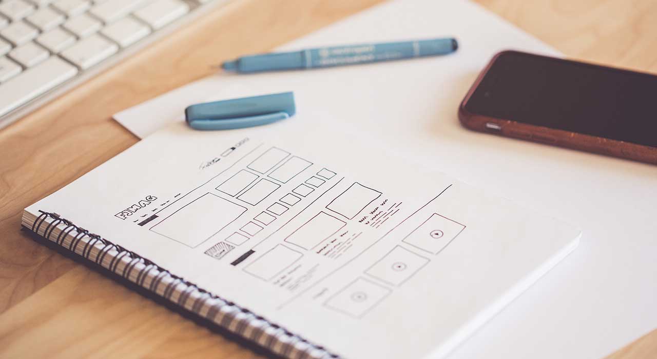
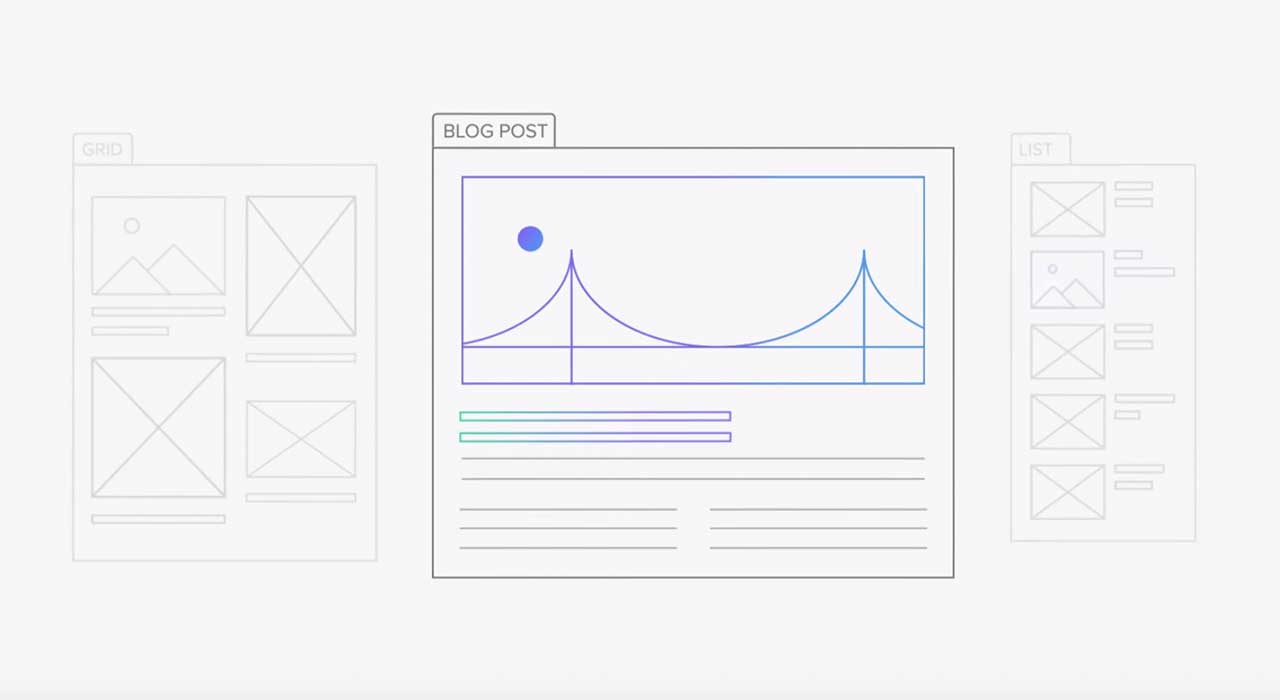
- The most valuable information on the page needs to stand out the most. If it’s a blog post, then you need a clear-cut headline like “Best web design trends” followed up by subtitles and subheadings that dig deeper into the subject matter.
- Users need to be aware of their location on the website or mobile app. Navigational tools need to be at hand. For example, you have a website navigation panel at the top of the page with all significant sections of the website easily accessible. Social media sharing buttons are usually on the left. On the right — put the blogroll with popular stuff, a tweet stream, a tag cloud, and other auxiliary elements. “You might also like” content goes at the bottom and is aimed at pulling the user into a wormhole.
- Action buttons need to stand out and include a clear description of their purpose. The essential credentials are appeal, universality, readability, and functionality. For example, a subscribe button with a field to type in your email.
- The search field needs to be visually distinct with the word “search” and the looking glass icon in it, ideally. Traditionally, it’s at the top right corner of a page.
And when it comes to colors, it's important to be aware that:
- Background colors are generally muted
- Blue is for text links
- Red is for the important stuff — typically alerts or errors
- Calls to action require a high-contrast, often exclusive color to stand out from the rest
5. Maintain consistency of the user flow throughout the journey
One of the most important practical aspects of user experience design is the "flow," the consistent continuity of the user’s journey.
In design terms, flow is when the user journey from one section of the website or mobile app to another is seamless in serving its ultimate goal — delivering the value.

Here's why it matters: a consistent design scheme helps users to get what they want and need smoothly, as if it were the most natural thing. That's working to your benefit. Consistency perpetuates usage.
To keep things consistent, you need to think through what the user is going to do step by step.
Let's take a website flow, for example. The user starts their journey at an entry point — usually the homepage or a blog post. You need to think where that entry point is going to lead. For example, it could lead to another blog post that expands on the subject or a page offering some service or product that answers the user’s needs.
The other thing to consider is dead-end pages — those pages that don't lead anywhere else. You need to avoid such instances throughout the user journey when possible. Everything must lead to something.
Finally, every website flow has an end goal — where users' needs and your website's goals meet. For example, if users are looking for valuable content and you’re offering valuable content, then the end goal is probably a subscribe button or Patreon link.
Conclusion
The secret of good UX design is making it work for both your users and your platform. In essence, a well-designed user experience boils down to leading a user to the information or tools they need, while trimming away anything that might disrupt their journey. While the goal seems to be universally understood, achieving it can be a little bit murky.
These tips for UX design will help you figure out the key elements that will make your design click with your target audience and make the interaction beneficial both for you and the users.


Why your design team should use Webflow
Discover how design teams are streamlining their workflows — and building better experiences — with Webflow.


.jpeg)


