When you understand UX design, you help your audience connect with your brand more naturally.
The UX design process begins at understanding the objectives of a business and how best to serve a target audience. By comprehending the psychology of a user, as well as applying widely accepted methods, it's possible to provide them with a positive and memorable experience. We've put together this guide to help you with the UX design process — every step of the way.
What is a UX design process?
What is a UX design process? A UX design process provides a strategy for organizing how you research, design, and iterate to craft a seamless experience. It aligns your business objectives with what people truly need.
Why is the UX design process important?
User experience design influences the entire structure of a website — guiding people through its expanse, and giving them something that affects how they feel. Visuals, content, structure, and navigation all come together to give someone a memorable experience.
End users are at the center of the UX. If someone is able to easily find the information they’re looking for, they’ve accomplished their goal and may return again.
UX concerns itself with an end users’ motivations. Why did they decide to check out a website? What information are they seeking? And what solutions are they after to the problems they may be facing? UX looks into the mind of a user, tailoring an experience that’ll give them what they’re after, in the least complicated way.
The elements of a design like navigational options, buttons, calls to action, and other interactions shuttles a users journey through a design — with content filling out the substance. UX design provides the intent for all of these in leading a user to where they need to go and what they should learn.
Any discussion about user experience must also mention user interface design. UI (user interface) concerns itself with the specifics of a design, touching everything from the typography used, to the look and feel of buttons and other interactions. UX design, unlike UI design, pulls itself back from these details and focuses on how someone will connect and engage within the product design. User experience designers take into account what people want from a web design and build an experience during the design phase that’ll meet these expectations.
Related reads: UX vs UI: What makes them different?
What steps are in the UX design process?
User experience and branding go hand in hand
Branding and UX share a symbiotic relationship. Well established brands may have their reputations tarnished by a website with a terrible user experience. Conversely, an up and coming company can get a boost from an easy to navigate and functional experience. Branding and user experience are about perception, and both must be consistent for a business to succeed. Interaction design
Mailchimp’s branding revolves around quirkiness, combined with the straightforward practicality of their products. Their website captures the duality of their brand identity striking just the right balance of fun and information.
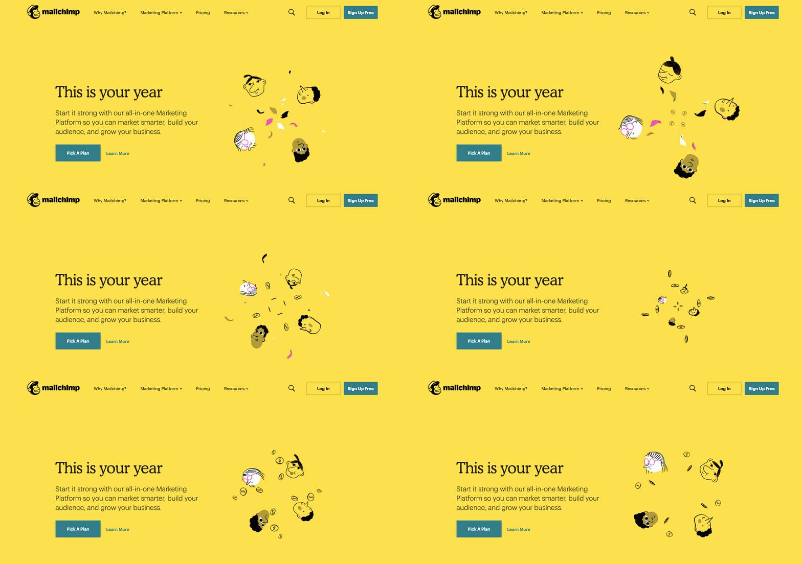
At the beginning of the UX design process, and throughout the product development process, UX designers must keep sight of a businesses’ branding and how it’s going to be communicated in a design.
Business goals are a part of the UX process
A new business website or redesign must fit into a business strategy. Both content and functionality must come together to develop a memorable brand. There must be reasons that guide the ux design process and an understanding of why this work needs to be done. A design team, and development team, needs to not only be experts in design thinking, but also understand the larger marketing goals of a company.
If it’s a redesign, look at what works and what needs improvement. Take into consideration what’s lacking, and how designing an improved user experience can help address these problems.
And for any website, whether it’s one that’s brand new or a pre-existing page that needs tweaking, identify the type of actions you’d want a user to take, whether it’s purchasing a product, signing up for a service, or requesting more information.
Design thinking plays a valuable role here because it frames every decision around genuine user needs, helping you maintain each business initiative aligned with real customer goals.
UX puts the user in usability
Intuitive navigation, onboarding UX, and a logical structure allows someone to interact and find their way through a design without obstacles. UX provides the guides that allow for a smooth flow, rather than one that's complicated and frustrating to get through.
The wide range of design skill sets a UX designer has allows them to architect the structure that real users will follow. Usability concerns the who, what and when. Who, being the user, what being the content, and when being the order and logic in experiencing the web design.
A user’s experience should be guided by empathy
Before even starting the development process of a project, a UX designer needs to put themselves in the shoes of the end user. They must know the motivations and pain points that users have. Designers must be able to see a website through a user’s eyes, and anticipate the best ways that they should move through it. They need to take the multitudes of pieces and assemble them in a way that makes sense for those navigating through it.
UX designers understand how all of the pages fit together holistically, while never overlooking at the microscopic level how each page functions in helping people meet the users’ goals.
Understanding an audience means crafting an experience that they’ll find valuable and enjoyment when scrolling through.
User research within the UX process
“You can only understand people if you feel them in yourself.”
–John Donne, “An Anatomy of the World,” 1611
The people you want to bring in are more than just "users." It’s important to understand their problems and the journey they’re on to getting to where they want to go. Never just assume the wants and needs of others. We may be able to gather a cursory understanding, but doing UX research will give us a more accurate understanding of their actual interests and desires.
User research and identifying the different user types allows for a more laser focused development process. Instead of making assumptions, actual data informs how a website design will be put together and what features need to be integrated.
User research takes out the guesswork, allowing us to see the challenges and expectations that real people have. True empathy can't exist when companies don't know those that they want to reach.
User research should be ongoing
User research provides an important starting point, allowing a design to be built around people's hopes and circumventing potential frustration with an experience custom made to meet their needs.
User testing and research never ends. Shifting objectives from stakeholders, changing consumer habits, and the competition may all change how people perceive a design. A website that left people satisfied two years ago, may now be less effective. User research needs to be ongoing to see if a design is still relevant to those using it.
Determine what answers you’re looking for from user research
Maximizing user research means knowing what questions and information you’re after. Like any process, success needs to be defined. Without any sort of limitations or measures, user research can get out of control and become its own form of scope creep, bogging down the design process.
A website is a product. You must determine what people want out of it.
Interview actual people
What's a better way to connect with your audience then to be in the same room as them? User interviews generally seat a few people and have them go through a website while members of the team observe. Seeing how people interact, and having them give you feedback in real time can pinpoint problems a design may have, and inform any changes that need to happen before it goes live.
User interviews let others expose things you may have missed from having looked at and worked on the same project for weeks or months. Maybe navigation isn't as easy as you thought, or people are missing out on the CTAs. Outside perspectives will let you know the problems everyday users may experience when trying to complete the tasks you want them to do.
Create user personas
A persona constructs a rough approximation of who a typical user may be — based on your user research.
This user persona, example by Vimala on Dribbble, for a travel service lays out all of the important statistics of who might be an average user. Not only do we get background information of who they may be, but we also see what type of travel products or services they’re interested in.
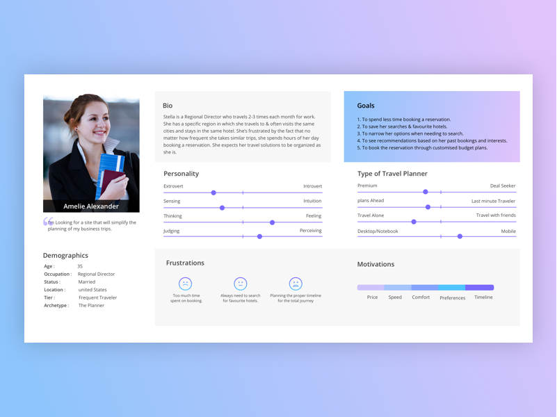
A persona isn't an average of all users, but represents a slice of your likely audience. Defining personas will help you create an optimal experience for how you want a particular individual, or team, to perceive your brand.
Conduct surveys
User surveys and questionnaires are also an effective way to gather important data. They give the opportunity to ask very specific questions about what people are looking for or to get feedback about a particular design and whether or not it’s delivering what they want.
Surveys can gather specific data — with yes/no answers, ratings, and other clear cut answers that can be compiled and analyzed.
But along with these data points, surveys are also used to gather more qualitative information. Users may be presented with a blank slate to fill with their thoughts and opinions. This long-form information complements the quantitative information compiled, and can bring light to issues that hadn’t been considered.
When coming up with those questions, keep in mind that you don’t want to lead people to the answers that you want. Keep the questions neutral, free from your own biases. Let them provide an answer with their own bias, not yours.
Construct user flows
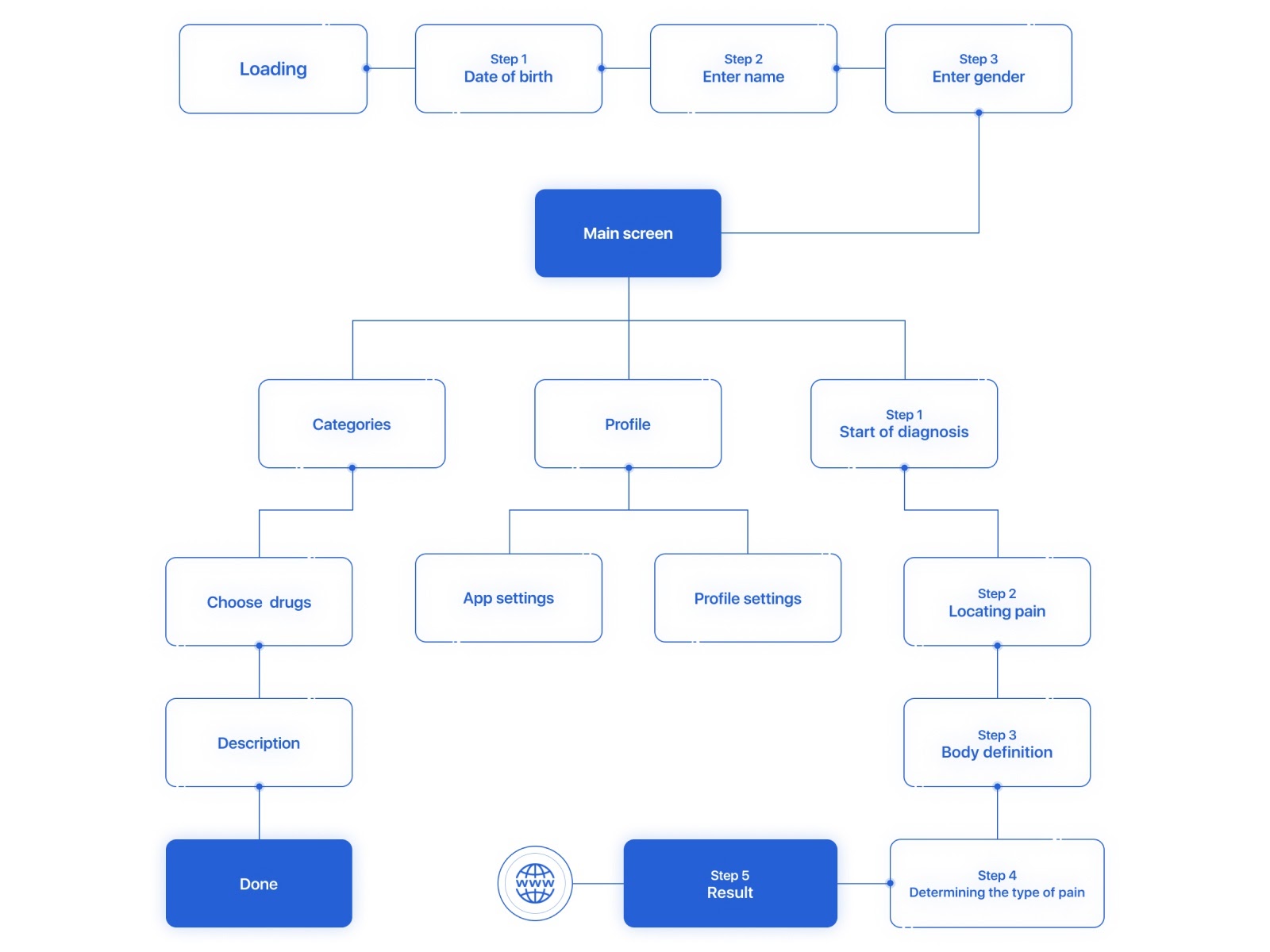
When figuring out the blueprint of a web design, you need to know what you want people to do and what steps they need to take. User flows provide a guide, showing the succession of interactions users should take from a landing page to other sections of a website. Knowing the roads you want a user to take inform how a design needs to be structured, which you’ll need to build wireframes and prototypes.
Whether you want to illustrate the steps someone will take in adding a product to a cart and checking out, or how they’ll access additional information about a given topic, user flows show each point along these paths. There are plenty of UX design tools like FlowMapp, Stormboard and Whimsical that can help you sketch out these ideas. Or, you can always go the analog route with pen and paper.
This Dribbble user, Seabass, shows how someone would interact with a medical app, and the paths and actions they would take when navigating.
Understand information architecture
Our brains prefer order over chaos. Whether it's a book we're reading, movie we're seeing, or website we’re navigating, we need to understand what’s being communicated. Information architecture takes the components of a web design and puts them in an arrangement that’ll make sense to someone experiencing it.
Imagine your content is like blocks in a bag. Opening it up and pouring these out results in a jumbled mess. By analyzing, grouping, and stacking them, you can put these together in a way that makes sense. Information architecture takes content, classifies it, and assembles it together in a way that makes sense to you and your end user.
Information architecture can be broken down into these parts:
- Identify: What content do you need to tell your brand's story? Determine every piece necessary in communicating what you want to relay to your audience.
- Classify: Categorize content and figure out how it will be divided off into the organization of the design.
- Map: Structure and organize the ideas, showing how each concept or block of content will lead to the next.
Information architecture arranges content into a manageable hierarchy. This framework lays out how people will take in the ideas presented in a logical succession.
One of the most common ways to do this is through card sorting, which can be done the old fashioned way with paper and pen, or through software like Optimal Sort and UserZoom.
Related reads: Why your design process should start with content
Creating wireframes
Creating a wireframe provides the blueprint for each page, with visual indicators like lines, grids, and boxes showing where content, images, and other elements are going to go. They can be high resolution, full of detail, or they may be low resolution with a sparse, minimal layout for each individual page. Whether it's a simple map of boxes, lines, and placeholder text, or a more sophisticated representation, wireframes provide developers the structure they’ll need to follow in building out a website.
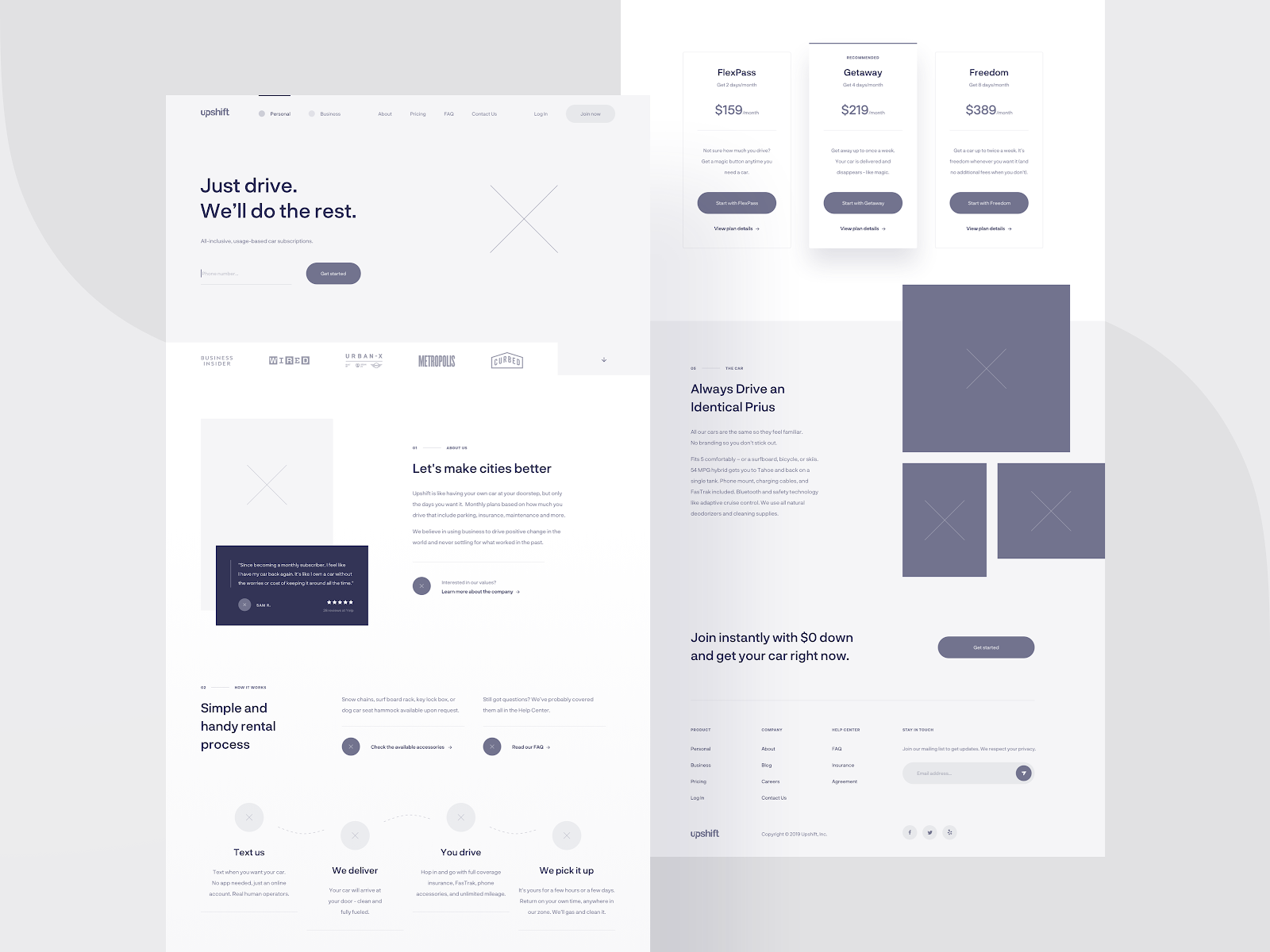
The wireframe from Dribble user Michal Roszyk shows in a clear and simple way the organization of website layout.
Wireframing also serves another important function and that's communication. They're a visual tool, making it possible to show everyone, no matter their role, how pages will be structured.


The modern web design process
Discover the processes and tools behind high-performing websites in this free ebook.
Prototyping and mockups
Some people get mixed up between what’s a wireframe, mockup, or prototype. Prototyping is never a single-step exercise. Design iteration, informed by ongoing testing, helps perfect the usability and overall feel.
A wireframe communicates in a basic manner the layout and organization of each individual page within a design. Though they may have varying levels of sophistication they generally don’t have functioning interactions, or artistic embellishments. They exist to show how each page will look from a general perspective.
Mockups are one step above a wireframe. If you’re using a platform like Webflow, which generates code while you design, you won’t have to bother with this step, as you end up with a fully functioning website. Mockups take what’s been established with wireframes and offer a graphic representation of the design. There may be some functionality like with navigation, but the focus here is to show what the design will look like.
Prototypes function an almost fully realized version of a design. Navigation, interactions, and all of the major visuals and blocks of content will be in place. It isn’t necessary to have every single element, but everything that a user will want to interact with and experience should be there. This means that features like call to action buttons, animations, and other dynamic elements that you want a user to experience have been integrated. Prototypes let you get the necessary feedback and to make tweaks and edits before going live. With prototyping, you have both low fidelity and high fidelity prototypes. Low fidelity prototypes focus on function over visual design, while high fidelity prototypes focus on what the final version will look like.
Usability testing
Once you have a functional prototype, it’s time to do usability testing. This means taking someone who has never seen the design before, and letting them loose in going through it.
Usability testing often happens in person or can be done remotely. Having people in the same room as you gives the opportunity to see how people are emotionally reacting to their web experience. It lets you get unfiltered feedback and see what’s working in a design and what isn’t.
People need to be given specific tasks that you want them to perform. If it’s an ecommerce website, you might have them go through the process of adding items to a cart and following them through check out. Or maybe you want them to find an answer to a common question that people may have about your product or service(s). Seeing how easy or difficult it is for a user to navigate through the content will give you a wealth of information about how effective the design may be and any edits or changes that need to happen.
Usability testing can happen at any point during the design process, but can be more valuable at the beginning stages. Major changes are easier to make early on, rather than later when it’s more fully built out. Taking care of changes in the structure, navigation, and information architecture are less labor intensive at the early stages compared to trying to do all of this at the final stages of a design.
Launch and continuous iteration
Once you’ve thoroughly tested your UX design, it’s time to launch. But the work doesn’t end here. Gather user feedback, monitor metrics, and keep refining the user journey to maintain alignment with your business goals.
If you’re looking for a platform that empowers both designers and their teams to bring these UX insights to life, consider exploring Webflow's visual web development approach.
Keep your users at the center of the UX process
Design should never lose sight of the people it serves. Every decision — whether it’s color, navigation, or content — should support a straightforward user journey. It’s easy to get caught up in the latest trends and fads that pop in and out of web design. But rather than try and have the hippest and coolest of web designs, it's better to create something that never falls out of touch with what end users want.
Ease of use, organization, and consistency all factor into how someone will experience a design. If there’s one take away, user experience concerns itself with empathy — making sure users are given what’s required to have a positive and fulfilling experience.

Build websites that get results.
Build visually, publish instantly, and scale safely and quickly — without writing a line of code. All with Webflow's website experience platform.


