

Add descriptions to sensory-based instructions
Instructions for understanding content and accomplishing tasks shouldn’t rely solely on characteristics like shape, color, size, visual location, orientation, or sound.
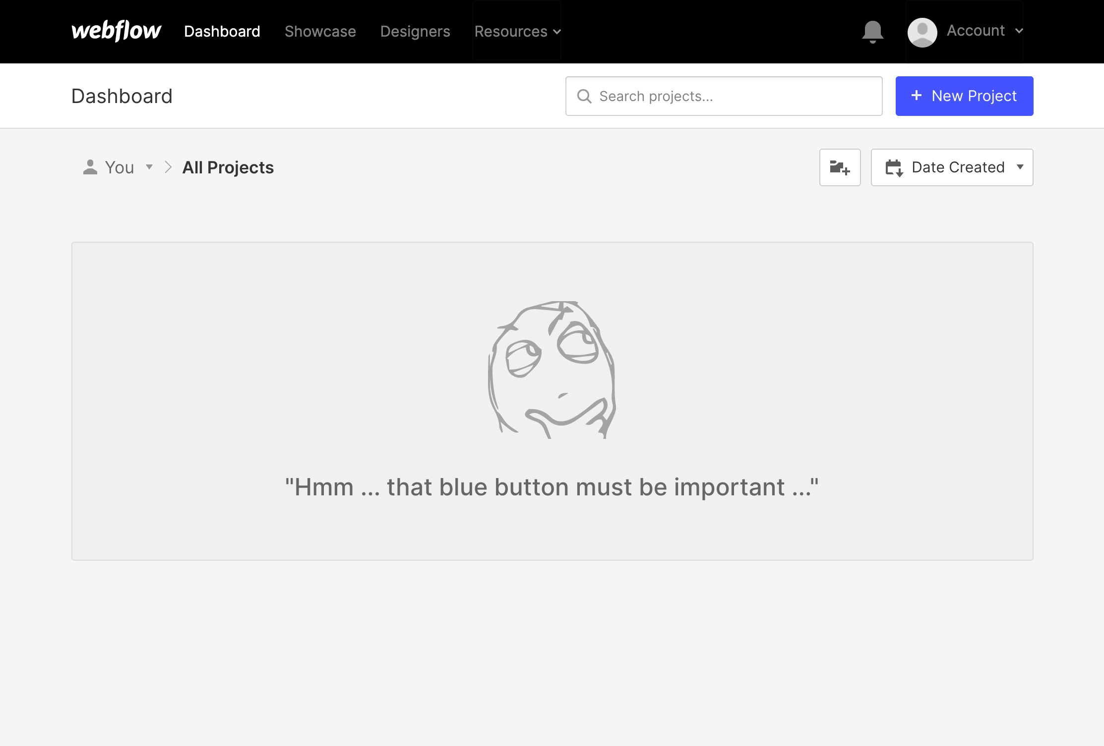
For example, an instruction to “Click the blue button” isn’t helpful for users who can’t see color. A prompt to “Start recording after the tone” with no other visual information will be inaccessible to someone deaf or hard of hearing. Referencing “information in the right column” won’t work for users who’ve zoomed their browser to 300% and can only see a single-column mobile view of your page.
Write clearly and use more indicators
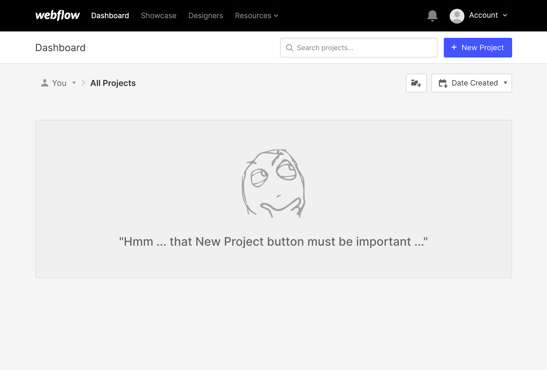
Use a combination of characteristics, particularly the actual names of sections and elements. For example, instead of “Click the circle icon,” write “Select the Flag for Later button.”
WCAG reference:
Congratulations on making the web a more accessible place!
Where:
When:
Where:
When:
Where:
When:
Where:
When:
Where:
When:
Where:
When:
Where:
When:
Where:
When:
Where:
When:
Where:
When:
Where:
When:
Where:
When:
Where:
When:
Where:
When:
Where:
When:
Where:
When:
Where:
When:
Where:
When:
Where:
When:
Where:
When:
Where:
When:
Where:
When:
Where:
When:
Where:
When:
Where:
When:
Where:
When:
Where:
When:
Where:
When:
Where:
When:
Where:
When:
Where:
When:
Where:
When:
Where:
When:
Where:
When:
Where:
When:
Where:
When:
Where:
When:
Where:
When:
Where:
When: