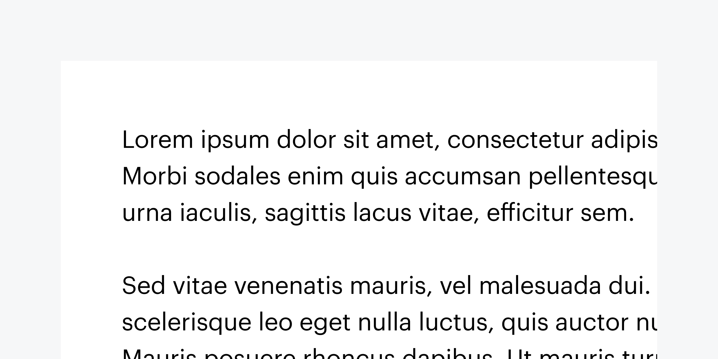
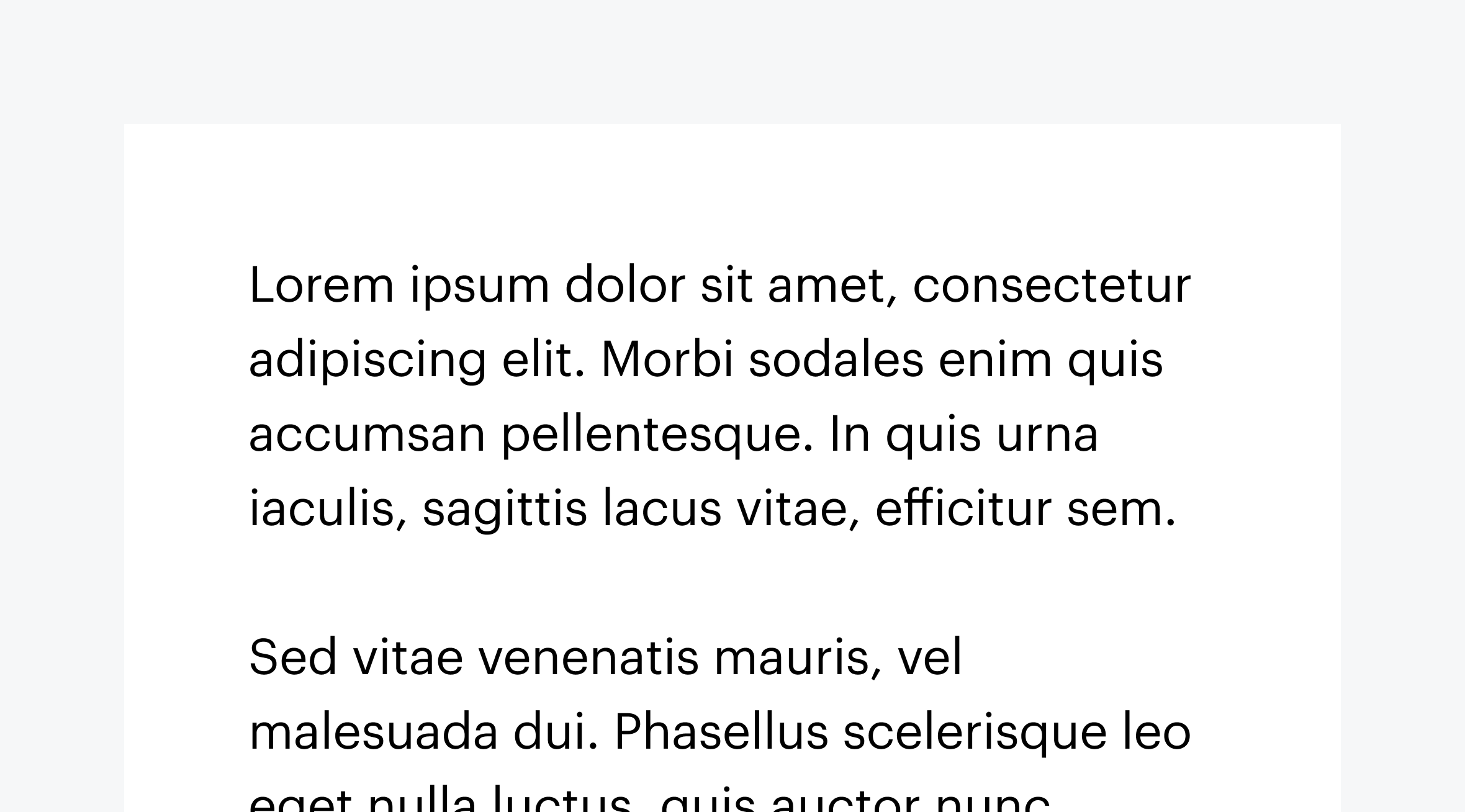
Allow zoom without forcing horizontal scrolling
People with low vision use zoom to scale content, sometimes up to 400%. As they zoom, content should reflow vertically (as a column) and remain fully legible and logical without a need for horizontal scrolling.


Here are some considerations to keep in mind to make sure reflow doesn’t force horizontal scroll.
Use relative units (like percentages and viewport width) to set width on text and images
Read more about size units and where to set them in the Webflow University lesson on Size Settings.
Check all breakpoints to make sure content doesn’t reflow horizontally
"Supporting the reflow of content is also known as 'Responsive Web Design'. It is enabled by CSS media queries which reformat the web content for different viewport widths (at particular break points) in order to provide optimized layouts for mobile devices such as tablets or smartphones. Importantly, these breakpoints are not only triggered by narrower viewports, but also when users employ the browser zoom function to zoom into the page."
Learn more about responsive design in the Webflow University lesson, Intro to Responsive Design.
Useful resources:
- Check out Michele Williams’ talk on Responsive Design vs Magnification: Designing for Users with Low Vision
- Ensure that text can be resized without loss of content or functionality
WCAG reference:
Congratulations on making the web a more accessible place!
Where:
When:
Where:
When:
Where:
When:
Where:
When:
Where:
When:
Where:
When:
Where:
When:
Where:
When:
Where:
When:
Where:
When:
Where:
When:
Where:
When:
Where:
When:
Where:
When:
Where:
When:
Where:
When:
Where:
When:
Where:
When:
Where:
When:
Where:
When:
Where:
When:
Where:
When:
Where:
When:
Where:
When:
Where:
When:
Where:
When:
Where:
When:
Where:
When:
Where:
When:
Where:
When:
Where:
When:
Where:
When:
Where:
When:
Where:
When:
Where:
When:
Where:
When:
Where:
When:
Where:
When:
Where:
When:

