

Check legibility on landscape and portrait
Some users mount devices in a fixed orientation (e.g., on the arm of a wheelchair). Make sure your content doesn’t restrict its view and operation to a single display orientation, such as portrait or landscape, unless a specific display orientation is essential.
Make sure your content is legible any orientation
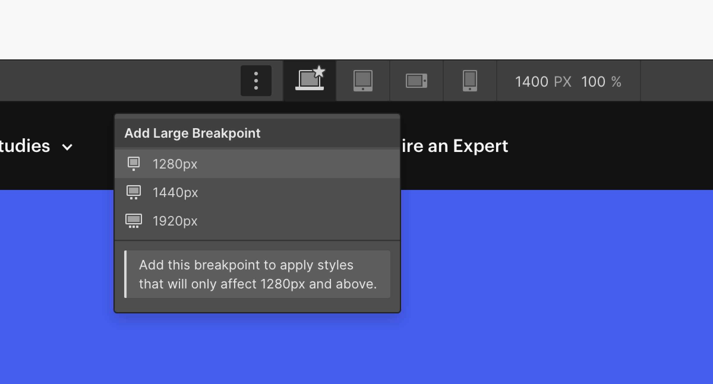
You can customize your site for different screens with Webflow's built-in responsive breakpoints (also known as media queries).
The styling you set cascades up starting from 992px (desktop) and down from desktop to mobile. This means that styles applied on desktop, 1280px, 1440px, and 1920px cascade up to larger devices. Styles set on the desktop breakpoint cascade down and apply to the tablet and both mobile device sizes.
Useful resources:
WCAG reference:
Congratulations on making the web a more accessible place!
Where:
When:
Where:
When:
Where:
When:
Where:
When:
Where:
When:
Where:
When:
Where:
When:
Where:
When:
Where:
When:
Where:
When:
Where:
When:
Where:
When:
Where:
When:
Where:
When:
Where:
When:
Where:
When:
Where:
When:
Where:
When:
Where:
When:
Where:
When:
Where:
When:
Where:
When:
Where:
When:
Where:
When:
Where:
When:
Where:
When:
Where:
When:
Where:
When:
Where:
When:
Where:
When:
Where:
When:
Where:
When:
Where:
When:
Where:
When:
Where:
When:
Where:
When:
Where:
When:
Where:
When:
Where:
When: