

Text should have sufficient contrast against its background to be readable.
Level AA compliance requires a contrast ratio of:
- 3:1 for large text (>18pt normal, >14pt bold)
- 4.5:1 for body text (<18pt normal, <14pt bold)
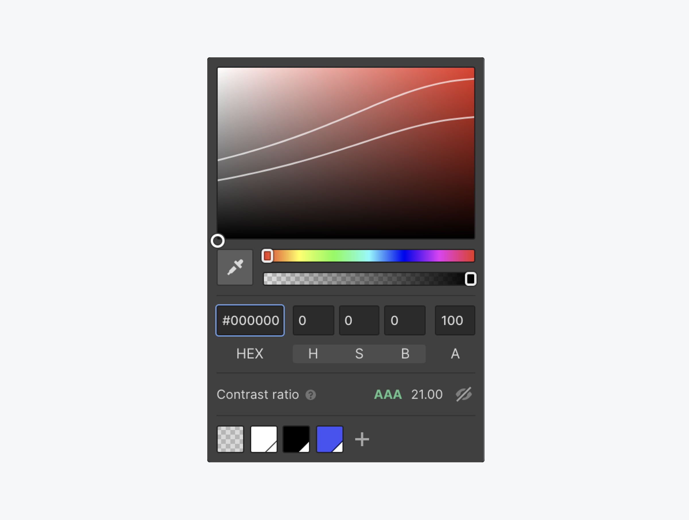
Use Webflow’s color picker to check contrast. When choosing a font color, the color picker will tell you if your contrast ratio is AA or AAA compliant. It also automatically adjusts the ratio for text is larger than 24px.
Useful resources:
Check the color contrast of your icons and learn more about best practices with these excellent color contrast tools:
WCAG reference:
Congratulations on making the web a more accessible place!
Where:
When:
Where:
When:
Where:
When:
Where:
When:
Where:
When:
Where:
When:
Where:
When:
Where:
When:
Where:
When:
Where:
When:
Where:
When:
Where:
When:
Where:
When:
Where:
When:
Where:
When:
Where:
When:
Where:
When:
Where:
When:
Where:
When:
Where:
When:
Where:
When:
Where:
When:
Where:
When:
Where:
When:
Where:
When:
Where:
When:
Where:
When:
Where:
When:
Where:
When:
Where:
When:
Where:
When:
Where:
When:
Where:
When:
Where:
When:
Where:
When:
Where:
When:
Where:
When:
Where:
When:
Where:
When: