When keyboard users tabs into modals (like a popup or dialog), focus should remain in that window. This helps prevent users from accidentally moving focus outside the modal without closing it. Users should be able to use the ESC key to close the modal.
Tab through your page to make sure modals are keyboard navigable
You want to make sure that as you tab through your page, focus doesn’t jump outside the modal window to the main page where it will be hidden.
- Tap enter on the button that opens the modal
- Tab into the elements within the modal
When the modal is open, try tapping the ESC key to make sure it closes the modal. If it doesn’t, follow the steps below.
Accessible modal components
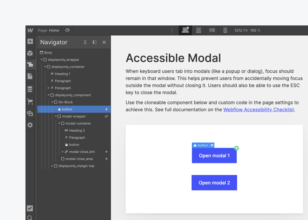
A common way to build a modal in Webflow consists of a button that is a direct sibling to the main modal element. An interaction is set on the button to show the sibling content element when clicked. We should also add some specific attributes on the button, modal and children elements along with some custom code to trap the user’s focus when the modal is open and allow them to close it with the ESC key.
Reference the cloneable project below that uses the proper structure, attributes and code outlined in this task.
Structure & class names
<checks-richtext_class>modal-open_btn<checks-richtext_class>
<checks-richtext_class>modal-wrapper<checks-richtext_class>
<checks-richtext_class>modal-container<checks-richtext_class>
<checks-richtext_class>modal-close_btn<checks-richtext_class>
<checks-richtext_class>modal-close_area<checks-richtext_class>

Custom attributes
How to add custom attributes: https://university.webflow.com/lesson/custom-attributes
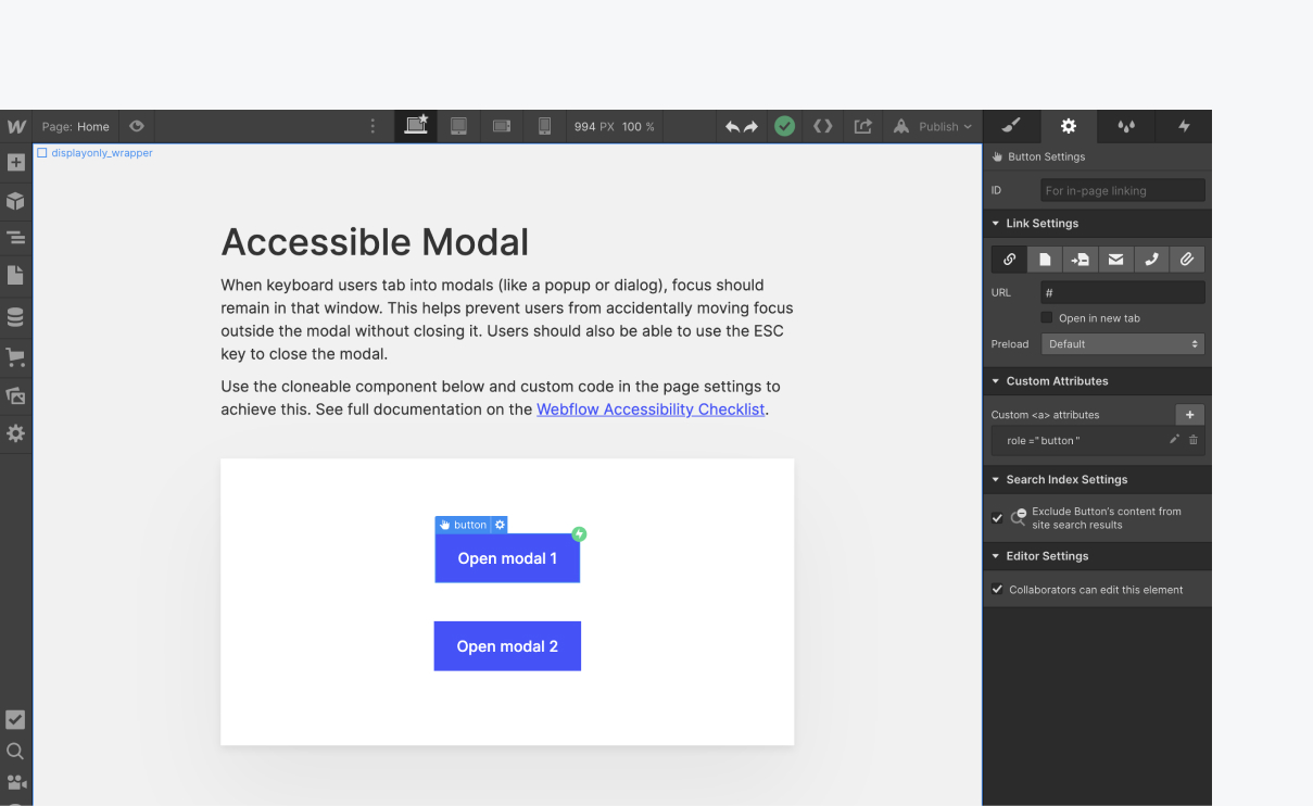
<checks-richtext_class>modal-open_btn<checks-richtext_class>
- role= "button"
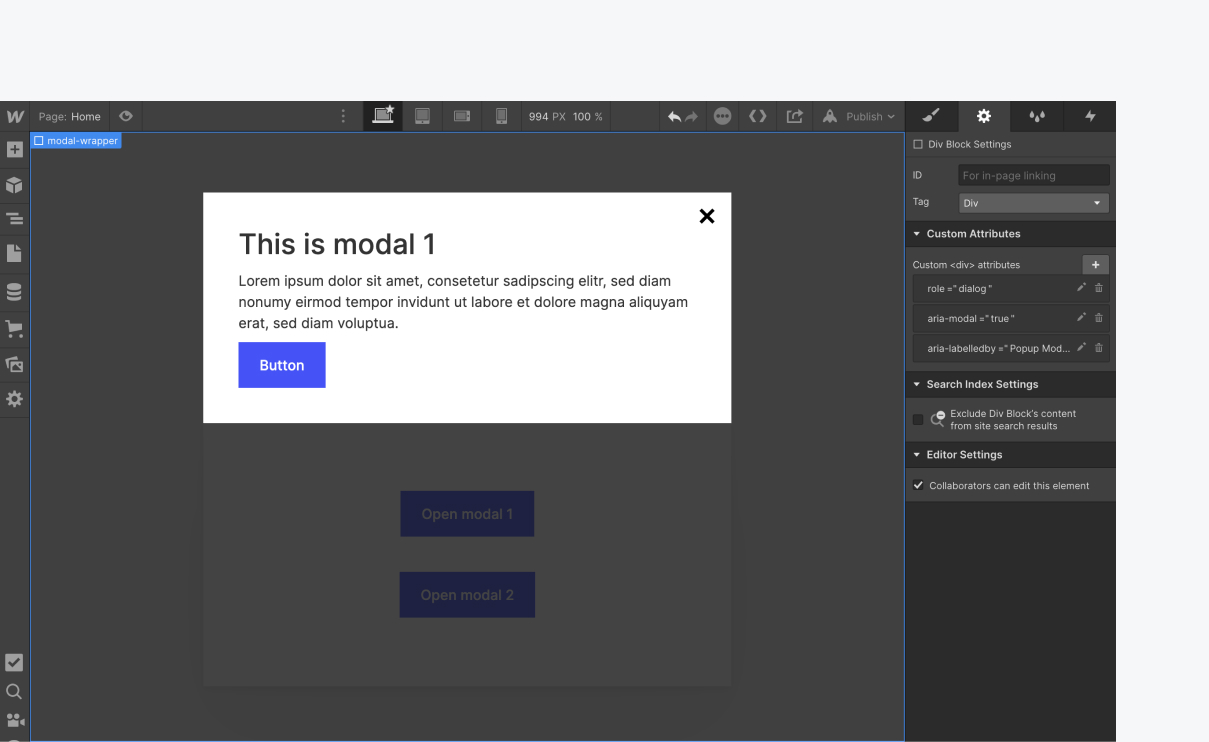
<checks-richtext_class>modal-wrapper<checks-richtext_class>
- role="dialog"
- aria-modal="true"
- aria-labelledby="Popup Modal"
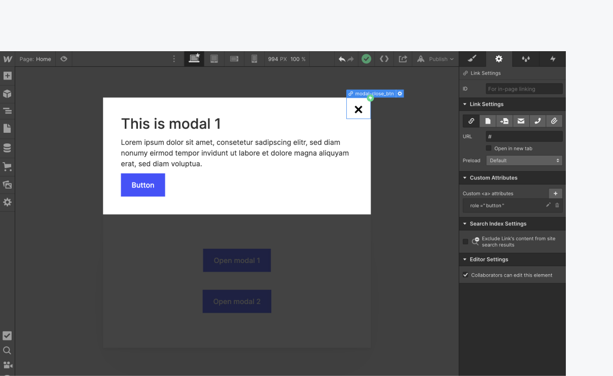
<checks-richtext_class>modal-close_btn<checks-richtext_class>
- role=”button”
<checks-richtext_class>modal-close_area<checks-richtext_class>
- tabindex="-1"
- aria-hidden="true"


Custom code
Add the custom code below to the before </body> section of the page or project settings.
Note: the script uses the class of <checks-richtext_class>modal-open_btn<checks-richtext_class> on the trigger element, <checks-richtext_class>modal-wrapper<checks-richtext_class> on the content element, <checks-richtext_class>modal-close_btn<checks-richtext_class> and <checks-richtext_class>modal-close_area<checks-richtext_class> for the close triggers. To use different classes, update the class names in the script as well.
Congratulations on making the web a more accessible place!

