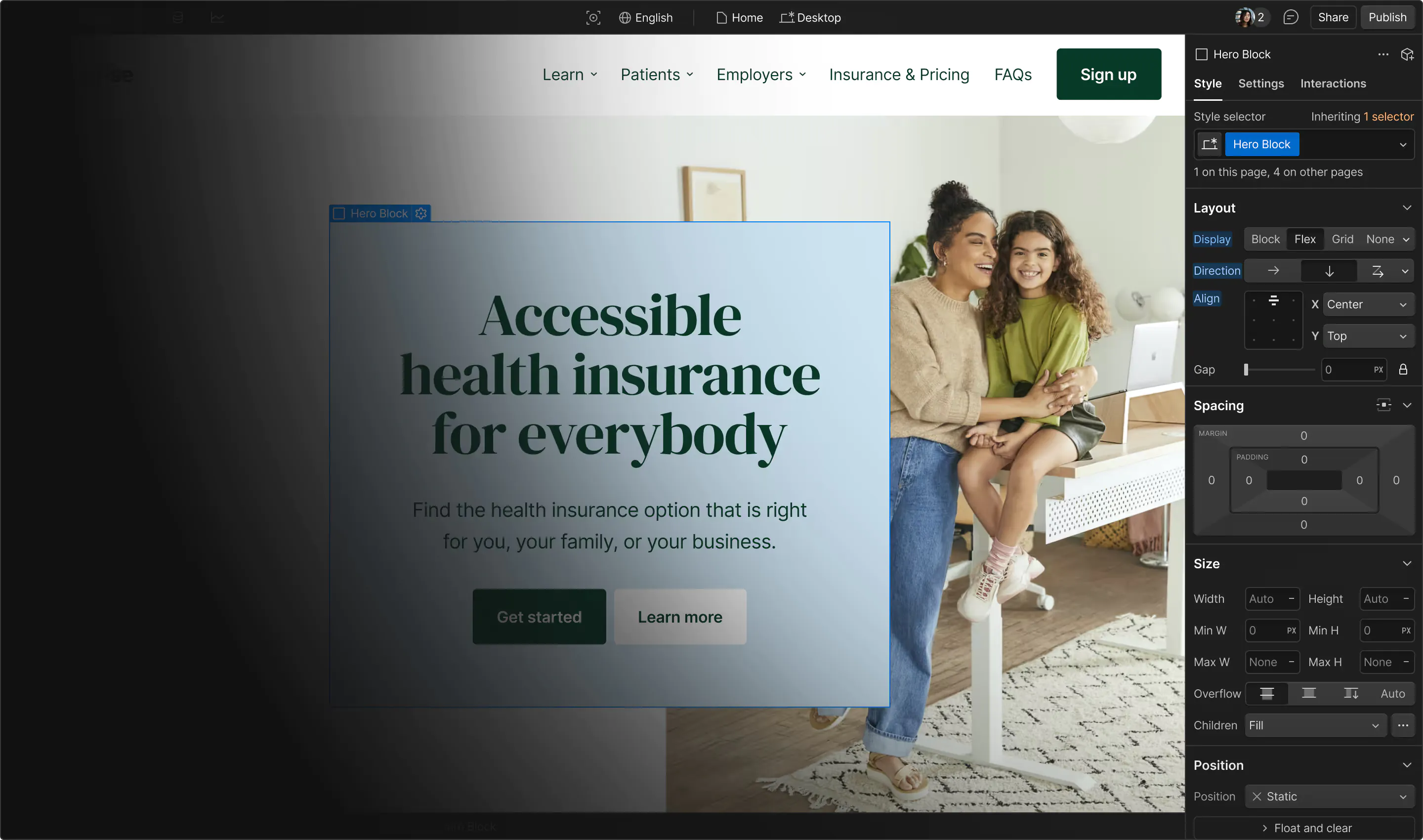
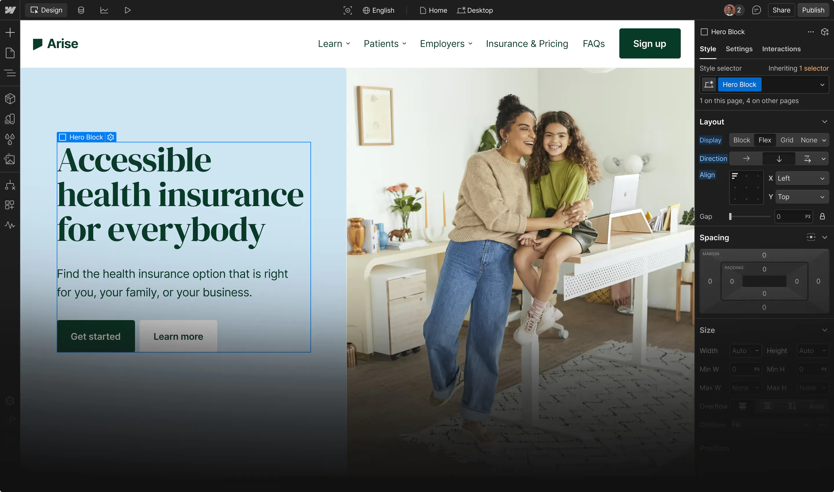
Make sure color isn't the only way information is conveyed
We shouldn’t rely solely on color to convey information, indicate an action, or distinguish a visual element. This makes it impossible for people who are blind, visually impaired, or who don’t easily distinguish colors to access this information.
Use more indicators than just color
A common web design pattern is to style success states with a green background and error states with a red one. Use additional indicators for success and error states, like:
- Using an icon for each different state (with a text alternative that indicates what the icon is)
- Using explanatory text, like a label that says “Error” or “Success”
Links are often styled with color to help distinguish them from non-link text. This works, but be sure to add another visual indicator, like an underline.
Other ways to convey information in addition to color include:
- Stylistic edits such as borders, outlines, box shadows, underlines, etc.
- Text labels
See also Add descriptions to sensory-based instructions
Useful resources:
Vision preview in the Webflow Designer
WCAG reference:
Congratulations on making the web a more accessible place!
Where:
When:
Where:
When:
Where:
When:
Where:
When:
Where:
When:
Where:
When:
Where:
When:
Where:
When:
Where:
When:
Where:
When:
Where:
When:
Where:
When:
Where:
When:
Where:
When:
Where:
When:
Where:
When:
Where:
When:
Where:
When:
Where:
When:
Where:
When:
Where:
When:
Where:
When:
Where:
When:
Where:
When:
Where:
When:
Where:
When:
Where:
When:
Where:
When:
Where:
When:
Where:
When:
Where:
When:
Where:
When:
Where:
When:
Where:
When:
Where:
When:
Where:
When:
Where:
When:
Where:
When:
Where:
When:

