

Optimize text styling for legibility
Designing text for readability and legibility are essential to a successful user experience. Appropriate text sizing and spacing ensure that visually-impaired people can read important text, and help those with cognitive disabilities to better focus on text blocks.
Let’s look at some ways to optimize your text for legibility.
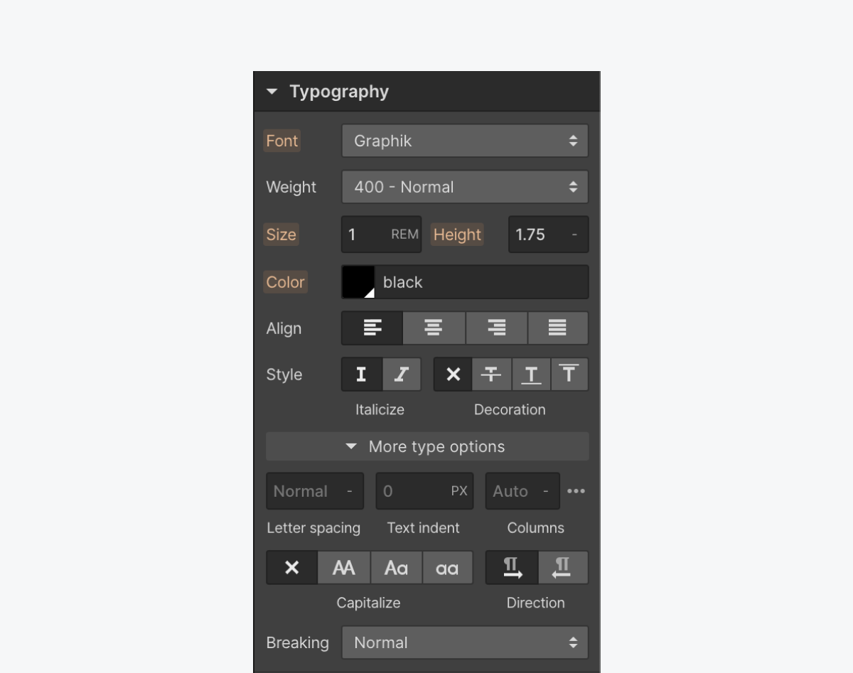
Keep paragraph line spacing between 1.5 - 2
Open the Style panel > Typography to set your Height. We recommend using unitless spacing (as indicated by the “-”).
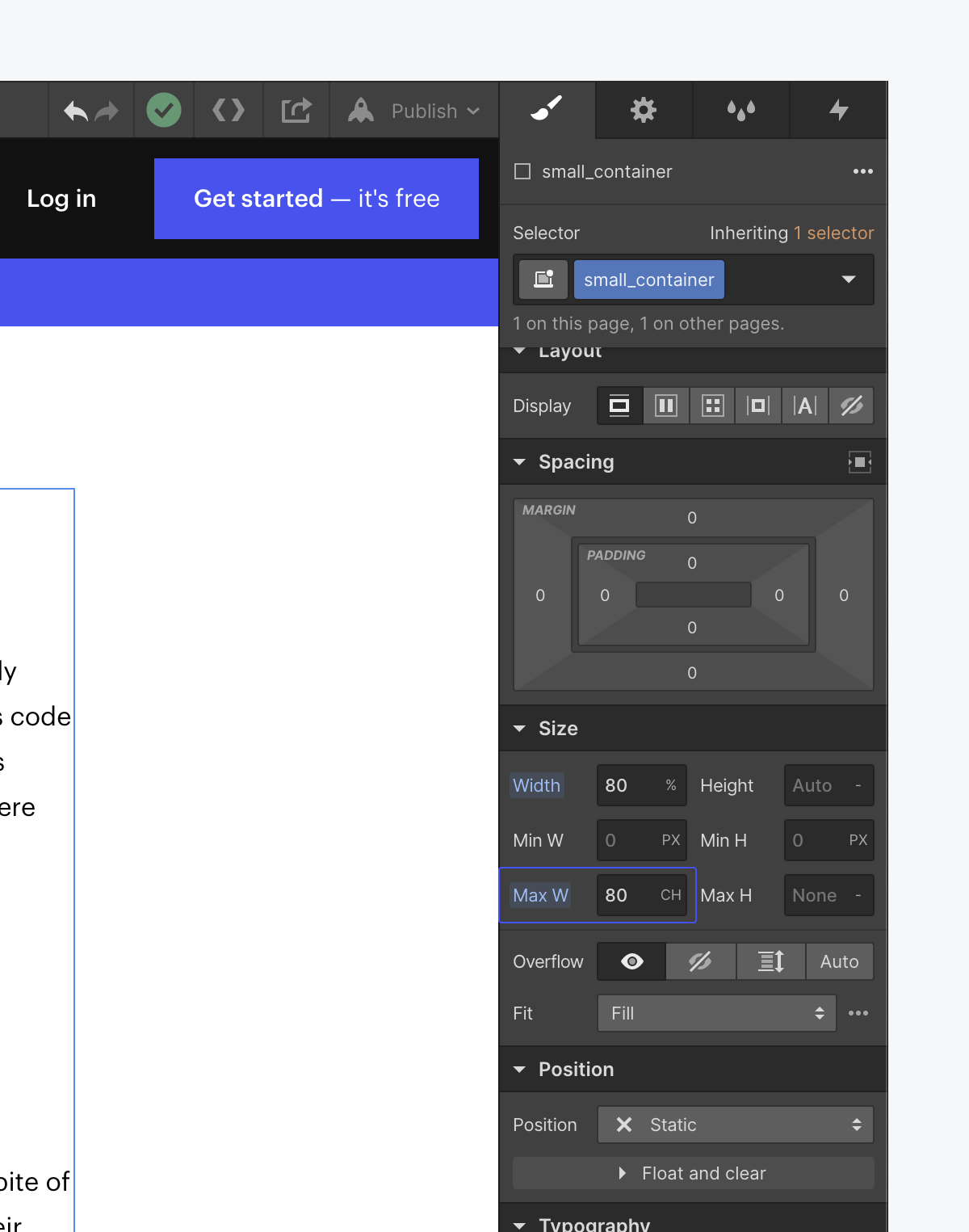
Limit characters to less than 80 per line
Use the ch unit to set a container’s width based on the width of the character “O” for a given font
Learn more about ch on Webflow.
Avoid centered, justified, or right-aligned text
Keeping justification to the left with a ragged right edge makes content easier to read for everyone.
- Use left-aligned text for left-to-right (LTR) languages
- Use right-aligned text for right-to-left (RTL) languages
- Don’t justify text
- Avoid centered text for more than one sentence on a page
Useful resources:
WCAG reference:
Congratulations on making the web a more accessible place!
Where:
When:
Where:
When:
Where:
When:
Where:
When:
Where:
When:
Where:
When:
Where:
When:
Where:
When:
Where:
When:
Where:
When:
Where:
When:
Where:
When:
Where:
When:
Where:
When:
Where:
When:
Where:
When:
Where:
When:
Where:
When:
Where:
When:
Where:
When:
Where:
When:
Where:
When:
Where:
When:
Where:
When:
Where:
When:
Where:
When:
Where:
When:
Where:
When:
Where:
When:
Where:
When:
Where:
When:
Where:
When:
Where:
When:
Where:
When:
Where:
When:
Where:
When:
Where:
When:
Where:
When:
Where:
When: