Your website is your most valuable marketing asset.
When you’re a creative trying to stand out to potential clients or employers, this rings even more true. For Marco Cornacchia, product designer at Figma, his portfolio was — and still is — key to highlighting his past work, showing off his web design skills, and connecting with potential clients.
At Webflow Conf 2023, Marco discussed what inspired him to build his portfolio, how he made it stand out, and how it has helped him grow his career.
Here are his top three tips for building a standout portfolio.
Shine a bright spotlight on your work
When Marco was leaving his last job and looking to transition into a new role, he realized that he was in desperate need of a new portfolio. Though building a new one felt straightforward enough, he didn’t feel like he had produced enough relevant product design work — and his application would get lost in the shuffle.
To combat this, he decided to lean into what he had the most experience in — which was building Webflow websites. He then leveraged these skills to prominently showcase relevant product design work he had done.
For Marco, this meant creating interactive elements to allow people to experience his past designs. For example, to showcase a food delivery app project, Marco’s portfolio allows users to click through an interactive prototype of the design and experience it first-hand. In addition — Marco also includes an information section where you can read a case study about the design, tools used to build, and the background information.
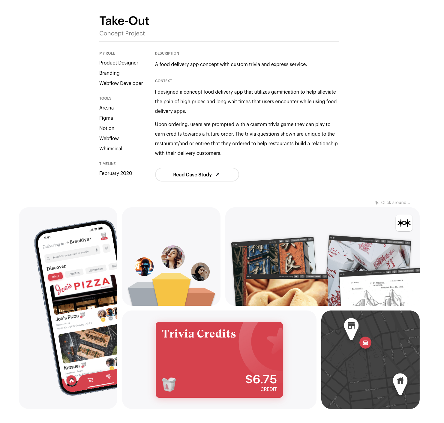
He urges other designers and developers to emphasize past experiences beyond just a quick screenshot and blurb because doing so is key to “show” what you can do as a designer or creative. This means building in site experiences that highlight your talents and position you positively to hiring managers or potential clients.
Highlight who you are as a person
Beyond the products, Marco also wanted to tell site visitors to his site about him as a person. So in his “About section,” he also built a grid of elements that visitors could interact with — this time with some of his favorite things. Some highlights include music that he’s currently listening to, his favorite podcasts, what he’s tweeting currently, and even some of his recent photography he’s taken on his iPhone.
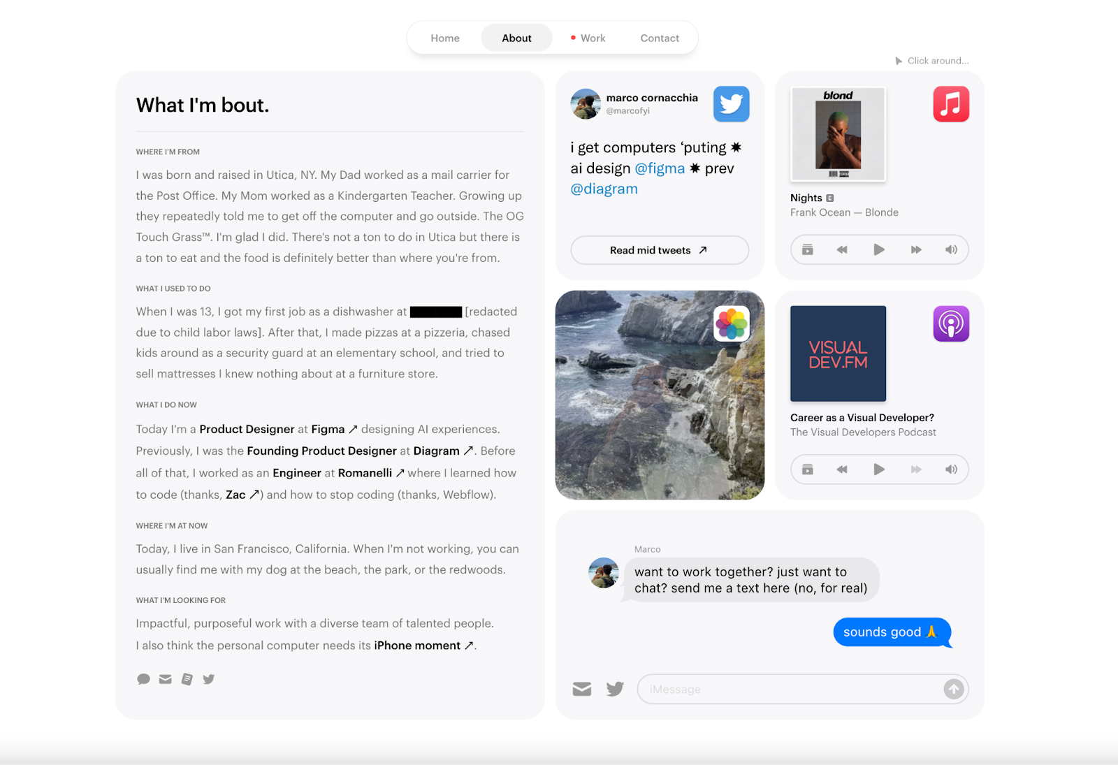
He even created a contact form that looks like iMessage so people can get in touch with him. When the form is filled out, it actually sends a text message directly to Marco’s phone and he can respond via text — so the conversation both aesthetically feels more personal and is more personal in practice.
Many designers and creatives often go for the standard “about” section that emphasizes professional accomplishments. Though that’s important, by highlighting who you are as a person — your interests, likes, even dislikes — he believes you create an opportunity to add a human element to your professional life. In your portfolio, you’re trying to reach people who you might be working with closely over large spans of time, so his advice to other designers is to let them get to know you and allow your personality shine through.
Don’t put too much emphasis on ideation
Though this can seem counterintuitive when building complex and visually stunning sites, Marco emphasizes that though ideation is important – it shouldn’t take up most of your time. He explained that he spends 30% of his time in Figma to “explore ideas, decide what.. [he’s].. going to build, and get the overall feel and structure laid out.” For the remaining 70%, he’s building in Webflow and executing on his designs.
For Marco, this allows him to quickly identify where designs might not work, troubleshoot issues quickly, and maintain flexibility. This helps avoid any major setbacks to the process of building a site and allows him to ensure that the design of the site is also functionally sound.
Build your own site that stands out from the crowd
In an increasingly crowded digital space, it’s important to create sites that meaningfully showcase your work and highlight your personality. If you’re feeling inspired — get started in Webflow today. We can’t wait to see what you build!


Relive Webflow Conf 2023
From our keynote showcasing the latest and greatest in Webflow to inspiring and informative sessions, all recordings from this year's Webflow Conf are available to watch on demand.


