


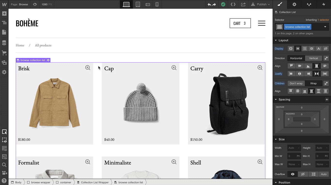
Ever wish your screen could be just a teensy bit wider? Well, if yes, we have good news.
Today, as the first in a series of steps toward unlocking larger breakpoint support (for devices 993 px and above, beyond our current “desktop” option), we’ve added controls to resize the Designer canvas and preview how your site looks on larger devices.

If you spend most of your Webflow time on laptops whose screen sizes fall on the smaller size of the spectrum (say, 13” or less), this update’s going to make your life a lot easier.
With these new controls, you can resize the canvas to a specific pixel width, or use a percentage to zoom out to a width wider than the display you’re using.
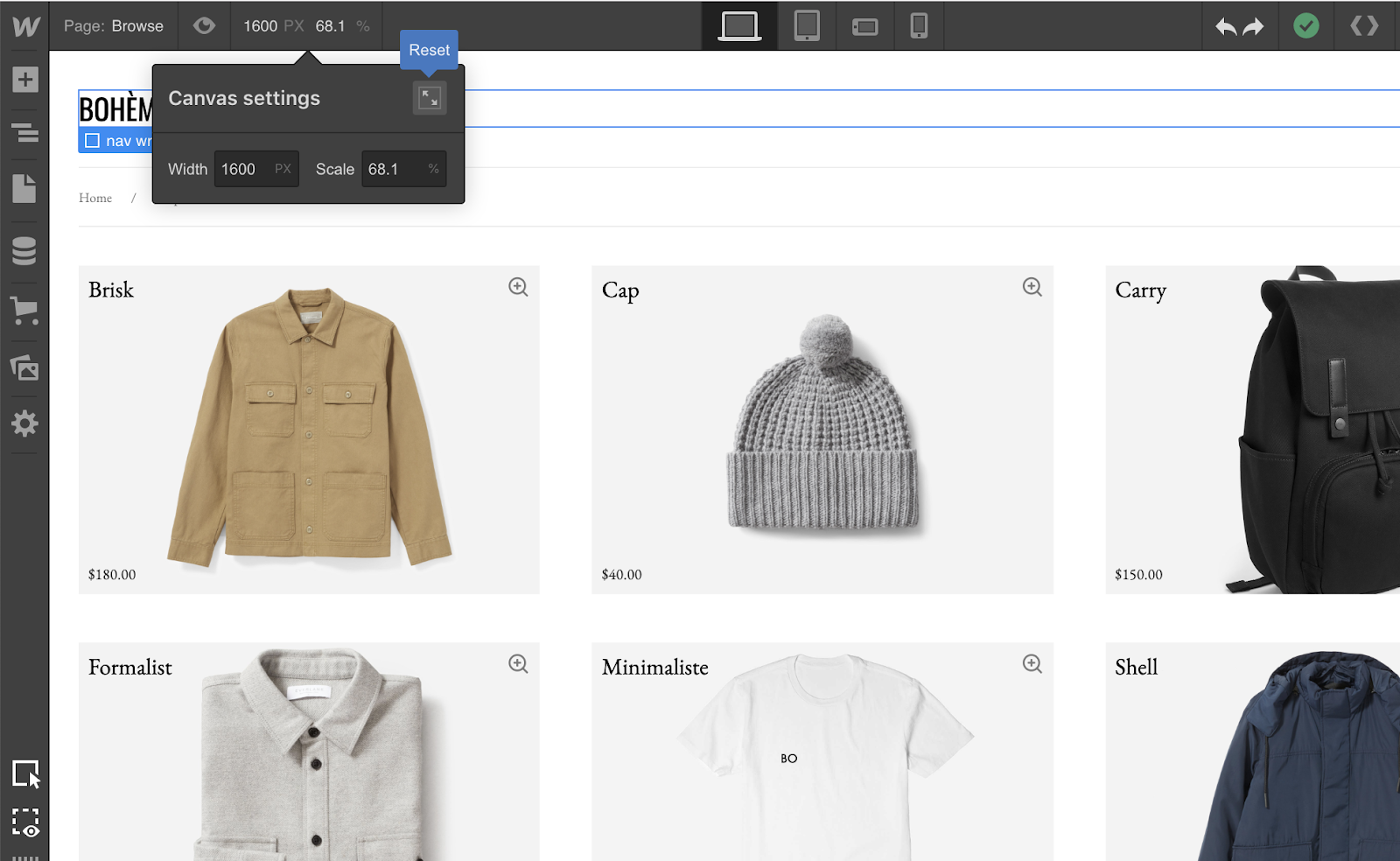
Notice also the option to set your canvas width to 100%, or true to the width of the device you’re using, by clicking the reset button.
