


When to use components
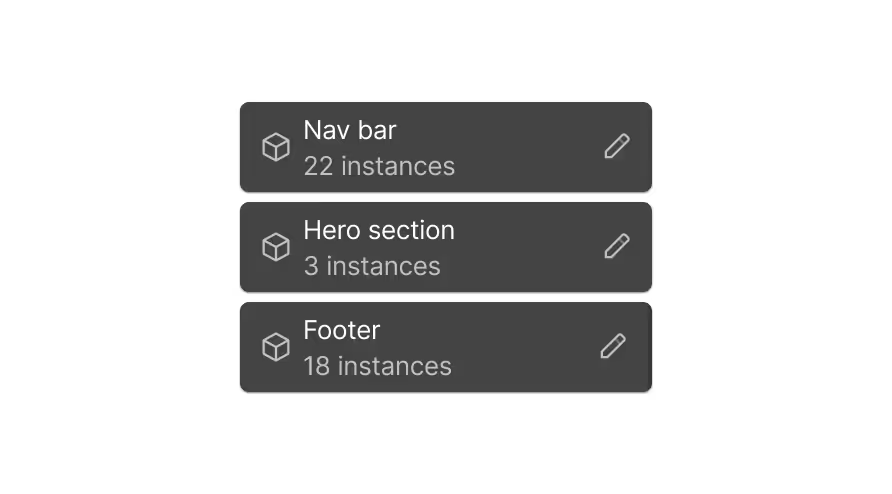
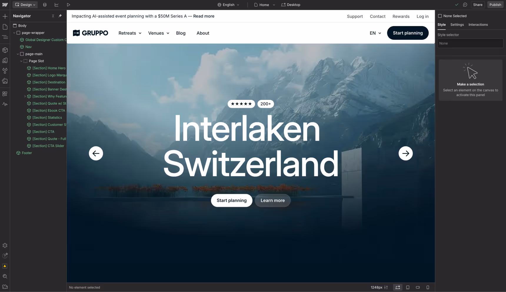
A scalable website builds from a component-first approach: any parts of your site can and should be a component to maximize reusability and unlock capabilities like page building. At a minimum, the best practice is to create components for any UI that appears more than once:
- Headers, footers, and other navigation
- Badges, buttons, and cards
- Sections and collection lists
Compose more complex patterns from smaller, more atomic components. For example, a Site Header component could include:
- A Logo component
- A Nav Bar component
- A Button component, e.g. an “Upgrade” or “Contact sales” call-to-action
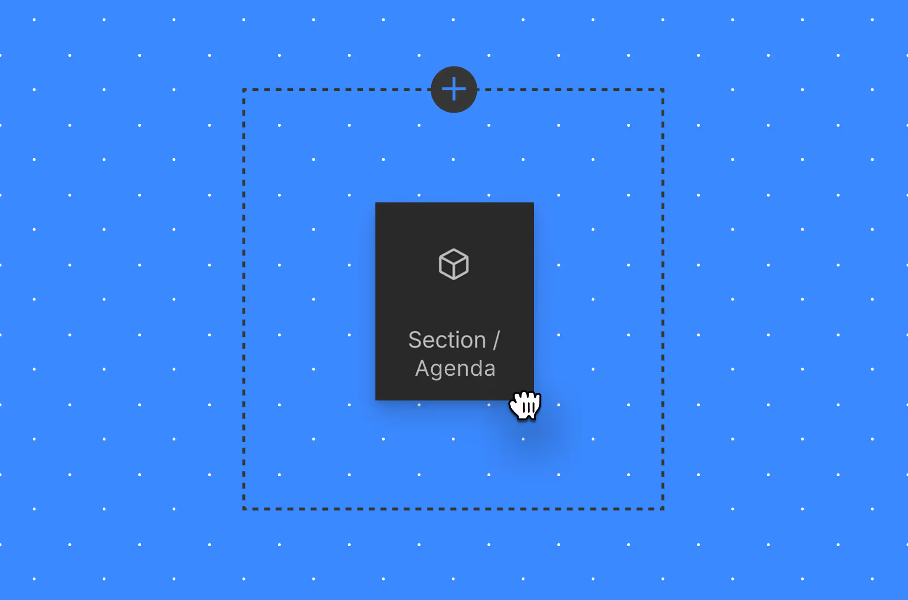
Atomic and compound components
In fact, you can think of components as being more or less atomic:
- Atoms: the smallest possible unit for a component, such as a button.
- Molecules: components composed from atoms, such as a card.
- Sections: a section of a page composed of molecules and potentially atoms as well. For example, a card grid.
Components for everyone
Cross-functional teams that are strong in design collaboration typically create two types of components:
Design components
These are components with a specific purpose. Similarly to semantic variables, their name indicates what they should be used for: Header, Footer, Card, Button, Call to Action, are all examples. Marketers can compose a page from these components in Build mode, configure them using the options you’ve provided via properties, and update their contents.
Development components
These components are used to create and compose other components, capturing reusable patterns like specific layouts. These components often provide a better alternative to utility classes, especially when combined with component style variants, reducing class bloat and selector overhead when updating designs.
When not to create a component
Building component-first means that components are nearly always the appropriate tool for the job. However, when it comes to the scope of an individual component, a page section is likely the largest you want to go. Page Templates are a great tool for defining reusable page structures—using components!
Modifying components

Configurability is key to making each component reusable in multiple contexts. Each instance of a component may have different content, structure, or style needs. This is where properties (aka: props), slots, and style variants come in.
When to use properties, slots, or style variants
Settings such as:
- Content like text, images, and links
- Visibility on optional elements
- IDs or custom attributes
- Properties on a nested component
For example, a section may call for an image, title, text, and optional CTA to be configured on each instances.
This might look like:
- Components that can include flexible number of nested components
- Components where the general structure is consistent, but additional content is sometimes needed.
- Developer components for layout and other utilities, composed to created other components.
For example, a testimonial section may call for a flexible number of testimonials on each instance.
Tip: If you find yourself using a lot of Visibility props, consider using slots instead.
This might look like:
- Different semantics, like Primary and Secondary
- Different color schemes, like Light and Dark
- Different layouts, like Horizontal and Vertical
For example, a Button component with primary and secondary variants, or a Card with horizontal and vertical variants.
Tip: Create style variants for different variable modes, like Light and Dark
If the structure or style modification has no relationship to the component, that’s best captured by a new component—rather than a style variant.
For example, two sections with layouts that call for very different structure, or content that calls for a different set of props.
Instead of using component properties for these, configure them directly on the component. This ensures that they will not be changed (against your intent) from instance to instance.
For example, links in header or footer navigation.
Naming components

Component names follow these conventions as a best practice:
- Do prioritize consistency above all else.
Do not mix casings, word separators, or internal naming structures. Component names do not impact your published site’s code, so effective naming practices are really about discoverability and organization. - Do balance brevity with clarity.
Names are economical, reducing overhead for your team. However, don’t sacrifice clarity of purpose for brevity—this will help prevent team members from creating multiple components that serve the same or similar purpose. - Do use shared language
Language that your team members and clients understand. Use your design system to reinforce this shared language consistently.
Component, style variant, and property names should use title casing, separating words with a space. This ensures that names are human-readable.
Naming a component
Following the aforementioned naming principles, examples include “Card” or “Pricing Card”—assuming pricing cards are structurally or stylistically much different than a typical card in your design system.
Naming a context-specific, atomic component
Suppose you are naming an atomic component that will only ever appear in a specific context, such as a call to action that will be added to a slot within a Card component. This component’s name should begin with the parent context’s name. For example, “Card Call to Action”.
Naming a component group
Component groups should get a simple, human-readable name that describes their purpose, such as “Sections”, “Cards”, or “Utilities”.
Naming a component property
Give your component properties a simple name based on their purpose, i.e. what part of the component they configure. Go for brevity here: you do not need to add the name of the component itself (whether a root or nested component) to your property names, as this is implied by the property’s context. For example, the text that appears on a button would be called “Text”, not “Button Text”.
Naming a property group
If the property group is used for a nested component, set the property group name to that component’s name. Otherwise, use a brief descriptor of its purpose.
Naming component style variants
Similarly to variables, component style variants could be either primitives or semantics. Their names should simply be an identifier of their primitive stylistic use, or purpose-based semantic use. There is no need to add the name of the component itself to your variant names, as this is implied by their context.
When using style variants, we also recommend renaming the “Base” variant to something more specific that describes its purpose.
Order variants by most to least common use cases. Examples include:
- “Primary” (renamed from “Base”), “Secondary”, “Tertiary”
- “Light” (renamed from “Base”), “Dark”
- “Confirm”, “Cancel”, “Upsell”
Organizing components

Component groups
A robust design system makes it easy for your team members to quickly find the component they need. We recommend that you start defining an organizational structure starting with your first component.
- Group components by like purpose, such as “Sections” or “Cards”.
- Create a separate group for developer components. These are the utility components that your developers leverage when building out designs, such as layout utilities.
Property Groups
These groups keep your component configuration cleanly organized, especially when using nested components or offering a high degree of customization on a component.
- Create a group for each nested component, such as a “Button” property group when nested inside of a “Card”.
- Create a group for each repeated, nested piece of structure. For example, if you have a list of 3 links, create property groups for “Link 1”, “Link 2”, and “Link 3”.
Ordering properties
List properties in the same order as the component structure, or DOM. Properties that affect the entire component—like Variant, or Visibility on the root element—come first. It’s best practice to create a property group for each nested component. For example, a Button nested in a Card would get a “Button” group containing “Link” and “Text” properties.

Accessibility considerations
Designing for accessibility ensures as many people as possible can use your site without barriers or roadblocks. Not only is web accessibility the most inclusive way to build for real customers, it’s also crucial in ensuring your brand has the broadest possible reach.
Accessibility must be considered throughout your site’s structure, semantics, content, style, and animations. Learn more about accessible structure
Using components with custom code
Code related to a component should be included in a code embed inside of the component. This is cleaner and easier to maintain than storing this code in page custom code, site custom code, or a code embed inside another component.
Next up: Static page templates
Static page templates let you bake in structure, branding, and SEO best practices, so marketers can build fast, and designers don’t have to QA every new page from scratch.
More ways to level up
 Webflow University
Explore courses and pathways to grow your skills or prepare for a Webflow-verified certification.
Go to University Help Center
Find solutions to your Webflow questions and get help from our expert customer support team.
Go to docs Community
Connect with other designers and developers to share tips, ask questions, and show off your work.
Go to Community