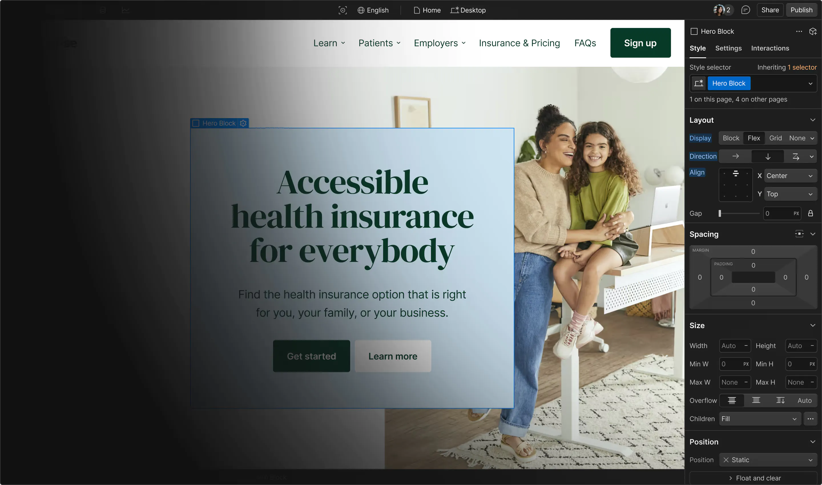
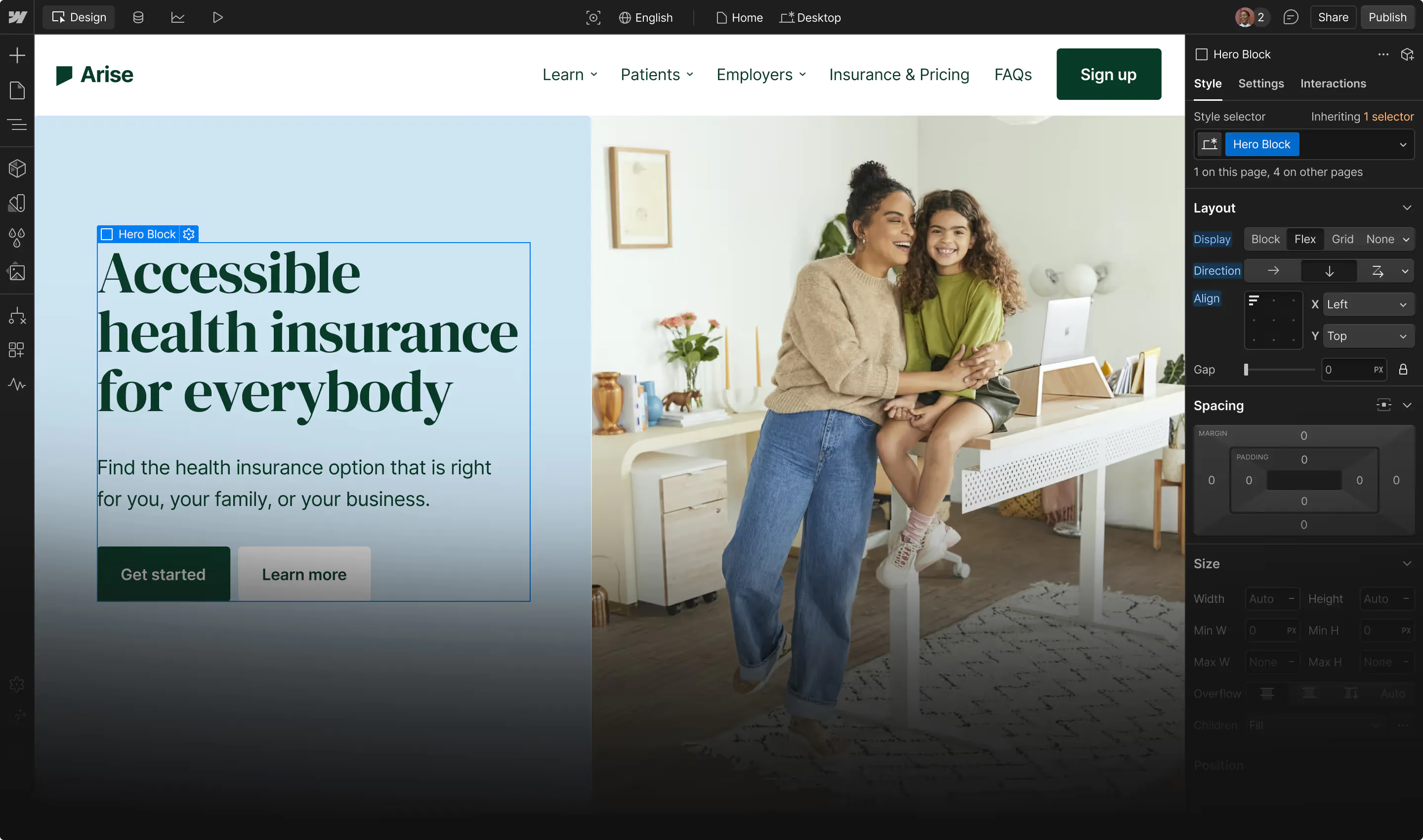
Dark mode is an interface display setting that offers an interesting inversion of standard dark-on-light designs.
The color theme of your website or app project is a fundamental choice you’ll need to make early in the design process. Whether you opt for light or dark mode, this decision dictates which highlights, effects, and contrasts you can use.
Selecting dark mode sets some limitations, but this option also offers many interesting benefits, like a unique aesthetic and a gentler viewing experience for users. Dark mode is a bit harder to design for than light mode, but if you can overcome those difficulties, you’ll find it works just as well. Discover the pros and cons of choosing dark or light mode for your underlying color theme.
What’s dark mode?
Dark mode, also known as dark theme or night mode, is a user interface (UI) color theme that has a black background and lighter text, icons, and images. You can enable it in many devices and apps where light mode is typically the default, but you can also employ it in your website designs.
Besides the aesthetic differences, dark mode’s reduced brightness can reduce eyestrain in low-light conditions, making it an intriguing design choice for some web design projects. Over 70% of users report that dark mode reduces eye strain during prolonged screen use, especially in low-light environments.
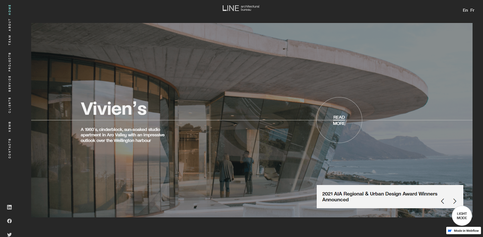
On Jeronimo Piquero Saiz’ Architectural Bureau website, you can toggle dark mode to change the website background to a dark-toned experience.
Dark mode vs. light mode: The UX debate
Is dark mode better than light mode? While some people strongly prefer one over the other, neither is objectively better than the other from a user experience (UX) design perspective. They both come with advantages and drawbacks that make them uniquely suited for different circumstances.
Light mode is typically the default choice when designing for mobile devices, apps, and websites because it’s brighter and gives a more vibrant appearance. Since more colors contrast with white than black, it’s also easier to select color palettes that pass the WCAG accessibility test. Given how vital accessibility is to modern design, it’s no wonder light mode is so common.
But selecting the best theme for your website requires you to address challenges beyond color contrast. If a dark theme better represents your brand, it might be worth trying to deliver a more consistent user experience. Ultimately, it’s up to designers to weigh the risks and rewards so they can produce an engaging, consistent experience.
Dark mode: Advantages and disadvantages
Dark mode isn’t as common as light mode, but it’s becoming increasingly trendy in web design and more popular in applications. Some popular services like Discord and Nvidia use it as their default theme, setting themselves apart from their competition.
Here are some pros and cons of using dark mode.
Advantages of dark mode
Selecting dark mode for your color theme isn’t just about bucking trends — it also comes with a host of other advantages, including:
- Reduced eye strain in low-light environments. In environments where the screen isn’t awash with ambient light, dark mode is just as easy to read as light mode but emits less blue light, the wavelength that causes the most eyestrain.
- Unique aesthetic appeal. Dark mode looks stunning with colors that properly contrast the black background. Light tones pop best, and designers can use white highlights to create a glassy effect you can’t achieve with light mode, where the highlights fade into the background.
- Interesting color contrast. Black contrasts against pale colors, like pastels, better than white does. For example, pink (#FFB3BA) contrasts against a black background with a 12.4:1 ratio, while against white, it’s 1.69:1.
- Potential improvement in sleep quality. Studies show that artificial light exposure before bed can suppress the body’s release of melatonin, a crucial hormone our bodies use to regulate sleep. The brighter the light, the worse the impact is.
- Optimal battery efficiency (in some devices). Most devices require more power to make a white pixel than a black one, especially with OLED screens where black pixels are essentially turned off. Nearly 80% of university students said they preferred dark mode in educational or e-learning sites, with many citing reduced glare and less eye fatigue during late hours.
Disadvantages of dark mode
If you decide to go with dark mode, account for the following disadvantages:
- Lower efficacy in bright environments. When there’s more ambient light, your screen’s brightness must compete to deliver crisp images and text. Since dark mode emits less light, it’s not as effective in these circumstances.
- Less battery-efficient with older LCD screens. LCD screens use a backlight to illuminate the entire screen, regardless of pixel color, and dark mode doesn’t reduce how much power that backlight consumes.
- More difficult to design for. Overall, creating a successful design is more challenging in dark mode. For instance, even though dark mode promises reduced eye strain, you must be very precise in your design to claim this benefit — if there’s enough white text, the screen still emits plenty of blue light, effectively eliminating that advantage.



Ultimate web design
From 101 to advanced, learn how to build sites in Webflow with over 100 lessons — including the basics of HTML and CSS.
Light mode: Advantages and disadvantages
Many ubiquitous brands, like Apple, use light mode in their marketing, websites, and products, so it has the weight of big-brand appeal behind it. But that popularity cuts both ways. Some designers opt for dark mode simply because it’s different.
Here are other important factors when considering light mode.
Advantages of light mode
Light mode has more going for it than sheer popularity and offers the following benefits:
- Better readability in bright environments. Light mode creates a screen that emits enough light to compete with bright surroundings, making it appear crisp and clear in daylight and other environments.
- Familiar visual appeal. People are accustomed to light mode because it’s long been the standard. And it’s a key component in minimalism, a major design philosophy that’s been popular for decades.
- Better contrast with primary colors. Primary colors pop against a white background much better than against black. For example, blue (#0000FF) contrasts against a white background with an 8.59:1 ratio, while against black, it’s 2.44:1.
Disadvantages of light mode
If you choose light mode, you’ll need to contend with the following drawbacks:
- Potential battery drain. On modern displays like OLED screens, white pixels require the most battery power to light, whereas black pixels require virtually zero.
- Less discretion. A bright white screen in a dark environment dramatically beams light like a beacon, making dark mode a better choice for low-light conditions.
- More eye strain. White light contains the blue part of the spectrum, which causes the most eyestrain.
- Disrupted sleep. Artificial light exposure, especially before bedtime, throws off our bodies’ circadian rhythm because it causes our brains to produce less melatonin at the regular intervals we need.
Enhance your site’s aesthetics and user experience with Webflow
There isn’t a clear winner between dark and light mode, so you must decide which is best for your particular project. Webflow, for example, uses different modes in different places — the homepage features a dark theme, but the blog has a lighter aesthetic.
Try experimenting with your designs in Webflow, where you can test significant theme changes quickly to see how they look. And check out the Made in Webflow Marketplace, where you’ll find dozens of templates for both dark mode and light mode designs.
Try Webflow today to craft a visually stunning website that excels across all devices and bring your vision to life effortlessly.

Get started for free
Create custom, scalable websites — without writing code. Start building in Webflow.
