


Draw attention to your most important website features with a minimalist design.
Minimalism is gaining popularity as web designers seek ways to create striking web layouts that engage visitors. It’s a smart style for any website, but design agencies and portfolio websites especially benefit from the minimalist aesthetics’ ability to draw attention to project showcases and case studies.
If you’re interested in trying your hand at minimalist website design, drawing inspiration from minimalist website examples can help. Below, you’ll find 25 examples of minimalism at its best.
25 minimalist website examples
As you explore the following minimalist website examples, consider what makes each one effective and how you might apply similar design principles to your own web designs.
1. Studio Yoke
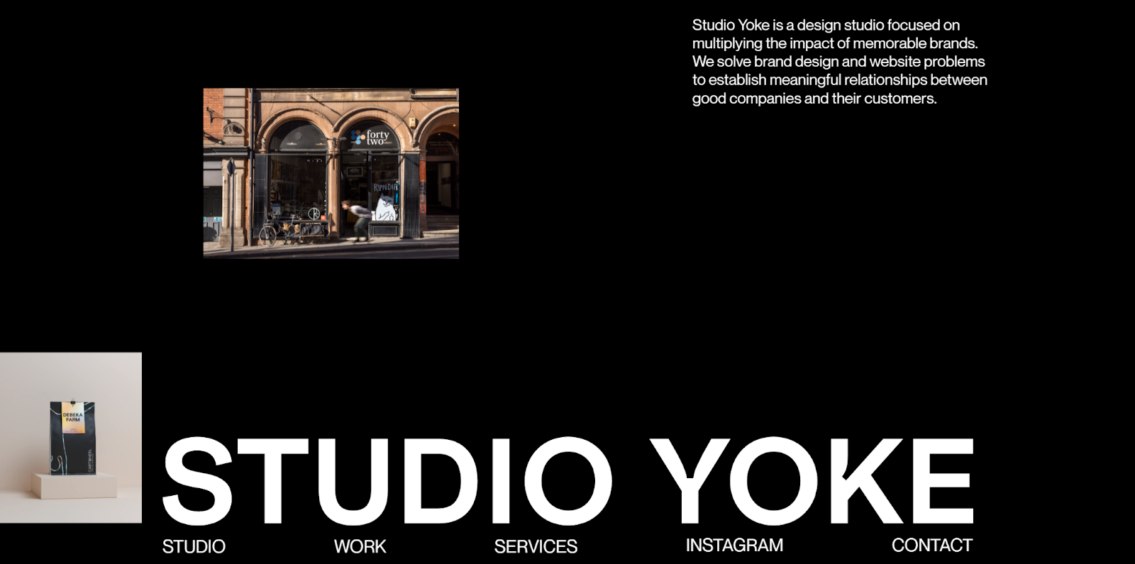
Studio Yoke is a design studio that helps brands develop deeper relationships with audiences. As you scroll through the homepage, a vertical gallery slides upward along the layout’s left side. Hovering over the navigation options causes the background and font colors to change.
What makes this site so compelling is how the simple elements add immersive flair without feeling overdone. Plenty of whitespace gives the homepage a clean aesthetic, and the bold but understated typography allows the high-quality images to shine. This web design illustrates how minimalists walk a fine line between decadence and simplicity.
2. Immeasurable
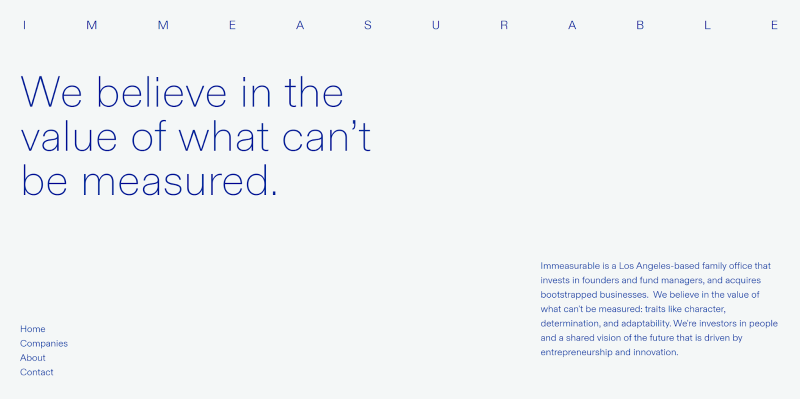
The Immeasurable homepage, designed by Basil Gloo, delivers a simple yet immersive user experience with limited interactions. There are just a few pages to explore, but each opens with a quick, impressive animation. Immeasurable uses every inch of the screen while maintaining enough whitespace to achieve a minimalist look.
Perhaps most noteworthy about Basil Gloo’s work is the use of font sizes to create a visual hierarchy. The brand name is only slightly more prominent than the body text, while headlines are much larger and styled in a serif font with only the smallest embellishments. Overall, this simple website excels at clarity and efficiency — two core tenets of minimalist design.
3. Noomo Digital Design Agency
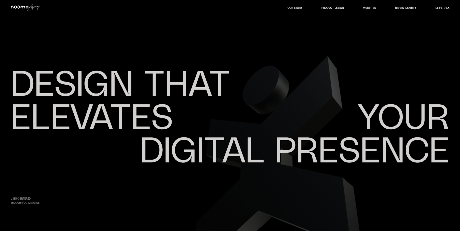
Noomo Digital Design Agency creates apps and websites for a wide range of clients. The agency showcases its impressive portfolio through clear, well-organized case studies. Noomo uses animations sparingly to enhance the high-quality visuals without overwhelming them.
The elegant layout is a strong reference point for any agency or portfolio website, carefully balancing simplicity with the interactive elements that make each case study stand out.
4. Adrienn White – Brand Strategist, Brand and Web Designer
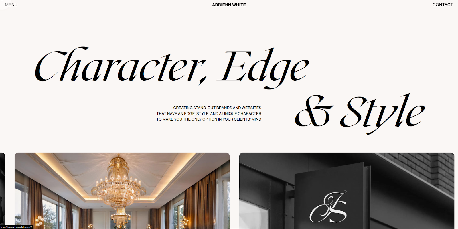
Adrienn White is a designer with a wide-ranging portfolio that includes everything from product packaging to web design. Her website delivers on the headline’s promise of character, edge, and style, pairing decadent typography with high-quality images while using negative space to maintain a minimalist design.
If you’re looking to build a minimalist website that incorporates a strong sense of personality, Adrienn’s website is a great reference point. To emulate her work, study her use of light-touch animations and subtle scroll effects that immerse visitors without overwhelming them. Then, find a combination of fonts that captures your unique style and use them to establish a clear visual hierarchy.
5. Quin
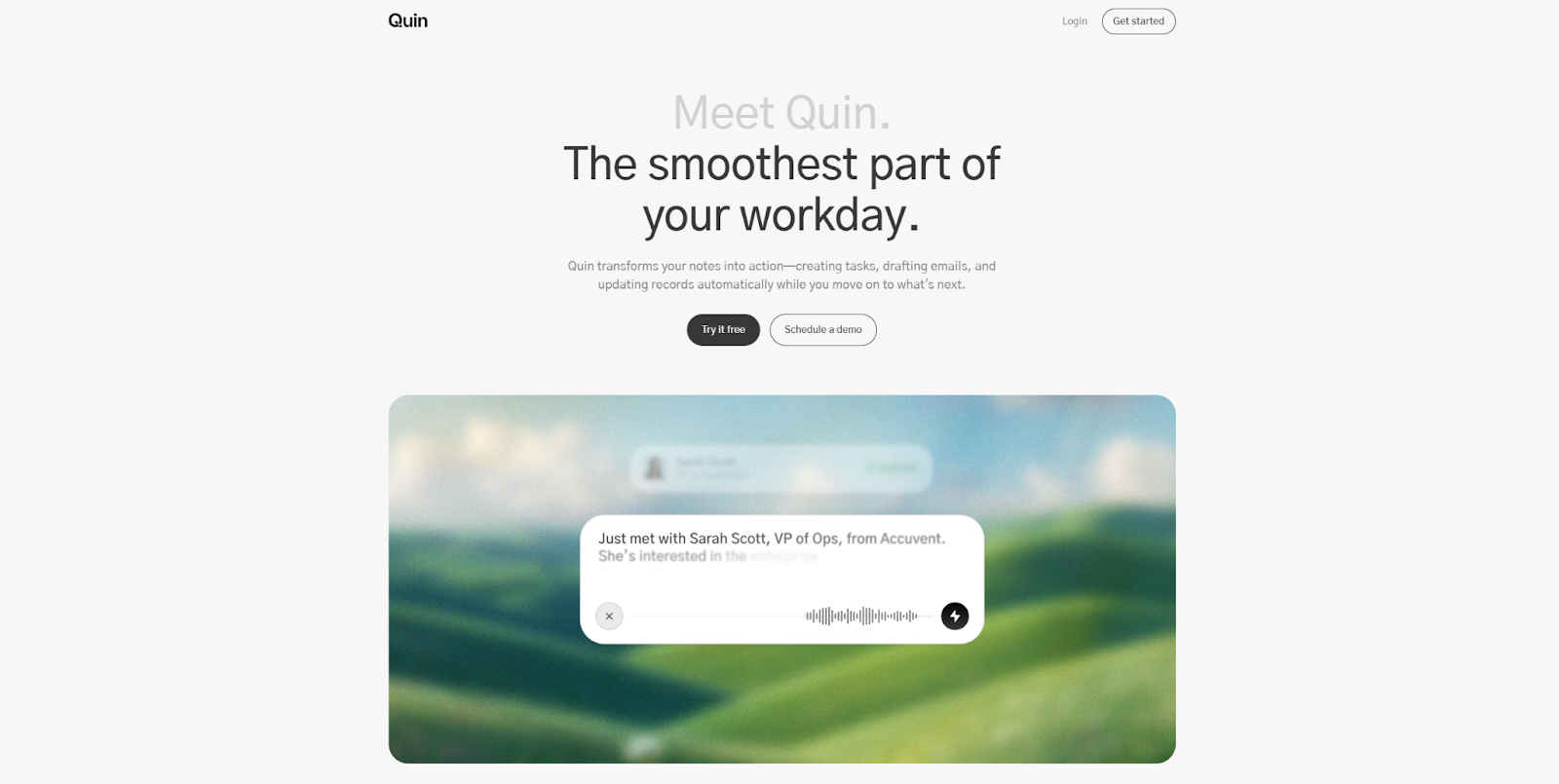
Quin is a simple, intuitive tool that captures action items from meeting notes and messages. The brand’s website mirrors the tool’s simplicity with its pared-down layout.
What sets Quin’s site apart is its cohesive use of color. Natural, contrasting tones emphasize key elements like use cases and calls to action (CTAs), while landscape images in the background reinforce the color palette. The result is a minimalist design that feels thoughtful.
6. Caleb Raney
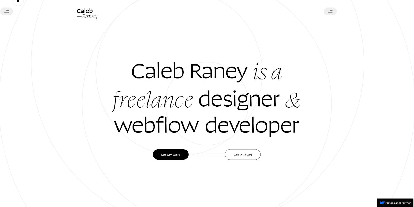
Caleb Raney is a talented freelance designer and developer with a unique style. Their striking black-and-white layouts combine elegant typography with bold animations, all grounded in a minimalist aesthetic.
Every case study follows a consistent visual rhythm, with carefully organized landing pages and animated transitions that don’t compete with the content. The case studies also take on the color scheme of the product being showcased, turning each one into a self-contained visual experience — a perfect example of the commitment to consistency and efficiency you should aim for in your minimalist designs.
7. Desktronic
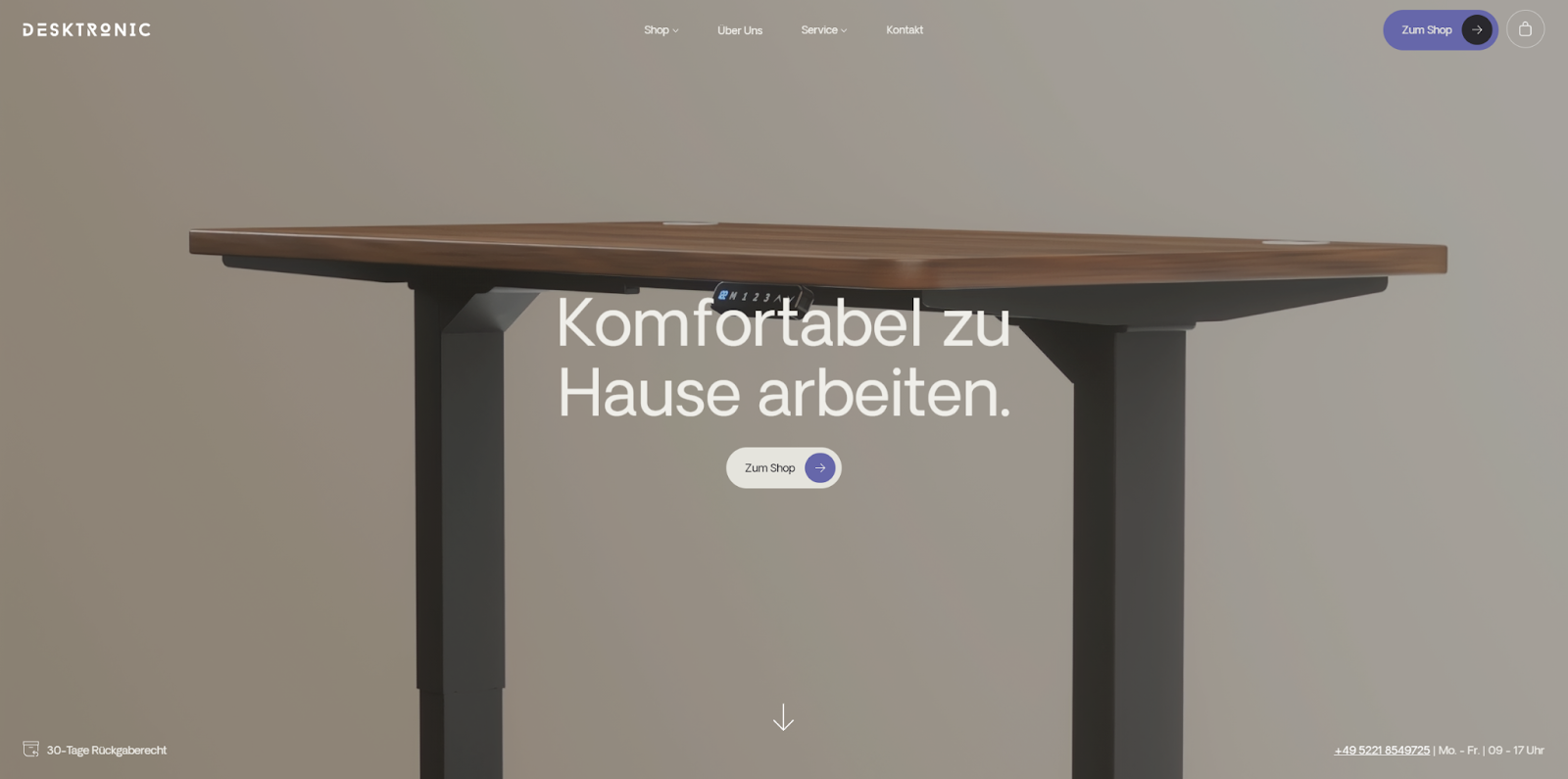
Desktronic makes ergonomic, adjustable work surfaces that embody minimalist design. The manufacturer’s website reflects the product’s modern aesthetic with crisp imagery, a muted color palette, sharp lines, lots of open space, and clearly defined layout sections.
Let it inspire you to find ways to make your minimalist website subtly reflect the product or service you’re presenting.
8. Nyton
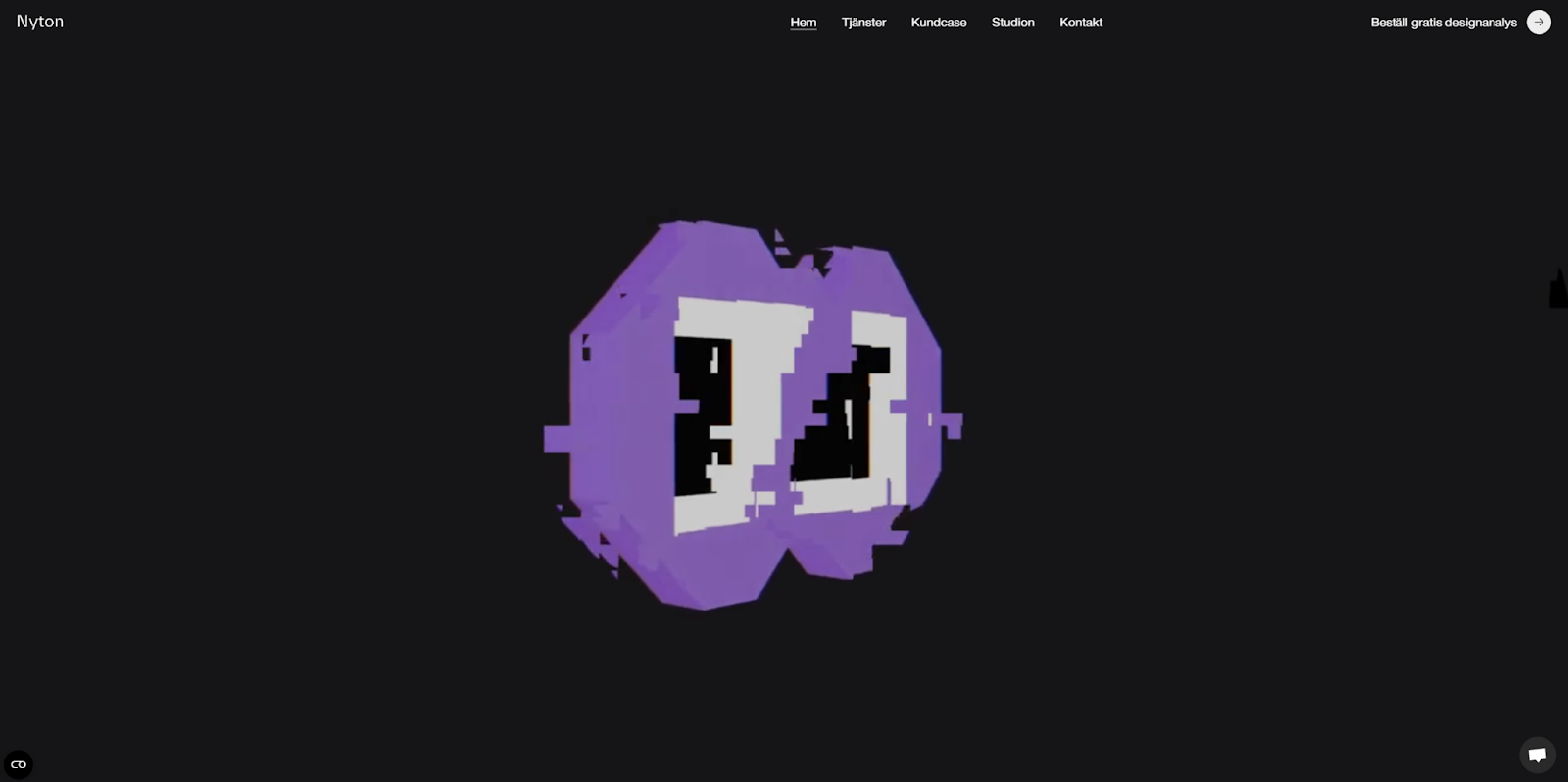
Nyton is a digital design studio with a flair for bold minimalism. The homepage opens with a quick montage of the studio’s work, and scrolling reveals a curated journey through select projects. The clean animations and visuals are offset by ample negative space that keeps the experience feeling focused.
Nyton’s layout is deceptively simple — proof that a minimal framework can still leave room for engaging, clear interactions as long as each element earns its place.
9. Function Health

Function Health helps people monitor their long-term health by tracking biomarkers and offering early warnings. The site communicates this long-view attitude through timelines and graphs, which are all presented with a soft color palette and simple typography.
The strategic use of contrast in both fonts and colors directs the eye to Function Health’s CTAs, increasing the likelihood that visitors take action and get in touch.
10. Onward
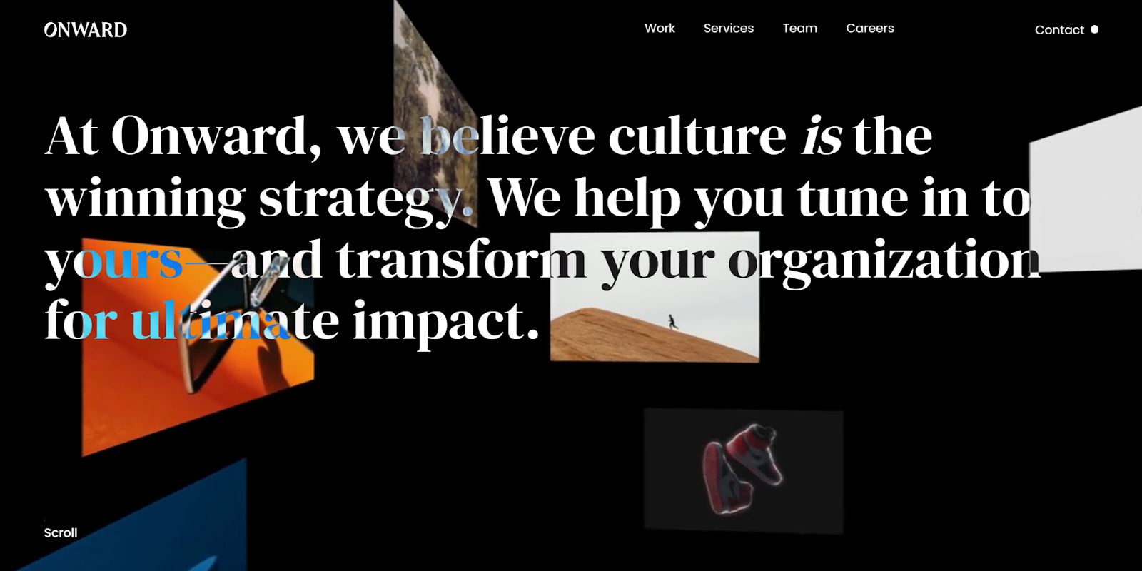
Onward is a change management agency that helps businesses grow their brands and redesign their company culture. Onward’s minimalist website includes case studies, high-quality images, and light animations, all of which stay tightly aligned with the agency’s messaging.
Consistent visual elements across layouts and pages tie everything on Onward’s site together. Take cues from this example by looking for repeating elements in your own designs that can create cohesion without adding visual clutter.
11. Bikicki Wine
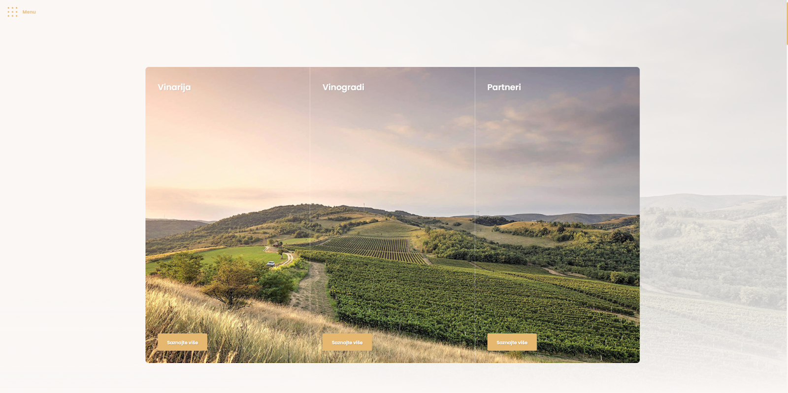
Bikicki Wine sells wine produced from grapes grown on the slopes of Fruška Gora, a mountain in Serbia. They use minimal intervention techniques to craft what they refer to as “honest wines,” and their website reflects that same authenticity.
Nebojša Ivezić designed their website using stunning photography and a soft color palette to create an inviting, grounded tone. The site’s minimalist structure reinforces the brand’s straightforward philosophy. If a central theme or culture drives your brand, look to Bikicki Wine as an example of how to weave that message throughout your web design.
12. Rule Studio
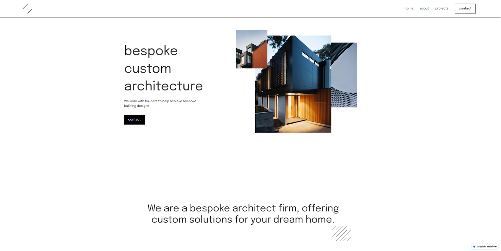
Rule Studio is an Australian architectural firm specializing in bespoke design. Packed with asymmetry and geometric shapes, the studio’s minimalist website reflects the angles of the firm’s home designs.
Rule Studio’s site (designed by Jonathan Waterworth) is an excellent example of how choosing minimalism doesn’t have to mean sacrificing a unique sense of style. If your design choices reflect your brand’s philosophy and offering, you’ll likely attract visitors interested in your offering.
13. BelArosa Chalet
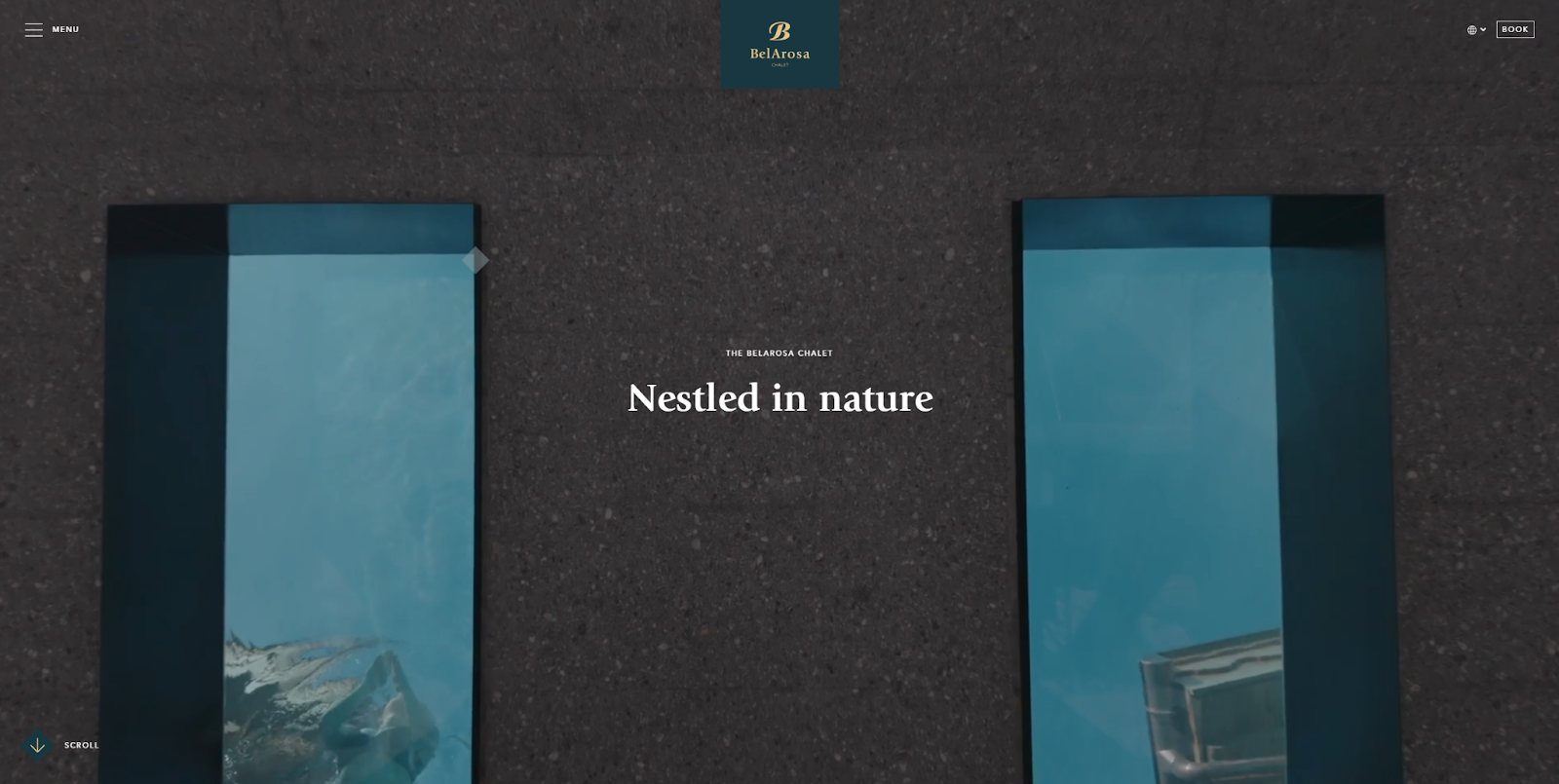
BelArosa Chalet’s website, designed by Clou, stretches the minimalist design with bold, immersive visuals. The site opens with rich video content that’s offset by negative space, modern typography, and a muted color palette.
In putting high-quality photography front and center, the design highlights the chalet’s luxury and tranquility. For visually driven websites, this is a strong reminder that minimalism doesn’t mean doing less; it means being more intentional with what you show visitors.
14. Gramercy Design
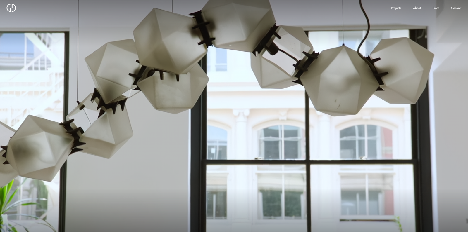
Gramercy Design’s site (by Lovably) prioritizes high-quality visuals with a site made up almost exclusively of photographs of the studio’s design projects. Gramercy Design’s site follows minimalist principles more strictly, with little to no text or animation.
A stripped-down approach keeps attention squarely on the work instead of on the web design. It’s ideal for portfolios where the visuals do the storytelling, though adding brief captions or context could help ground the viewer even more.


Build websites that get results.
Build visually, publish instantly, and scale safely and quickly — without writing a line of code. All with Webflow's website experience platform.
15. Marion Milice
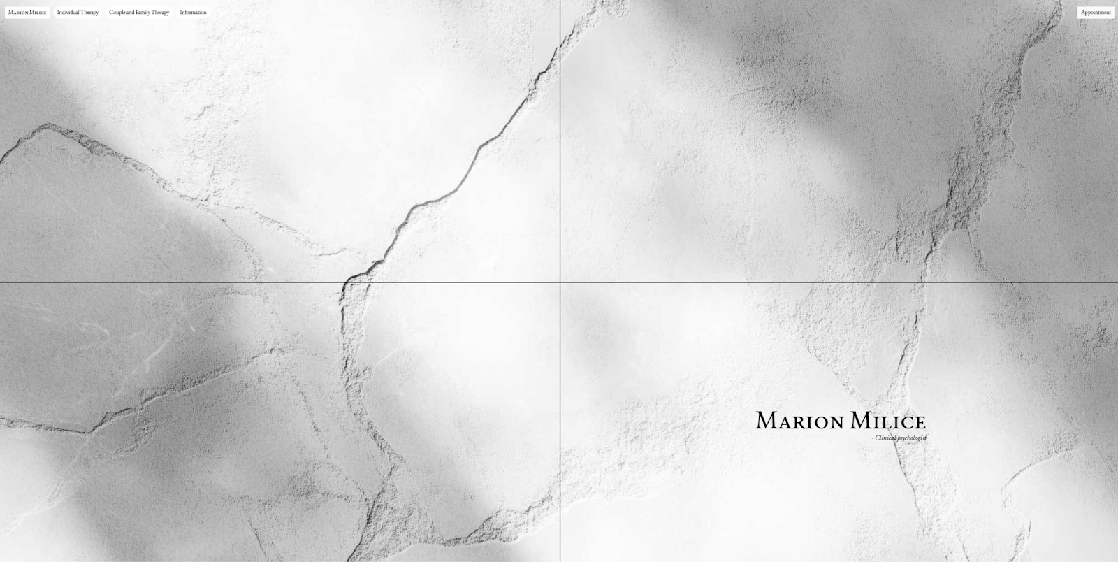
Marion Milice is a clinical psychologist, and NSLT Studio designed their site to reflect that clinical vibe with a stark, monochrome aesthetic. Sepia-toned hover effects and concise, direct language add to this atmosphere.
Navigation is discreet, and subdued visuals create a feeling of formality and distance. The website may not be warm or inviting, but it’s a powerful example of the ways you can use minimalism to reinforce tone and intent.
16. Zenit
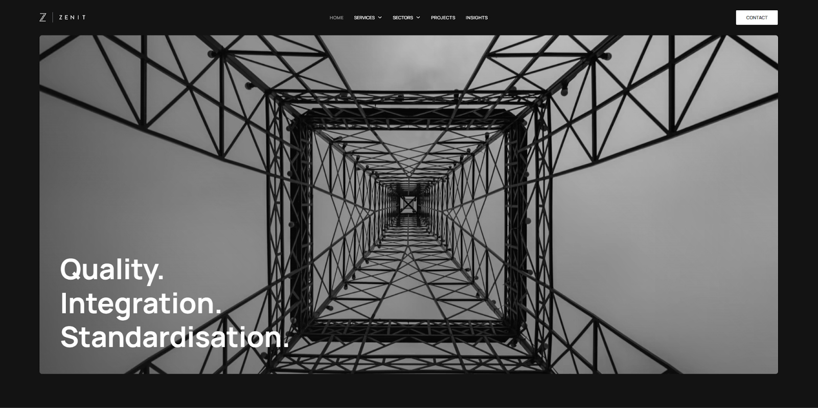
Zenit is a UK-based engineering firm that specializes in utility infrastructure. The firm’s website, built by Riot & Rebel, is almost entirely in black and white, with a few instances of primary colors and hover effects.
Symmetrical grids and ample whitespace reflect the precision of Zenit’s work. You could easily repurpose this design for a photography website or a portfolio that emphasizes structure and visual clarity.
17. Wilo
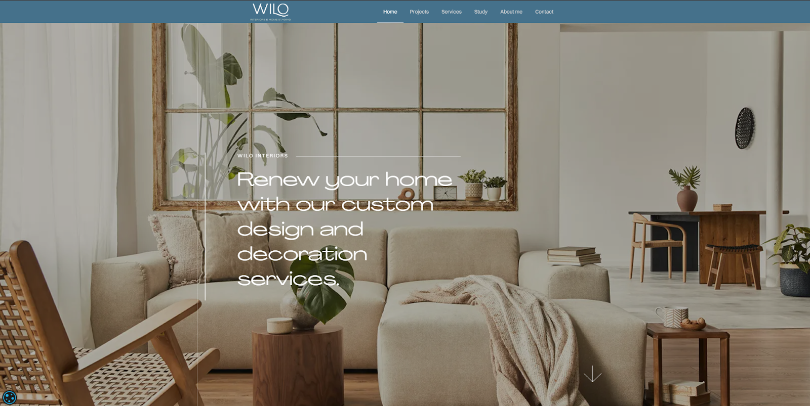
Wilo is an interior design studio that excels at everything from chic minimalism to rustic nostalgia. Edu Salvo designed their website with a minimalistic style that leverages soft colors and plenty of whitespace without detracting from the other styles of some of their projects.
Wilo’s simple website design creates space to showcase high-quality project photographs without additional visual noise, a strong example of how minimalist design can serve as a neutral foundation for different visual aesthetics.
18. The Maker Makes
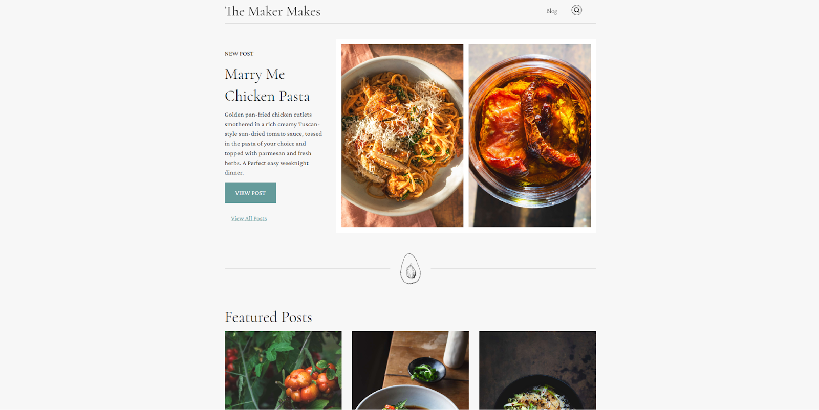
The Maker Makes is a food blog full of gorgeous photography and globally inspired recipes. With dozens of content-rich pages, this blog designed by Mike Ouellette uses a tag-based navigation system to group related posts.
This makes it easy for users to find what interests them without cluttering the interface. It’s a smart strategy that could work well for a portfolio or photography website where organization is key.
19. Legora
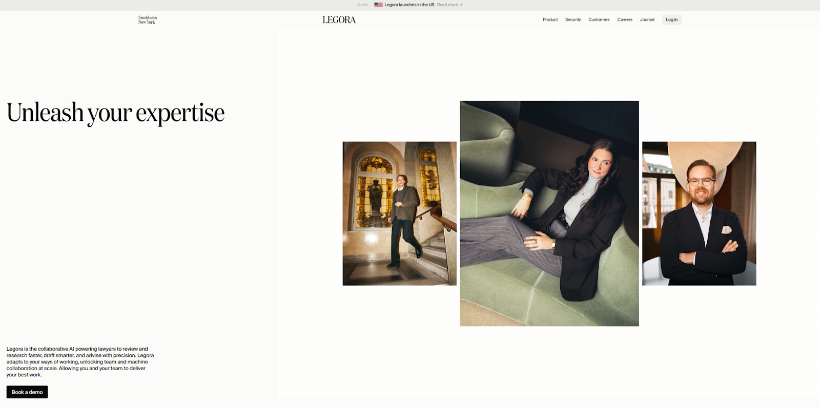
Legora offers legal services powered by AI-driven research. Their simple website uses minimalism to explain a complex service, incorporating videos, icons, and bold visuals that illustrate how the service works.
Using a balanced layout and limiting distractions makes Legora’s message more accessible. If you offer a niche or hard-to-explain service, this use of minimalism might be just what you need to communicate with clarity.
20. Recor Group
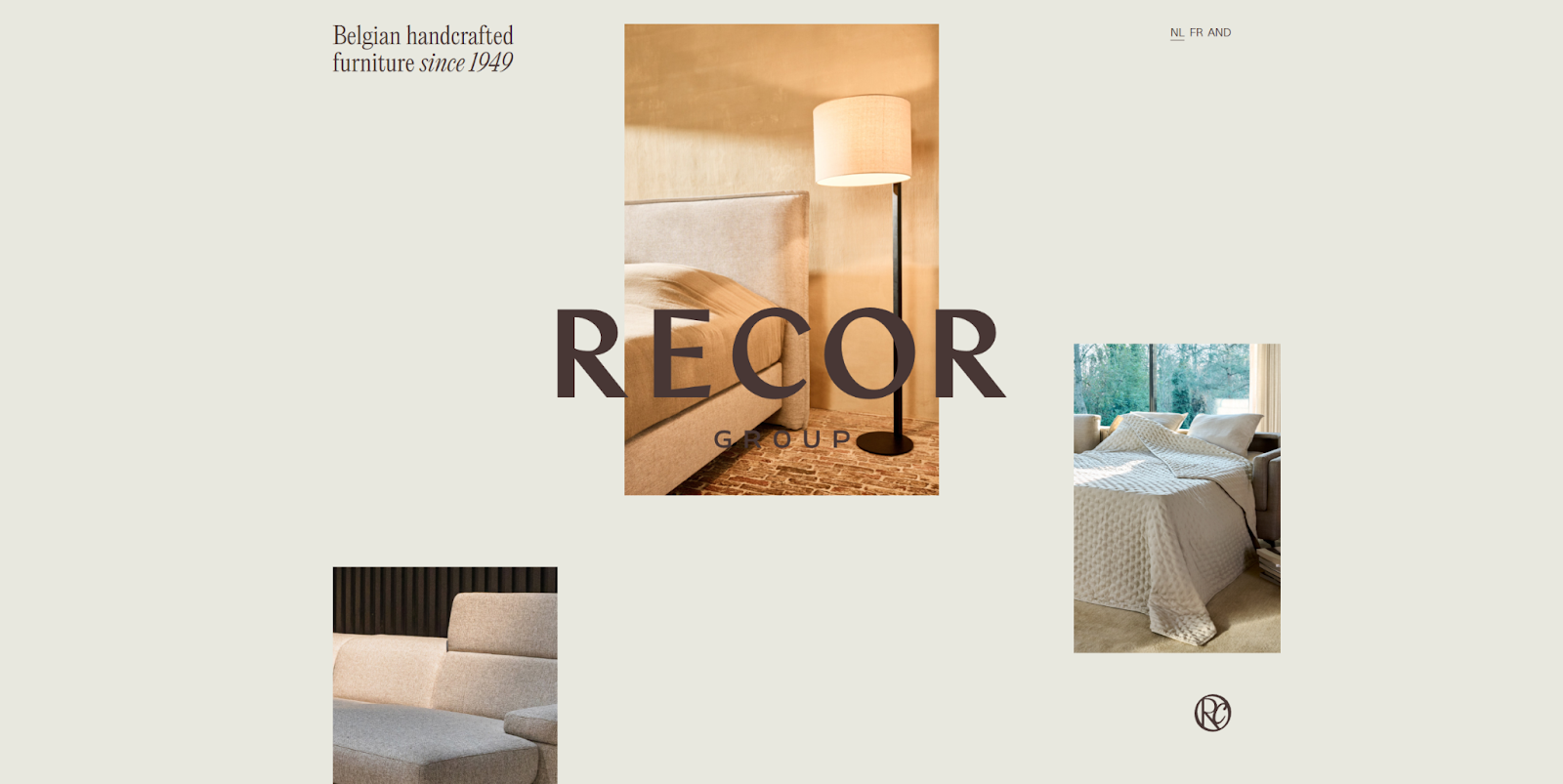
Recor Group is a Belgium-based crafting studio that specializes in “seating and sleeping solutions” with an emphasis on style. Designer RCA chose minimalism for their website, with no navigation menu, lots of whitespace, and a subdued background.
The one-page layout lets images shine, using bursts of bright color and elegant typography to keep the content visually engaging. Recor Group’s website is a useful reference for agency or freelancer websites with a strong visual identity and clear aesthetic.
21. Åmot
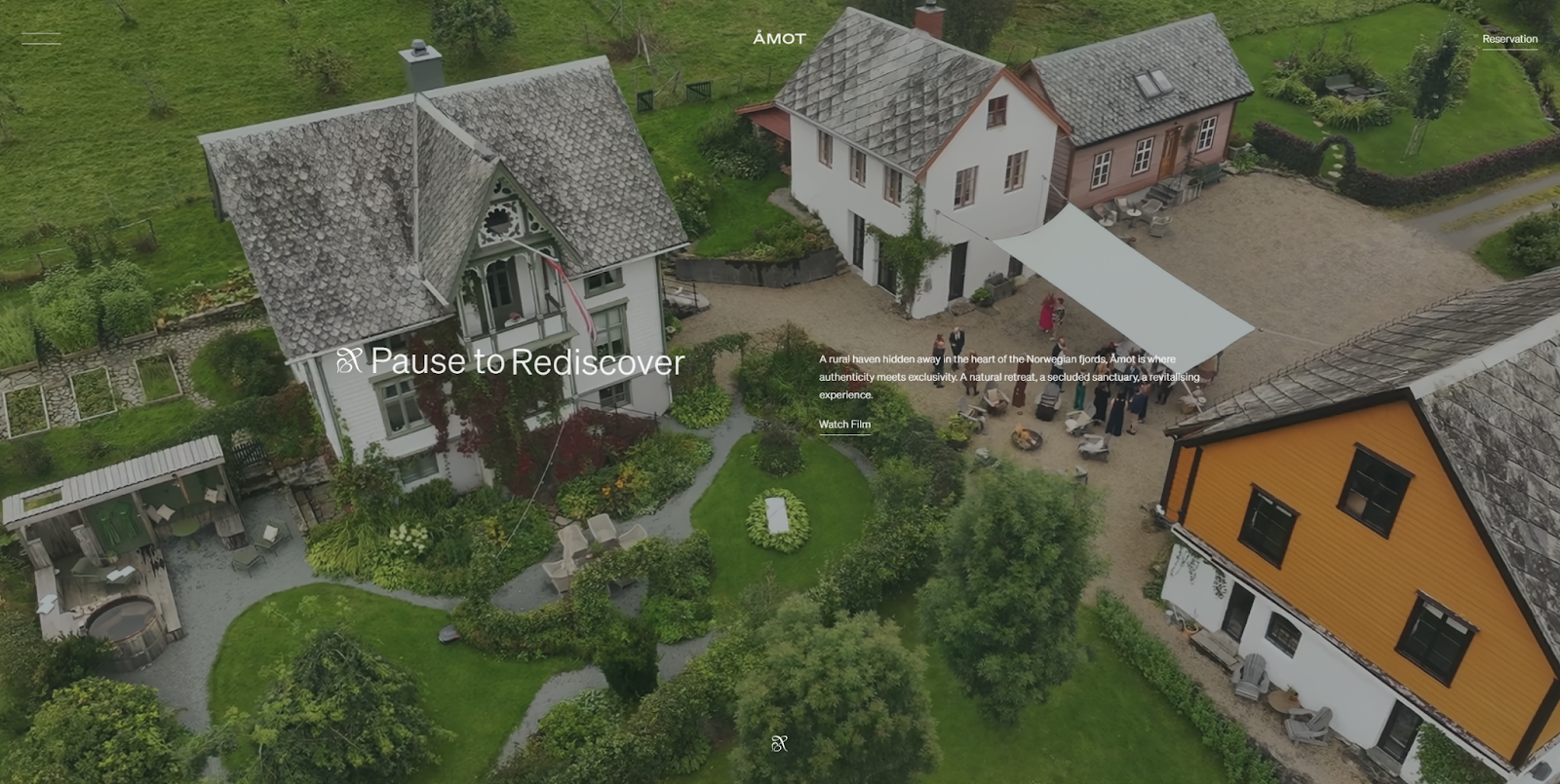
Åmot offers a luxury getaway, and their minimalist website design (made by Aditya Dubey) contrasts beautifully with the richness of the experience they offer. Sharp typography and an asymmetrical layout allow the stunning imagery to shine.
Åmot’s site strips away unnecessary elements, creating space for high-quality visuals to tell the property’s story. This works well when photography is your strongest asset, especially for service-oriented brands in hospitality or lifestyle.
22. Bolto
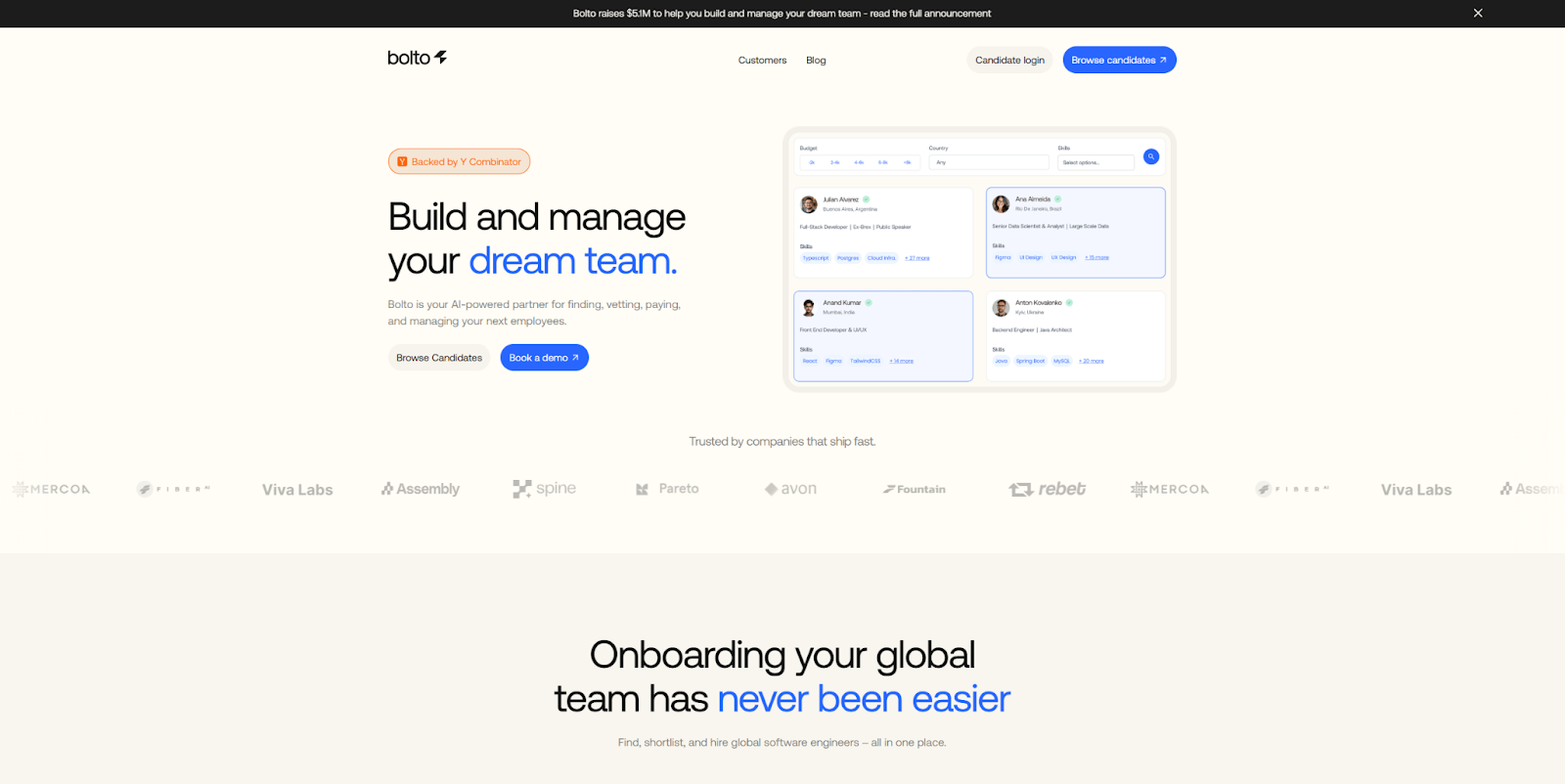
Bolto is an AI-powered onboarding platform that simplifies hiring. Its main feature is its ease of use, which the minimalist landing page reflects by showcasing case studies from past clients with only a few CTAs and a simple blog.
Sans-serif fonts, bright accents, and wide margins keep the design feeling purposeful and approachable. For content-light websites like Bolto, minimalism does a great job of conveying polish and professionalism.
23. Pellonium
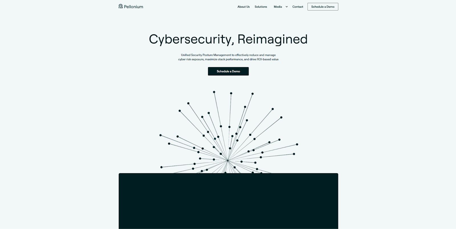
Pellonium is a cybersecurity agency specializing in vulnerability detection and risk management. The agency’s simple website by Brightscout is largely text-based, using subtle visuals like clustered dots that reappear as design motifs.
Pellonium’s repurposing of a minimalistic graphic is a useful trick for providing a portfolio website with a signature look that doesn’t overcomplicate the layout.
24. Pure Cosmetics
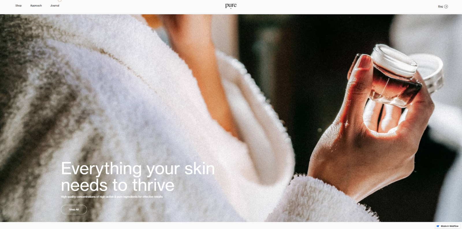
Pure Cosmetics is a beauty brand that prioritizes sustainability and natural ingredients. The minimalist layout, designed by Thomas Pernkopf, uses a soft color palette and clear grid structure to echo the brand’s ethos.
The result is a polished, high-end look that feels true to the company’s ideals. The site proves that minimalist design can align seamlessly with brand values — there’s nothing unnecessary here. If you value symmetry in layout grids and simplicity in navigation options, this is one of the best website examples to turn to for inspiration.
25. YY Shop
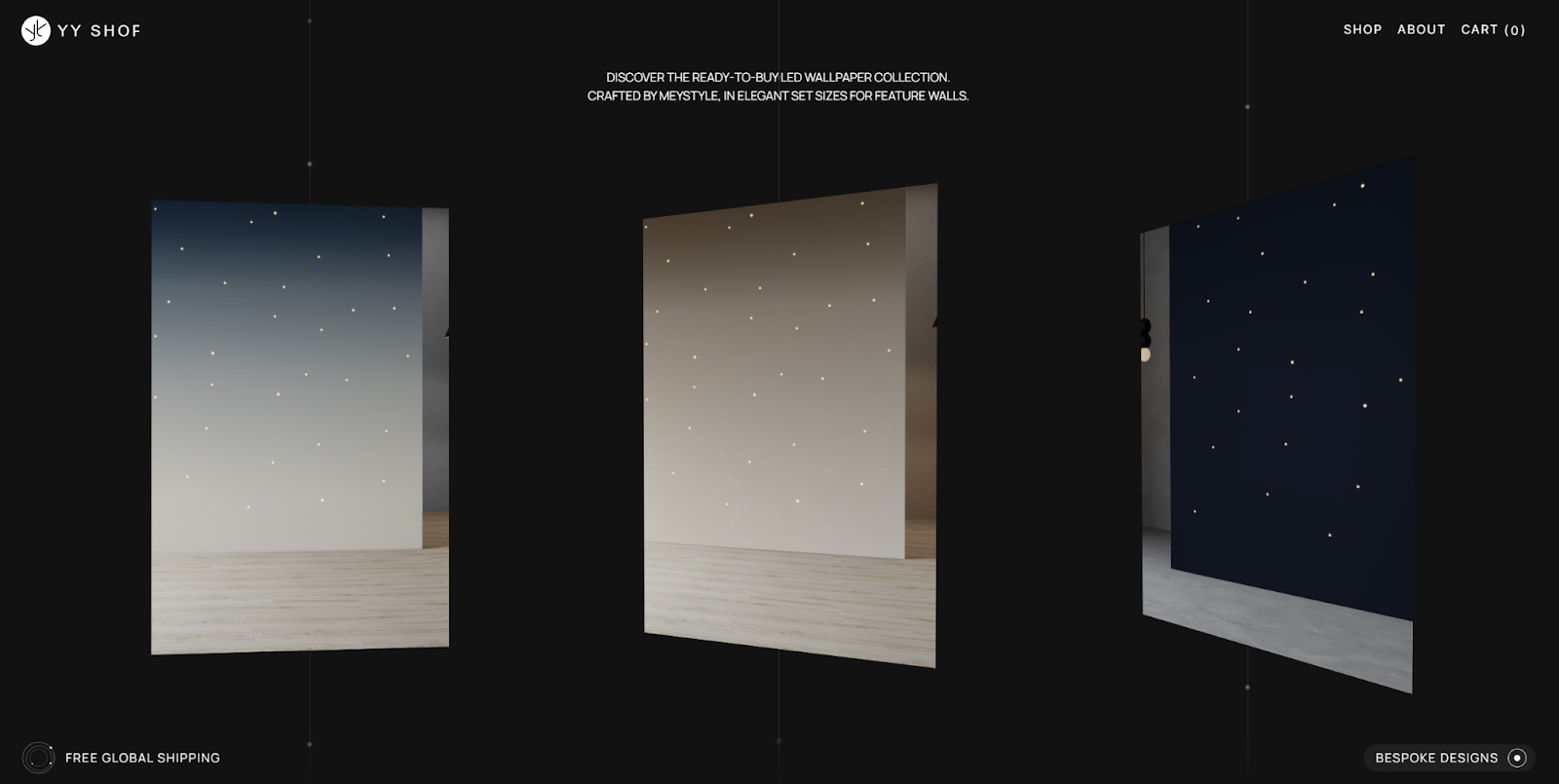
YY Shop sells unique LED wallpaper designed by sisters Maria and Ekaterina Yaschuk. Forage Studio designed their website to be a minimalist interactive gallery that puts all the focus on the designs, with negative space and delicate typography guiding the experience.
There’s no distracting copy, just images that lead to individual product pages. The gallery layout translates well for a photography website or visual portfolio that prioritizes image-based navigation.
Understanding minimalism in web design
Minimalist design is all about visual simplicity and clean aesthetics. You can distinguish it from maximalist design through its use of whitespace, muted color palettes, bold typography, and intentional imagery. Minimalism offers several benefits:
- A clear visual hierarchy that draws the eye to a focal point, like a CTA button or product image.
- An intuitive user experience that makes navigation menus and interactive elements easy to find and engaging to explore.
- A streamlined design process that encourages deliberate choices rather than overly complex backgrounds or animation-heavy layouts.
5 key elements of minimalist website design
Before trying your hand at minimalism, you’ll need to understand what makes it different from other styles. Here’s a recap of the five key minimalist elements we covered in the examples above.
1. Negative space
Minimalism uses whitespace to create breathing room, reducing viewers' cognitive load and highlighting the most important elements.
2. Visual hierarchy
In being deliberate with your color scheme, typography, and whitespace, you can create a visual hierarchy that guides the eye. Less important elements often appear in muted tones, while headlines and CTAs use stronger contrast and bolder styling to stand out.
3. High-quality images
Minimalist layouts rely on strong visuals to make an impact. Choose crisp, high-resolution images that hold focus. If you’re using several images, hover effects (like switching from grayscale to color) can provide dynamic contrast without adding clutter.
4. Bold typography
Headlines and body text play a key role in guiding users. Many minimalist designers mix creative serif fonts with clear, accessible sans-serif fonts for body copy and CTAs.
5. Color palettes
Minimalist websites stick to a narrow palette — usually muted tones with one or two bold accent colors. Pastels work well for backgrounds, while brighter hues are ideal for CTAs and other interactive elements. If you want to try for an ultra-refined look, you can even restrict your color palette to greyscale.
Build your own minimalist web design
While minimalist websites may seem simple, they’re built on careful decisions, the smart use of space, and restraint. Great minimalist design balances form with function, stripping away the unnecessary while keeping the user experience instinctive and clear.
Minimalism is harder than it looks to pull off, but a visual design tool like Webflow can help you optimize your web designs with fine-tuned precision. The Webflow Marketplace is also a great place for inspiration and minimalist website templates that give your new project the head start it needs to succeed.
Get started for free
Create custom, scalable websites — without writing code. Start building in Webflow.