Head to the settings menu on your device and you’ll probably find a “dark mode” option.
Dark mode is a display setting that uses light-colored fonts, icons, and other design elements on a dark background. This high-contrast display transforms the user interface (UI) of websites, apps, and more from a traditional light-themed UI into this darker version.
Learn the ins and outs of dark mode, how it came to be, and find some dark mode website examples to inspire your next creation.
A brief history of dark mode
Dark mode isn’t a new concept for websites and mobile apps. In fact, the first computers in the 70s and 80s all had “dark” screens because early technology couldn’t illuminate an entire screen without burning it.
Then, in 1991, Apple launched its System 7 operating system (OS), called CloseView, which featured an inverted color scheme designed to make products more accessible for visually impaired individuals. The OS allowed people to switch between black-text-on-white-background (light mode) and white-text-on-black-background (dark mode) themes. Microsoft offered similar high-contrast themes with Windows 95 and Windows XP in 2001.
While many people with and without visual impairments have come to prefer dark mode, it’s worth noting that dark mode can also be challenging for people with astigmatism and dyslexia. So if you choose to design with dark mode, we recommend including a toggle to switch back to light mode to ensure your content is accessible to as many people as possible.
Recent estimates suggest that in 2022, almost 82% of Android users deployed a dark UI or OS on their smartphones. The feature is also common on Google Chrome and other apps, like Gmail and Google Docs (for which someone created a dedicated browser extension). There’s even an Auto Dark Theme that allows you to make any website dark mode.
Why should you incorporate dark mode on your website?
The adoption of dark-themed UIs depends on comfort. Some people find dark modes more comfortable to use at night or in poor lighting conditions, as dark mode may relieve eye strain, thanks to darker background colors. Dark mode also claims to reduce blue light exposure, which harms the eyes during periods of prolonged screen time.
Adding customizable elements enhances the user experience (UX), as people prefer to personalize their smartphones. Toggling between light and dark modes lets customers transform the entire OS' appearance.
4 dark mode websites for modern web design inspiration
Designing in dark mode is more than using white text and a black background. While some web designers prefer desaturated colors like the grayscale in their dark mode, some like a touch of bright colors on a black background for emphasis.
What works for one website may not have the same effect for another, so experiment with nuanced and specific colors, fonts, and graphic combinations for each site.
Take a look at these four dark mode website examples across industries that show this design style in action.
1. The Moody Doula
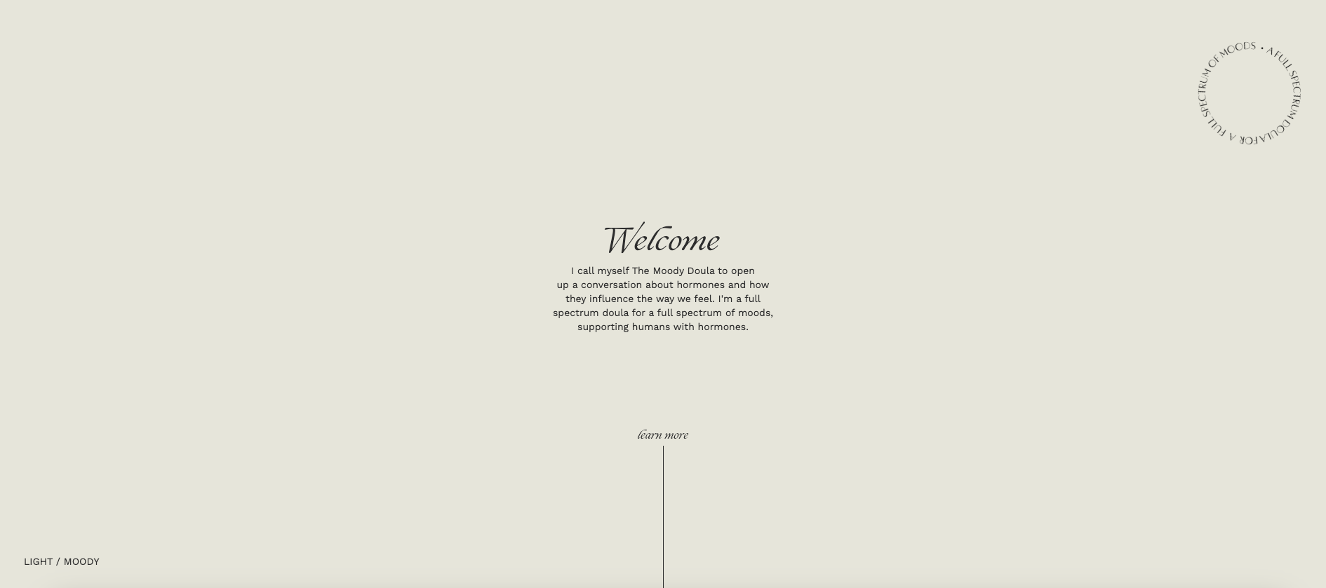
This website’s beauty lies in its minimalistic design. The Moody Doula is a pseudonym for Rachel, a full-spectrum doula who supports individuals and their partners through pregnancy, birth, and postpartum care in the Seattle area.
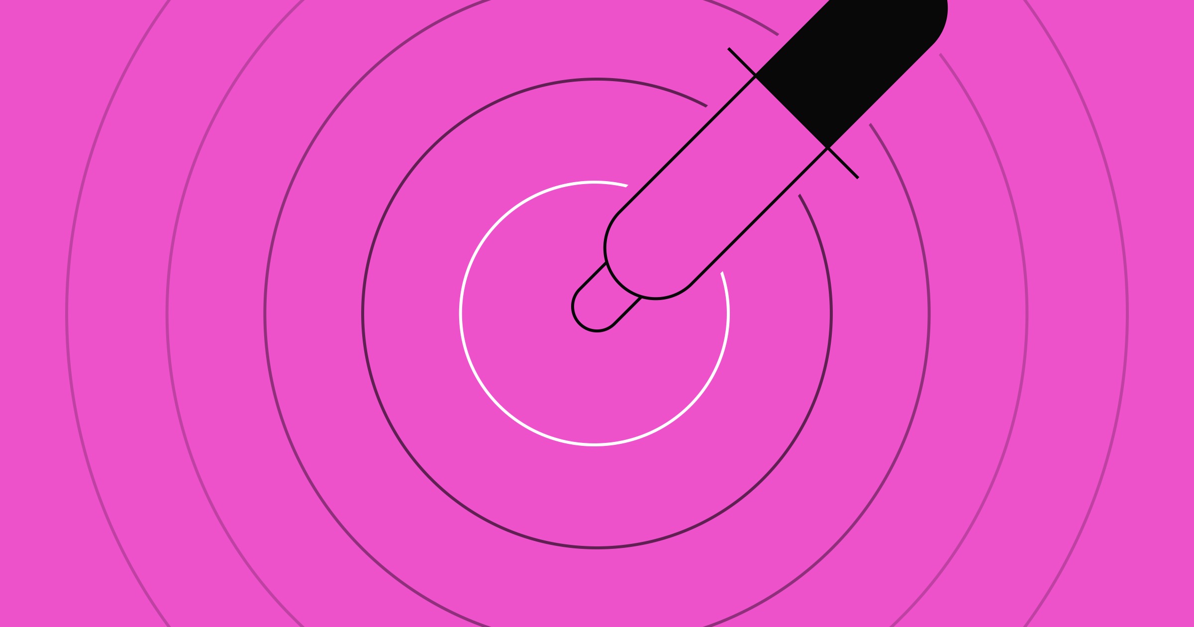
When visiting her website, you’re greeted by an interactive image that resembles a picture of a reflection of a person in the water. As you hover across the image, ripples form and follow the cursor. Then, as you scroll and browse through the entire website, you’ll find a short welcome message on a plain beige background.
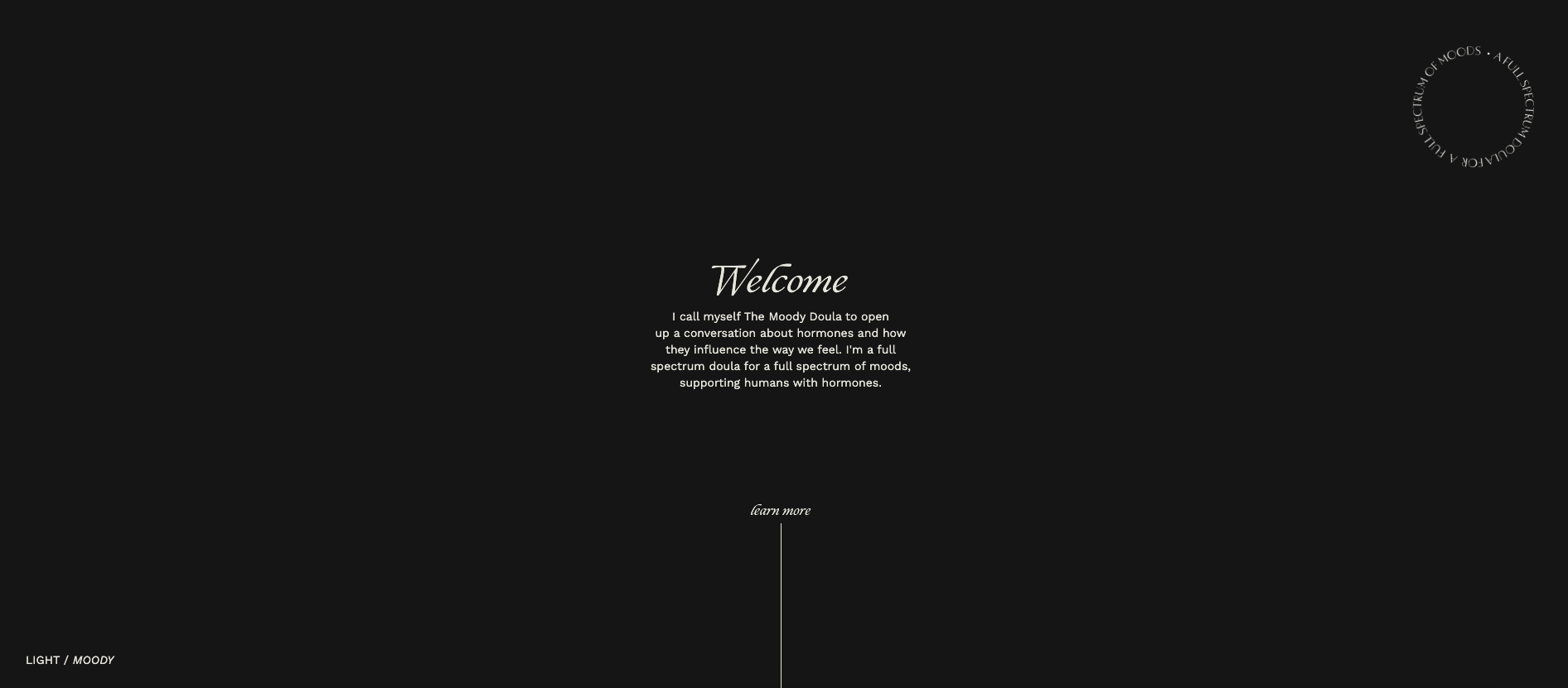
You’ll also find a “LIGHT/MOODY” option in the bottom left corner to toggle between light and dark modes. The “MOODY” switch inverts the colors of both the background and text.
We love The Moody Doula’s modest design, calming color palette, and minimal layout. The dark mode adds another layer of moodiness to the UI to align with The Moody Doula’s brand. Giving visitors the option of a dark mode site also represents the support and care she’ll give if hired.


Get started for free
Create custom, scalable websites — without writing code. Start building in Webflow.
2. Max Joles
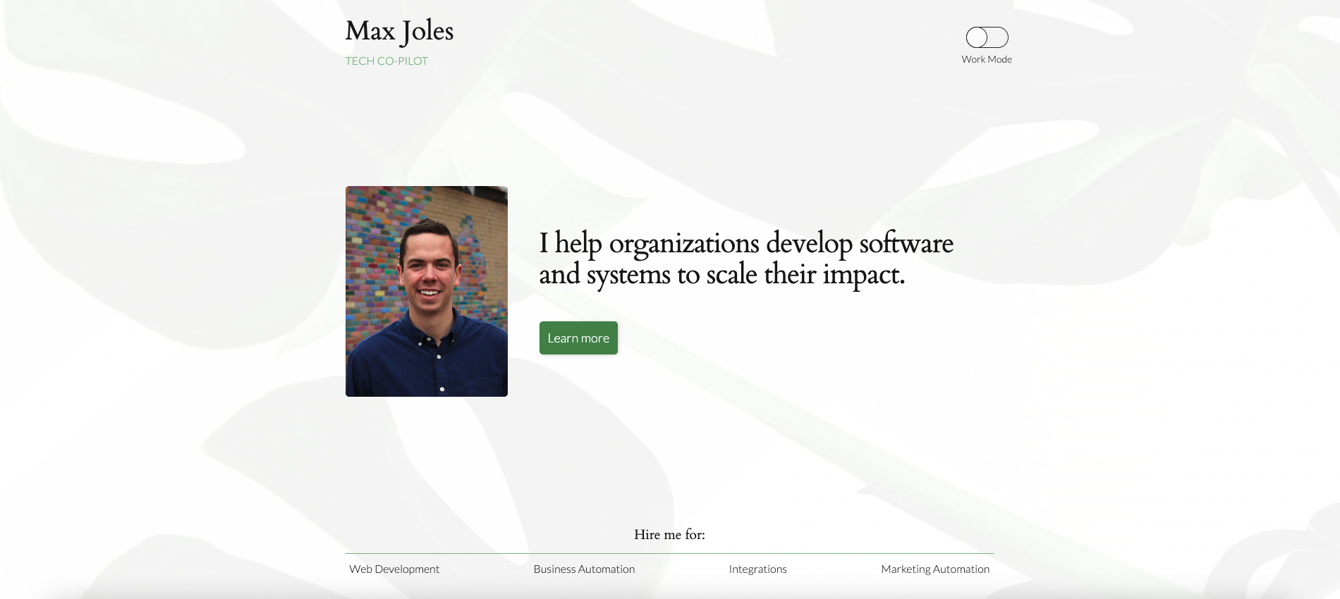
According to his website, Max Joles is a software developer by day and a “curious dude” by night. His portfolio represents two different facets of his life — a “work mode” and a “play mode.” The work mode includes a professional photo of Joles, with formal text on a minimal white and gray plant background.

When you switch to play mode, a dark brown illustration of mountains replaces the plant, surrounding a picture of Max in casual, outdoorsy clothing.
We love how Max implemented a dark mode into his portfolio, combining two websites in one. Featuring an image of the natural world as the background of both and leaving the site elements in the same place helps blend the two modes to offer us a consistent impression of Max — even if we’re seeing both sides of him.
3. Olliepop Art
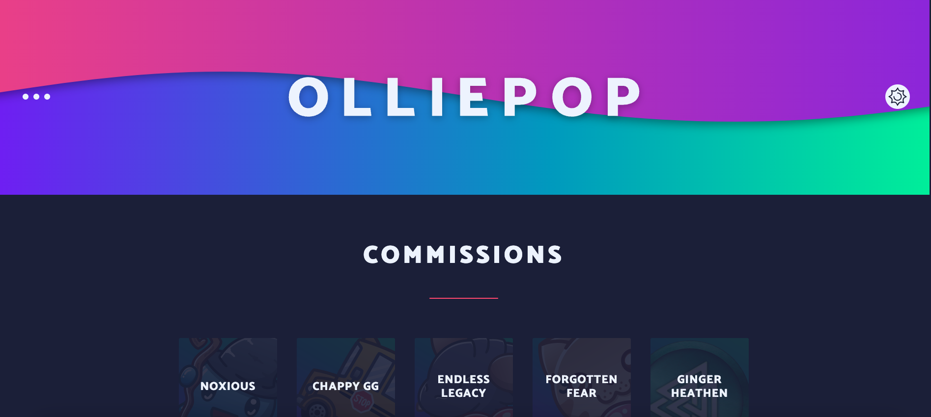
Olliepop Art’s portfolio site shows off its fun illustrations with a playful font and color palette. The website actually starts in dark mode. The not-quite-black background is moodier and a little less harsh than white in contrast with the rainbow header and footer.
To the right of the header, a button toggles between modes and switches from a sun to a moon. We love this design because it’s universal — the sun represents light mode while the moon symbolizes dark mode. This is an excellent way to convey information without words.
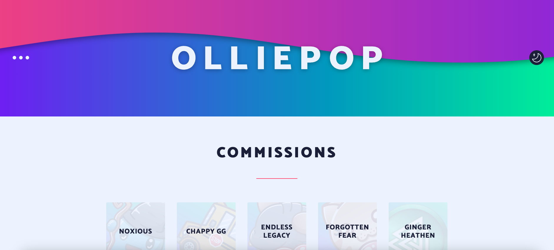
Another interactive feature is the gradient in the header and footer. The wave-like design moves with your cursor, and the same gradient appears in the scroll bar on the right. These are the only elements that don’t change for both light and dark modes, maintaining consistency in identity and design.
Olliepop Art offers an engaging user experience with just a few elements, proving that sometimes, less is more.
4. Nexxt Group
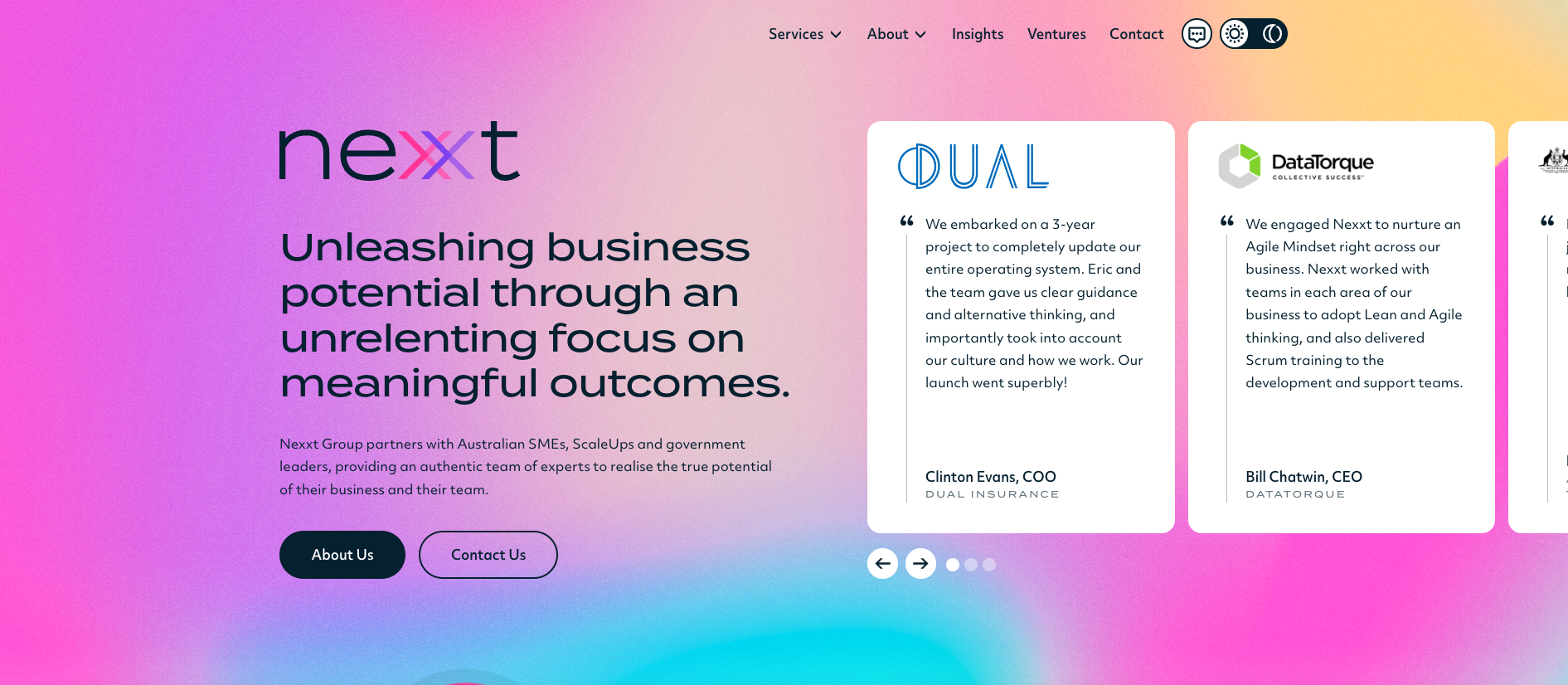
Nexxt Group is an Australia-based business consulting, staffing, and software company. Their homepage greets you with a background animation of several colors moving slowly in all directions.
As you scroll down, you’ll find another clockwise animation of Nexxt’s process — a visual representation with the words “ASSESS,” “PLAN,” and “DELIVER” in a pink circle, orange triangle, and purple square, respectively.
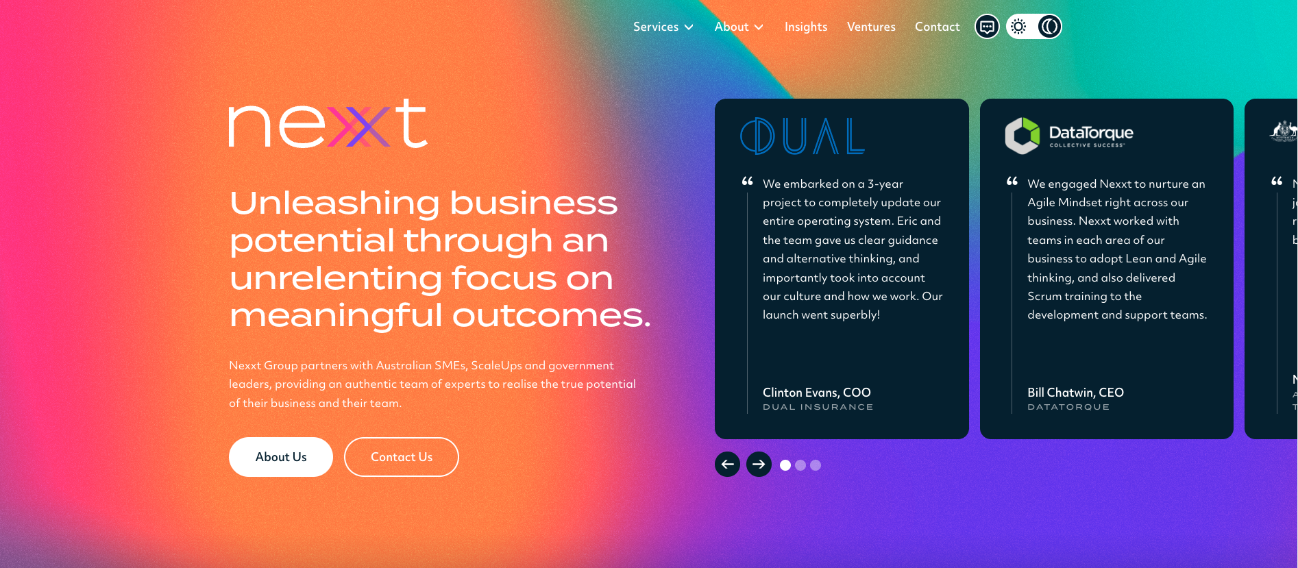
As soon as you enable the dark mode, the color scheme changes from pastels to darker hues. This tweak doesn’t sacrifice functionality and readability, but it does deepen the color scheme to emphasize the text. It also demonstrates that you don’t need to use grayscale to design in dark mode.
Nexxt merged the concept of dark-themed displays with out-of-the-box ideas to create an attractive website that offers visitors clear navigation.
Create your own dark-themed website with Webflow
Demand for dark UIs increases with dark mode’s popularity and the desire to limit eye strain. Knowing how to make a dark mode website and having a toggle to choose between light and dark caters to everyone’s preferences and helps you create user-friendly designs.