


Smartphone screens are smaller than the average device, but that doesn’t mean mobile websites can’t have the same dynamic designs.
Research proves the obvious: Smartphone usage is widespread and growing. The number of U.S. adults using mobile phones will swell to 253.3 million in 2023.
But that’s not all: 15% of Americans only have internet access through their smartphone, so they’re browsing the web on mobile exclusively. That means if you’re designing a website, the mobile site will be the only version some visitors encounter. It has to catch their attention if you want them to stay and convert.
Designing for mobile web — and ensuring your mobile site functions correctly — is essential to creating a usable, accessible, and striking website. Let’s explore what mobile design is and how to create successful mobile designs.
What is designing for mobile?
Designing for mobile is the process of creating a web layout that adjusts to fit mobile screens and suits the needs of touchscreen devices. But it’s about more than having a condensed mobile version of your desktop website — it’s about actively optimizing for mobile users.
Optimized websites must consider varying screen sizes, touchscreen navigation, and load time. They also need a design that reels users in quickly because many smartphone and tablet users access the web when they’re on the go throughout the day.
Creating a mobile version of your designs or adjusting your desktop site to meet mobile specifications means there’s less chance that elements will load slowly or fail to display properly. Mobile users might get frustrated and leave if the site’s unnavigable.
Responsive versus adaptive design
There are two main ways to build a website that works on different screen sizes: responsive and adaptive design. Each has its pros and cons, but the best one for your client’s website depends on their business needs.
Responsive design
Responsive web design uses mathematical queries to break down site content into breakpoints. On different devices and screen sizes, these breakpoints automatically scale images, wrap text, and adjust to the change in dimensions. Your website’s layout remains the same. Responsive design just reorganizes and resizes it for a better mobile experience. This means the end user experiences the same content, no matter their device. The content and functionality of the desktop version are still there on mobile, just adjusted.
Since the process is automatic, responsive design is future-proof. You don’t have to create a new design every time a new device with a new screen size becomes popular. Responsive design does it for you.
Advantages of responsive design
- Consistent experience across devices
- Smoother maintenance process
Disadvantages of responsive design
- Potentially slower than adaptive sites
Adaptive design
Instead of adjusting a website automatically, adaptive web design means manually creating a new layout for standard screen sizes — usually 320, 480, 760, 960, 1,200, and 1,600 pixels. When visitors find your website, the adaptive design sizes it to match their screen.
Manually creating different site layouts offers more control during the design process. And with predetermined layouts, a visitor's browser doesn’t need to adjust your website when loading the page, which leads to faster load times. However, adaptive designs can “break” and load incorrectly on new screen sizes, so you need to update them more frequently to match trends and new device sizes.
Advantages of adaptive design
- Faster performance
- More customizable
Disadvantages of adaptive design
- Can’t fit every device
- Takes longer to design
Things to consider when designing a mobile site
Here are some tips to remember for creating mobile-friendly designs.
1. Keep navigation functional
Thoughtful website navigation is crucial to delivering the best user experience (UX) possible. With limited space on smartphone screens, you must compress buttons and menus without compromising usability.
Touchscreen operation and thumb positioning make it harder for users to find and tap small elements, so they need to be even more clear than usual. All of the steps in the user journey will be the same, but mobile design emphasizes where people move from one step of that journey to the next.
Here are some ways to do this:
- Design finger-friendly buttons. Make links and buttons large and distinct so users know where they’re going and don’t have to zoom in to navigate.
- Highlight important navigation. Emphasize the menu bar and important CTAs that drive users to the information they seek.
- Add a search bar. Presenting a prominent search bar is especially handy on smartphones when visitors want to find information fast, like a specific ecommerce item.
2. Create consistent content
When users visit the same site on different devices, they should know what to expect. They’ll get confused if your mobile version has vastly different content features than your desktop website — another reason why responsive design, which keeps the same elements, might be a better choice than adaptive design, which allows more changes.
Maintain your branding elements and user flow across devices. Keep colors, text, and tone consistent, and use the same navigation options. Mobile versions can take some liberties, like resizing buttons and text for clarity, but they should ultimately be recognizable.
Use designs that:
- Maintain logical flow. Present information in the same places on both desktop and mobile so visitors don’t have to guess where to find content.
- Limit pop-ups. Pop-up ads and forms take up more space on mobile than on desktop. Shrink or relocate them so they serve the same purpose without being disruptive.
3. Take advantage of mobile features
Mobile screens don’t offer the same size and navigation capabilities as desktops. But that doesn’t have to be a bad thing. The small screen lets you pare down your website design and show off what matters. And you can use other mobile-specific characteristics — like mobile SEO and location services — to your advantage.
Make sure you:
- Improve SEO. Google uses mobile-first indexing, which means it crawls the mobile version of your website and chooses how to rank you based on the content and structure of your mobile site.
- Use location services. Unlike the generally static location of desktop devices, smartphone locations constantly change. Location services help mobile websites serve specific, location-based content or targeted ads.
- Consider download speed. Designing a website that takes speed into account enhances the on-the-go mobile UX. Choose a minimalist design to improve load times.


Get started for free
Create custom, scalable websites — without writing code. Start building in Webflow.
3 examples of great mobile web design
Made in Webflow using responsive design and visual editing, these websites are examples of mobile design done right.
1. Alpha Coach
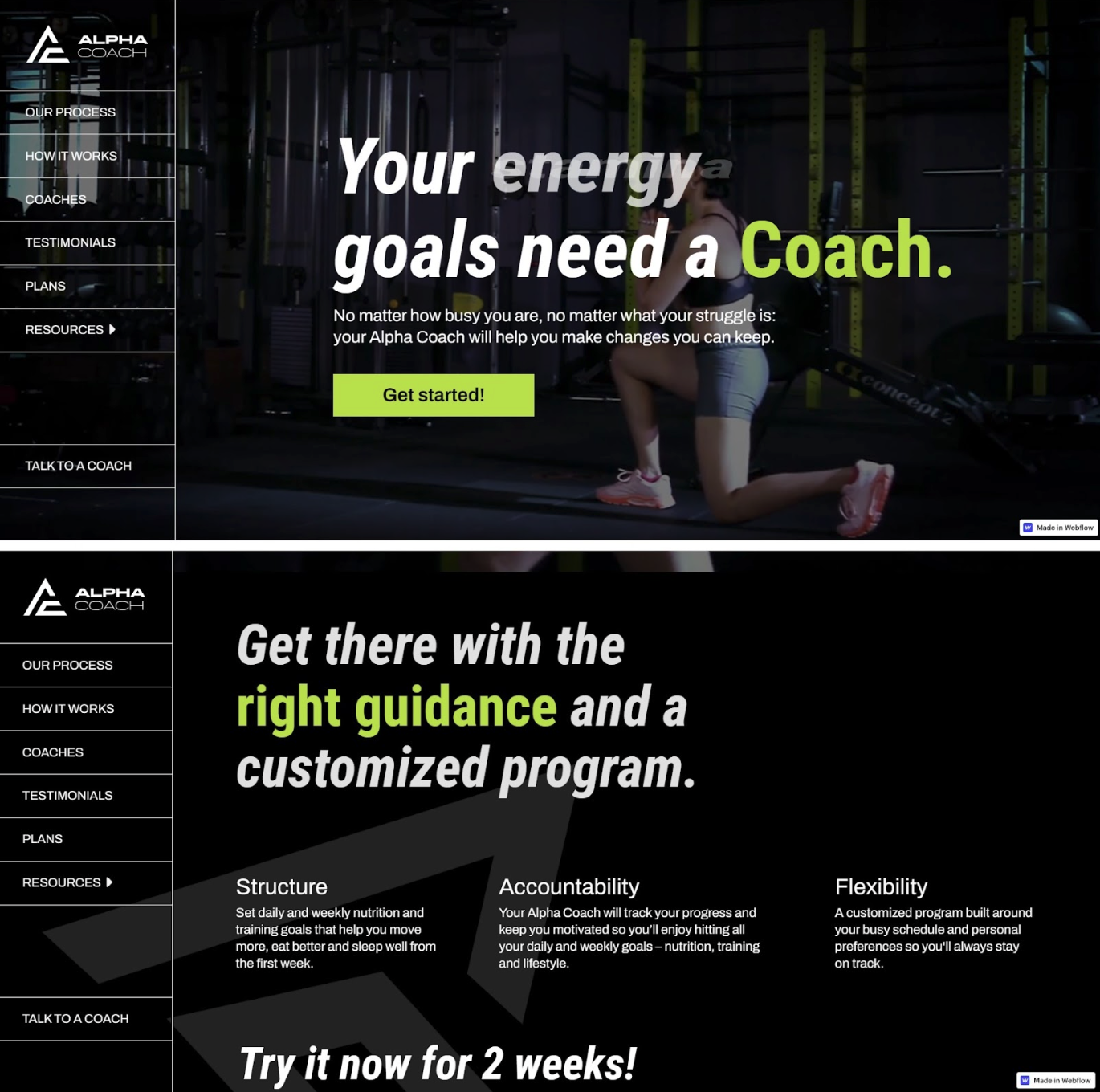
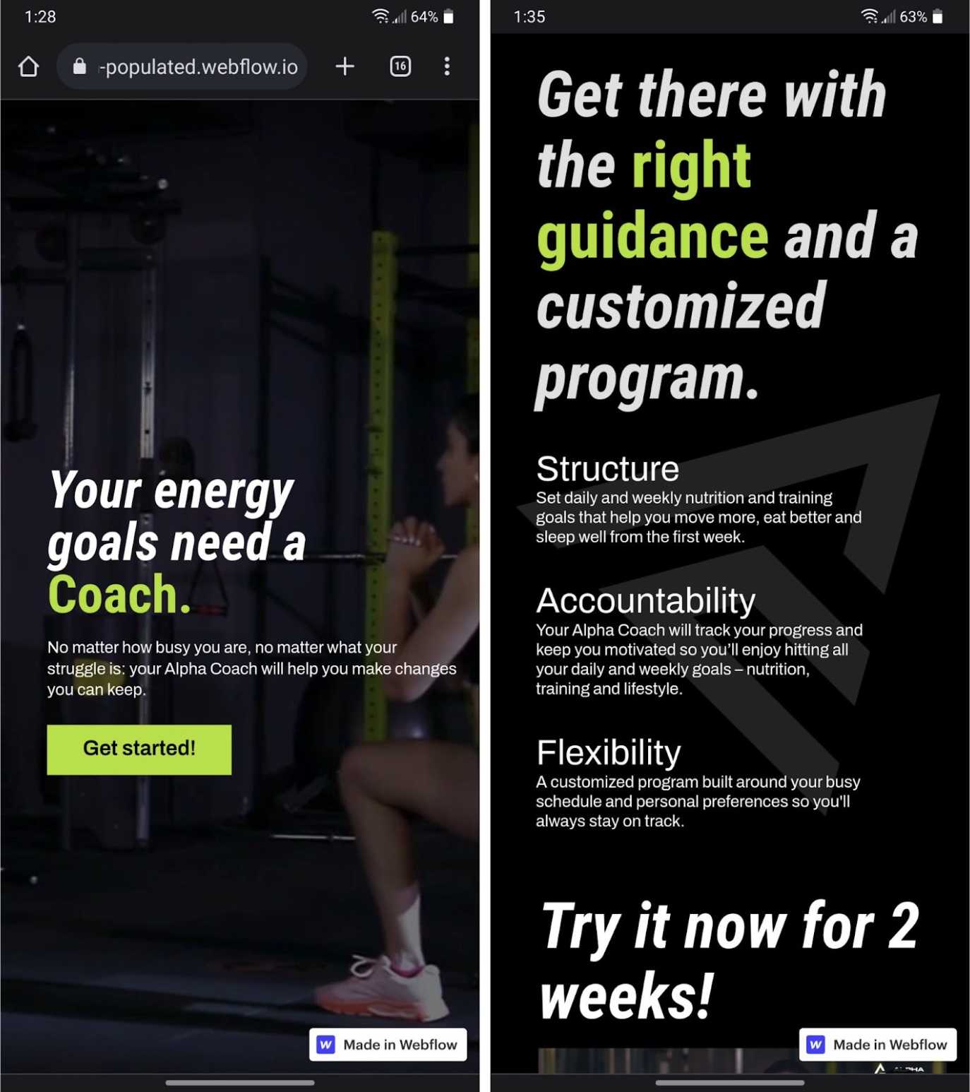
Alpha Coach is a fitness coaching website designed by Devanjana Peiris. Its messaging is front and center on both the mobile and web landing pages. The bold text wraps to fit the smaller screen and the three desktop columns with the headings “Structure,” “Accountability,” and “Flexibility” become one column, presenting the copy vertically instead of horizontally. This is a strong example of adapting the layout for mobile without altering the content.
The main difference between Alpha Coach’s mobile and desktop versions is that on mobile, the sticky menu disappears, and users have to scroll all the way down to find a full menu of navigation options. This encourages on-the-go mobile users to slow down and read more about the company as they scroll, encouraging conversion. Removing the menu also makes the layout less cluttered, letting the content shine. Alpha Coach is mobile design at its best: the same informative content adjusted for smaller screens.
2. Amour Bridal
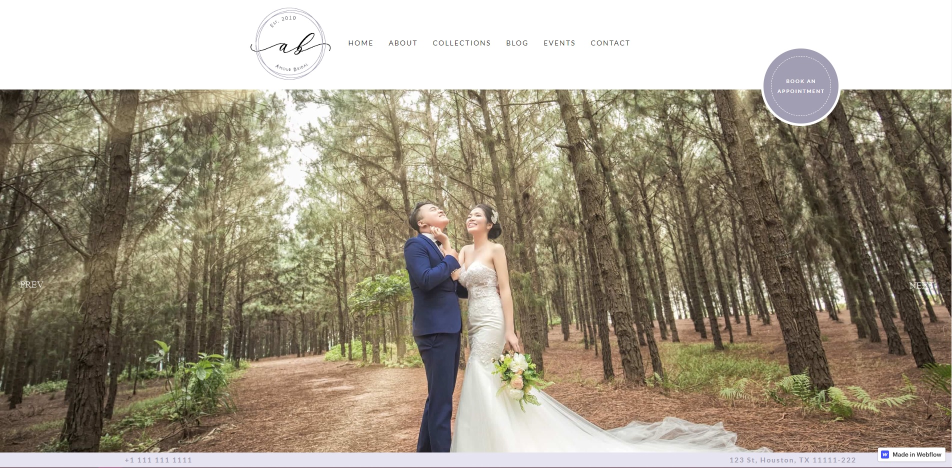
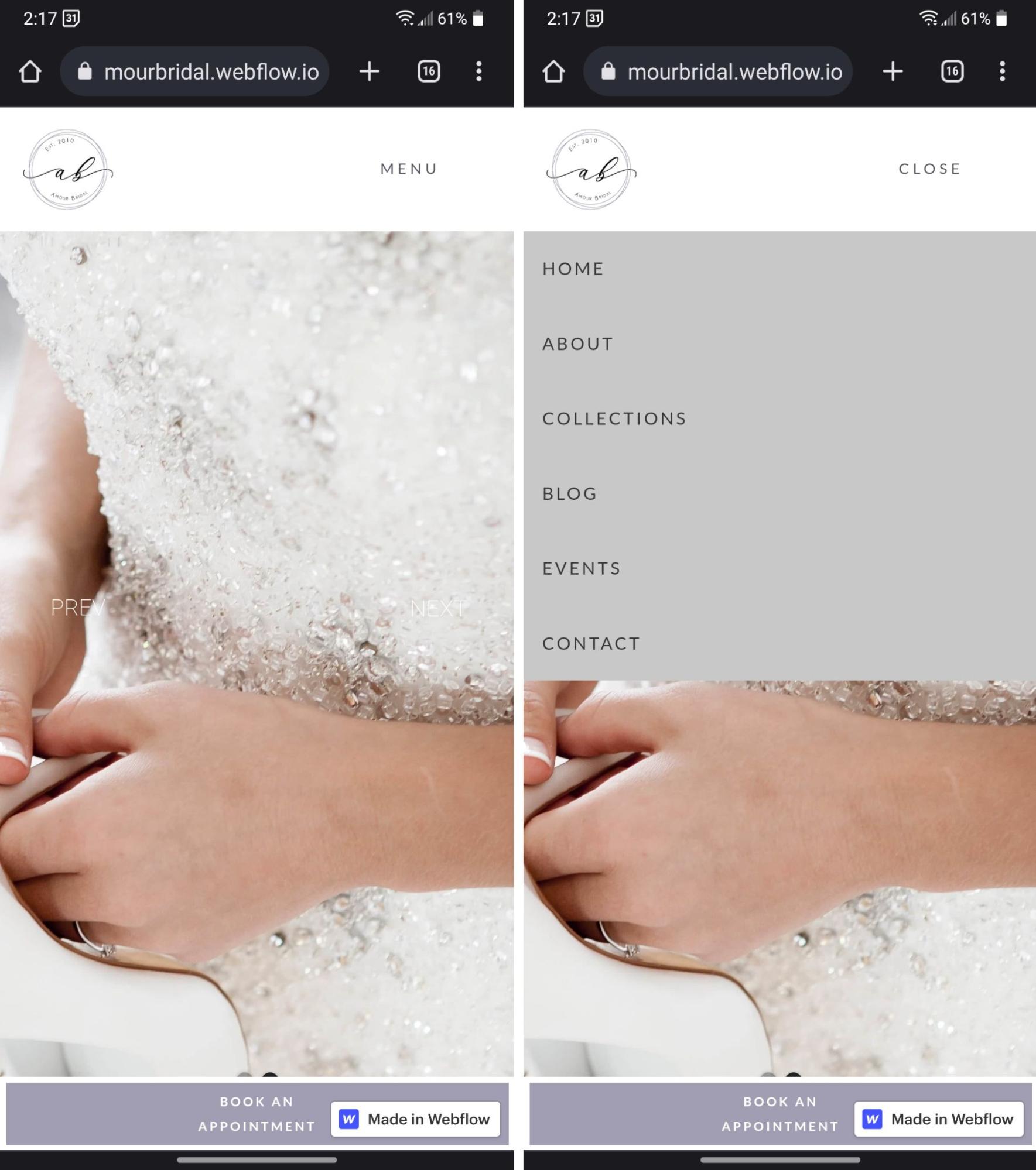
Amour Bridal is a clonable bridal boutique website template by designer Ana Aguiar. Its landing page relies on images to build atmosphere and show visitors its gowns and wedding services, and those images translate well from mobile to desktop. The first homepage image — a wide shot of a couple standing in a forest — centers the pair, so when the mobile design crops the image, the focal point remains. The second image — a bride’s hands holding a white shoe — appears automatically in a slideshow and retains the image’s concept despite being cropped.
Amour Bridal’s menu also has a major change from desktop to mobile: The design pushes the horizontal navigation across the top of the desktop browser into a vertical drop-down with a plain button in the top-right corner that says “menu,” saving space and preserving image visibility. The same navigation options remain so visitors know where to find what they’re looking for, maintaining logical flow without sacrificing the full-page images. Amour Bridal’s mobile design adjusts the elements it needs to and keeps brand identity intact.
3. Chosen Youth
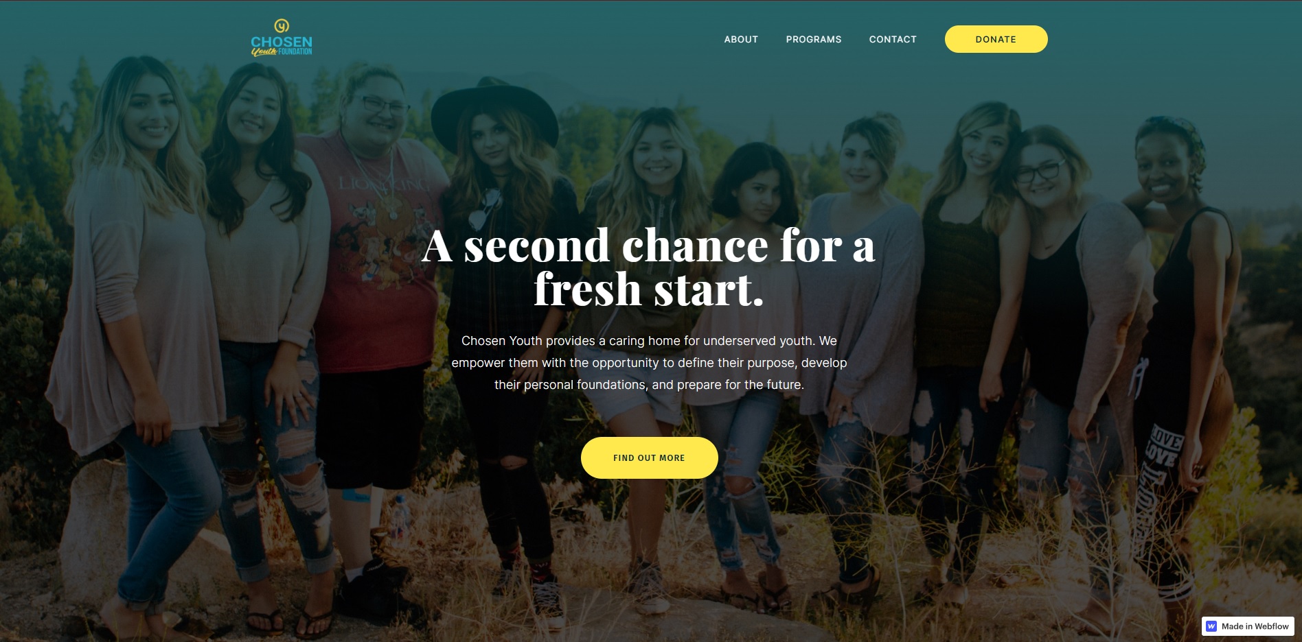
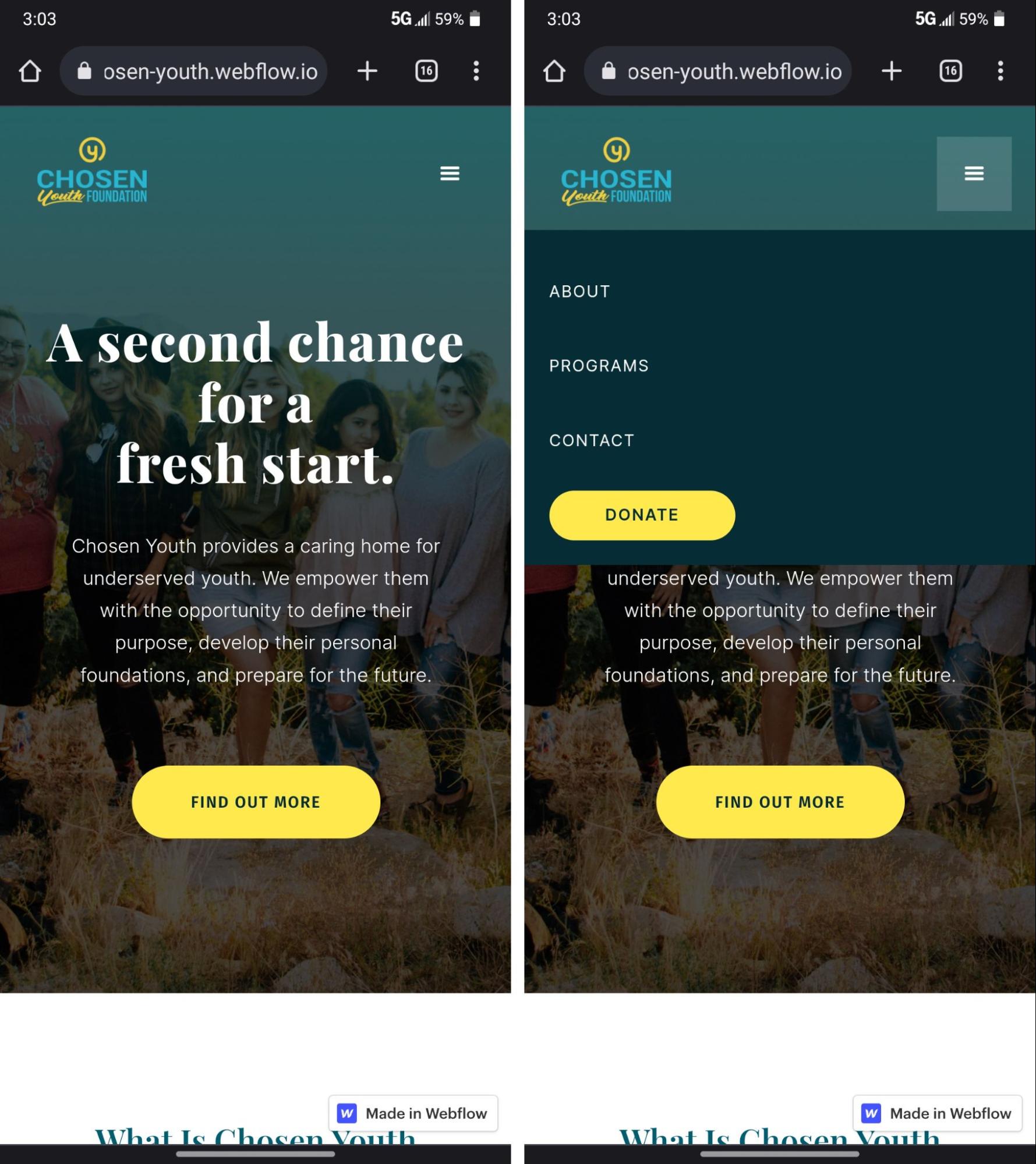
Chosen Youth offers a home for children and teens who need one, and Kat Cuevas created a website that showcases important program details equally on both desktop and mobile. The mobile version offers the same informative landing page and messaging, just optimized for the smaller screen.
Chosen Youth crops the header image — a teal-tinted photo of smiling teens — to fit on mobile, maintaining the same image quality as on desktop. The round CTA buttons are bright yellow, standing out against the darker background so potential donors or youth seeking a fresh start know where to find the information they need. The buttons are also comparatively larger on mobile than on desktop, aiding navigation. Chosen Youth’s mobile site keeps its audience in mind and emphasizes usability for a functional mobile experience.
Use mobile elements to your advantage
Mobile web design can — and should — be just as functional as desktop design. Your website’s visitors will come from all kinds of devices. Build a website that works for as many screens as possible.
Webflow provides plenty of code-free templates and support, such as tutorials on responsive breakpoints and mobile menus to help you optimize your mobile web designs.