

We’ve rounded up a collection of projects that range from cool cloneable elements to entire websites full of interactions and surprises.
Here are 11 projects from February 2022 that grabbed our attention:
1. BWNT Showcase 2022 (cloneable)
Baldwin Wallace University showcases their musical theater program in style. Scrolling down the page activates a curving dotted line with cast photos appearing in ornate picture frames. This project takes basic information — cast names and photos — and presents them in a fun, unique way. Creator Mack Shirilla even made this project cloneable for anyone who wants to customize it.

The individual photos are our favorite part. Hovering over a photo activates a quick video — making the subjects look like portraits coming to life.
2. Automatic Link Preview
This straightforward project by Dhruv Sachdev lets site visitors preview external links by hovering over the text.
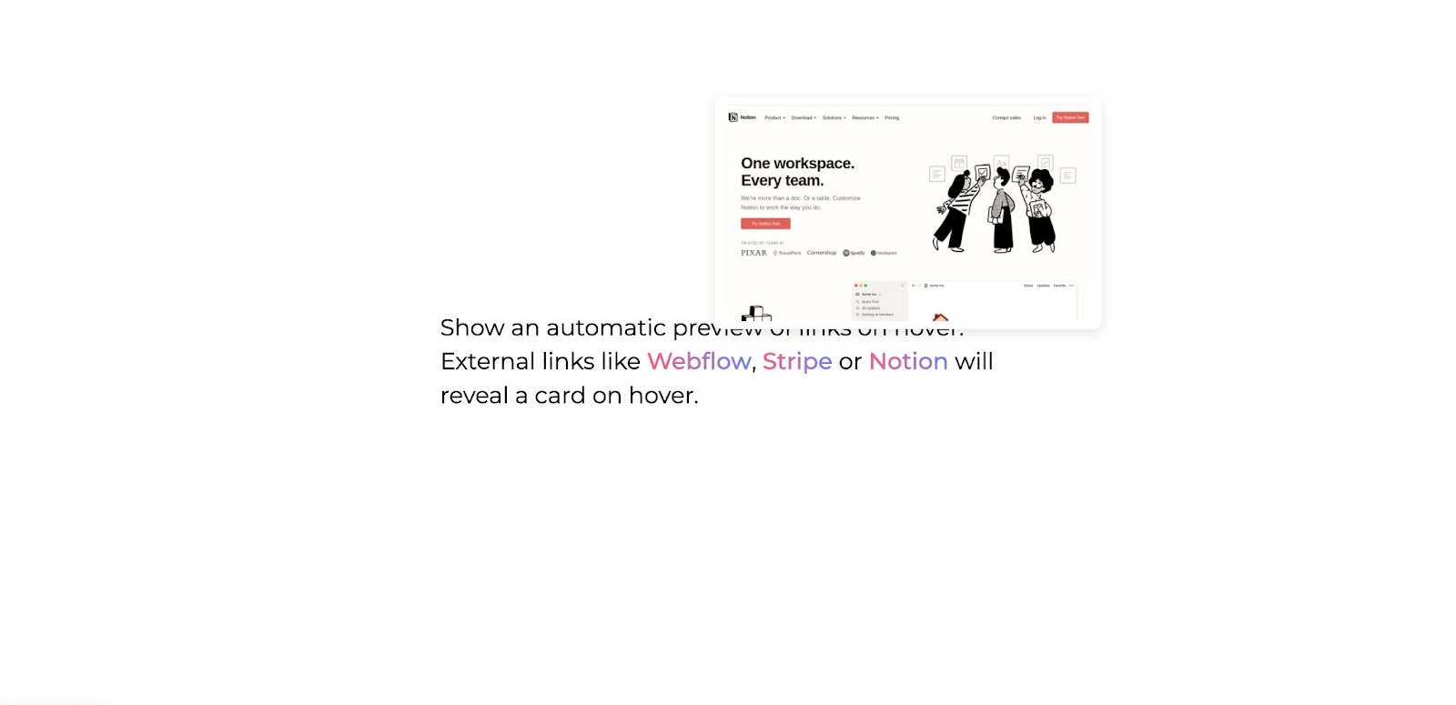
Showing a thumbnail of the linked page upon hover allows your site visitors to preview the external website without leaving yours. It’s a clever way to give people information about the link without disrupting the reader.
3. Gemini Skincare
Zorro Web Design created a fluid experience on the Gemini Skincare website. Muted colors and amorphous blobs accent photos of people with glowing skin — making visuals of their products in use take center stage.
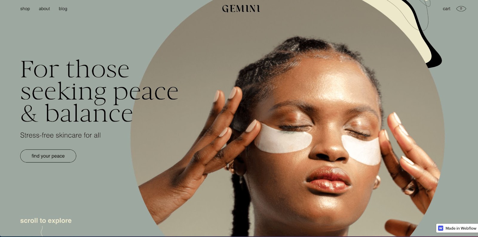
This website also features oversized typography paired with curved lines that create a sense of movement throughout the design.
4. Yes, Chef! Studio
Though the Yes, Chef! website By OK Micah mixes several colors, fonts, and styles together — the result is an enjoyable and cohesive experience.
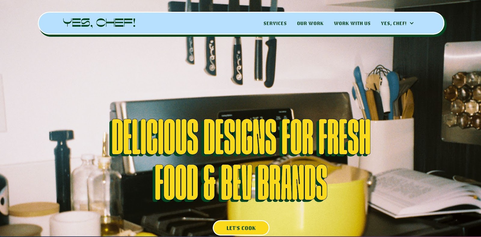
Adding in a variety of styles creates interesting moments, drawing your eye to elements like the pixelated font in the menu bar or the rotating burst icon that appears when you hover over different service options. We also love that this studio website keeps the restaurant theme going throughout — labeling services as “the specials” and describing the company as “a small studio with a big appetite."
5. Get Good At
For the first episode of Get Good At — a podcast about trying to get good at something in 2 weeks — the creators tried to “get good at” building a website, and this project is the result.
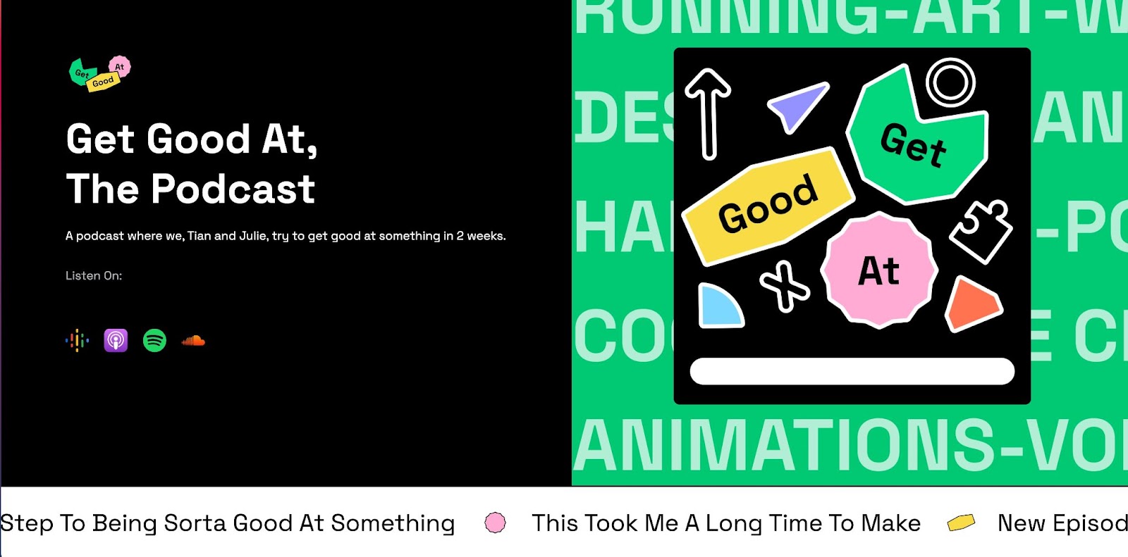
We love this website’s bright colors and icons. The ticker-tape style messages add to the site’s playful nature with funny and sometimes random musings like “This took me a long time to make” and “Bananas are mushy.” It’s clear that this is a work in progress, which is perfectly on-brand for the Get Good At podcast. Be sure to listen to the first episode or read through the build process to learn how the creators built this site in just 2 weeks.


Build websites that get results.
Build visually, publish instantly, and scale safely and quickly — without writing a line of code. All with Webflow's website experience platform.
6. Portfolio Website - Victor Onwuzuruike
Victor’s portfolio opens with a colorful background and illustrated self-portrait. While Victor’s portfolio focuses on product and UI/UX design, he incorporates his skills as an illustrator and 2D motion designer throughout the site as well.
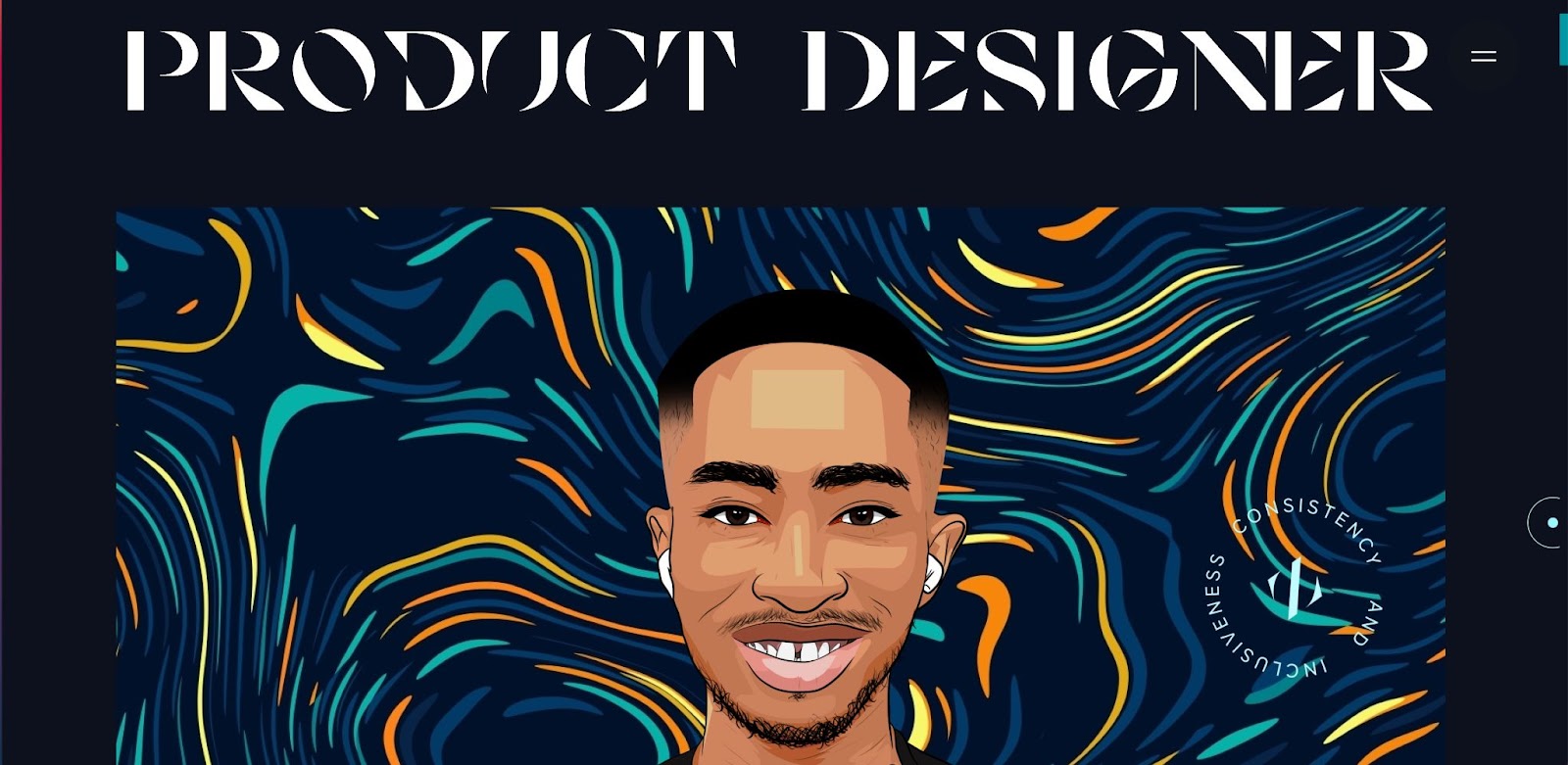
This portfolio features just a few top projects, just enough to give you an idea of what Victor can do without overwhelming you with too much at once. We also love that Victor adds something special to his client testimonials by using a teal, purple, and blue gradient.
7. Love Button (Cloneable)
This pixelated heart button was such a hit in our 2021 year in review that the team decided to share the love — pun intended — and make it a cloneable.
Each time you click the love button, a red or pink heart falls from the top of the screen and bounces around before settling at the bottom of the page. You can play around with this customizable project by changing the colors, swapping the hearts for a different shape, and adjusting the speed. Make it your own!
8. Parallel
Creative studio, Parallel, specializes in interactive content, so it’s no surprise that they incorporate subtle interactions throughout their site — starting with the out-of-focus orange sphere that follows your cursor.
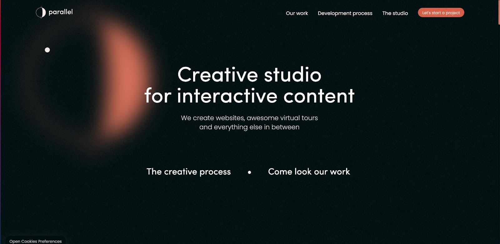
Images of selected works respond when you hover over them, zooming in slightly and changing the cursor to an arrow. Further down the page, gray text turns white as your scroll, as if a highlighter is swiping over the letters as you move down the page.
9. JUO
The JUO website by Halo Lab is as chic as the furniture featured on the site. The homepage has a beautiful background that subtly changes from a dark to light gradient. As you scroll, images smoothly shift into place, making the website feel like a virtual gallery.
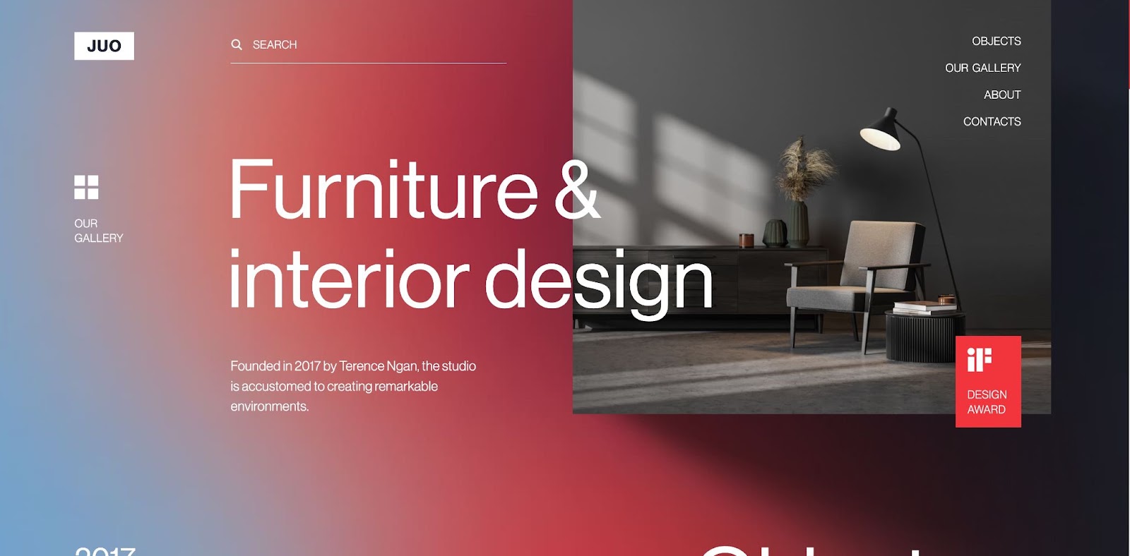
Throughout the page, you’ll notice simple interactions like buttons that turn into animations and shadows that appear beneath photos upon hover. This site delivers a clean and professional experience from start to finish.
10. Personal Portfolio - Rob Green
Rob Green’s portfolio is unique, fun, and functional. It opens with an adorable black and white drawing — a little blob creature that comes to life when you click on it. After a quick animation, the page transitions to an old-school desktop, complete with a graph paper background and three file folders.
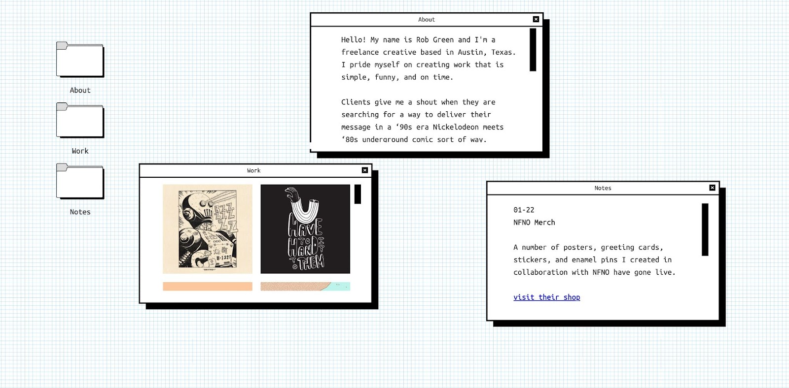
Rather than linking the folders to new landing pages, Rob has the folders open as draggable elements on the homepage. Most one-page websites rely on vertical or horizontal scrolling, which is why this creative approach is so refreshing to see.
11. Historia do Design
Historia do Design — the history of design in Portuguese — is a stunning site full of little surprises that appear as if you caught them in the beam of a flashlight.
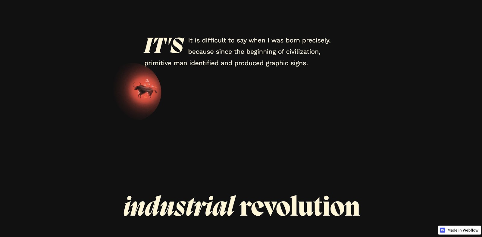
As you scroll through the timeline, you’re treated to illustrations and animations alongside historical facts. Smooth transitions, delightful drawings, and clever effects like flipping cards and illustrations that move as you scroll make this website feel like an immersive experience.
Show off your work
If you’ve got a project you’re proud of, be sure to submit it to Made in Webflow! You just might see your work in next month’s roundup.