


Okay, so designing your jobs page may not be your first thought when kicking off a website design project. But it’s a key element of your company’s efforts to attract top talent, build your brand, and add a human touch to your site. So it pays to think carefully about the user experience.
Unfortunately, many jobs pages offer a … well … a less-than-awesome experience. So let’s dig into a few of the reasons jobs pages suffer, and how to overcome those issues.
To ground the discussion, I’ve explored a few real-world sites to evaluate their jobs page experience and think through how they could be better. It’s worth noting that I love each of these sites — so no offense intended!
Make me think in terms of your org chart
I can’t remember quite how I got started on this journey, but it began with Huge. (Don’t worry, Vlad; I’m not looking to jump ship.)
And at www.hugeinc.com/careers, I see this:
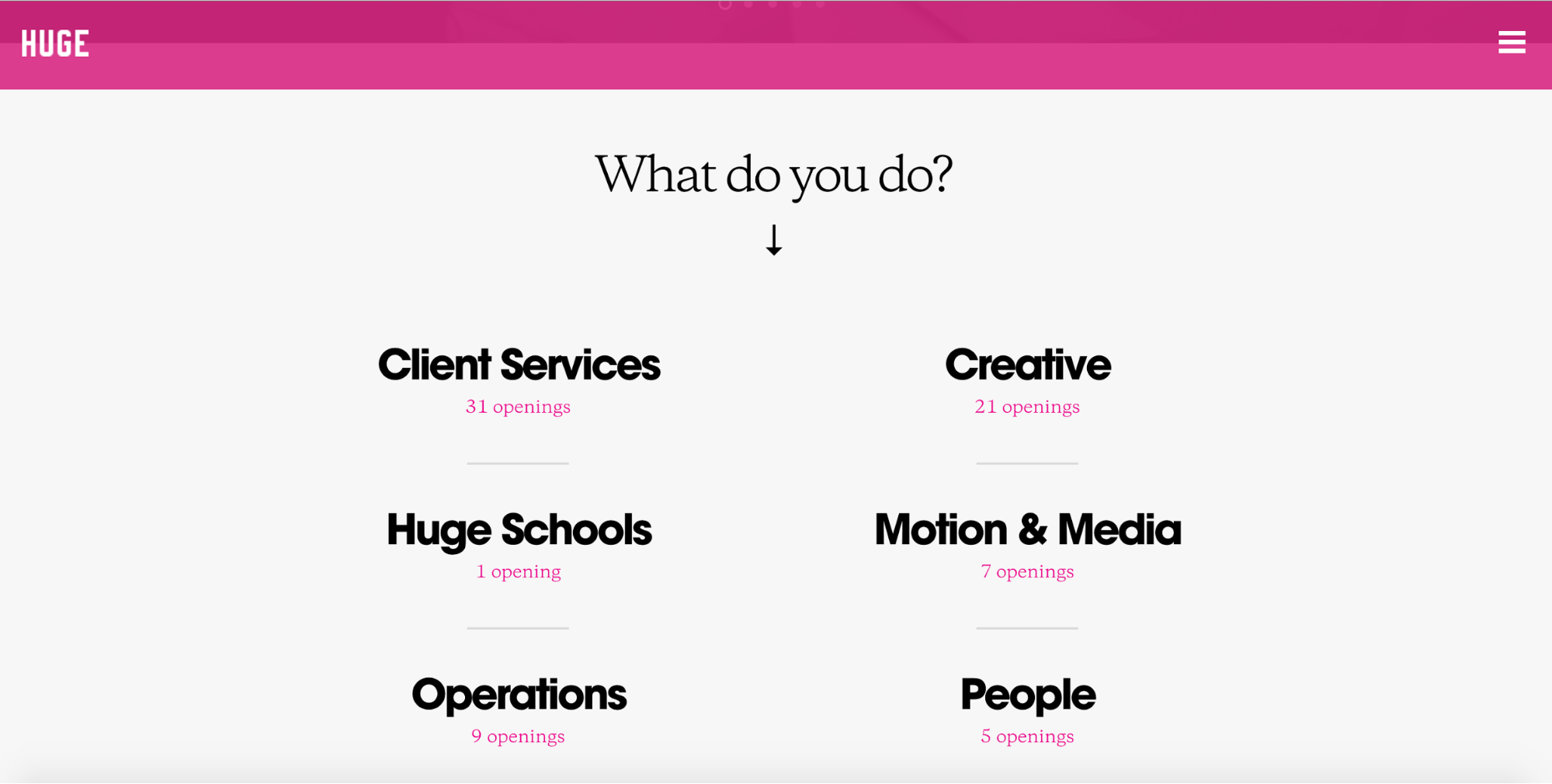
Okay, so, having been a “creative” for about 9 years now, I know pretty well what niche I fit into. But over the last few years, I’ve done a lot of content strategy work and, scrolling down the page, I see that there’s a strategy category too.
So how do I know where to look for a content strategy position? Let’s say I assume it’ll be in Creative. I click, scroll through, and don’t see anything for content strategy.
But that doesn’t mean there aren’t any content strategy roles available. Maybe they’re in the Strategy category after all.
On the other hand, maybe they would be categorized in Creative, and there just aren’t any openings in my discipline right now.
Plus, what if Huge employs content strategists in different roles across the company? Maybe they have content strategists in People who work on onboarding and providing employees with content they need to succeed.
I have no way of knowing. So, after awhile, I bounce.

Medium also highlights departments, and doubles down with a strikingly non-obvious design.
Unless I bother to read the block of copy under “Have an impact,” I might not even realize those giant “buttons” link to jobs in different organizations in the company. Which is one of the most common critiques of flat design: that interactive elements aren’t obvious.
And if I do read that block of copy, there’s another issue. A sentence in there calls out a few of their top needs: “We need best-in-class engineering, exceptional editorial, beautiful design, and insightful data.” But nowhere in the buttons do I see “editorial” listed. Grr.
But let’s say I do grok the design and begin deciding which button to click. Again, I’m challenged. Is content strategy a Growth discipline? Maybe it’s a Design thing. I’ve been a content strategist in both roles.
No way to know but by clicking.
And clicking.
And bouncing.
Make me dig for the jobs

You know who gets it right? MailChimp.
The orgs are still there, but instead of links obscuring the available positions, they're headings that add structure to a list of actual positions. Now that’s how people think of job hunts!
There’s even a filter that lets me jump to the right place, and (bonus!) they’ve named their orgs using terms that make sense to people in the industry. Double-win. I still might have trouble deciding whether I want to look in User Experience or Marketing for a content strategy gig, but I can just Ctrl+F to search for “content” on the page.
Nice work, Chimps.
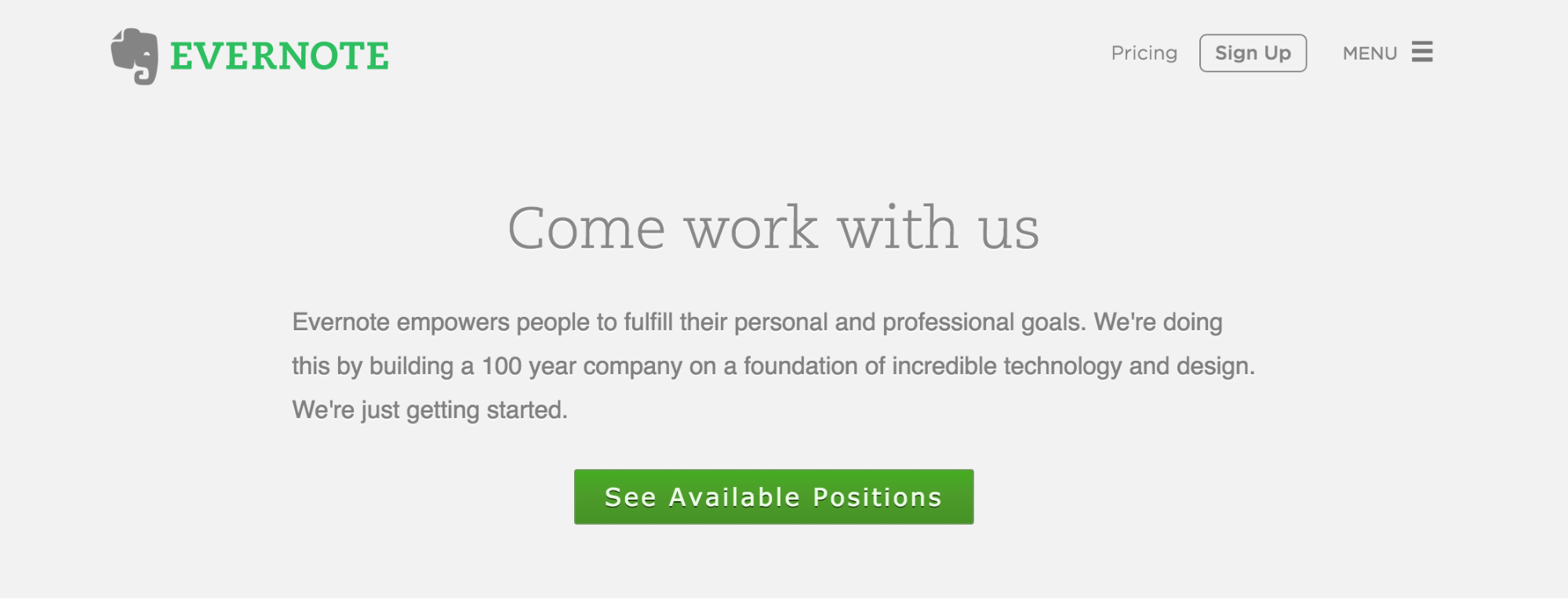
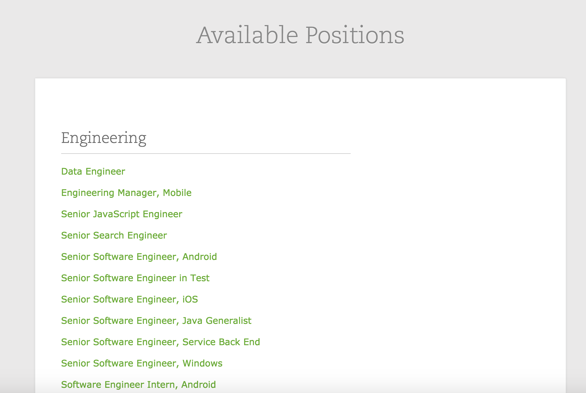
Evernote does a great job of staying user-centric too. Unlike other jobs pages, there’s a big, bright button that points me right where I want to go: the list of available jobs, which are listed just a bit down the page.
But you know what we haven’t seen yet? It’s something that really, really surprises this guy.
Don’t let me search
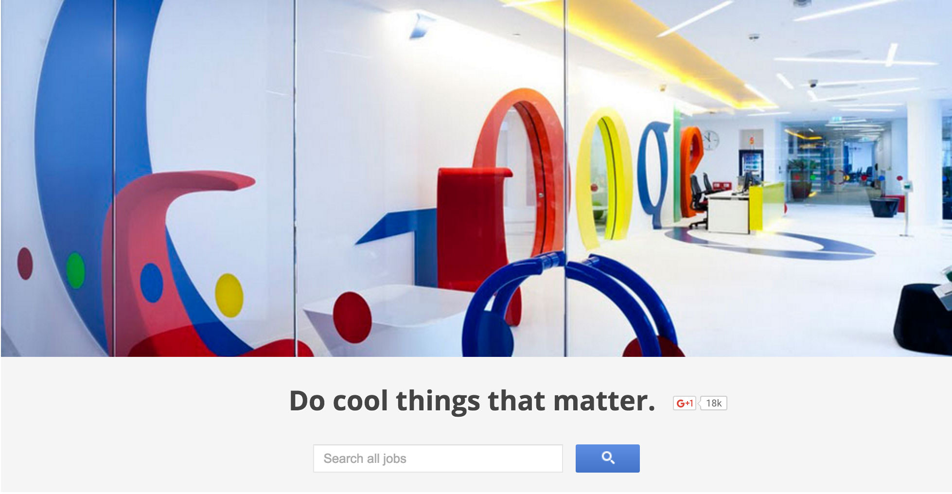
A simple little search box: the fastest, easiest way to find the role I’m looking for. No surprise Google gets it right.
It probably also shouldn’t come as a surprise that LinkedIn, the original job-centric social network, also prioritizes search. They also offer a plethora of filtering options in case I want to get really detailed.
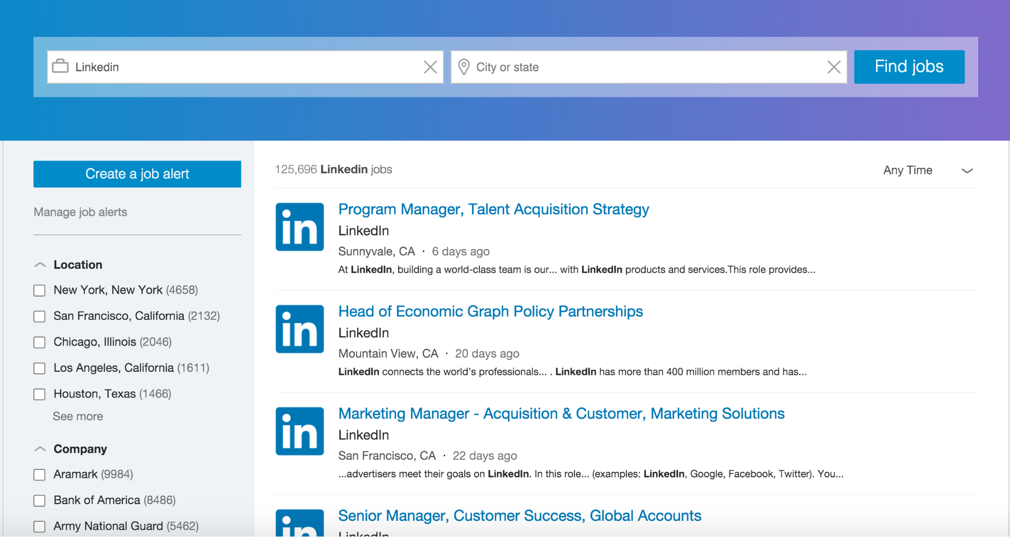
Now, you’ll note that the companies that let me search for open positions are massive corporations that always have a wealth of positions open. So search is obviously the optimal way to let people search for roles.
If your company is smaller, or doesn’t have many open positions available, it’s fine to skip search. Especially if it’s too expensive to implement.
But if you have more than a handful of open jobs and can pony up for search, do it. And if you can’t, remember that the great thing about search is that enables immediate and direct access to the roles I want. Not the departments. So use that as inspiration for your jobs page’s UX design, and you’ll be starting off on the right foot.
Bury the lede
Journalists have a saying: “Don’t bury the lede.”
By which they mean, don’t make people dig for the most important fact in your story. Bring it front and center so people can quickly and easily grasp the big idea and move on (or dig deeper if they want to).
So as much as you might want to go on and on about what a great place to work your company is, how vital its mission, and how awesome the people — resist the urge.
Obviously, people do want to know why they should want to work for you, but there are other places to do that. Like your About page. Or with a brief module on the Jobs page that links elsewhere. Or maybe even below the jobs. (On our site, we list jobs below mission info, but there’s also a main nav link that anchors straight down to the Jobs, so you can skip all my blabbering, if you’d like.)
After all, why would I want to read about how awesome your company is to work for before I even know if there’s a chance of working there?
Plus, I’d lay money that the majority of visitors to your Jobs page actually already want to work for you. In which case, you’re just preaching to the choir.
How to optimize your jobs page UX
When working on UX design, I always try to stay focused on the user’s mindset. And when it comes to jobs, the user’s mindset is, naturally enough, about jobs.
So don’t use your org chart as the primary organizational principle for your job listings. Or, make it easy for me to see what jobs belong in each org without having to click to another page. You can support that with filters, anchor links, or tabs.
If you can, support search, and maybe even flitering. And don’t make me read an entire essay on your mission, vision, and the crazy story about how that ping-pong table ended up in the elevator shaft.
Just let me see if you’ve got a job I can do.

Master the fundamental concepts of web design, including typography, color theory, visual design, and so much more.
Master the fundamental concepts of web design, including typography, color theory, visual design, and so much more.


