Update
Designer
Updated UI in the Designer
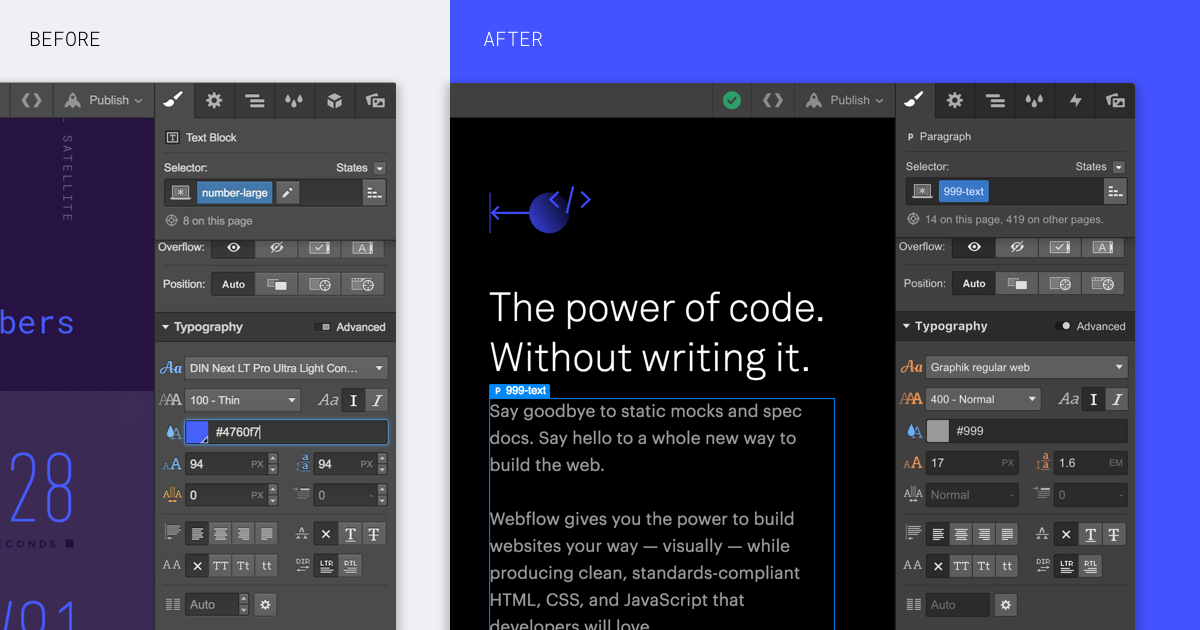
We gave the Designer a new paint job and tweaked the UI in a few places. Full details available in our update notes.

When you open the Designer next, you might notice a slightly new look. That's because we've restyled the UI to increase contrast, make everything a bit easier to read, and simplify options where possible. The main differences include:
New colors and simplified UI
The most obvious change is the new visual look, which features brighter, more contrasting colors, alongside some toned down shadows that should make the controls a bit more legible.

Removed field arrow buttons
To remove rarely used UI controls, we've taken out the up/down buttons in the input fields. You can use the up and down keyboard keys when a field is selected (and hold SHIFT while using these keys to increase/decrease the value by increments of 10).
Related updates
Get started for free
Try Webflow for as long as you like with our free Starter plan. Purchase a paid Site plan to publish, host, and unlock additional features.
Try Webflow for as long as you like with our free Starter plan. Purchase a paid Site plan to publish, host, and unlock additional features.


.jpeg)
.jpeg)
.jpeg)


